
Fluent Forms is designed to look great & fit with any WordPress theme and look excellent. However, you may need to style the form further to make it resemble the rest of your website.
Introducing Official Form Styler for Fluent Forms
Without any coding experience, The Form Styler allows you to build a custom design for the form. In this article, we’ll show you how to quickly and easily style the Fluent Forms elements and layouts with Form Styler with just a few clicks
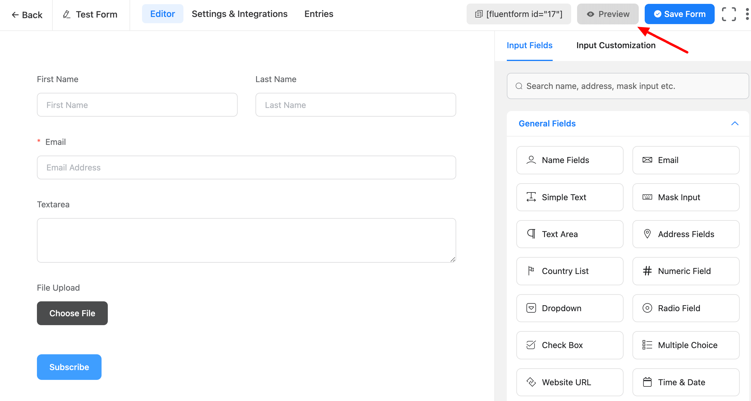
- After you’ve finished building the form, go to the top right corner of the Editor, Save the Form, and select Preview & Design to enter the preview window, where you may start styling it.
The design part consists of three tabs.
- General
- Misc
- Import
- The General Tab is used to style each element of the form, while the Misc Tab is used to style the Form Container background, padding, and margin and the Import tab selects a Fluent Form existing style add and can also import your style.
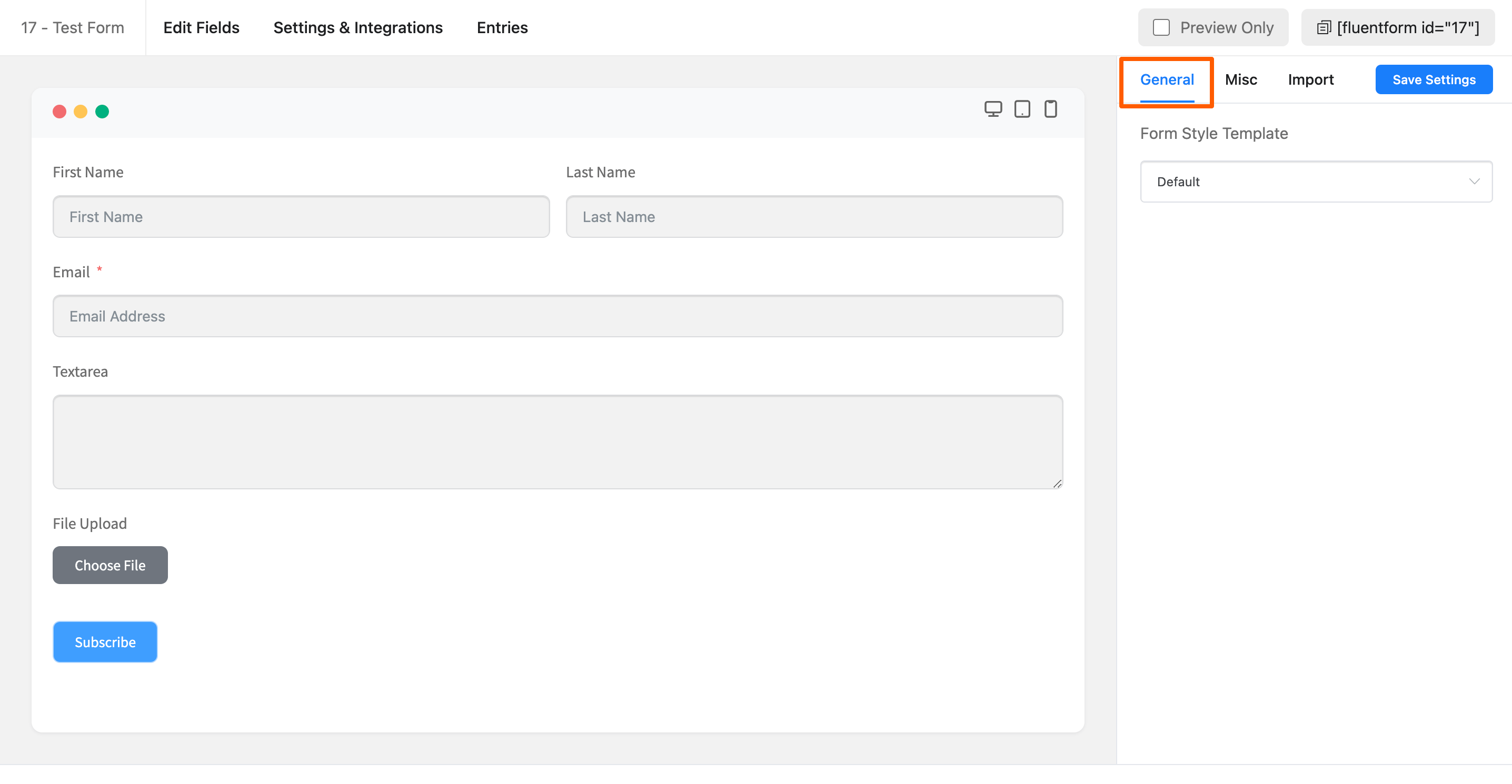
General (Choose Predefined Styles)
- As shown in the screenshot above, you can choose some pre-defined styles from Form Style Templates. There are five different style sets to choose from. Modern Bold, Modern Light, Classic, and Bootstrap Style are all styles that are inherited from the theme.
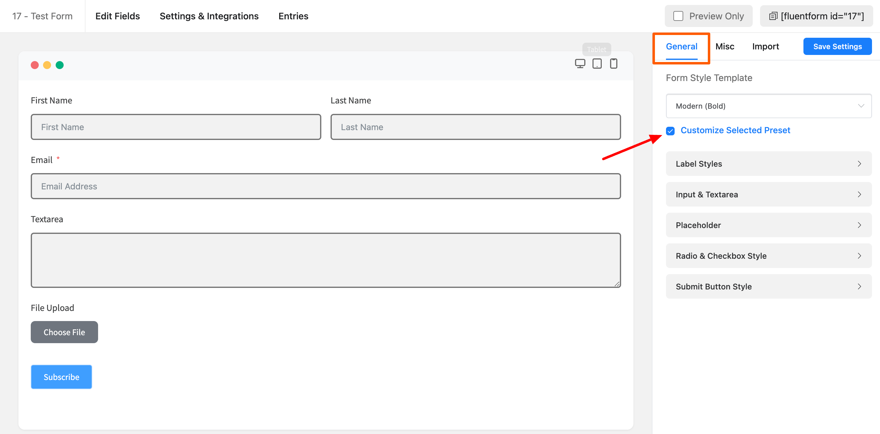
You can also customize the preset by choosing the option customize this preset. You can change the Label Styles, Input & Textarea, Placeholder, Radio & Checkbox Style and Submit Button Style from this Customize Preset option.
- You can still customize some form styles when utilizing the predefined style set. Consider the Container’s style and background, for example. Go to the Misc Tab, which is just after the General Tab, to edit these form styles.
Misc ( The Form Container Style )
- As shown in the screenshot below, you can customize the Form container’s background color, padding, and margins.
- Form Border Settings: Enable form border settings and specify the border type, color, width, and radius of the border.
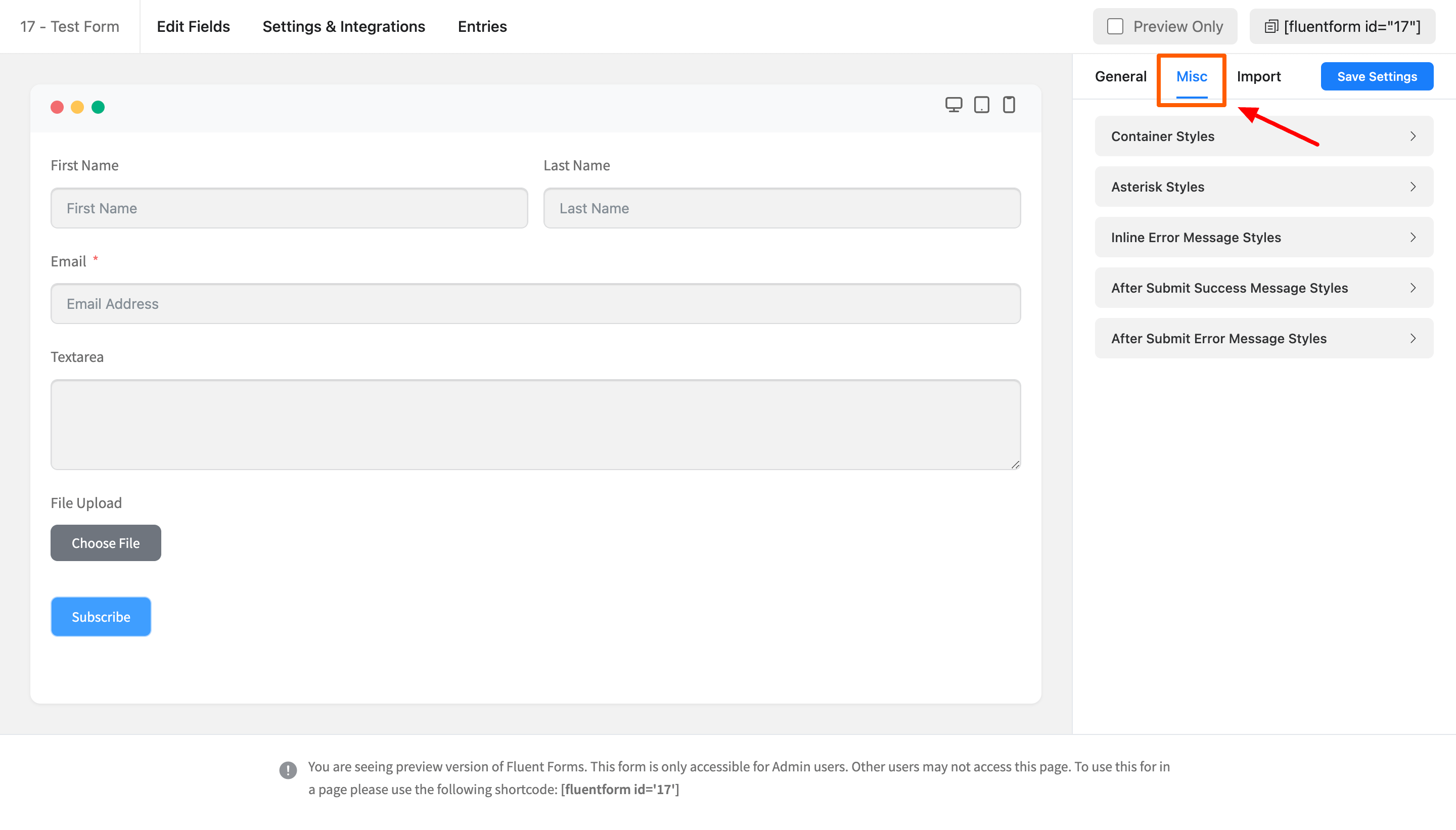
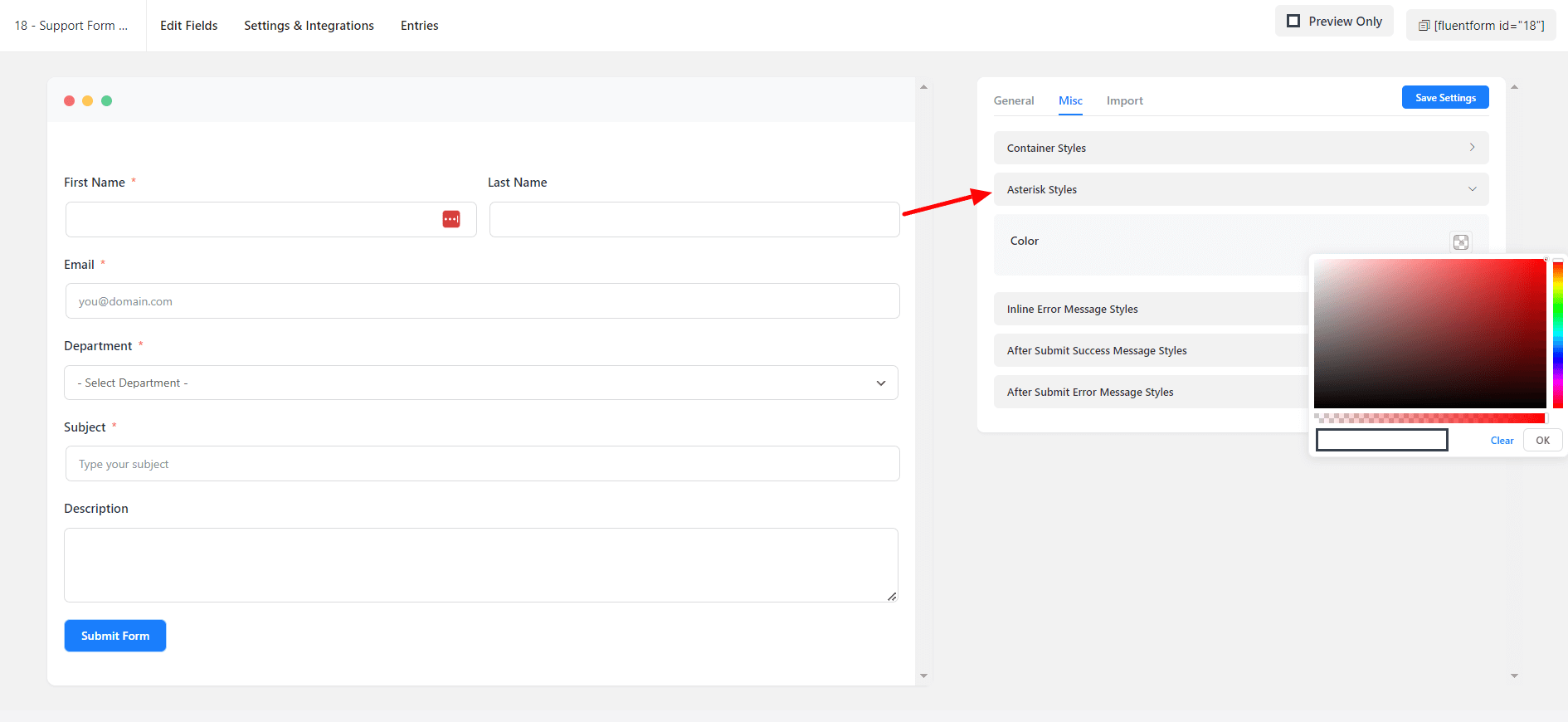
Asterisk Styles
Choose the color of the asterisk styles of your form.
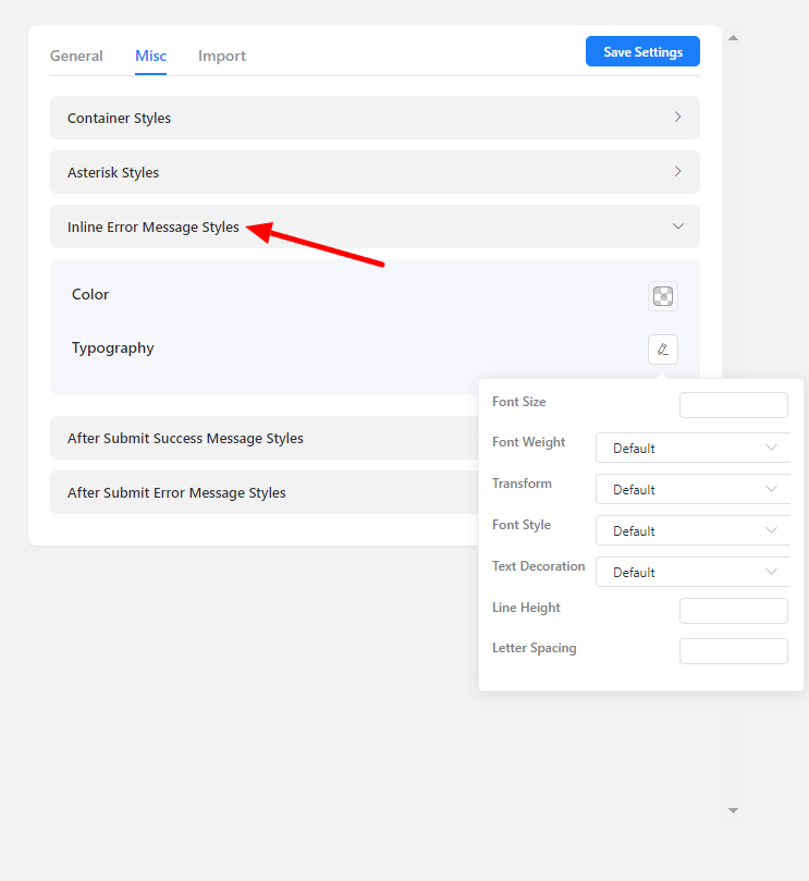
Inline Error Message Styles
- The color of the Inline Error Message is customizable. As shown in the screenshot below, define the typography, including font size, font weights, text decoration, line height, and letter spacing, among other things.
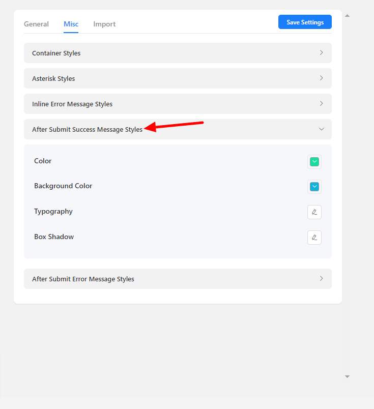
After Submit Success Message Styles
- You can easily customize the After Submit Success Message. Fill out your form and submit it for a visual view while designing the submit success message for testing purposes.
- You can customize the background and fonts. Change the font size, weight, text decoration, line height, and letter spacing, among other things. The box shadow of the success message box can be defined underneath the typography settings.
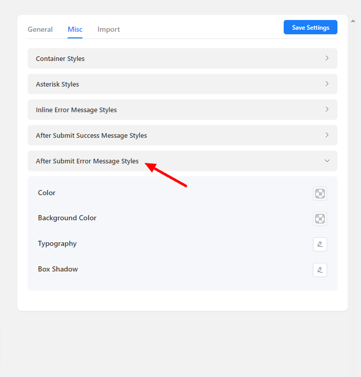
After Submit Error Message Styles
- After Submit Error Message can also be customized. The After Submit Success Message Styles are the same as the After Submit Success Message Styles.
- Set the color of the background and the font color. Set the font size, weight, text decoration, line height, and letter spacing, among other things.
- You may also configure the box shadow of the success message box underneath the typography settings.
Custom (Advanced Customization)
- You can customize the input fields according to your preferences and needs using the Custom Advanced Customization under the General Tab.
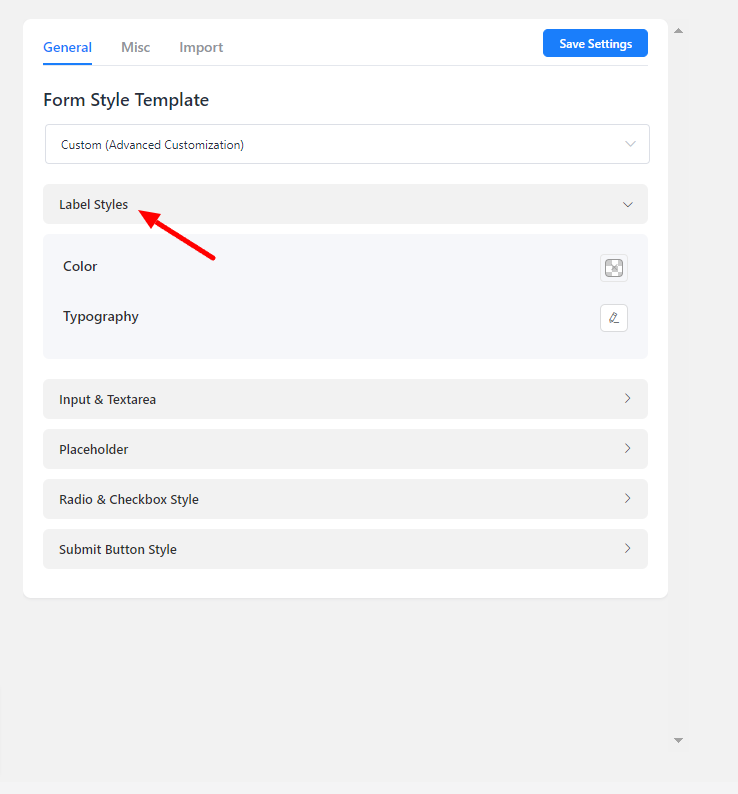
Label Styles
- The color of the field labels can be changed. As shown in the screenshot below, you may also define typography, such as font size, font weights, text decoration, line height, and letter spacing.
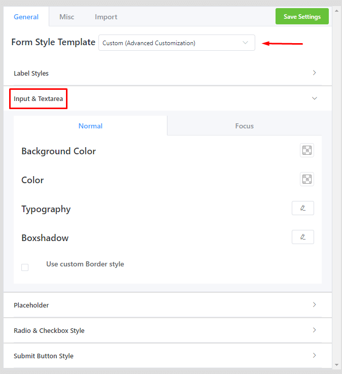
Input & Textarea Styles
- Set the input fields and text areas with background and text colors. Change the font size, font weight, text decoration, line height, letter spacing, etc. The box shadow of the input and text-area boxes can be defined below the typography settings.
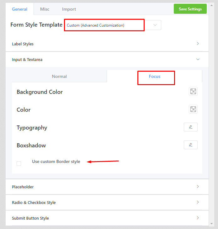
- You can add style to the input fields and text regions when clicking on Focus. It’s the same as the standard styling options.
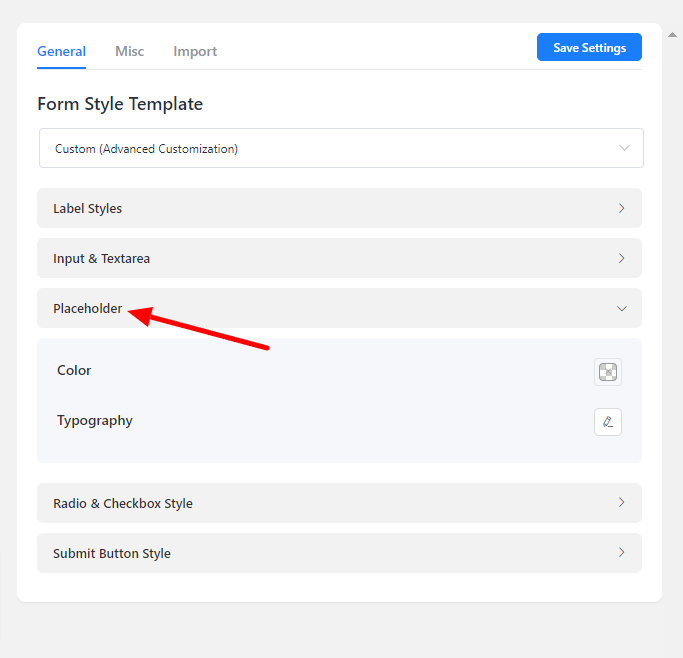
Placeholder Styles
- Choose the color of the input field placeholders. Set the typography as indicated in the screenshot, which includes Font Size, Font Weights, Text Decoration, Line Height, and Letter Spacing, among other things.
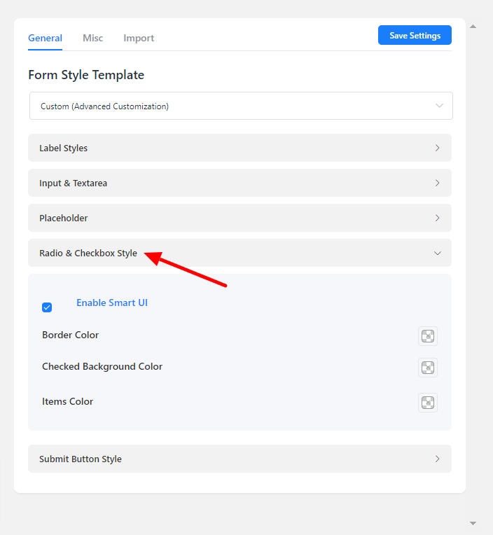
Radio & Checkbox Style
- You’ll see three styling options for the radio and checkbox fields when you enable smart UI. When the radio or checkbox is checked, define the border, item, and background colors.
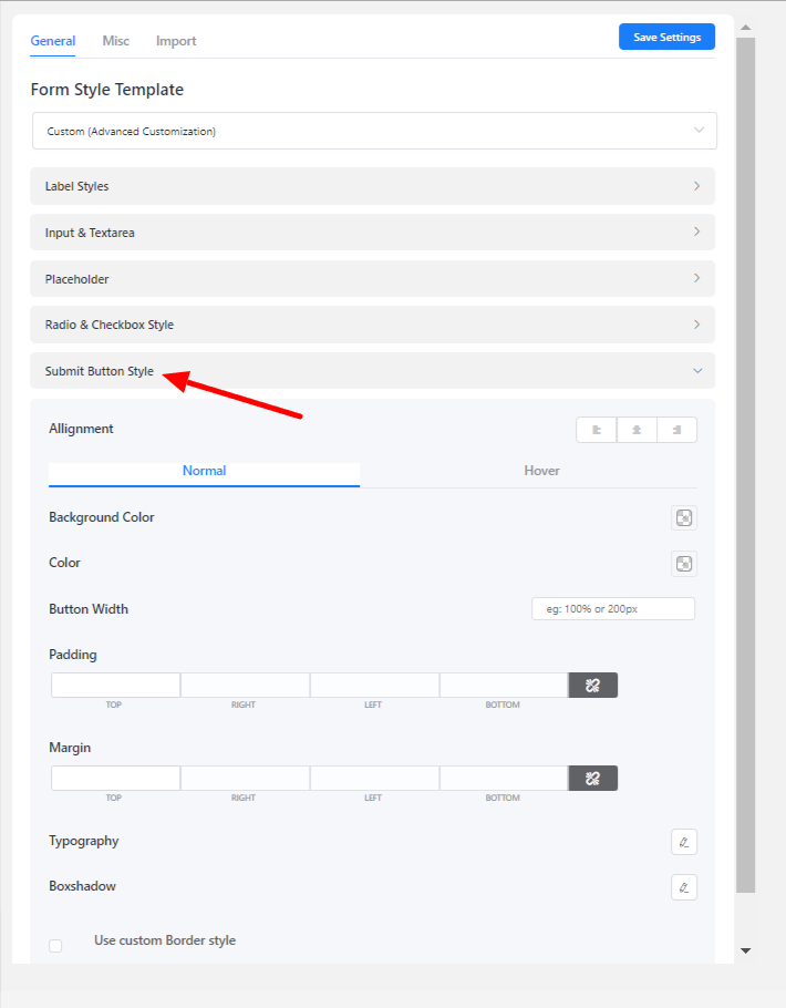
Submit Button Style
- By default, Fluent Forms styles the Submit button color with a dodger blue. But you are not limited to it; customize the submit button styles with your own preferences.
- The Submit button styling is identical to the next & previous button styling of the multi-page. Choose the button background color, text color, typography border options, and box shadows for both normal & hover states.
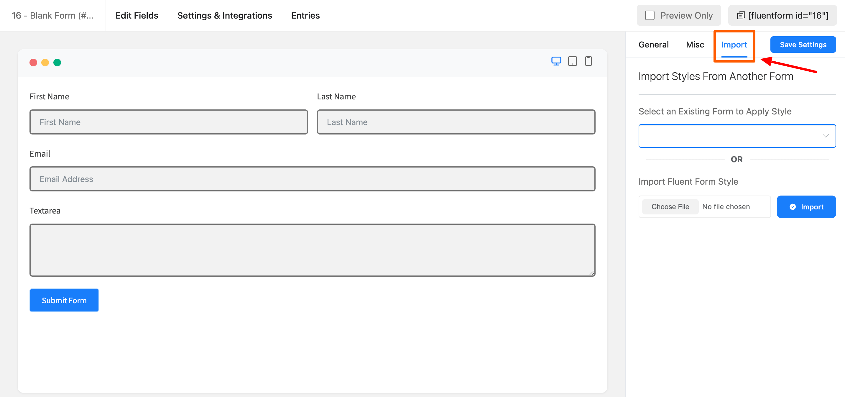
Import
You can import your form style from another existing form or you can also upload your Fluent form style.