
The Dropdown menu is essentially a list that appears usually whenever a button is clicked. This allows the users to select an item from a set of items. Fluent Forms allows you to have this drop-down menu facility as well.
- To add this field to your form, drag and drop the field from the available Advanced input fields. Input fields can be added to a form in other different ways. Let’s create a form first.
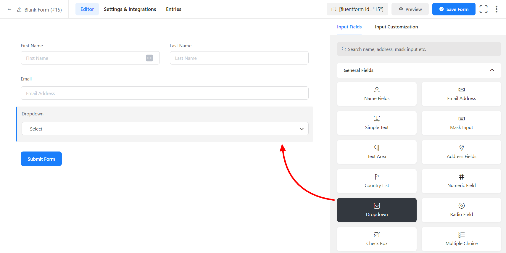
- To enable customization, click on the edit icon you get when hovering over the field. Or click on the Input Customization tab in the right sidebar when selecting the field.
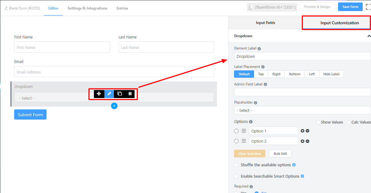
In the Input Customization section, you can customize the input field in the following ways. In this section, you will find 2 portions:
- Basic Options
- Advanced Options
Basic Options
On the right side of the tab, there are some important Basic options which are given below:
- Element Label: This is the text that users will see in the form of the input field. You can put any text here that helps to understand the purpose of that field.
- Label Placement: Determine the placement of the label that you set previously concerning the input field. The available options are Top, Left, Right, and Default. All of those are self-explanatory except the Default. What it means is that it will represent your global label placement settings.
- Admin Field Label: If you want to show a different label for your admin users when they view the form submissions, you can configure that. It doesn’t have any actual effect on the form but rather only for administrative purposes.
- Placeholder: You can also have a placeholder by which users will perceive the field subject.
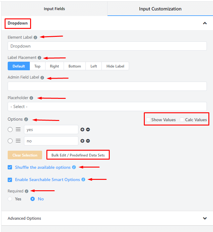
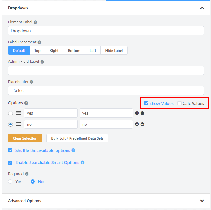
- Options: Create options for the field and checkmark them for default selection.
– Mark Show Values as checked for the ease of admins if needed.
– Name the options.
– Add options by clicking on the plus icon beside the last entered option. Or an option can be added in between two options by clicking on the plus icon beside the immediate previous option.
– Drag & Drop the options holding the marker and rearrange them if required.
- Show & Calc Values: Users will get Show Values and Calc Values options. You may display your data and perform calculations using Show Values and Calc Values.
- Bulk Edit/Predefined Data Sets: You can choose from predefined data set for the dropdown field, so you don’t have to add each item manually.
- Shuffle the available options: You can enable shuffling of your dropdown list or select field options so every user will see a randomized option to choose from.
- Enable Searchable Smart Options: When you have a long dropdown list, you might want to give users the search option to select a field. Just Enable the Searchable Smart options to allow users to search into dropdown fields. When this option is selected, a search option appears, allowing the user to search for the desired country list manually.
- Required: Determine whether the field could be empty or not when the user submits your form by choosing the appropriate option from here.
Advanced Options
The Advanced customizations available for the Dropdown field are as follows:
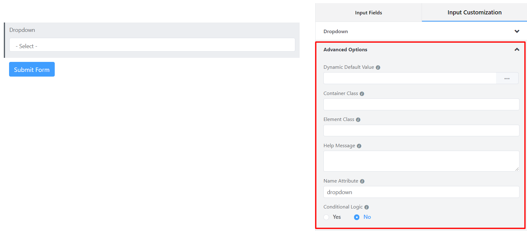
- Dynamic Default Value: You can manually set any fixed value in your field and pre-populate your input field dynamically using our shortcodes. To get a better understanding of Dynamic Default Value, read this guide.
- Container Class: Use this option to add your custom CSS classes to the field’s wrapper.
- Element Class: Similarly, you can add custom CSS classes to the input field itself.
- Help Message: To guide your user thoroughly, you can use this option. Just add your text here, and it will be shown as a help message to the user.
- Name Attribute: The input field’s name attribute is the HTML equivalent of the same name. You don’t need to modify this.
- Conditional Logic: You can create certain rules to dynamically hide/show the input field based on the values from some other fields. To get a better understanding of Conditional Logic, read this.
- Save the form when the customization is done.
You can get the visual representation of this field entries. To learn more click here