
In Fluent Forms, an Address input field can be used to collect a person’s full address (Street, City, State, Zip code, Country) without having to create or manage multiple textbox fields.
Address Field input type allows you to make fields in a form to retrieve the address from your users. Fluent Forms offers six different input fields by default to retrieve data from users. They are- Address Line 1, Address Line 2, City, State, Zip Code, and Country.
Now you can autocomplete your address field using google map integrations, see this doc.
- To add an Address Field to your form, drag and drop the field from the available input fields.
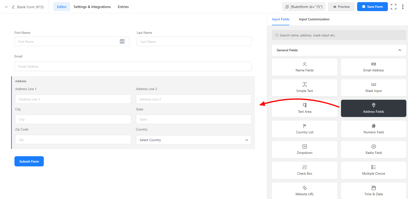
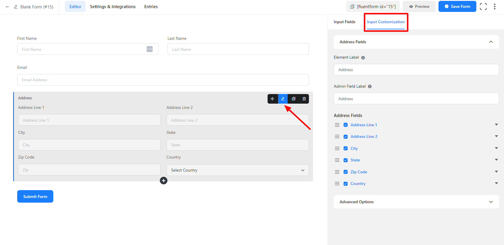
- To enable customization, click on the edit icon you get when hovering over the field. Or click on the Input Customization tab in the right sidebar when selecting the field.
In the Input Customization section, you will find different options like–
- Basic Options
- Advanced Options
Basic Options
On the right side of the tab, there are some important Basic options which are given below:
- Element Label: This is the text that users will see on the form for the email input field. You can put any text here that helps to understand the purpose of that field.
- Admin Field Label: If you want to show a different label for your admin users when they view the form submissions, you can configure that using this option. It doesn’t have any actual effect on the form but rather only for administrative purposes.
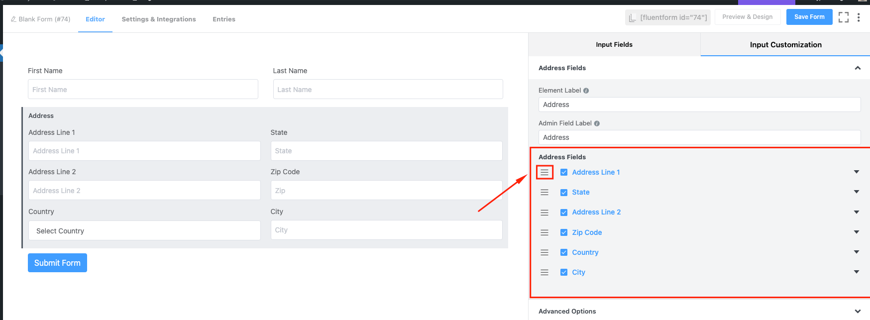
- Address Fields: From this section, customize the six data input fields (Address Line 1, Address Line 2, City, State, Zip Code, Country). Check on/off any field according to your needs. If you want, you can change the position of the individual Address Fields by dragging the bar icon according to your requirements. Click on the drop-down button beside these fields and determine the Input Field Label, Default, Placeholder, Help Message, and Required options. To know more about these options, see the below screenshot:
Take another look
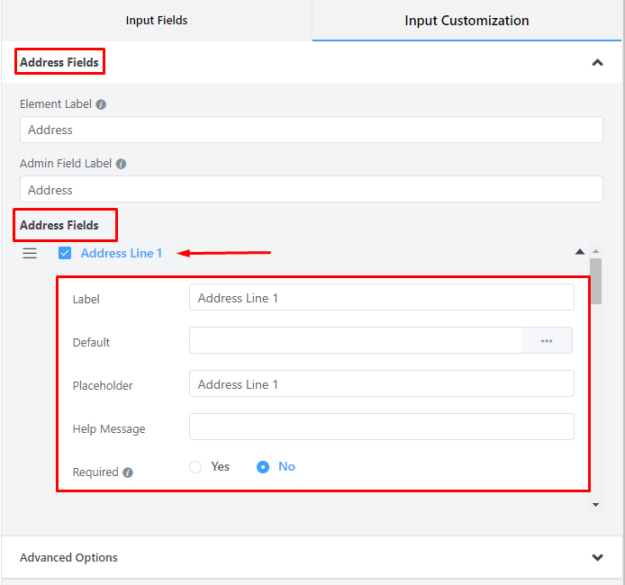
- Label: You can also change the field label as your wish by this option.
- Default Value: Using our shortcodes, you can manually set any fixed value in your field and pre-populate your input field dynamically. To get a better understanding of Dynamic Default Value, read this guide.
- Placeholder: When the input is empty, it is customary to show a certain message to the users so they can grasp what the input field expects from them. It is the equivalent of the HTML input placeholder attribute.
- Help Message: You can use this option to guide your user thoroughly. Just add your text here, and it will be shown as a help message to the user.
- Required: Determine whether the field could be empty or not when the user submits your form by choosing the appropriate option from here.
Advanced Options
The Advanced customizations available for the Address input field are as follows:
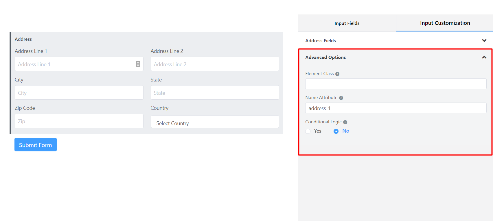
- Element Class: You can add custom CSS classes to the input field itself.
- Name Attribute: The input field’s name attribute is the HTML equivalent of the same name. You don’t need to modify this.
- Conditional Logic: You can create certain rules to dynamically hide/show the input field based on the values from some other fields. Let’s learn more about conditional logic.
- Save the form when the customization is done.