
Checkable Grid is an excellent option for collecting feedback with multiple variables in an organized manner. This field can function as a concise combination of multiple checkboxes or radio buttons. You’ll find this option available with Fluent Forms.
- To add this field to your form, drag and drop the field from the available Advanced input fields.
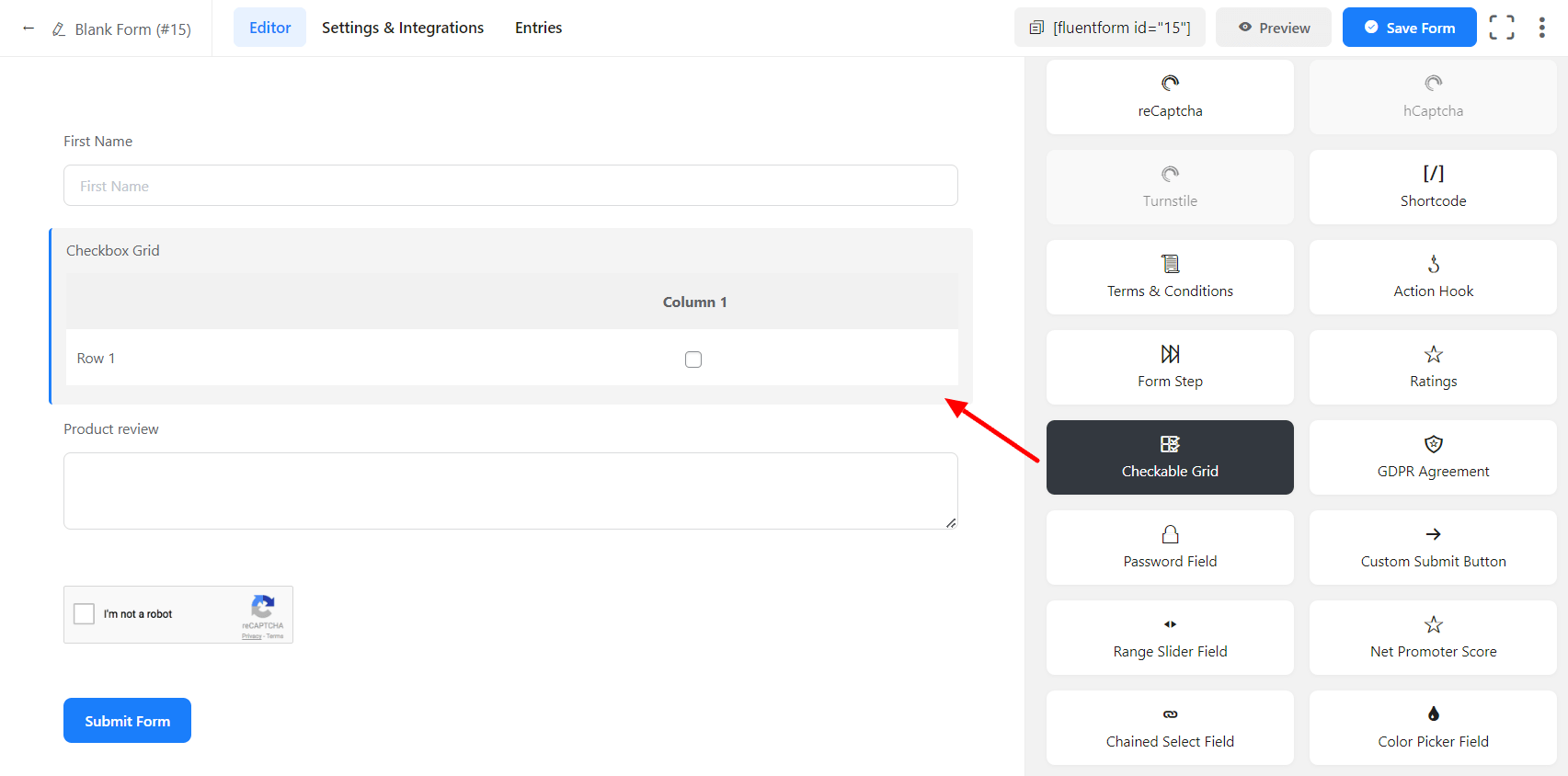
- To enable customization, click on the edit icon you get when hovering over the field. Or click on the Input Customization tab in the right sidebar when selecting the field.
In the Input Customization section, you can customize the Checkable Grid input field in the following ways. In this section, you will find 2 portions:
- Basic Options
- Advanced Options
Basic Options
On the right side of the tab, there are some important Basic options which are given below:
- Element Label: This is the text that users will see on the form for the input field. You can put any text here that helps to understand the purpose of that field.
- Label Placement: Determine the placement of the label that you set previously concerning the input field. The available options are Top, Left, Right, and Default. All of those are self-explanatory except the Default. What it means is that it will represent your global label placement settings.
- Admin Field Label: If you want to show a different label for your admin users when they view the form submissions, you can configure that. It doesn’t have any actual effect on the form; rather only for administrative purposes.
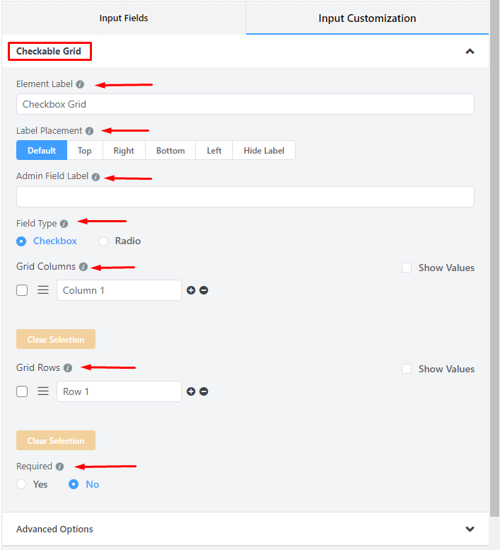
- Field Type: Determine if the Checkable grid is to function as a Checkbox or a Radio Button field. The procedure of setting up these two options is the same, but in the output, selecting the checkbox will work as a multiple-choice option, and selecting Radio will work as a single-choice option.
- If you select the Checkbox button, your users will be able to get the opportunity to respond in the form of a checkbox. If you select the radio button, your users will get the options in the form of a radio button.
- Grid Columns: This section allows you to add a column to your grid system. If you want to add a column to the vertical grid, you just need to click on the plus(+) sign. For each click, a column will be added to the vertical grid. On the other hand, if you want to delete a column, just click on the minus(-) sign.
- Grid Rows: This section allows you to add a row to your grid system. If you want to add a row to the horizontal grid, you just need to click on the plus(+) sign. For each click, a row will be added to the horizontal grid. On the other hand, if you want to delete a row, just click on the minus(-) sign.
- Grid Columns & Grid Rows: Create options for the field and check to mark them for default selection.
– Mark Show Values as checked for the ease of admins if needed.
– Name the options.
– Add options by clicking on the plus icon beside the last entered option. Or an option can be added between two options by clicking on the plus icon beside the immediate previous option.
– Drag & Drop the options holding the marker and rearrange them if required.
- Required: Determine whether the field could be empty or not when the user submits your form by choosing the appropriate option from here.
Advanced Options
The Advanced customizations available for the Checkable Grid input fields are as follows:
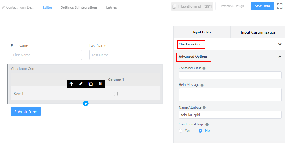
- Container Class: Use this option to add your custom CSS classes to the field’s wrapper.
- Help Message: To guide your user thoroughly, you can use this option. Just add your text here, and it will be shown as a help message to the user.
- Name Attribute: The input field’s name attribute is the HTML equivalent of the same name. You don’t need to modify this.
- Conditional Logic: You can create certain rules to dynamically hide/show the input field based on the values from some other fields. To get a better understanding of Conditional Logic, read this.
- Save the form when the customization is done.