
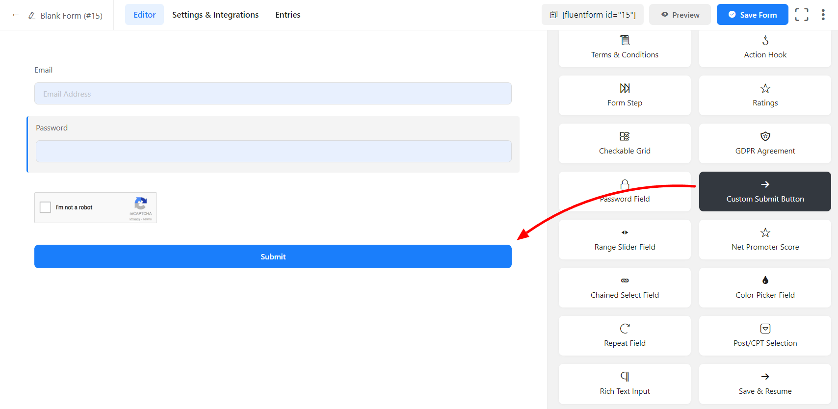
In Fluent Forms, the Custom Submit Button field is used to replace the default submit button of the form. The default submits button is generated automatically when you create a form and place it below all of the form fields. But you might want to have your own custom position and styling for the button instead of the default one. In this situation, the Custom Submit Button field will do the job.
The only differences between the default submit button and the custom submit button is the position changing feature, custom styling options, and conditional logic. The default submit button position is fixed below the form and doesn’t have conditional logic but the custom submit button can be used as inline with other form fields inside a container and have conditional logic feature. Learn how to create an inline subscriber form with Fluent Forms.
- To add this field to your form, drag and drop the field from the available Advanced input fields. Input fields can be added to a form in other different ways. Let’s create a form first.
- To enable customization, click on the edit icon you get when hovering over the field. Or click on the Input Customization tab in the right sidebar when selecting the field.
In the Input Customization section, you can customize the input field in the following ways. In this section, you will find 2 portions:
- Basic Options
- Advanced Options
Basic Options
On the right side of the tab, there are some important Basic options which are given below:
- Submit Button: Default or Image; these two options are available in Submit Button option. Users can keep this Button as a Default button or choose the Image option with the Image URL.
- Button Style: As described earlier, the basic design and other functionalities of the custom submit button are the same as the default one. But you can get under the hood and change its pre-defined color scheme, positioning, or action for the button.
- Background color: Give a suitable background color to the button according to your website color scheme. In my case, the background color is the default blue.
- Text Color: You can give a smooth color to the button text based on the background color. In my case, the button text is white(#ffffff), which perfectly suits the blue background.
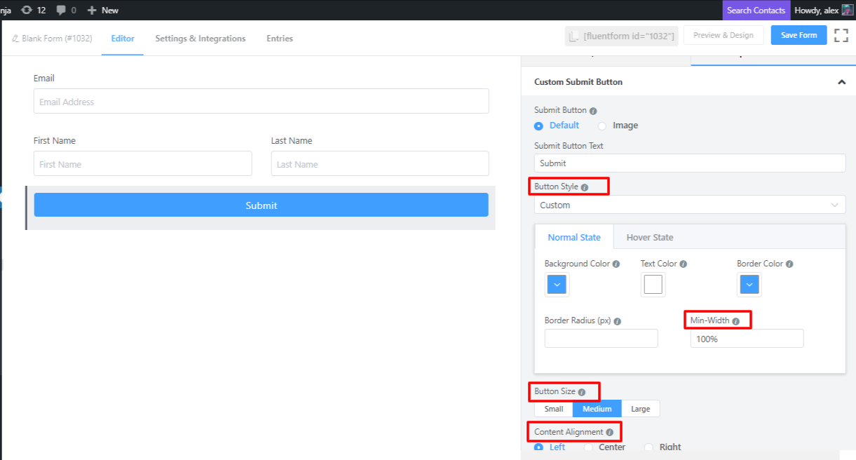
- Border Color & Radius: The button, by default, has a one-pixel border. You can also define a color for the border. In my case, I gave a slightly darker color than the background color, which is standard. Also, you can give a radius for the button based on what suits the form.
- Min-Width: You can give a minimum width to the button both in pixels and percentage, whichever suits your form. A 100% min-width will be a full-width button.
- Button Size: This option defines the size of the button. Small, Medium & Large these three options are available with the Button size.
- Content Alignment: This option defines how the content will be aligned.
Also, you can use exact same style features for the hover states of the button. Click on the hover state and apply the same kinds of styling features which suits the active state styles.
Advanced Options
The Advanced customizations available for the Custom Submit Button field are as follows:
- Container Class: Use this option to add your custom CSS classes to the field’s wrapper.
- Element Class: Similarly, you can add custom CSS classes to the input field itself.
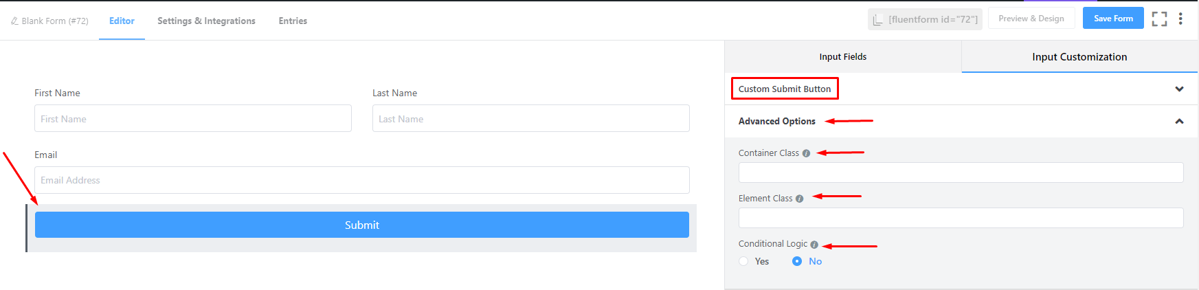
- Conditional Logic: You can create certain rules to dynamically hide/show the input field based on the values from some other fields. To get a better understanding of Conditional Logic, read this.
- Save the form when the customization is done.