
It is essential to have an email address input field in any form. Fluent Forms allows you to produce an input field to take in users’ email addresses.
- To add this field to your form, drag and drop the field from the available input fields.
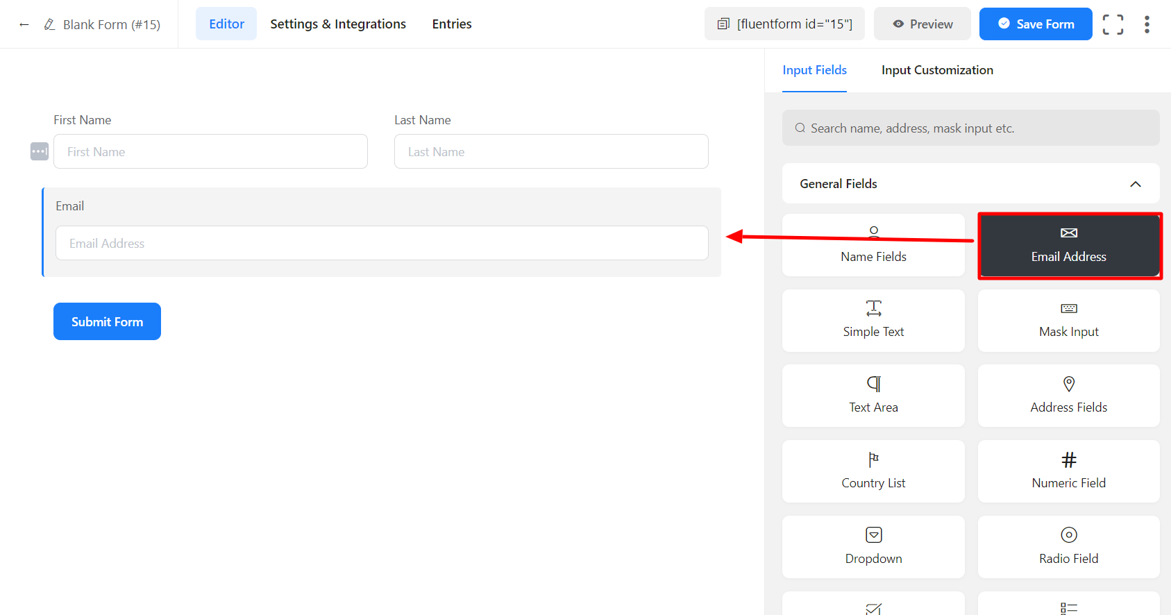
- To enable customization, click on the edit icon you get when hovering over the field. Or click on the Input Customization tab in the right sidebar when selecting the field.
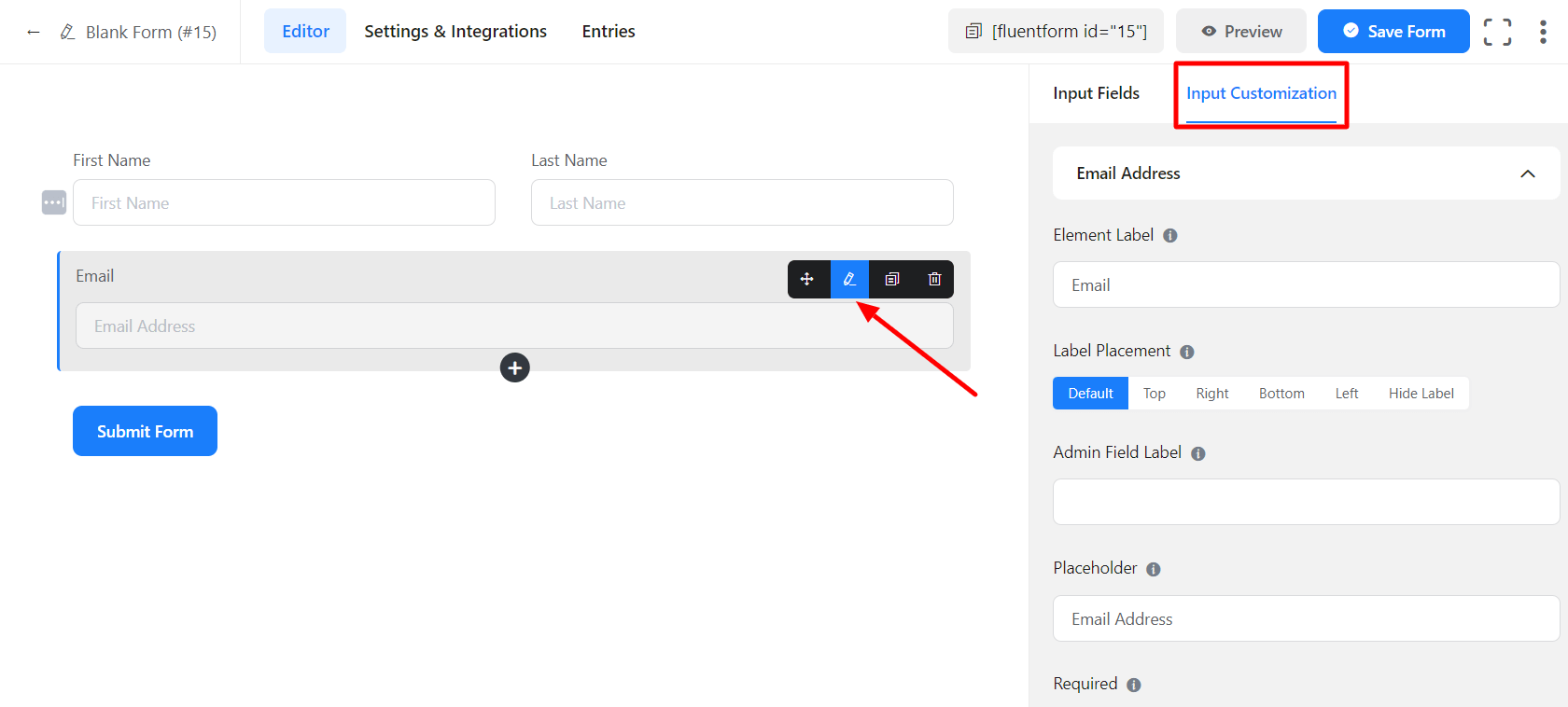
In the Input Customization section, you can customize the email field in the following ways. In this section, you will find 2 portions:
- Basic Options
- Advanced Options
Basic Options
On the right side of the tab, there are some important Basic options which are given below:
- Element Label: This is the text that users will see on the form for the Email input field. You can put any text here that helps to understand the purpose of that field.
- Label Placement: Determine the placement of the label that you set previously concerning the input field. The available options are Top, Left, Right, and Default. All of those are self-explanatory except the Default. What it means is that it will represent your global label placement settings.
See the below screenshot to get a better understanding of the Basic options-
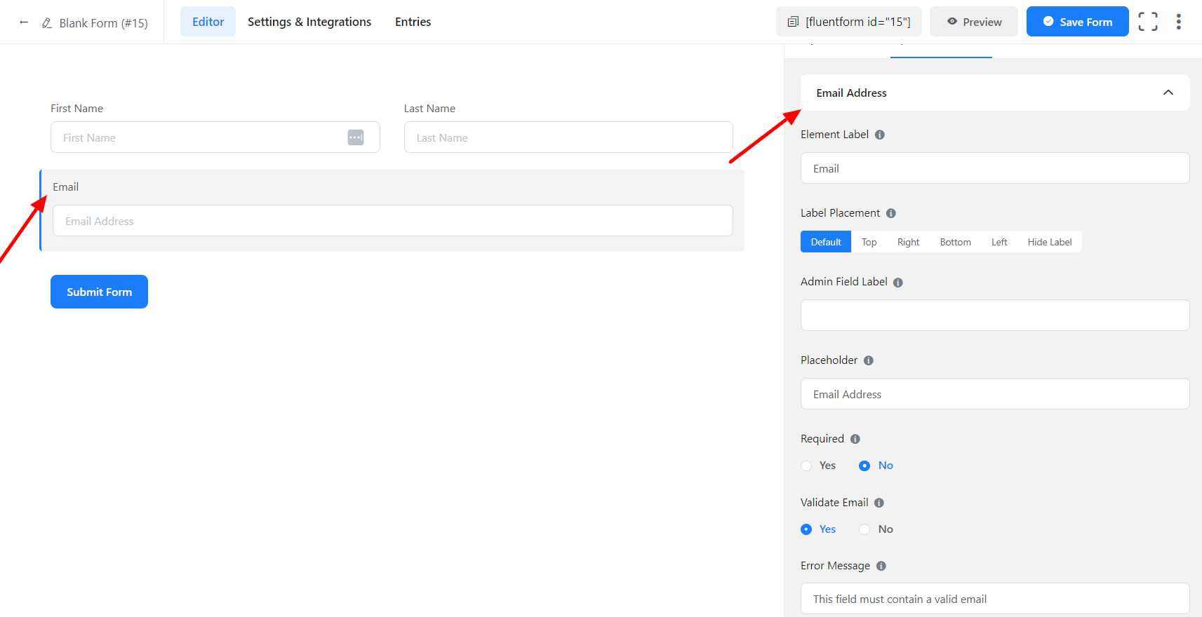
- Admin Field Label: If you want to show a different label for your admin users when they view the form submissions, you can configure that using this option. It doesn’t have any actual effect on the form but rather only for administrative purposes.
- Placeholder: You can also have a placeholder by which users will perceive the field subject.
- Required: Determine whether the field could be empty or not when the user submits your form by choosing the appropriate option from here.
- Validate Email: You can select Yes to notify a user that he needs to add a Valid Email; otherwise, an Error message will show. Or you can select No.
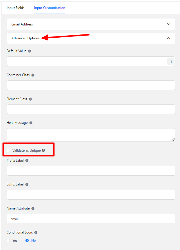
Advanced Options
The Advanced options available for the Email input fields are as follows:
- Default Value: Using our shortcodes, you can manually set any fixed value in your field and pre-populate your input field dynamically. To get a better understanding of Dynamic Default Value, read this guide.
- Container Class: Use this option to add your custom CSS classes to the field’s wrapper.
- Element Class: Add custom CSS classes to the input field itself.
- Help Message: You can use this option to guide your user thoroughly. Add your text here, which will be shown as a help message to the user.
- Validate as Unique: You can click on this option to show the message that the user’s Email address needs to be unique.
- Prefix Label: You can use this field to provide Prefix Label in your input field. It will show in the input field as a prefix label.
- Suffix Label: To provide Suffix Label in your input field, you can use this field. It will show in the input field as a Suffix label.
- Name Attribute: The input field’s name attribute is the HTML equivalent of the same name. You don’t need to modify this.
- Conditional Logic: You can create certain rules to dynamically hide/show the input field based on the values from some other fields. Learn more about conditional logic
- Save the form when the customization is done.
These are the total configuration processes for the Email Address input field.