
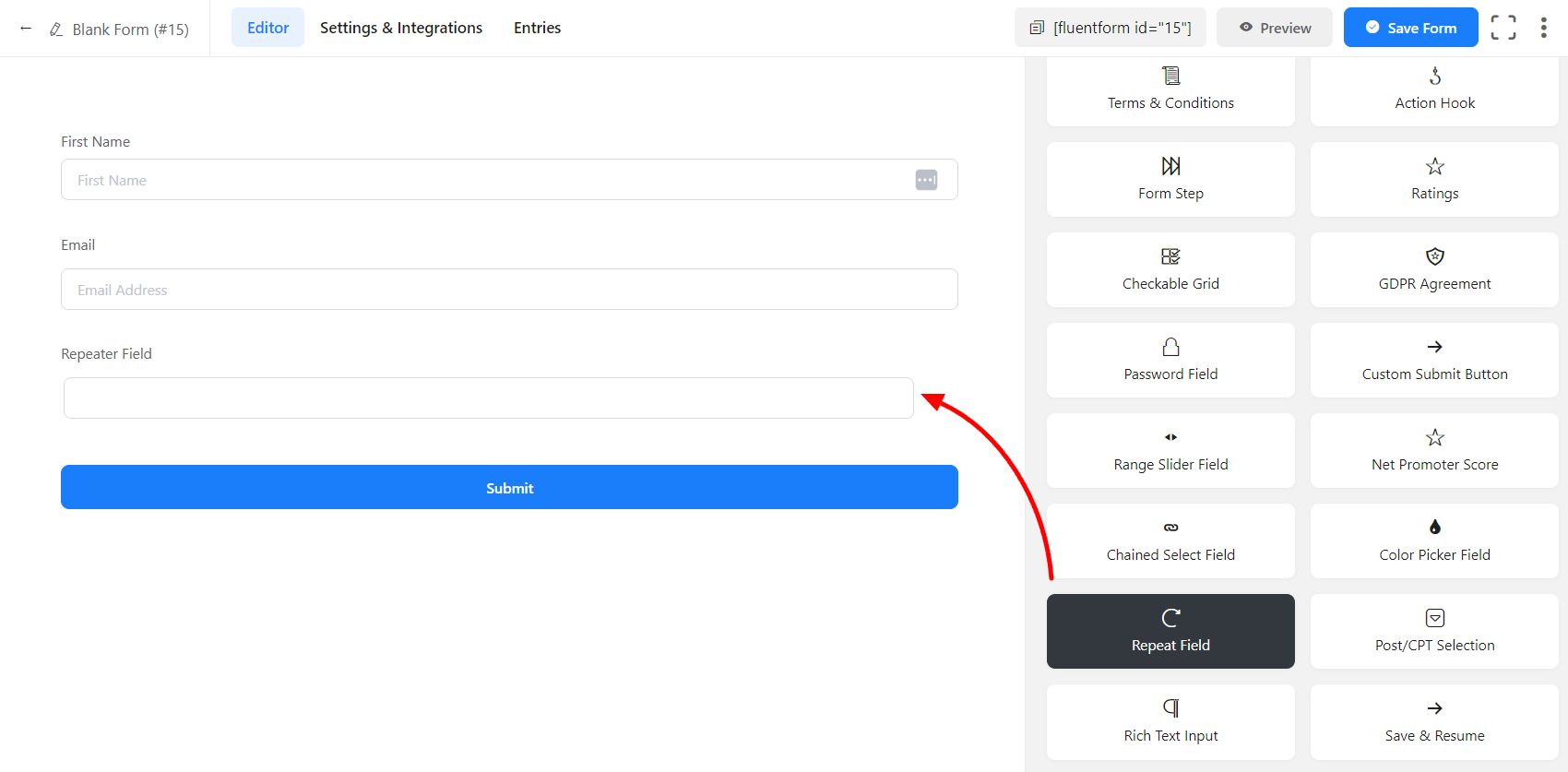
A repeat Field is used to create a duplicate field. It’s a handy feature to create a similar type of field within a form. Your users can add a copy of your required field if they want. Fluent Forms allows you to have such an opportunity in your custom form. Have a look below to get an idea of how Repeat Fields work:
- To add this field to your form, drag and drop the field from the available Advanced input fields. Input fields can be added to a form in other different ways. Let’s create a form first.
- To enable customization, click on the edit icon you get when hovering over the field. Or click on the Input Customization tab in the right sidebar when selecting the field.
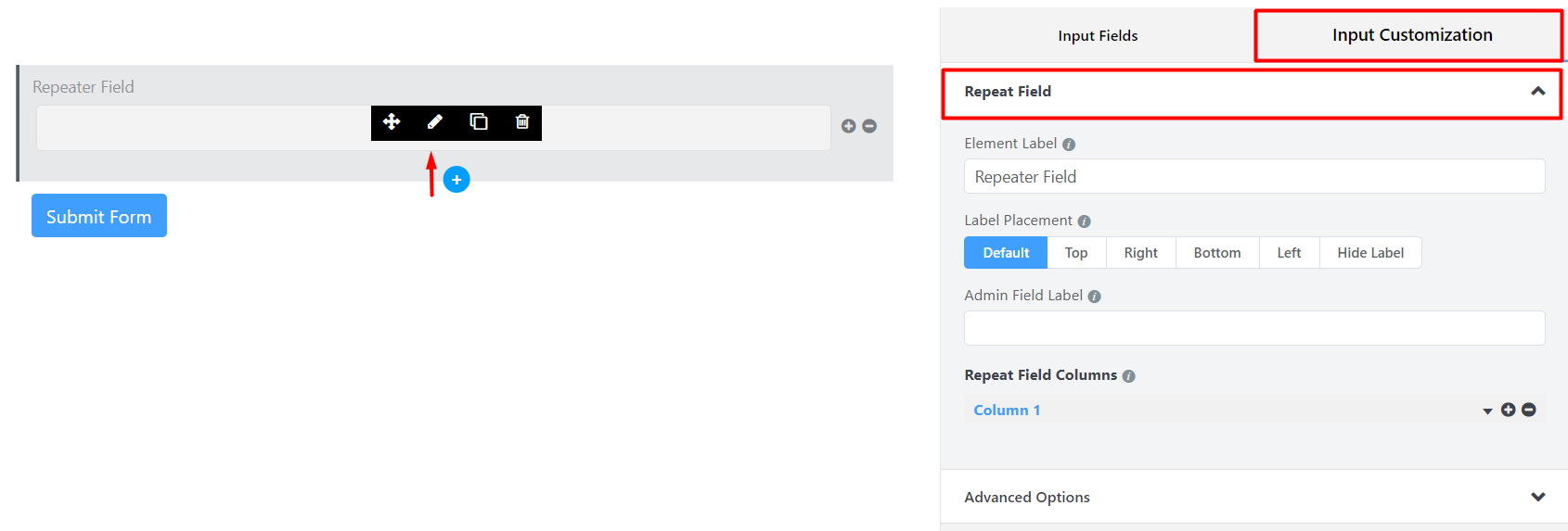
In the Input Customization section, you can customize the input field in the following ways. In this section, you will find 2 portions:
- Basic Options
- Advanced Options
Basic Options
On the right side of the tab, there are some important Basic options which are given below:
- Element Label: This is the text that users will see on the form for the Repeat Field. You can put any text here that helps to understand the purpose of that field.
- Label Placement: Determine the placement of the label that you set previously concerning the input field. The available options are Top, Left, Right, and Default. All of those are self-explanatory except the Default. What it means is that it will represent your global label placement settings.
- Admin Field Label: If you want to show a different label for your admin users when they view the form submissions, you can configure that using this option. It doesn’t have any actual effect on the form; rather only for administrative purposes.
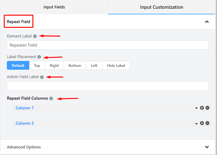
- Enable Multiple Columns in Repeat Field: Checkmark this option if the repeating field should have multiple input fields in multiple columns.
- Click on the Chevron Down icon to configure the columns of this repeating field.
- Click on the Plus icon (+) to add columns.
- Click on the Minus icon (-) to remove a column.
- Name the Label of the columns.
- From the Default value, select if any pre-populated values are to be put for logged-in users in the columns.
- Set placeholders for the columns.
- Required: Determine whether the fields could be empty or not when the user submits your form by choosing the appropriate option from here.
Advanced Options
The Advanced customizations available for the Repeat input field are as follows:
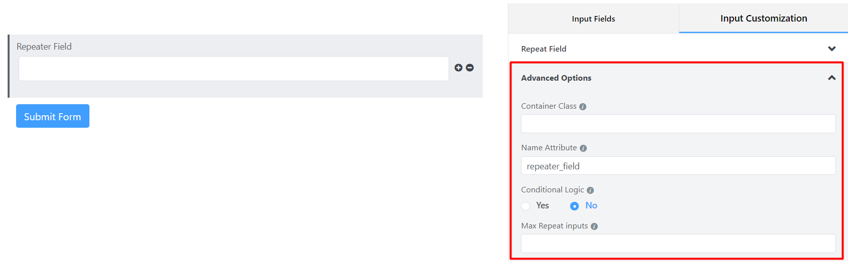
- Container Class: Use this option to add your custom CSS classes to the field’s wrapper.
- Name Attribute: The input field’s name attribute is the HTML equivalent of the same name. You don’t need to modify this.
- Conditional Logic: You can create certain rules to dynamically hide/show the input field based on the values from some other fields. To get a better understanding of Conditional Logic, read this.
- Max Repeat Inputs: Users can provide the max number of rows the user can fill up for this repeated field. Keep blank/0 for unlimited numbers.
- Save the form when the customization is done.