
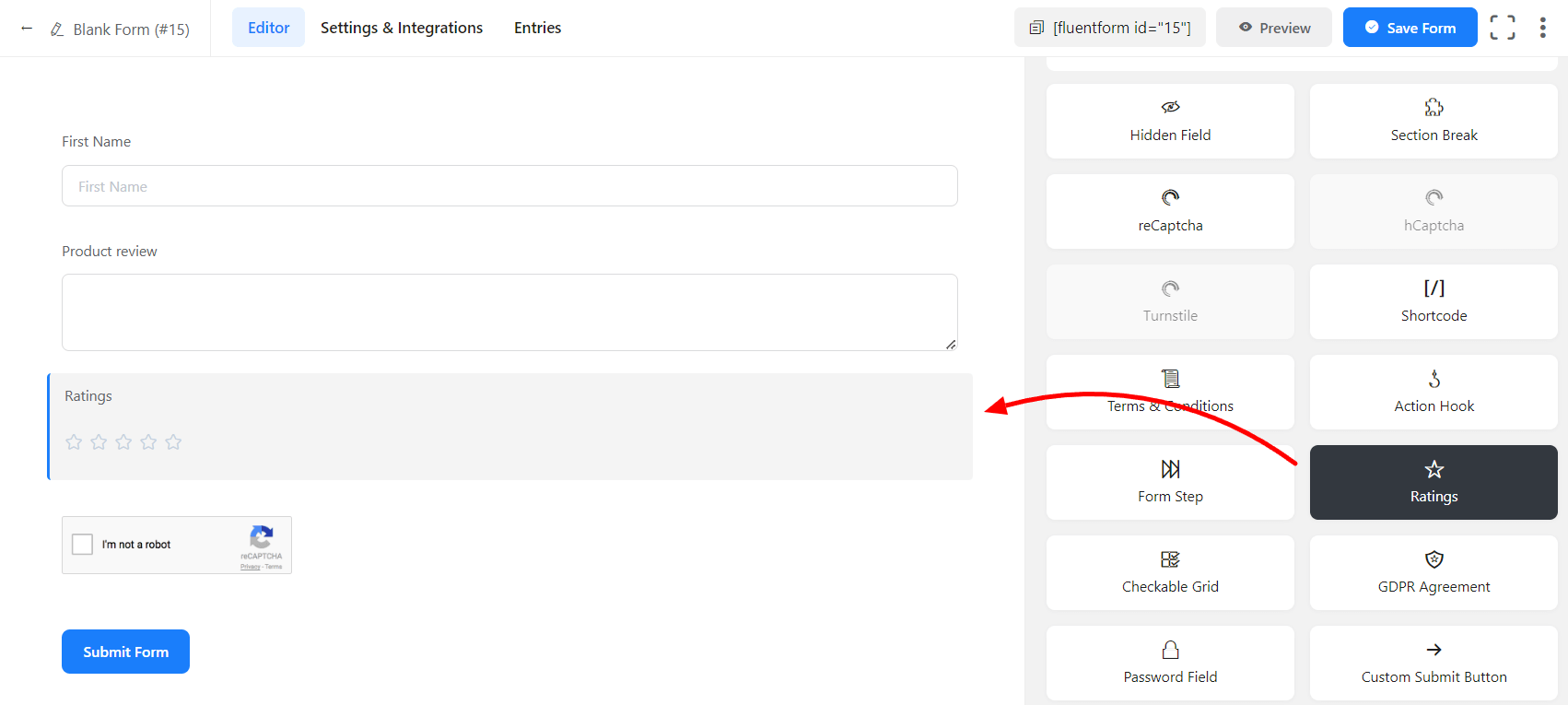
With Fluent Forms, you can add a Ratings input field to your form. The Rating field comes with a few default settings for the ease of users. But these default settings can be customized as well.
The Ratings input field in Fluent Forms is designed in five hierarchy orders by default Nice, Good, Very Good, Awesome, Amazing, etc. If you want to add more, you can do such. You can easily add a Ratings field in your form. This will add interactivity to your form.
- To add this field to your form, drag and drop the Ratings field from the available Advanced input fields.
- To enable customization, click on the edit icon you get when hovering over the field. Or click on the Input Customization tab in the right sidebar when selecting the field.
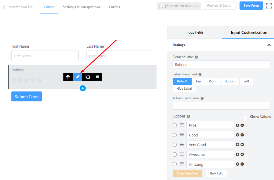
In the Input Customization section, you can customize the Ratings input field in the following ways. In this section, you will find 2 portions:
- Basic Options
- Advanced Fields
Basic Options
On the right side of the tab, there are some important Basic options which are given below:
- Element Label: This is the text that users will see on the form for the Ratings input field. You can put any text here that helps to understand the purpose of that field.
- Label Placement: Determine the placement of the label that you set previously concerning the input field. The available options are Top, Left, Right, and Default. All of those are self-explanatory except the Default. What it means is that it will represent your global label placement settings.
- Admin Field Label: If you want to show a different label for your admin users when they view the form submissions, you can configure that. It doesn’t have any actual effect on the form; rather only for administrative purposes.
- Options: Add/Remove/Edit the rating options here.
– Checkmark any one of them to be the default option.
– The rating options can be renamed as well.
– Drag & Drop the options by grabbing the markers to rearrange them.
– Click on the Plus (+) icon beside the options to add more options
– Click on the Minus (-) icon beside the options to remove that option.
- Show Text: Define whether or not the Rating options texts should be shown here.
- Required: Determine whether the field could be empty or not when the user submits your form by choosing the appropriate option from here.
Advanced Options
The Advanced options available for the Ratings input field are as follows:
- Help Message: To guide your user thoroughly, you can use this option. Just add your text here, and it will be shown as a help message to the user.
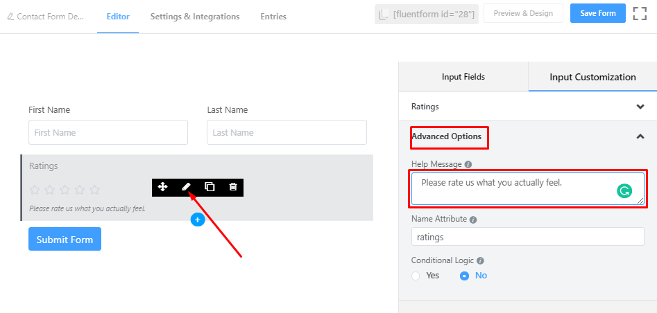
- Name Attribute: The input field’s name attribute is the HTML equivalent of the same name. You don’t need to modify this.
- Conditional Logic: You can create certain rules to dynamically hide/show the input field based on the values from some other fields. To get a better understanding of Conditional Logic, read this.
- Save the form when the customization is done.