
In Fluent Forms, Mask Input allows admins to set a certain format for users to follow when filling up a form. For instance, a phone number input field might allow 11 digits or 10 digits for a particular country to pass through; and most importantly, it might not allow passing inputs in any other format.
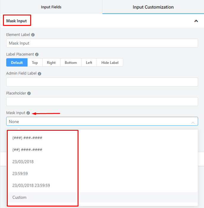
Fluent Forms comes with five pre-defined masking formats. If these five formats are not enough for you, you can customize them as you wish.
Let’s have a look at how to add Mask Input in Fluent forms.
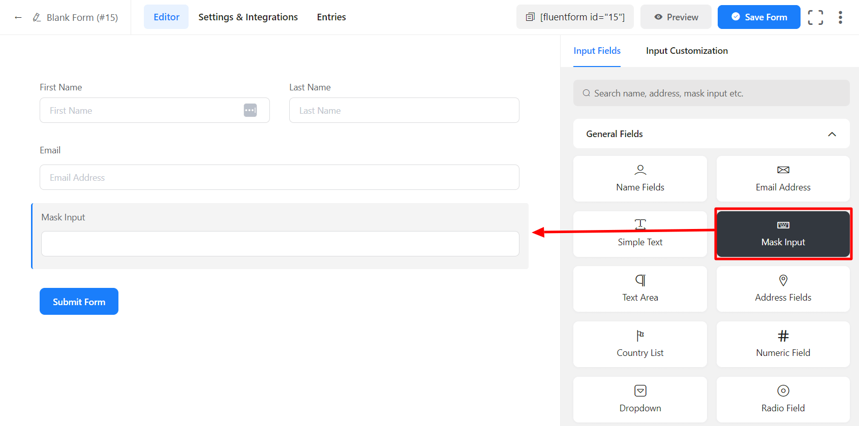
- To add the Mask Input field to your form, drag and drop the field from the available input fields.
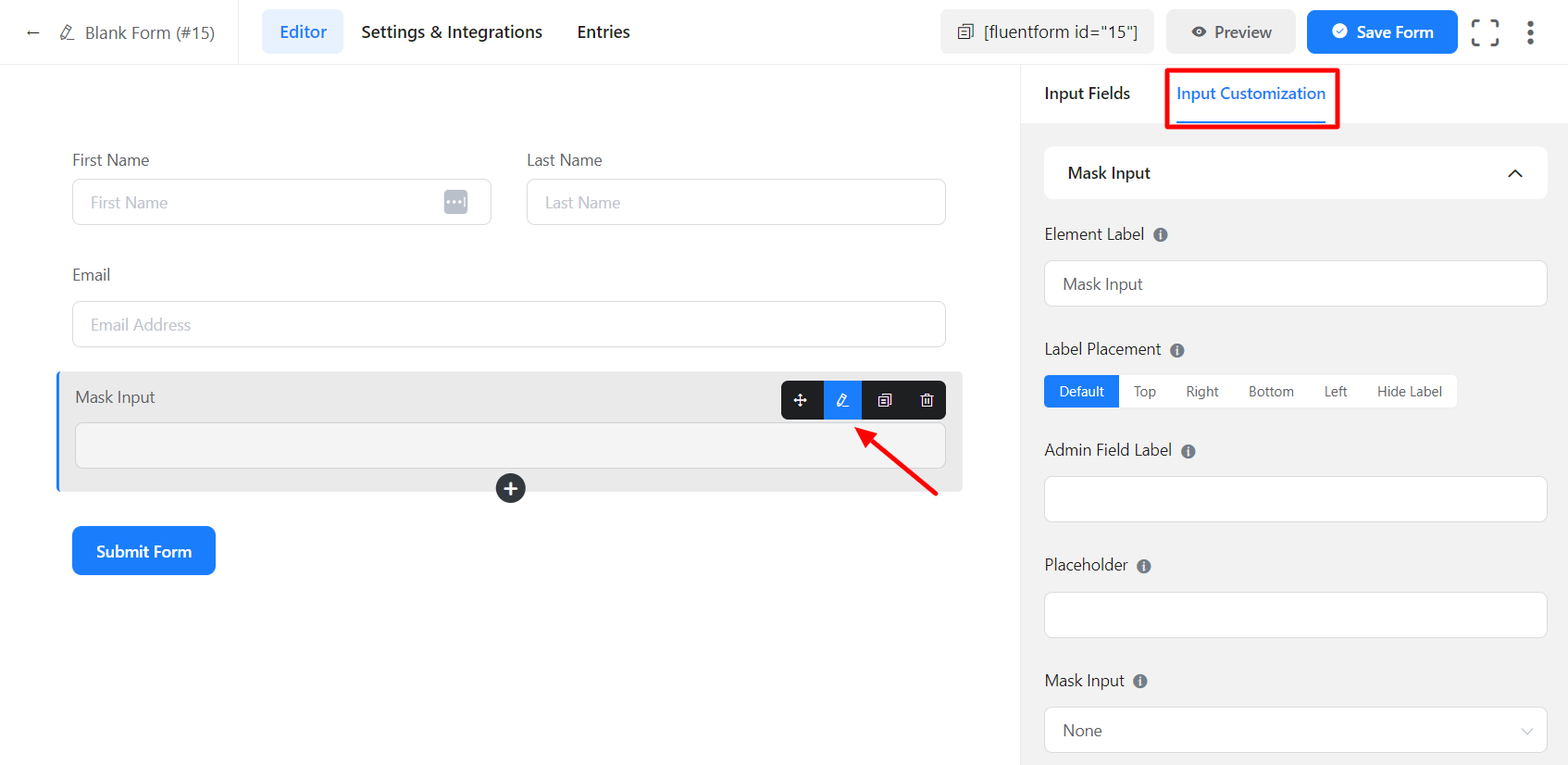
- To enable customization, click on the edit icon you get when hovering over the field. Or click on the Input Customization tab in the right sidebar when the field is selected.
- Select from the pre-defined mask formats, or create a custom mask.
- While creating a custom mask, abide by the following format:
– Use a ‘0’ / ‘#’ to indicate a numerical character.
– Use an uppercase ‘A’ to indicate an alphabetical character.
– Use an asterisk ‘*’ to indicate any alphanumeric character.
– All other characters are literal values and will be displayed automatically.
Examples:
Date Mask: 00/00/0000. Valid Input: 10/21/2011
Social Security Number Mask: 000-00-0000. Valid Input: 987-65-4329
Course Code Mask: AAA 999. Valid Input: BIO 101
License Key Mask: *-*-***. Valid Input: a9a-f0c-28Q
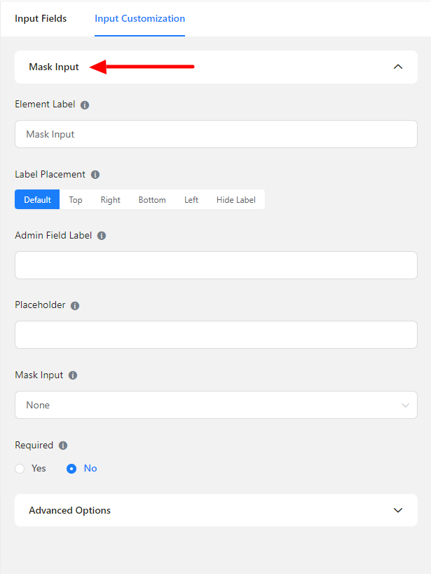
In the input customization tab, customize the mask input field.
In the Input Customization section, you will find different options to customize the mask input field-
- Basic Options
- Advanced Options
Basic Options
On the right side of the tab, there are some important Basic options which are given below:
- Element Label: This is the text that users will see on the form for the input field. You can put any text here that helps to understand the purpose of that field.
- Label Placement: Determine the placement of the label that you set previously concerning the input field. The available options are Top, Left, Right, and Default. All of those are self-explanatory except the Default. What it means is that it will represent your global label placement settings.
- Admin Field Label: If you want to show a different label for your admin users when they view the form submissions, you can configure that using this option. It doesn’t have any actual effect on the form; rather only for administrative purposes.
- Placeholder: You can also have a placeholder by which users will perceive the field subject.
- Mask Input: Select from the pre-defined mask formats, or create a custom mask.
While creating a custom mask, abide by the following format.
– Use a ‘0’ / ‘#’ to indicate a numerical character.
– Use an uppercase ‘A’ to indicate an alphabetical character.
– Use an asterisk ‘*’ to indicate any alphanumeric character.
– All other characters are literal values and will be displayed automatically.
Examples:
Date Mask: 00/00/0000. Valid Input: 10/21/2011
Social Security Number Mask: 000-00-0000. Valid Input: 987-65-4329
Course Code Mask: AAA 999. Valid Input: BIO 101
License Key Mask: *-*-***. Valid Input: a9a-f0c-28Q.
- Required: Determine whether the field could be empty or not when the user submits your form by choosing the appropriate option from here.
Advanced Options
The Advanced customizations available for the Mask Input field are as follows:
- Default value: Using our shortcodes, you can manually set any fixed value in your field and pre-populate your input field dynamically. To get a better understanding of Dynamic Default Value, read this guide.
- Container Class: Use this option to add your custom CSS classes to the field’s wrapper.
- Element Class: Similarly, you can add custom CSS classes to the input field itself.
- Help Message: To guide your user thoroughly, you can use this option. Just add your text here and it will be shown as a help message to the user.
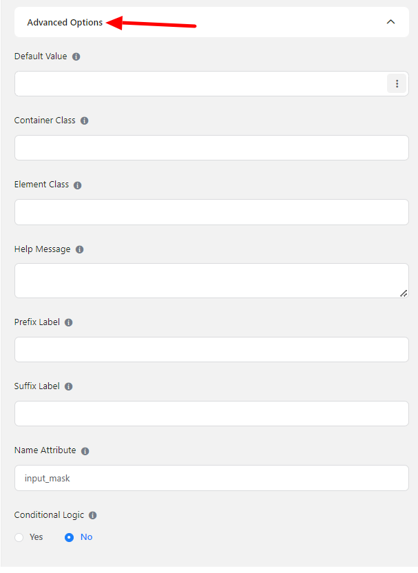
- Prefix Label: You can use this field to provide Prefix Label in your input field. It will show in the input field as a prefix label.
- Suffix Label: To provide Suffix Label in your input field, you can use this field. It will show in the input field as a Suffix label.
- Name Attribute: The input field’s name attribute is the HTML equivalent of the same name. You don’t need to modify this.
- Conditional Logic: You can create certain rules to dynamically hide/show the input field based on the values from some other fields. Learn more about conditional logic
- Save the form when the customization is done.