
The Time & Date field allows users to present a field that captures date data and submit a time as hours or minutes. There is an available Date Format where you can choose your desired date and time in both formats.
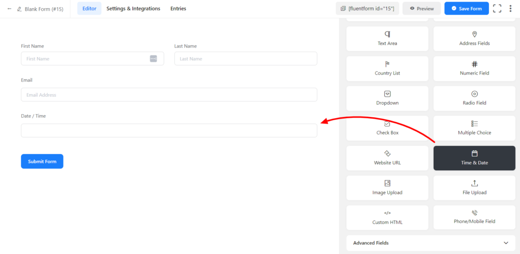
Adding a Time & Date input field in your forms is easy with Fluent Forms.
- To add this field to your form, drag and drop the field from the available input fields.
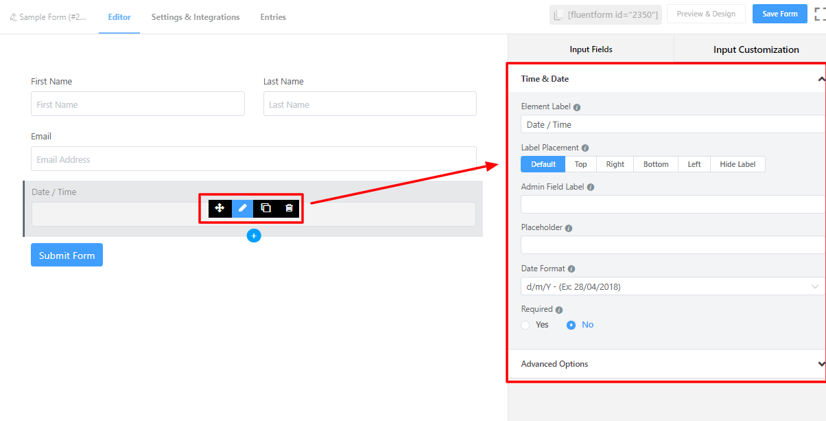
- To enable customization, click on the edit icon you get when hovering over the field. Or click on the Input Customization tab in the right sidebar when selecting the field.
In the Input Customization section, you can customize the Time & Date input field in the following ways. In this section, you will find 2 portions:
- Basic Options
- Advanced Options
Basic Options
On the right side of the tab, there are some important Basic options which are given below:
- Element Label: This is the text that users will see on the form for the Time & Date input field. You can put any text here that helps to understand the purpose of that field.
- Label Placement: Determine the placement of the label that you set previously concerning the input field. The available options are Top, Left, Right, and Default. All of those are self-explanatory except the Default. What it means is that it will represent your global label placement settings.
- Admin Field Label: If you want to show a different label for your admin users when they view the form submissions, you can configure that using this option. It doesn’t have any actual effect on the form; rather only for administrative purposes.
- Placeholder: You can also have a placeholder by which users will perceive the field subject.
- Date Format: Select any date format from the drop-down. The user will be able to choose a date in this given format.
- Required: Determine whether the field could be empty or not when the user submits your form by choosing the appropriate option from here.
Advanced Options
The Advanced options available for the Time & Date input field are as follows:
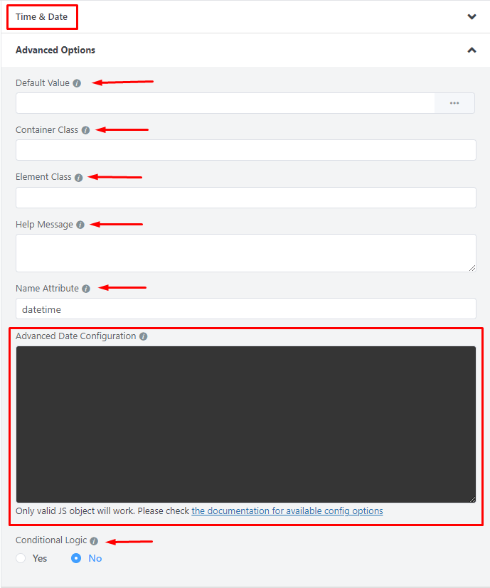
- Default value: You can manually set any fixed value in your field also, you can pre-populate your input field dynamically by using our available shortcodes. To get a better understanding of Dynamic Default Value, read this guide.
- Container Class: Use this option to add your custom CSS classes to the field’s wrapper.
- Element Class: Similarly, you can add custom CSS classes to the input field itself.
- Help Message: To guide your user thoroughly, you can use this option. Just add your text here, and it will be shown as a help message to the user.
- Name Attribute: The input field’s name attribute is the HTML equivalent of the same name. You don’t need to modify this.
- Conditional Logic: You can create certain rules to dynamically hide/show the input field based on the values from some other fields. To get a better understanding of Conditional Logic, read this.
Advanced Configuration
Fluent Forms Date and Time field use flatpickr JS library; for advanced users, you can provide the config object in the field’s advanced settings.
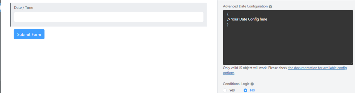
Adding the First Day of Week Date
Now, you can add the start of the week date. You can do this with the help of a custom code; just use the code given below:
{
    "locale": {
        "firstDayOfWeek": 1 // start week on Monday
    }
}
Available Options
| Config Option | Type | Default | Description |
|---|---|---|---|
| altFormat | String | “F j, Y” | Exactly the same as date format, but for the altInput field |
| altInput | Boolean | false | Show the user a readable date (as per altFormat), but return something totally different to the server. |
| altInputClass | String | “” | This class will be added to the input element created by the altInput option. Note that altInput already inherits classes from the original input. |
| allowInput | Boolean | false | Allows the user to enter a date directly input the input field. By default, direct entry is disabled. |
| appendTo | HTMLElement | null | Instead of body, appends the calendar to the specified node instead*. |
| ariaDateFormat | String | “F j, Y” | Defines how the date will be formatted in the aria-label for calendar days, using the same tokens as dateFormat. If you change this, you should choose a value that will make sense if a screen reader reads it out loud. |
| clickOpens | Boolean | true | Whether clicking on the input should open the picker. You could disable this if you wish to open the calendar manually with.open() |
| dateFormat | String | “Y-m-d” | A string of characters which are used to define how the date will be displayed in the input box. The supported characters are defined in the table below. |
| defaultDate | String | null |
Sets the initial selected date(s). If you’re using Otherwise, you can supply a single Date object or a date string. |
| defaultHour | Number | 12 |
Initial value of the hour element. |
| defaultMinute | Number | 0 |
Initial value of the minute element. |
| disable | Array | [] | See Disabling dates |
| disableMobile | Boolean | false | Set disableMobile to true to always use the non-native picker.By default, flatpickr utilizes native datetime widgets unless certain options (e.g. disable) are used. |
| enable | Array | [] | See Enabling dates |
| enableTime | Boolean | false | Enables time picker |
| enableSeconds | Boolean | false | Enables seconds in the time picker. |
| formatDate | Function | null | Allows using a custom date formatting function instead of the built-in handling for date formats using dateFormat, altFormat, etc. |
| hourIncrement | Integer | 1 | Adjusts the step for the hour input (incl. scrolling) |
| inline | Boolean | false | Displays the calendar inline |
| maxDate | String/Date | null | The maximum date that a user can pick to (inclusive). |
| minDate | String/Date | null | The minimum date that a user can start picking from (inclusive). |
| minuteIncrement | Integer | 5 | Adjusts the step for the minute input (incl. scrolling) |
| mode | String | “single” | "single", "multiple", or "range" |
| nextArrow | String | > |
HTML for the arrow icon, used to switch months. |
| noCalendar | Boolean | false | Hides the day selection in calendar. Use it along with enableTime to create a time picker. |
| onChange | Function, [functions] | null | Function(s) to trigger on every date selection. See Events API |
| onClose | Function, [functions] | null | Function(s) to trigger on every time the calendar is closed. See Events API |
| onOpen | Function, [functions] | null | Function(s) to trigger on every time the calendar is opened. See Events API |
| onReady | Function, [functions] | null | Function to trigger when the calendar is ready. See Events API |
| parseDate | Function | false | Function that expects a date string and must return a Date object |
| position | String | “auto” |
Where the calendar is rendered relative to the input."auto", "above" or "below"
|
| prevArrow | String | < |
HTML for the left arrow icon. |
| shorthandCurrentMonth | Boolean | false | Show the month using the shorthand version (ie, Sep instead of September). |
| showMonths | Integer | 1 | The number of months showed. |
| static | Boolean | false | Position the calendar inside the wrapper and next to the input element*. |
| time_24hr | boolean | false | Displays time picker in 24 hour mode without AM/PM selection when enabled. |
| weekNumbers | Boolean | false | Enables display of week numbers in calendar. |
| wrap | Boolean | false | Custom elements and input groups |
Please check flatpickr documentation for more details.