
A Radio Button can be used in forms to allow users to select a single option from multiple options rolled out by admins. Here is how you can add and customize a radio button with Fluent Forms
- To add this field to your form, drag and drop the field from the available input fields. Input fields can be added to a form in other different ways. Catch here for a basic direction for creating your first form.
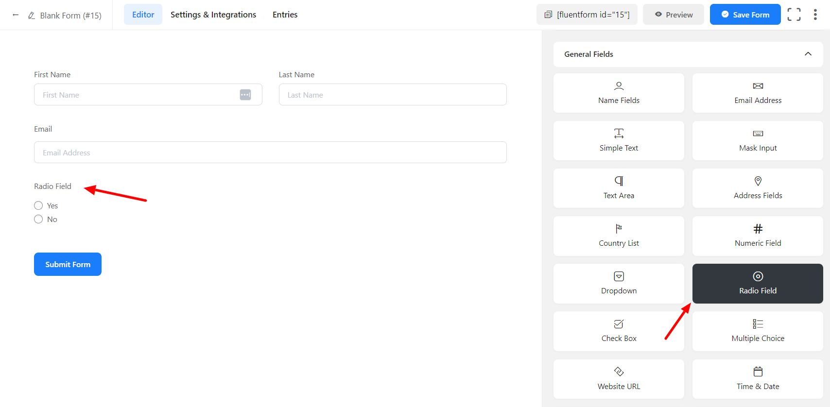
- To enable customization, click on the edit icon you get when hovering over the field. Or click on the Input Customization tab in the right sidebar when the field is selected.
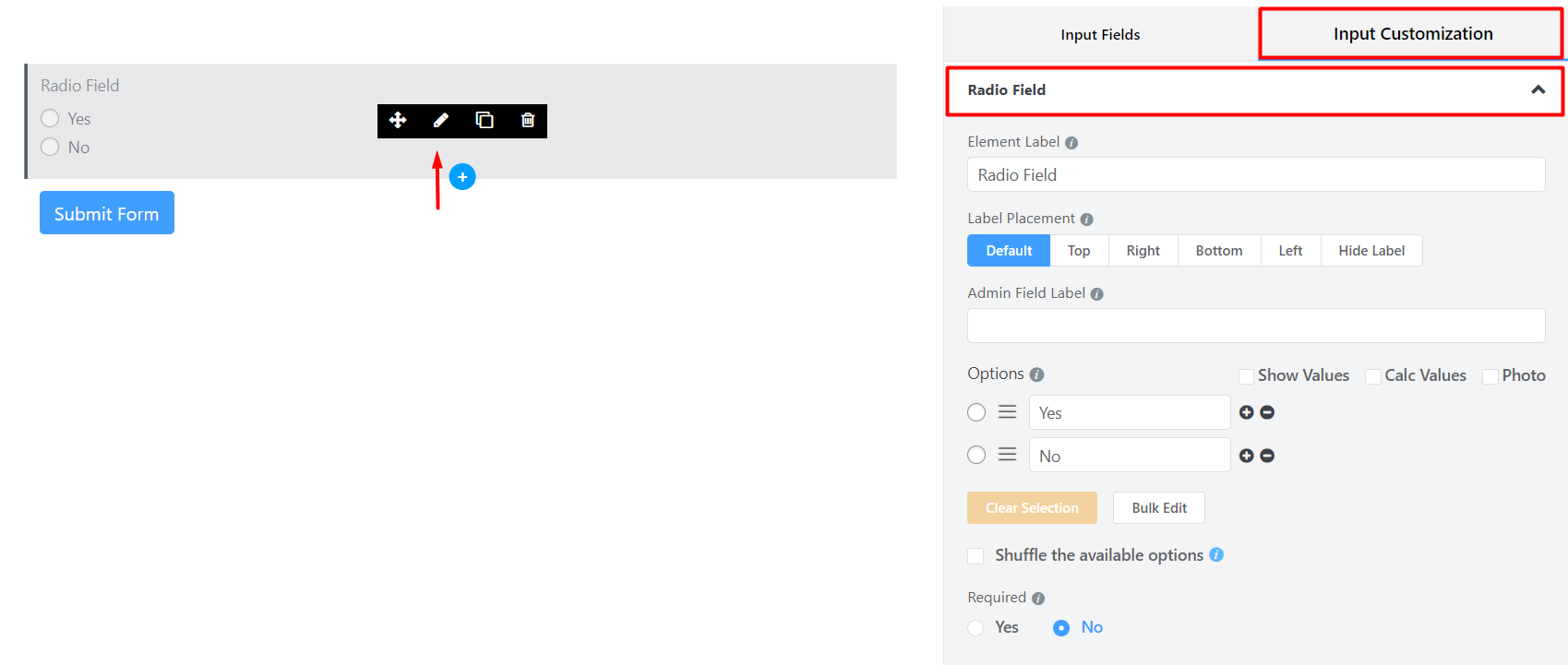
- In the Input Customization section, you can customize the input field in the following ways. In this section, you will find 2 portions:
- Basic Options
- Advanced Options
Basic Options
On the right side of the tab, there are some important Basic options which are given below:
- Element Label: This is the text that users will see in the form of the input field. You can put any text here that helps to understand the purpose of that field.
- Label Placement: Determine the placement of the label, that you set previously, with respect to the input field. The available options are Top, Left, Right, and Default. All of those are self-explanatory except the Default. What it means is that it will represent your global label placement settings.
- Admin Field Label: If you want to show a different label for your admin users when they view the form submissions you can configure that using this option. It doesn’t have any actual effect on the form but rather only for administrative purposes.
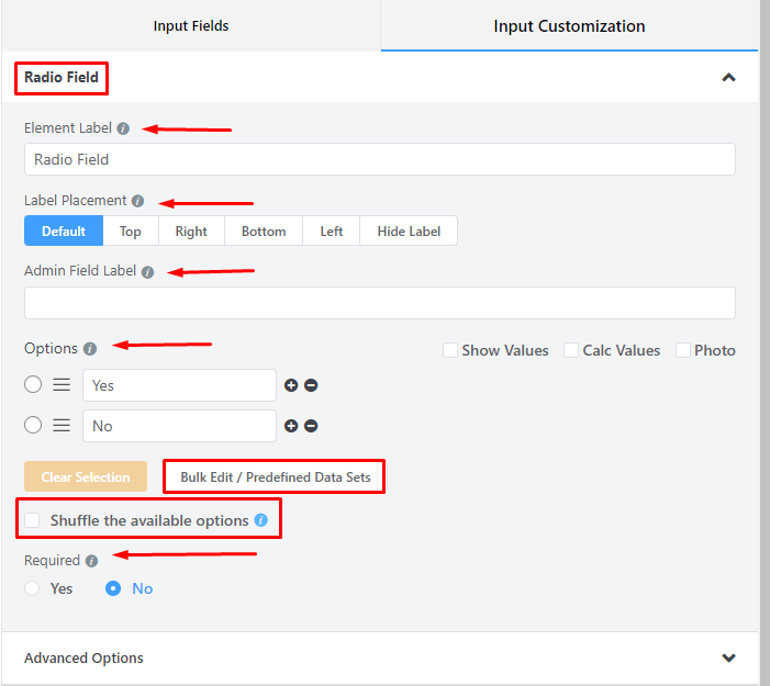
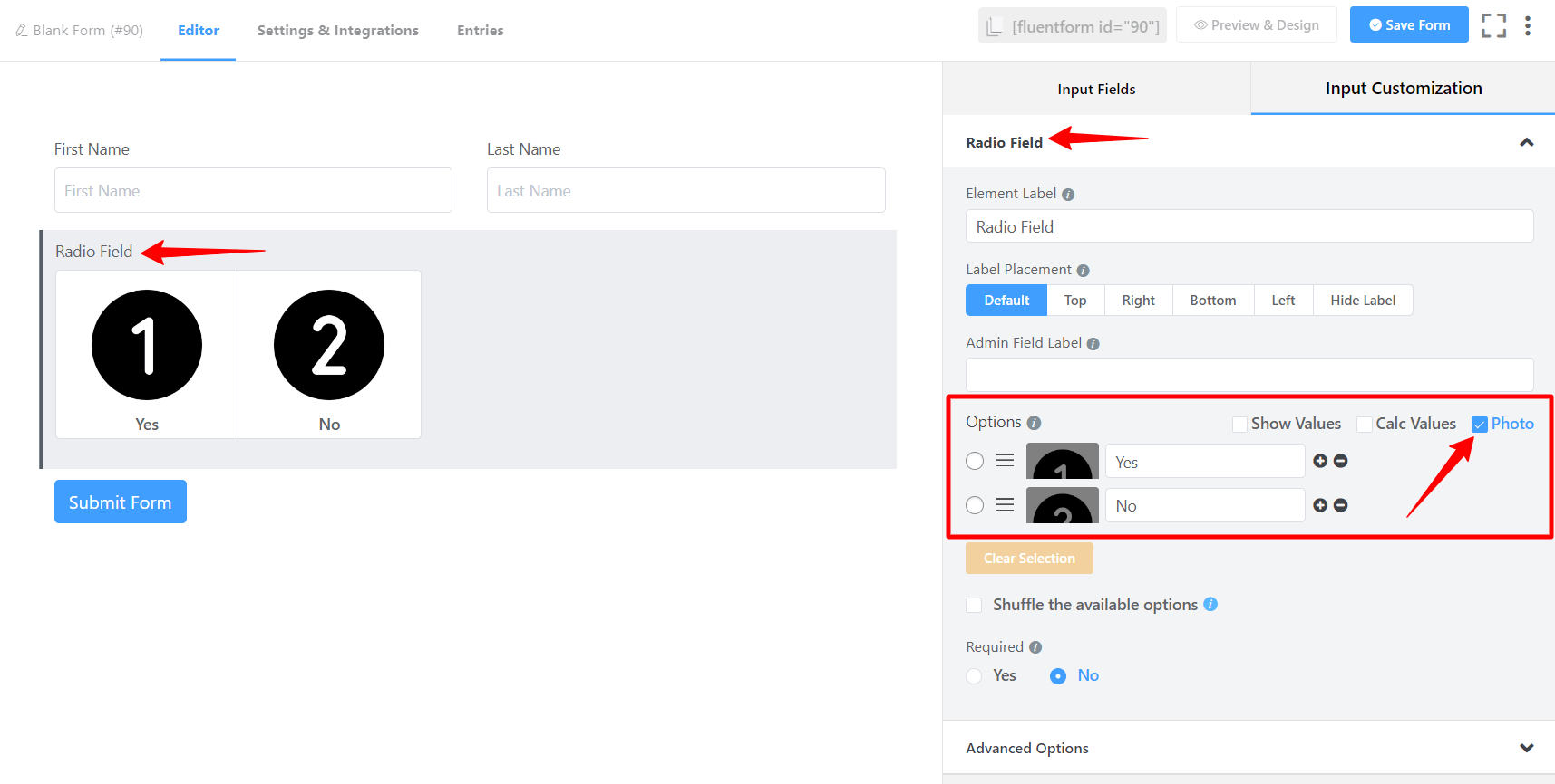
- Options: Create options for the field and checkmark them for default selection.
– Mark Show Values as checked for the ease of admins if needed.
– Name the options.
– Add options by clicking on the plus icon beside the last entered option. Or an option can be added in between two options by clicking on the plus icon beside the immediate previous option.
– Drag & Drop the options holding the marker and rearrange them if required.
- Show & Calc Values: Users will get Show Values and Calc Values options. You may display your data and perform calculations using Show Values and Calc Values.
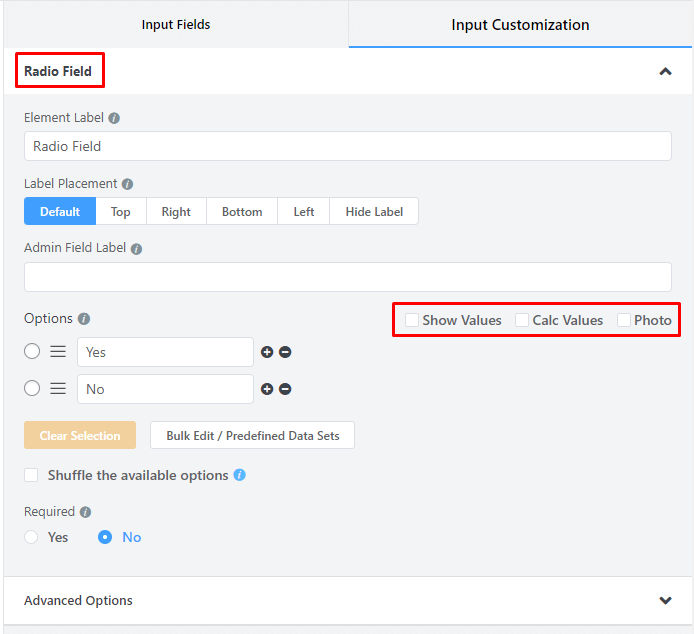
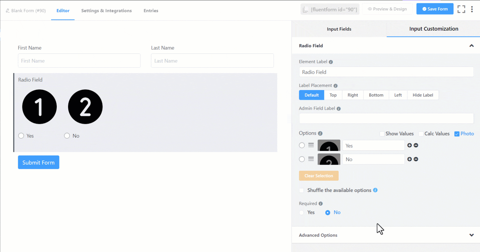
- Photo: By clicking on the Photo option, you may add photos for the field.
- Bulk Edit/Predefined Data Sets: You can choose from predefined data set for the radio field, so you don’t have to add each item manually.
- Shuffle the available options: You can enable shuffling of your radio field or select field options so every user will see a randomized option to choose from.
- Required: Determine whether the field could be empty or not when the user submits your form by choosing the appropriate option from here.
Advanced Options
The Advanced customizations available for the Radio Button input field are as follows:
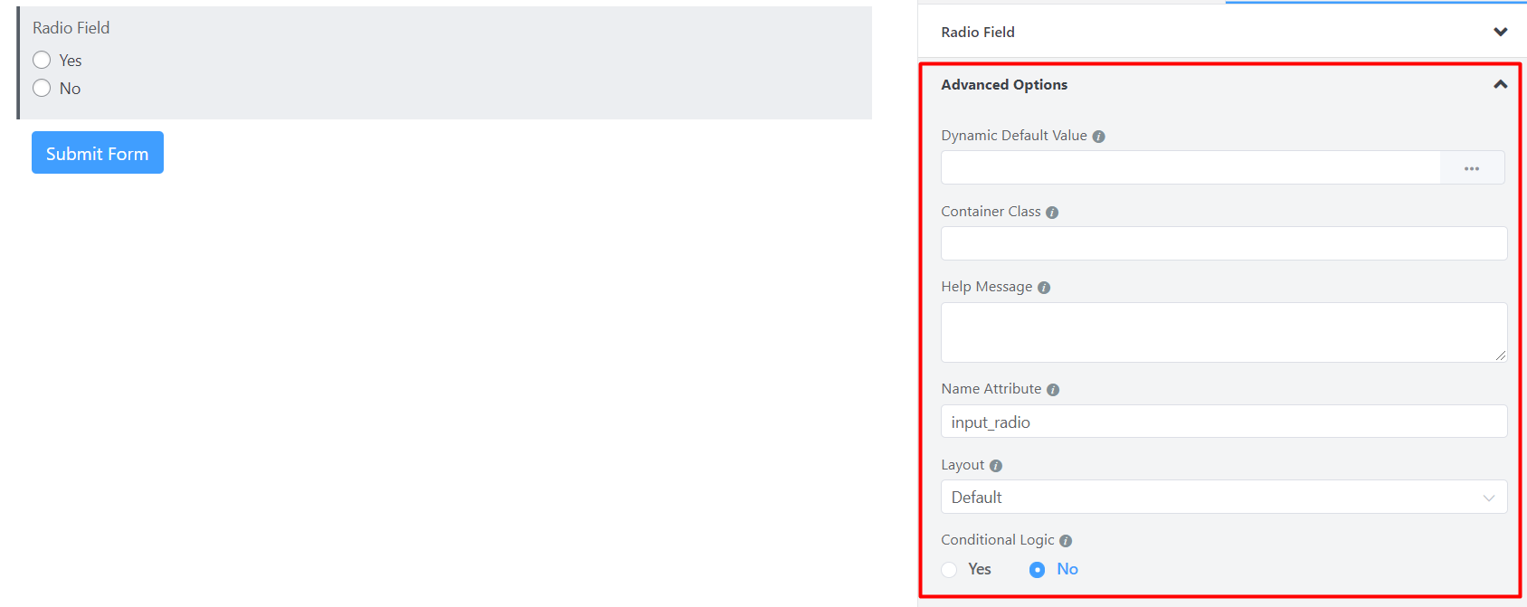
- Dynamic Default Value: You can manually set any fixed value in your field and pre-populate your input field dynamically using our shortcodes. To get a better understanding of Dynamic Default Value, read this guide.
- Container Class: Use this option to add your custom CSS classes to the field’s wrapper.
- Help Message: To guide your user thoroughly, you can use this option. Just add your text here, and it will be shown as a help message to the user.
- Name Attribute: The input field’s name attribute is the HTML equivalent of the same name. You don’t need to modify this.
- Layout: The user can select the Layout for checkable items.
- Conditional Logic: You can create certain rules to dynamically hide/show the input field based on the values from some other fields. To get a better understanding of Conditional Logic, read this.
- Save the form when the customization is done.
You can get the visual representation of this field entries. To learn more click here
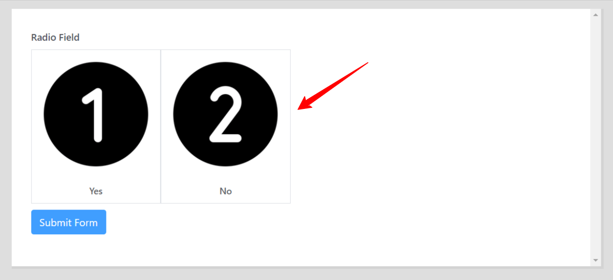
Image Button Layout
- Enable the Photo option first, upload the images & then go to the Advanced Options.
- After going to the Advanced Options, select the Layout & choose the Button Layout Options from the dropdown.
- The Final Preview of the Radio Button Layout is given below –