
The Save & Resume field in Fluent Forms allows users to store their form progress in the database without being logged in. A unique link is generated, enabling users to continue filling out the form later from any device.
This guide will walk you through adding and customizing the Save & Resume field in Fluent Forms.
The Save & Resume Input Field is an advanced feature of the Fluent Forms plugin. To use it, you require the Fluent Forms Pro Add-on.
Adding a Save Progress Button Field
To learn how to add the Save & Resume Input Field to Fluent Forms, follow the steps below-
First, go to the Forms section from the Fluent Forms Navbar, choose a desired form, and click the Edit Icon to open the Editor page of that form.
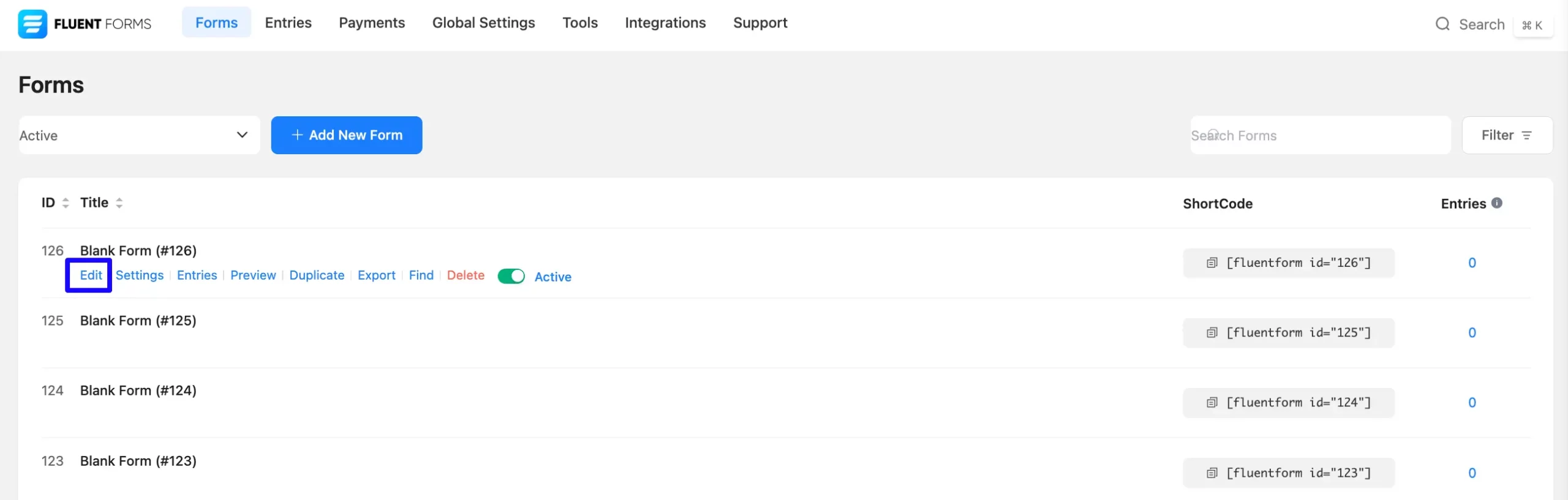
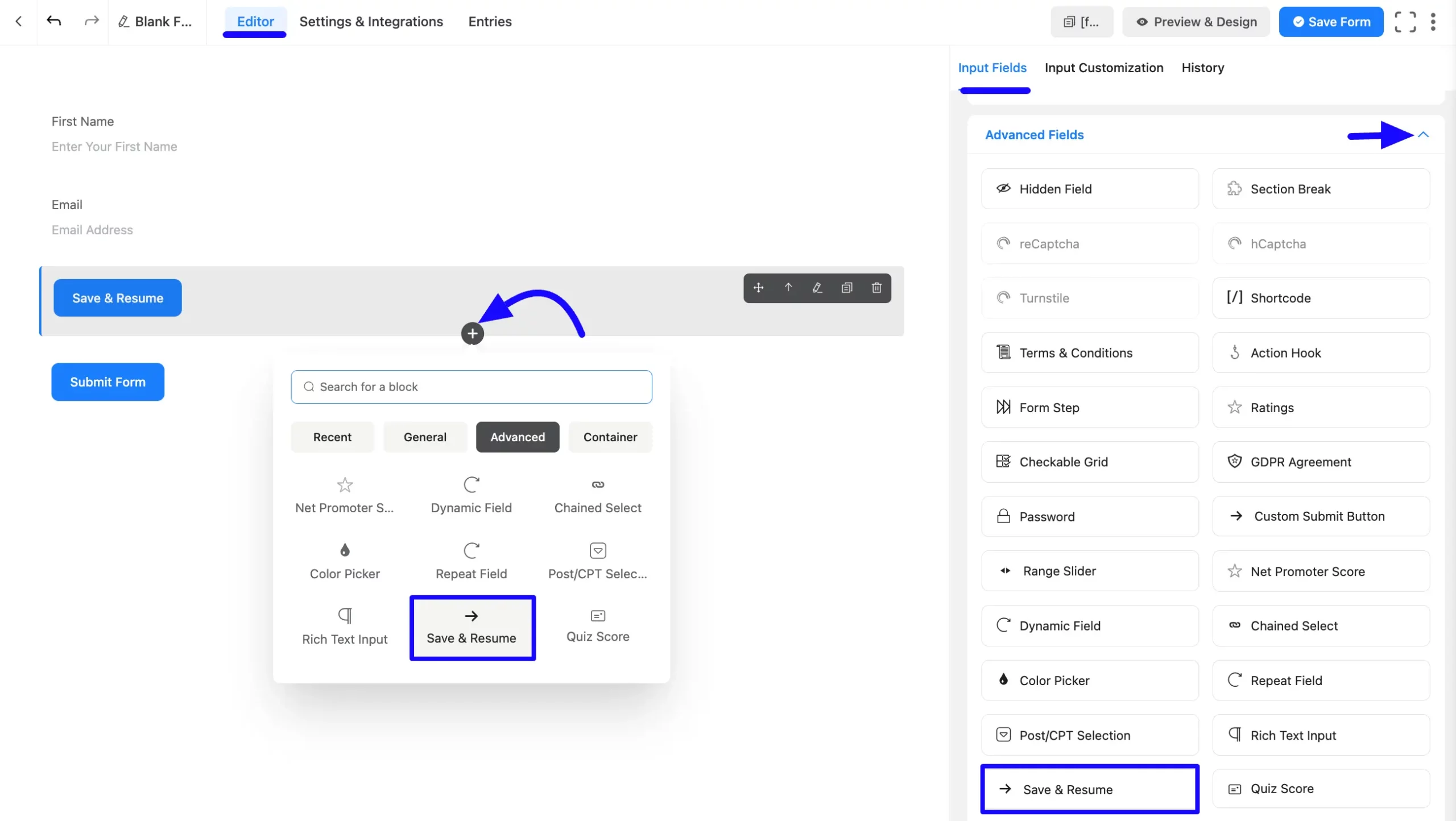
Once on the Editor page, click the Plus Icon in your form editor and open the Advanced Fields module. You can also find this option in the right sidebar under the Input Fields tab.
Now, select the Save & Resume Input field by clicking or dragging it and dropping it into your editor.
Customizing the Save & Resume Input Field
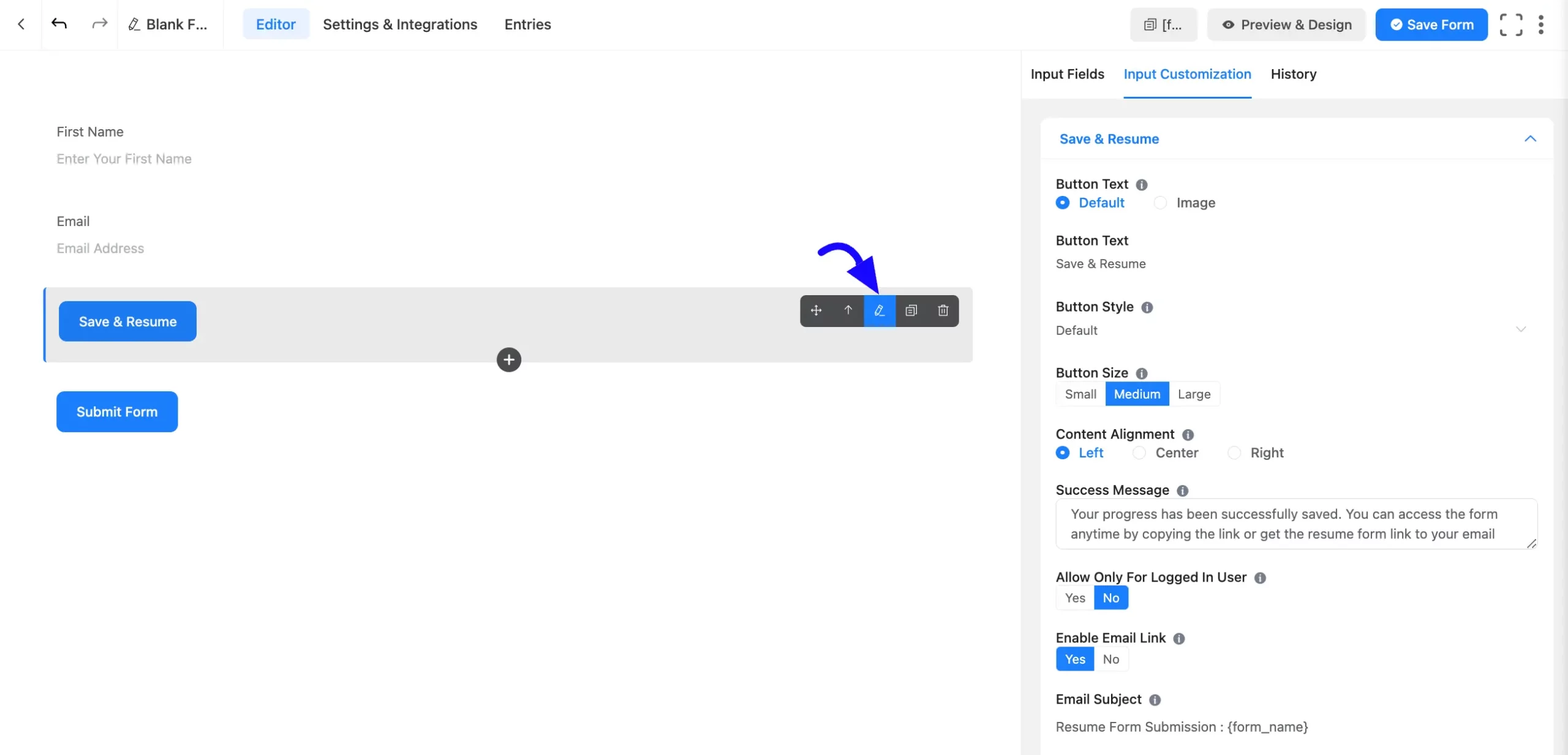
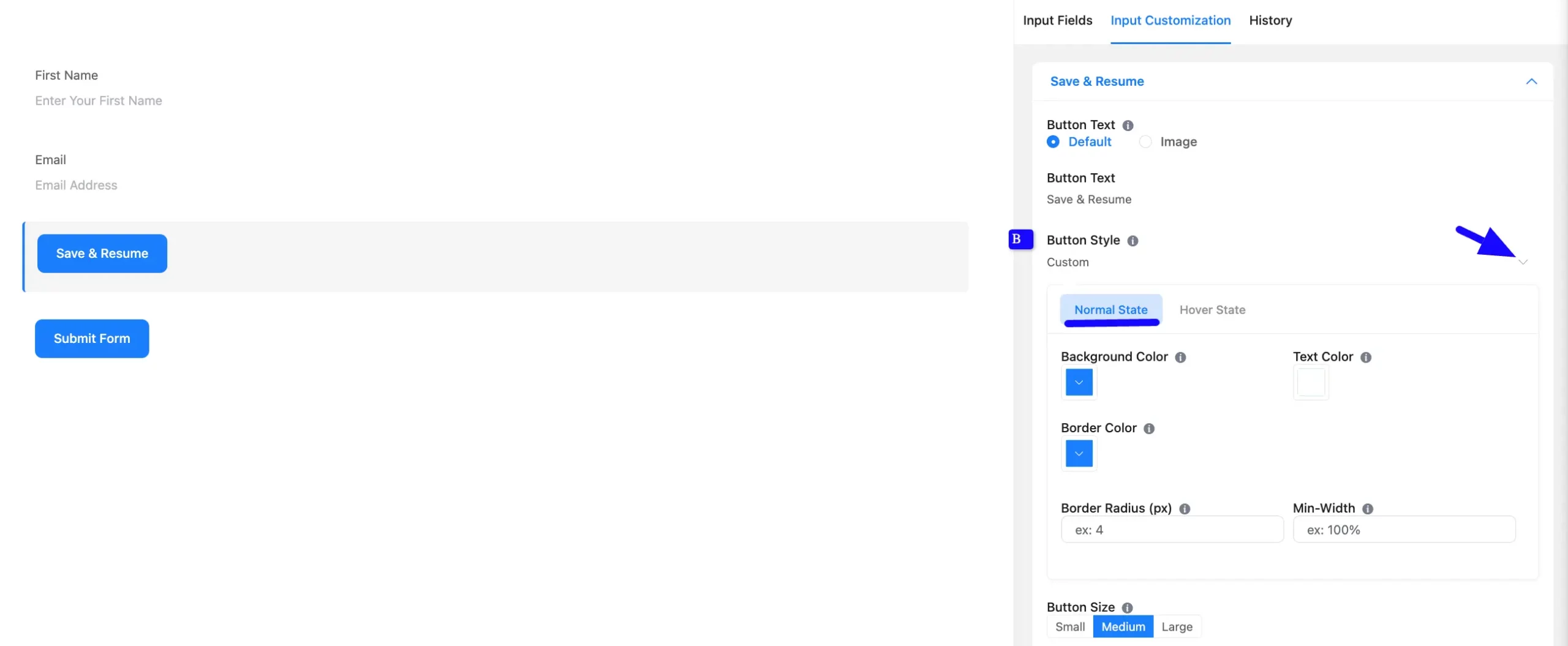
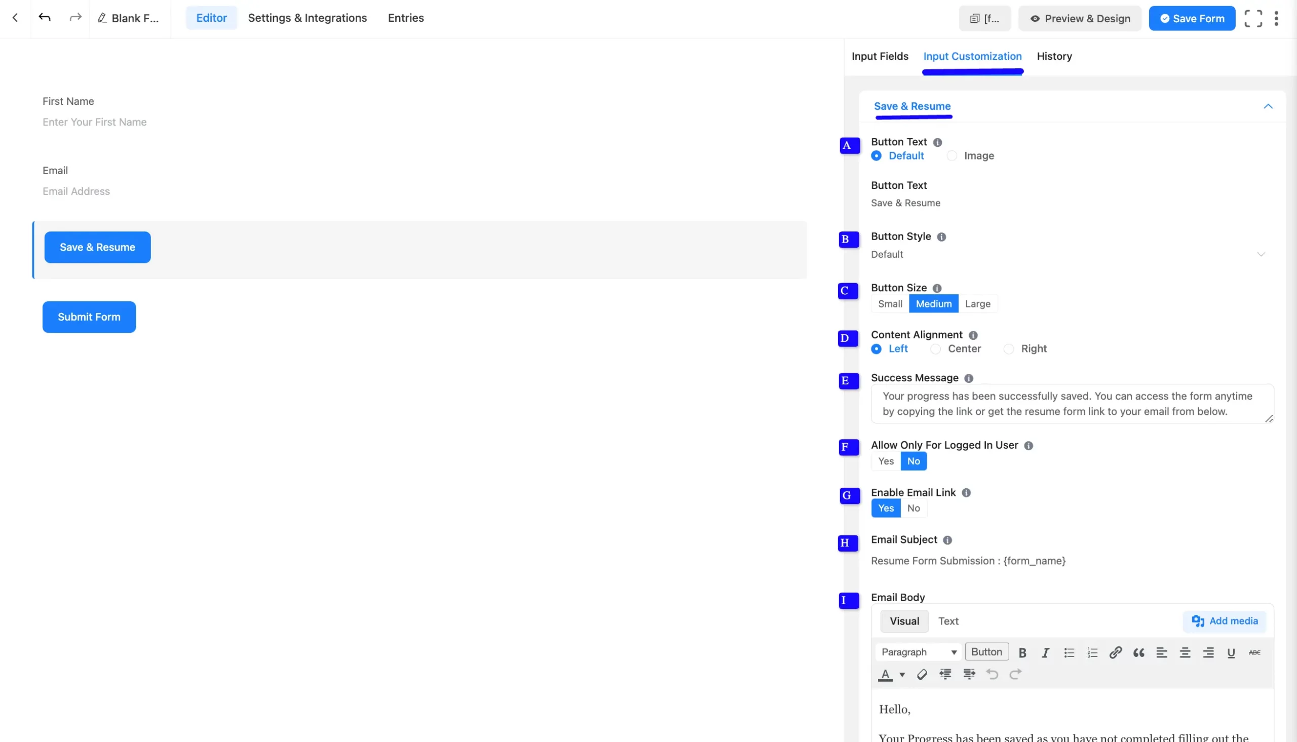
Once you add the Save & Resume Input field, you can customize it by hovering over it and clicking the Pencil Icon. It will take you to the Input Customization tab on the right, which offers the following customization options.
- Save & Resume Field Options
- Advanced Options
Rich Save & Resume Options
Under the Input Customization tab, you will find various settings options for customizing the field. These options allow you to configure essential aspects of the Save & Resume Input field.
All the settings under the Save & Resume Input Field mentioned above are briefly explained below-
A. Button Text: You can choose your button text Default or Image. Users can customize button text using this field if you keep button text by default. Whichever text is used for this field will be shown as the button text.
If you select the Image option, you can add an image as your button with the image URL. Also, you can add Image Alt text for your button.
B. Button Style: You can choose the button style dropdown option from the right side. Also you can select Custom options to adjust predefined color schemes, position, and functionality.
- Background Color: Choose a suitable background color for the button according to your website’s color scheme. In my case, the default background color is blue.
- Text Color: Based on the background colour, you can give a smooth colour to the button text.
- Border Color: The button, by default, has a one-pixel border. You can also define a color for the border.
- Border Radius: Enter the border-radius that suits your forms.
- Min-Width: You can give a minimum width to the button in pixels and percentages, whichever suits your form. A 100% min-width will be a full-width button.
C. Button Size: Select the button size suitable for your form. There are three options: Small, Medium, and large. You can choose one option.
D. Content Alignment: This option defines how the content will be aligned.
E. Success Message: Enter a text that displays when the user sees their progress is saved.
F. Allow Only for Logged-in Users: If you select Yes option here, then only logged-in users can use Save & Resume. If you choose the No option, all users can save the progress.
G. Enable Email Link: You can allow users to get an Email Resume Link by selecting the Yes or No options.
H. Email Subject: You can use {form_name} placeholder to get the Form Name.
H. Email Body: Enter the email body text here.
You can also use the same style features for the Hover States of the button. Click on the hover state and apply the same styling features that suit the active state styles.
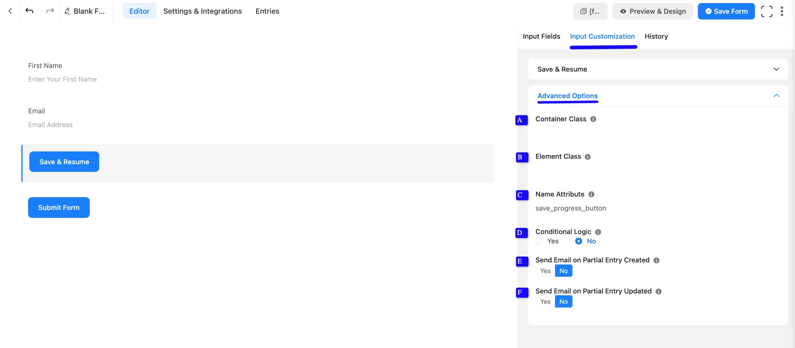
Advanced Options
Advanced settings allow further customization to meet specific use cases. All the Settings under the Advanced Options tab mentioned in the screenshot are briefly explained below –
A. Container Class: Use this option to add your custom CSS classes to the field’s wrapper.
B. Element Class: Add custom CSS classes to the input field.
C. Name Attribute: The input field’s name attribute is the HTML equivalent of the same name. You don’t need to modify this.
D. Conditional Logic: This option allows you to create specific rules to dynamically hide/show the input field to function conditionally based on your submission values according to your set of conditional logic.
E. Send Email on Partial Entry Created: If you want to enable the user to receive an email when they initially save the progress, select the Yes options, or if you don’t receive an email when they initially save progress, select the No options.
F. Send Email on Partial Entry Updated: If you want users not to receive an email when they update their saved progress, select the No option, or if you’re going to receive an email when they update their saved progress, select the Yes option.
Embed the Form into Frontend
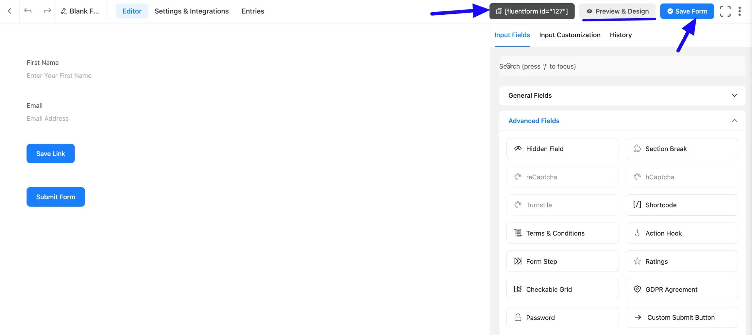
Once you complete the customization, click the Save Form button to save all your changes. Click the Preview & Design button in the middle to see the form preview.
To integrate and display the form on a specific Page or Post, copy the Shortcode from the top right side and paste it into your desired Page or Post.
The Save Progress Button is equally applicable to the Step Form.
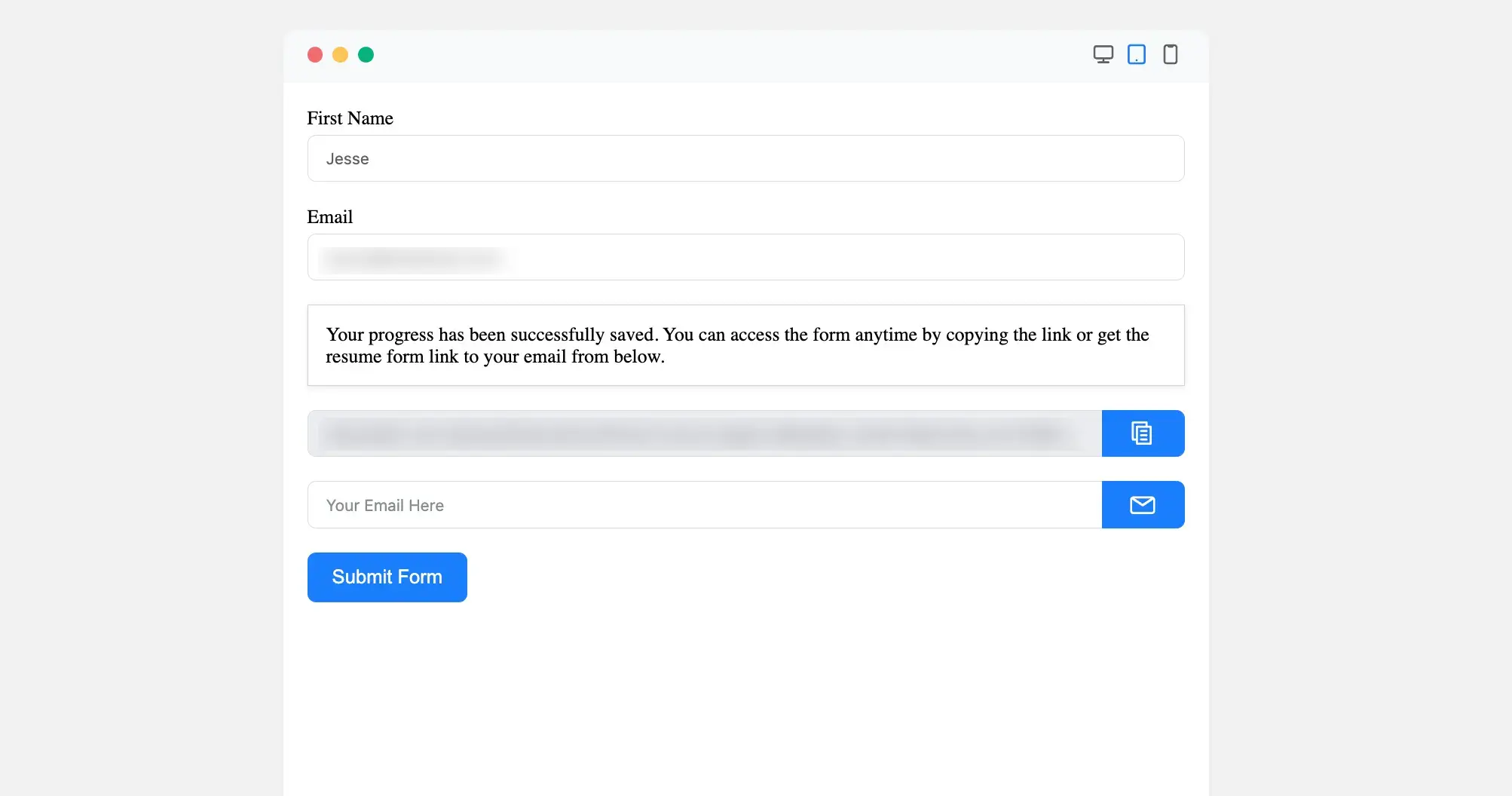
Preview of Save & Resume Field
Here is the added Save & Resume field preview under the form.
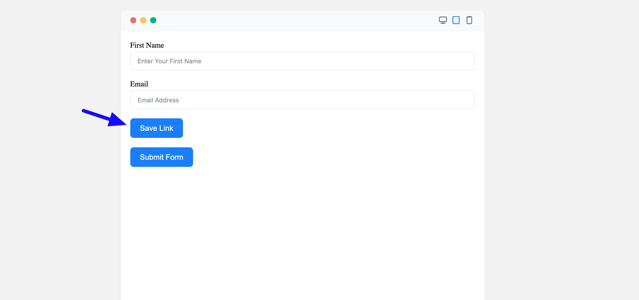
Admin may now add this form’s shortcode to any page. Users can see the form, and after hitting the Save Progress Button, a link will be generated so that they can use this link to view the form from any browser at any time. For a better understanding, see the screenshot below.
Congratulations! You have successfully added a Save & Resume field to your Fluent Forms form.
If you have any further questions, concerns, or suggestions, please do not hesitate to contact our support team. Thank you!