
With the Fluent Forms Text Area input field, you can allow users to type many texts together. It is a place where you can push multiple lines of text.
- To add this field to your form, drag and drop the field from the available input fields.
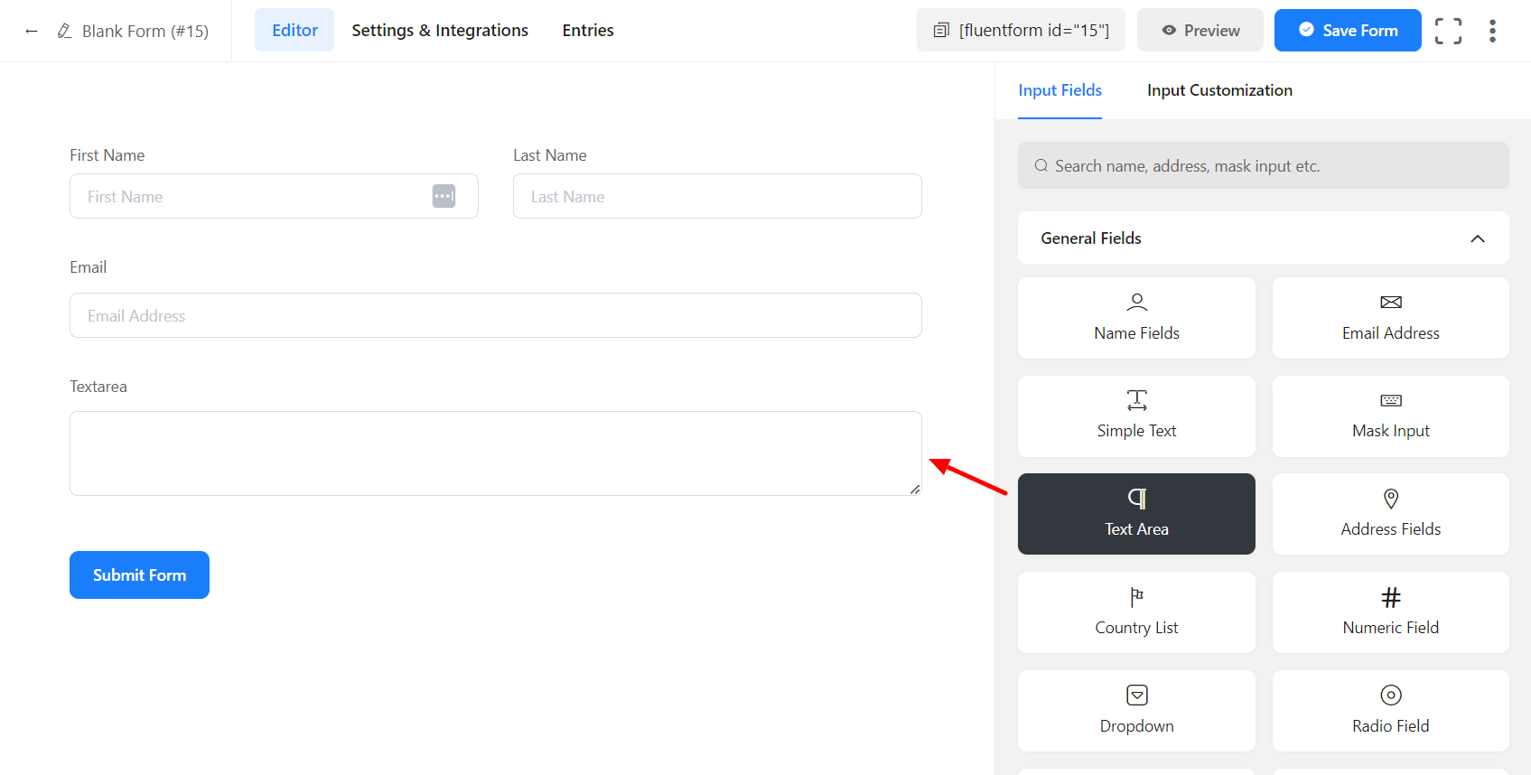
- To enable customization, click on the edit icon you get when hovering over the field. Or click on the Input Customization tab in the right sidebar when the field is selected.
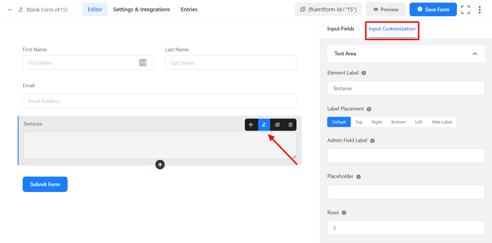
In the Input Customization section, you can customize the Text Area field in the following ways. In this section, you will find 2 portions:
- Basic Options
- Advanced Options
Basic Options
On the right side of the tab, there are some important Basic options which are given below:
- Element Label: Give a proper label to your input that suits your purpose here. It will be shown to the user while filling up the form. It is equivalent to an HTML label.
- Label Placement: Determine the placement of the label that you set previously concerning the input field. The available options are Top, Left, Right, and Default. All of those are self-explanatory except the Default. What it means is it will confirm your global label placement settings.
- Admin Field Label: If you want to show the different labels for your admin users when they view the form submissions, you can configure that using this option. It doesn’t have any actual effect on the form; rather only for administrative purposes.
- Placeholder: When the input is empty, it is customary to show a certain message to the users so they can grasp what the input field expects from them. It is the equivalent of an HTML input placeholder attribute.
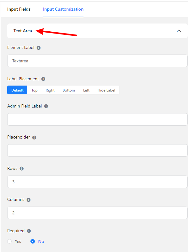
- Rows: Fluent Forms allows you to have control over the rows. You can make a choice about the row choosing. This option allows you to choose a certain number of rows. You need to implement it.
- Columns: Like the rows, Fluent Forms allows you to make a choice column section. This option allows you to determine the column.
- Required: Determine whether the field could be empty or not when the user submits your form by choosing the appropriate option from here.
Advanced Options
The Advanced customizations available for the Text Area input fields are as follows:
- Default value: Using our shortcodes, you can manually set any fixed value in your field and pre-populate your input field dynamically. To get a better understanding of Dynamic Default Value, read this guide.
- Container Class: Use this option to add your custom CSS classes to the field’s wrapper.
- Element Class: Similarly, you can add custom CSS classes to the input field itself.
- Help Message: You can use this option to guide your user thoroughly. Just add your text here, and it will be shown as a help message to the user.
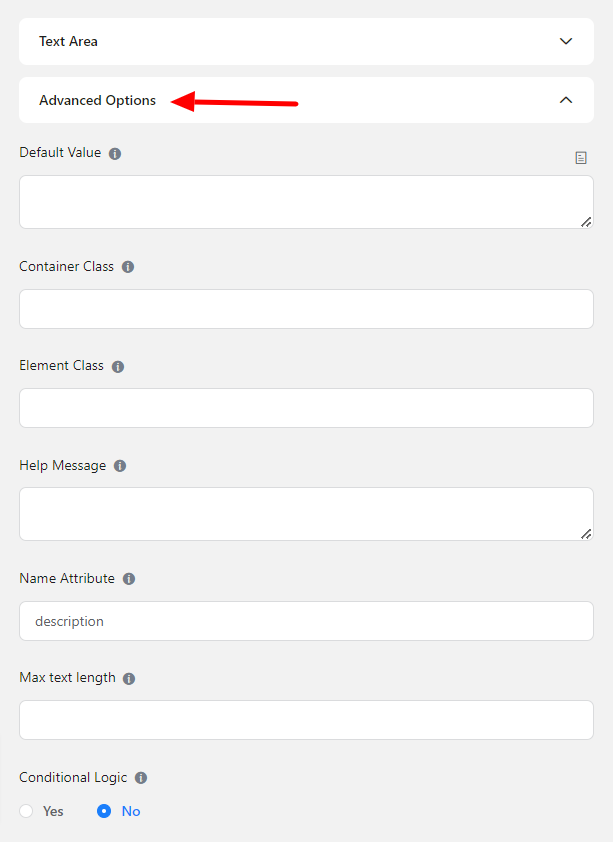
- Name Attribute: The input field’s name attribute is the HTML equivalent of the same name. You don’t need to modify this.
- Max text length: It allows the user to set the maximum number of characters the input should accept.
- Conditional Logic: You can create certain rules to dynamically hide/show the input field based on the values from some other fields. Learn more about conditional logic
- Save the form when the customization is done.