The Numeric Field is used to take an input of any kind of numeric value. The input of numeric value could be a contact number, it could be for age determination, could be for salary purposes, and so on.
- To add Numeric Field to your form, drag and drop the field or simply select it from the available input fields. These fields can be added to a form in other different ways.
Want to learn how to create a basic form? Get started here.
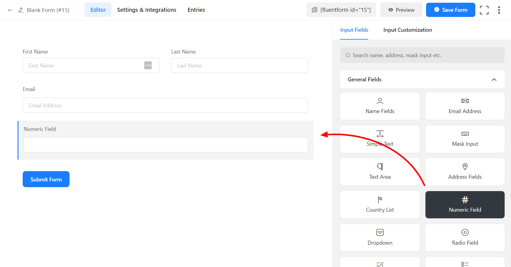
- To enable customization, click on the edit icon you get when hovering over the field. Or click on the Input Customization tab in the right sidebar when the field is selected.
In the Input Customization section, you can customize the numeric input field in the following ways. In this section, you will find 2 portions:
- Basic Options
- Advanced Options
Basic Options
On the right side of the tab, there are some important Basic options which are given below:
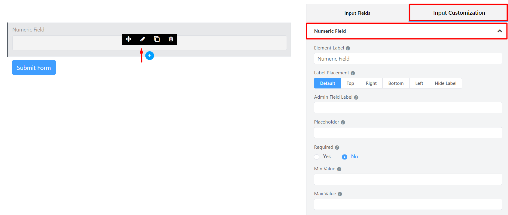
- Element Label: This is the text users will see on the form for the input field. You can put any text here that helps to understand the purpose of that field.
- Label Placement: Determine the placement of the label that you set previously concerning the input field. The available options are Top, Left, Right, and Default. All of those are self-explanatory except the Default. What it means is it will confirm your global label placement settings.
- Admin Field Label: If you want to show a different label for your admin users when they view the form submissions, you can configure that using this option. It doesn’t have any actual effect on the form; instead only for administrative purposes.
- Placeholder: You can also have a placeholder by which users will perceive the field subject.
- Required: Determine whether the field could be empty or not when the user submits your form by choosing the appropriate option from here.
- Min Value: You can define a minimum value to be allowed in the input field. The users will not be allowed to put a smaller number than the defined value, which is already set as a minimum number. Set the error message to be shown when a smaller number is submitted.
- Max Value: You can also define a maximum value that can not be exceeded by your users. Set the error message to be shown when a number exceeding the determined maximum value is submitted.
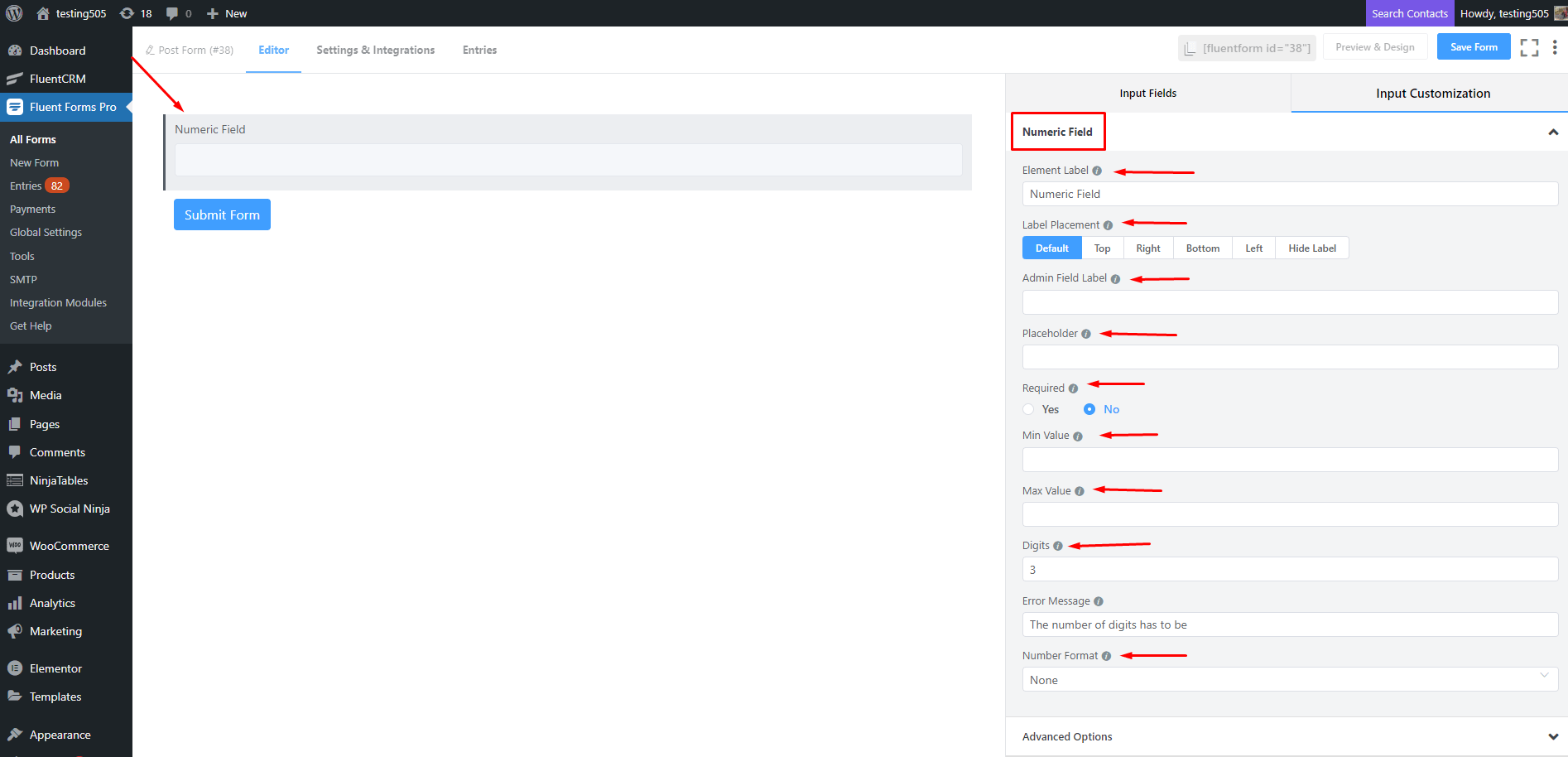
- Digits: You can set the number of digits for the input field. The Error message will be shown if validation fails for Digits.
- Number Format: You can select the format of numbers allowed in this field. You can use a comma or a dot as a decimal separator. Both EU and US-style with or without commas and dots are available to choose from.
Advanced Options
The Advanced customizations available for the Numeric input field are as follows:
- Default value: Using our shortcodes, you can manually set any fixed value in your field and pre-populate your input field dynamically. To get a better understanding of Dynamic Default Value, read this guide.
- Container Class: Use this option to add your custom CSS classes to the field’s wrapper.
- Element Class: Similarly, you can add custom CSS classes to the input field itself.
- Help Message: You can use this option to guide your user thoroughly. Just add your text here, and it will be shown as a help message to the user.
- Step: The user can provide a Step attribute for this field. Users can give the value any for floating value.
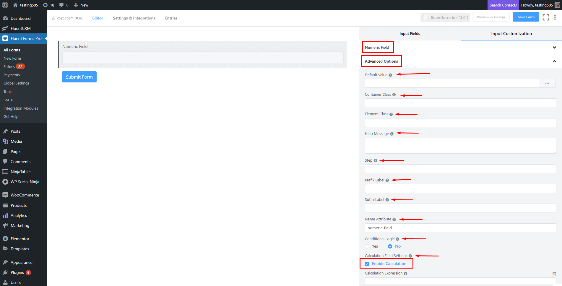
- Prefix Label: You can use this field to provide Prefix Label in your input field. It will show in the input field as a prefix label.
- Suffix Label: To provide Suffix Label in your input field, you can use this field. It will show in the input field as a suffix label.
- Name Attribute: The input field’s name attribute is the HTML equivalent of the same name. You don’t need to modify this.
- Conditional Logic: You can create certain rules to dynamically hide/show the input field based on the values from some other fields. To get a better understanding of Conditional Logic, read this.
- Enable Calculation: The user can enable this and provide a formula expression if you want this field as calculated based on other numeric field values. To learn about Numeric Calculation here.
- Save the form when the customization is done.