
Why Mobile Users are Abandoning WordPress Forms

To gain more traffic, you need to take care of your site on mobile phones. Because the number of people from mobile browsers is increasing, you should emphasize evenly your products and services to display correctly on handheld devices.
No need to mention the importance of keeping forms. Alongside the main site, WordPress forms are the special cases you need to consider. Since the conversion depends on the form big time, so you must learn how to present it by making it more user-friendly.
WordPress form abandonment is a big issue for webmasters and you need to know why it happens and how to prevent it. In this article, we are going to discuss everything in detail, and we hope, you can make more conversion with your forms.
On a short note, the best way to prevent form abandonment is using conversational forms that was recently introduced by Fluent Forms. It’s a Typeform-style forms in WordPress.
Read another article to save your low-converting forms and turn it into a powerful one
What is form abandonment?
Form abandonment simply describes as an unexpected incident where users stop in the middle of a checkout. It means they come to make a purchase and while they’re proceeding, they abandon the form without going to the end.

Why people abandon the forms
The reasons for abandoning forms in mobile phones are not too different from the reasons happen with the desktop version. The causes are equal still, some particular issues are there to address if you’re concerned about the visitors from the mobile devices.

Now, have a look at the reasons below to find if any of them matches your abandonment. After that, you’ll be enlightened with some pro-tips that can help you reduce the low-conversion.
Your form isn’t mobile-friendly
The first and foremost reason for not being the form converted is because your form isn’t responsive. Keeping the site mobile-friendly is equally significant to ensure your website’s good architecture. If you can’t ensure your site’s flexible appearance on smaller screens you’re potentially going to lose the customers.

Web pages don’t look the same on all platforms. They appear diversely on various screen shapes. So, your forms will have to adapt to multiple sizes and you need to ensure that users from all devices get the best experience.
Your site isn’t fast enough
Between coming to your site and making a decision, a user only needs 2 to 3 seconds. If your site is loading for a long time and users have to wait to see a page then you’re done. Visitors will leave your site immediately and go somewhere else. Too slow sites cause the form abandonment and you don’t know why this happens.

You have designed your form very well, made it responsive, and presented it lucratively but it takes much time on loading, then you’re going to lose your customers. Above all, your forms require to load faster which depends on the site’s speed.
Privacy and security
Yes, these two are pivotal issues for a site especially when people are about to submit their personal information. If your site isn’t secure enough, how would people trust with the data that are private and non-shareable with everyone? Also, if you can’t assure users that every single piece of information is safe, they hardly go for the final submission.

The more you can assure the privacy, the more you can expect with the conversion. At somewhere (better below the form), let the users read the terms and conditions. GDPR-compliance could be another great option to promise your users that their data is secured and they have control over it.
The navigation is complicated
You need to ensure whether your site is easy to navigate or not. Not only for mobile users but for all, your site should be user-friendly so that users could find everything they want. On the other hand, when people come from mobile, it’s more necessary to keep the site well-arranged in order to give the users a feeling of comfort. Otherwise, you’re going to lose some prospective customers who are close to converting.
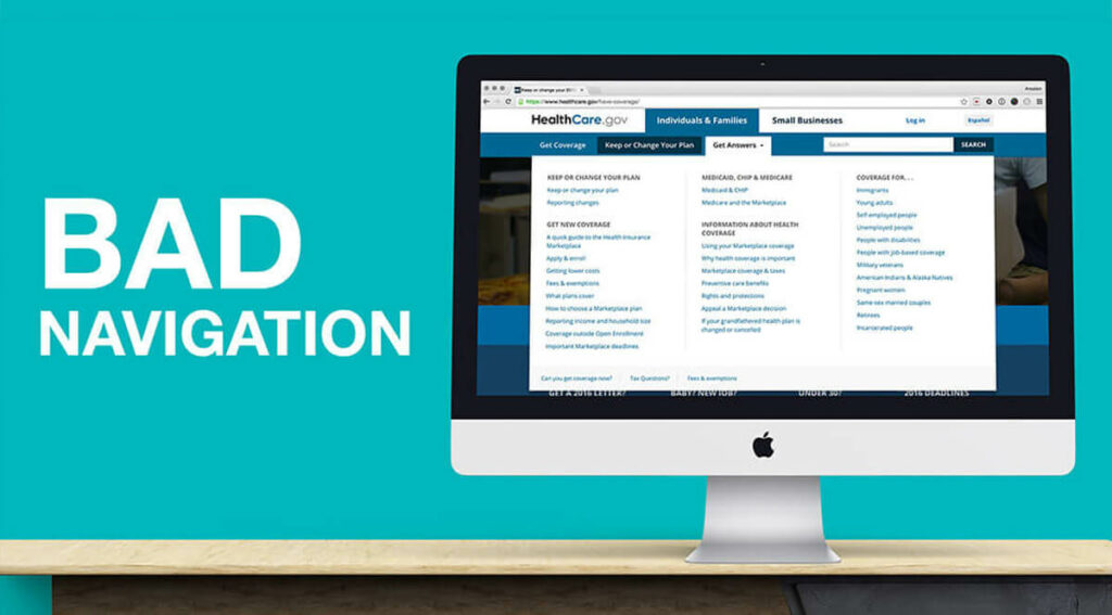
As long as you want people will complete the form, keep it easy to navigate from everywhere – desktops, mobiles, tablets. Users don’t fill your form because it’s hard to find or it’s not easy to scroll. Fix the navigation issue and see how better the situation becomes.
Tips to improve the forms for mobile users
Now the fun part. Here you will find a number of actionable tips that will turn your low-converting forms into a powerful one. Check

Make it look good on mobile
No way you can achieve higher success if you don’t set the mobile version of your forms as a priority. The amount of successful form conversion bolsters this phenomenon. Usually, people love to check the forms when they’re browsing on the mobile. If it’s not okay then they might go for the desktop version. Why don’t you set up your form with a responsive layout so that every mobile user can see it right?

Improve the design
Yes, nothing else could work better than this action. If possible, make your site enthralling for all users, all devices, and all platforms. A good-looking site is already containing enough power to lock visitor’s attention. Moreover, it’s also useful to make the form outstanding with the design that separates it from the website.

Human minds don’t love to interact with an ugly design, keep in mind that. If your website doesn’t look great, you shouldn’t expect more engagement to receive. Again, you need to focus on your form solely because you want a bigger conversion. And, that needs extra care with the form to make it enticing before users.
Reduce the fields
In other words, keep your form as short as you can because it’s a good way to encourage users to fill it out. You can shorten the form in many ways. But, remove the unnecessary fields, at first. Put only the essential fields there like name, email etc. Another smart way to keep the form simple is using conditional logic. By applying this method, you can show some fields only when necessary.

Unless you can’t remove the redundant fields, people will abandon the form instantly. The goal is to present the form as simple and clean as it’s possible. Consider keeping the input fields based on the demand and then trim what you don’t need, what makes your users don’t feel bad. Study other forms to give a fat-free look to your form.
Cut the loading time
You need to make your site fast no matter how. Yes, there are options available for you if you just want to speed up your site. Accelerate the site’s speed so that it loads faster on every platform, especially on mobile devices. To ensure the speed, you can take several steps like using a high-end WordPress theme, checking the speed of your site on mobile, and optimizing images.

There are several techniques that help you personalize your site to make it fast, smooth, and high-performance. Although the methods vary for desktop and mobiles, you will have to fix your site on desktop first. Then, the site will start running awesomely on both platforms.
Call to action for mobile phones
After doing everything, what you want from your users is clicking the call to action and make your effort countable. What if your call to action is not interesting enough that attracts a lot of customers? That said, it’s time to take care of the buttons to make it stand out. An ideal call to action describes what it is with a clear copy text. On the other hand, after the submission, a thank you page should welcome the users for future relationships.

Users come to your form, they might start filling out the form, and then they leave it there without submitting it. To motivate the participants to click the submit button, you need to make it look great. Test the button from mobile phones, as well. Things look way different on smaller screens and you don’t know how it works until you check it out.
Conclusion
We hope, now you can create a form that will perform amazingly on every platform including mobile browsers. Start with a free WordPress form builder plugin to see how things work beautifully regardless of the device or screen size. This is a matter of hope and prospect that by improving the mobile version of the form, you can attain more success.
Fluent Forms Pro
Try Fluent Forms today and see for yourself!
To gain more knowledge, please visit our blog. Alternatively, we can suggest you go through these posts for a better understanding of WP forms, UX, and more WordPress things!
Do subscribe to our YouTube channel to get WordPress-related tips and tricks. Also, follow us on Twitter and Facebook.
-

Contact Form Mistakes to Avoid in 2026: UX, Spam, and Conversion Fixes
Fixes for Contact form mistakes covering UX, SMTP delivery, spam, -

Create Online Surveys in Conversational Style with Fluent Forms
You know why surveys are needed. To collect information, to… -

Design a Spooky Popup Form & Halloween Email Campaign in WordPress
No matter what your website is about, collecting emails, doing…
Comments
-
Wow Da weiss man, wo es hingehen muss Viele Grüsse Mirta
-
English, please.
-
-
Thank you for your wonderful post! It has long been very insightful. I hope that you’ll continue sharing your wisdom with us.
-
Oh, Carie, it means a lot to us. Please visit our site while you can.
-
-
[…] doesn’t look good on mobile devices. If your page isn’t optimized for mobile users, they will abandon your site, and your conversions will take a hit — […]
Leave a Reply
You must be logged in to post a comment.