
Design Better Forms With These 13 Tips to Make Forms More UX-Friendly

Repetitive form abandonment indicates the weakness of form design. Too many fields, unclear labels, awkward spacing, and bad flow can make even a simple form feel like a chore.
What you need is a form that prevents users from bouncing back and keeps them engaged until they reach the submission button.
Fluent Forms gives you a clean way to put these ideas into practice without fighting the builder in your WordPress site. These tips will help you improve form UX and show where Fluent Forms fits in.
- Maintain length and structure: Include the most essential fields, align everything cleanly, and break long forms into steps.
- Make inputs understandable: Use clear labels and opt for dropdowns, radios, or checkboxes over open text fields.
- Reduce users’ effort: Enable autofill, use smart layouts (like multi-column), tabs or accordions, and keep spacing natural for better readability.
- Use features thoughtfully: Add repeatable fields for multiple entries, apply conditional logic, and involve CAPTCHA only where it’s actually needed.
- Optimize for completion: Use advanced form styler and apply customized branding, decorate the form with a compact user experience.
Why Form UX Matters
Good form UX helps people understand what to do, why they should do it, and how long it will take. That matters whether you are collecting leads, registrations, support requests, bookings, or payments.-
Don’t publish a form that seems to be only a container of fields. It is a decision-making asset that demands an interactive structure. Every extra second of confusion adds friction. A single unclear field increases hesitation. Every unnecessary click pushes people closer to leaving.
A better form is not just prettier. It converts more consistently because it respects the user’s time.
Form UX Tips to Design Better Forms
1. Keep it short, but enough to contain everything
Ideal forms ask for the minimum amount of information needed to move forward. If a field does not help you make a decision, follow up, or complete the task, it probably does not belong there.
That does not mean every form should be tiny. It means every field should earn its place. For example, asking for a phone number on a newsletter form can feel excessive. Asking for it on a callback request form makes sense.
To make forms visually shortened without deducting the necessary information, you can:
- Remove optional fields that do not affect the outcome
- Ask only for what you need right now
- Collect extra details later if necessary
Use flexible form structures to build compact forms without sacrificing clarity.
2. Maintain alignment with proper relevance
Users should be able to move through the form without pausing to figure out where each label belongs or which field comes next. A clean visual flow is not decoration. It helps the brain process the form faster.
Follow these form design tips to improve visual flow:
- Keep labels close to their fields, whether these are on top of or beside the field icon
- Avoid random alignment changes inside the same form
- Use consistent spacing between sections
- Group related inputs together
When people can predict the structure, they feel more confident completing it.
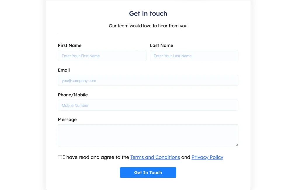
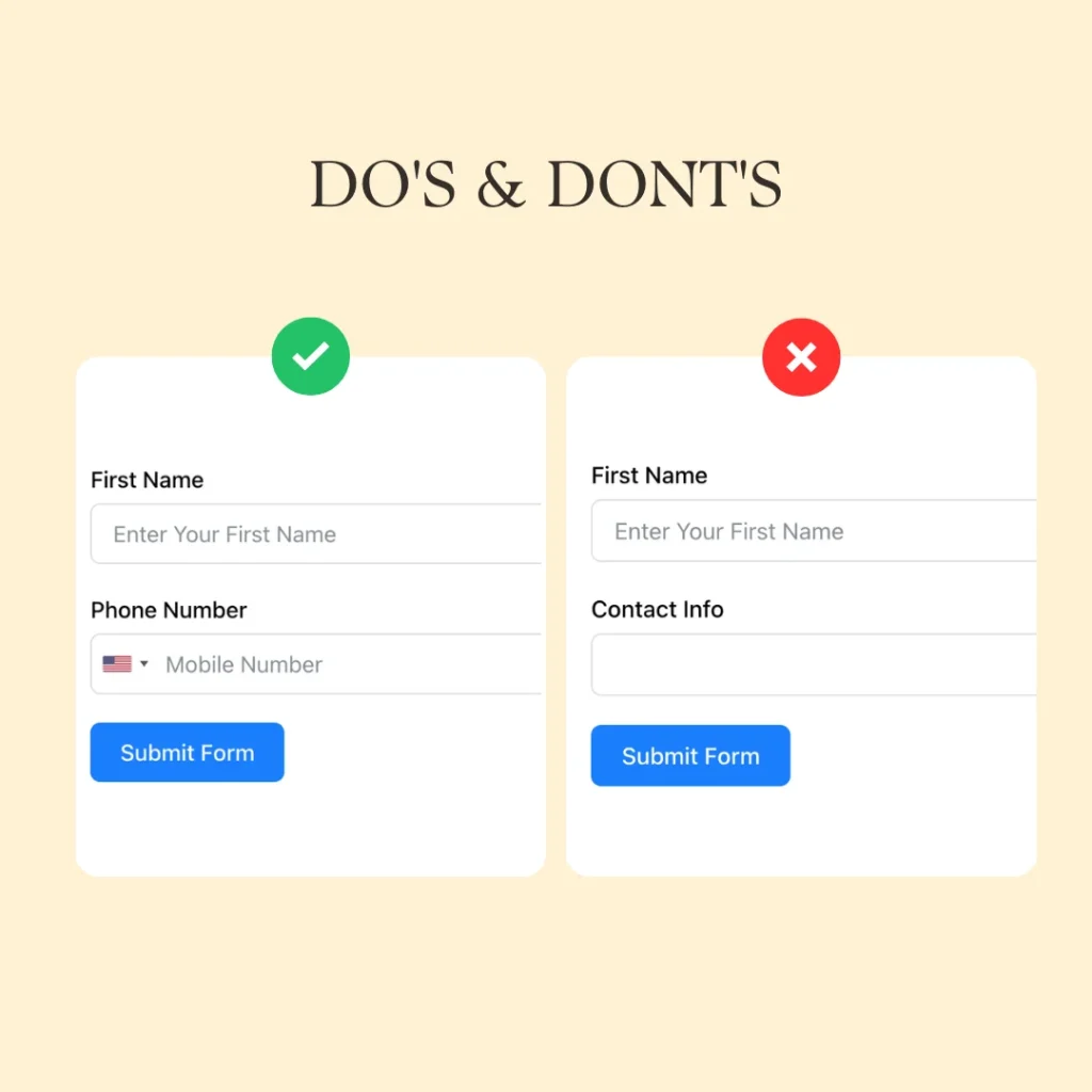
3. Add a clear and concise label
Labels should explain the field without making people think. A label like “Your email address” is obvious. A label like “Contact info” is vague and leaves the user guessing about what to enter.
Here is how you can make the labels more effective:
- Use clear language
- Keep labels short but specific
- Do not hide important instructions inside placeholders only
- Make required fields unmistakable
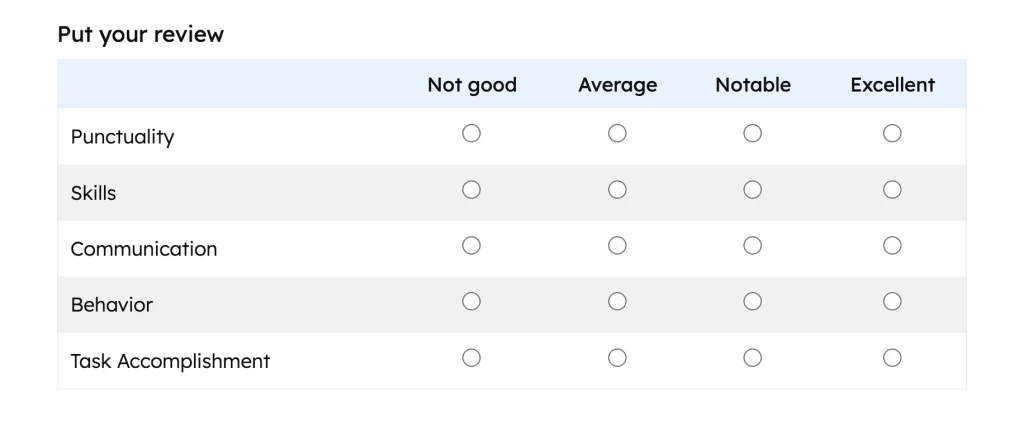
4. Ensure less writing and more selection
Choosing from a list is easier than typing. Whenever possible, replace free-text entry with checkboxes, radio buttons, dropdowns, toggles, range sliders, or date pickers.
This reduces errors and speeds up completion.
Use selection fields for occupational data, required services needed, and preferred contact method.
Suppose you can add a checkable grid to your form to help readers compare positions and select exact options to express their perception, even without writing a single word.
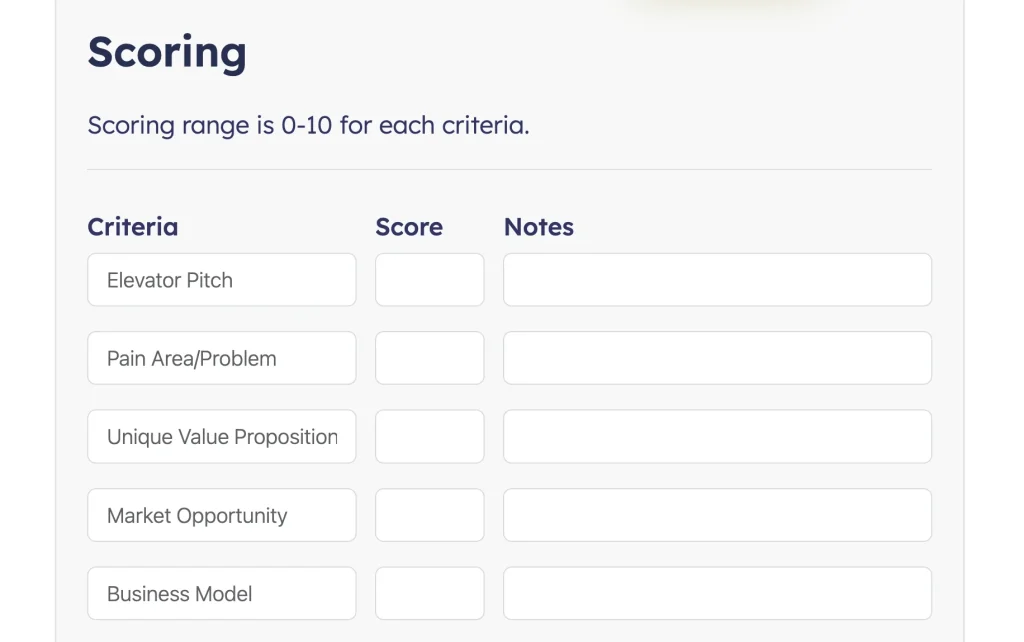
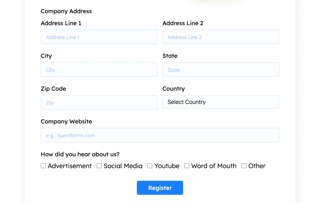
5. Apply multi-containers where it’s highly relevant
When collecting multiple related items, such as contacts, repeatable entries, or product options, forcing users into a single long vertical list is clumsy.
A multi-container layout helps keep related choices organized. Use this when:
- A form has repeating groups of fields
- You need to separate logical clusters of information
- You want to prevent visual overload
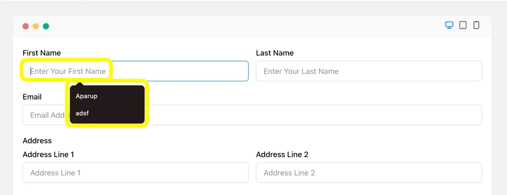
6. Help respondents with obvious autofill
Autofill and browser-friendly field setup remove friction from forms that ask for routine details.
If the browser can accurately guess a field, let it.
Form design tips for autofill:
- Use meaningful field names
- Keep standard field types where possible
- Avoid unnecessary custom behavior that confuses users
- Let users complete routine info quickly
This is especially useful on mobile, where typing is more annoying and mistakes happen more often.
7. Improve readability and make multiple field selection easy
A scannable form wins the first impression and makes it spontaneous to fill out. If the text is cramped, the field spacing is too tight, or the options are visually unpleasant, users slow down.
Readability is not just about font size. It is about rhythm, contrast, and breathing room.
Here are a few aspects that can make the multi-layered form more readable as well as functional:
- Short field labels
- Clear group headings
- Enough space between options
- Strong contrast between text and background
- No wall-of-fields syndrome
When multiple selections are involved, make the choices easy to compare. The goal is to reduce mental load, not increase it.
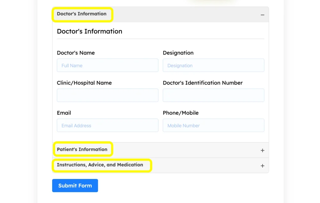
8. Use tabs or accordions for a relevant group of fields
If your form has several sections that do not need to be shown all at once, tabs and accordions can make the experience feel much lighter.
This is useful for forms that ask about different categories of information, such as personal details, business details, and preferences.
Tabs and accordions bring more engagement because they:
- Reduce visual clutter
- Make long forms feel more manageable
- Keep related fields together
- Help users focus on one section at a time
Using Fluent Forms, you can use Accordion and Tab Sections to organize longer forms without dumping everything onto a single screen.
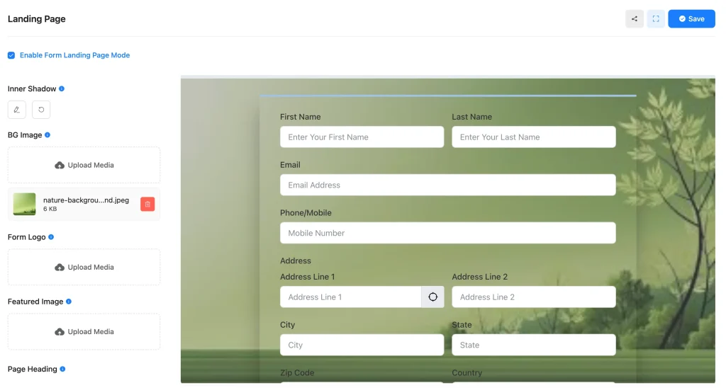
9. Add a separate landing page for a compact purpose
Sometimes a form should not live as a tiny element buried on a busy page. If the form has a focused goal, a dedicated landing page can improve concentration and completion.
This works well for event registration, webinar sign-ups, lead-capture offers, bookings, application forms, etc.
A focused page removes distractions and gives the form a better context.
You might be seeking a better solution than embedding a form everywhere because when the goal is specific, the form needs attention. A separate page can give the user one clear action instead of competing with the rest of the page.
Using Fluent Forms, you can develop a landing page form with a custom background, logo, featured image, etc. This makes the form page-ready and makes the form’s performance tracking easier, while ensuring a complete user experience.
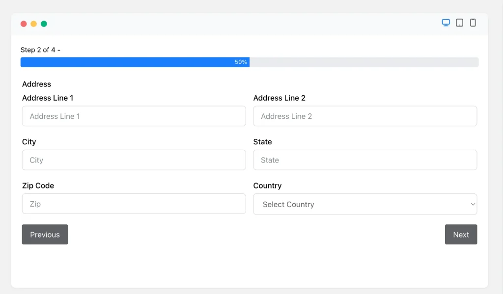
10. Divide the form into steps with progress
Long forms feel shorter when they are broken into steps. That simple trick changes perception. Instead of one giant task, users see a sequence of smaller, more manageable tasks.
Progress indicators matter because people like knowing where they are and how much is left.With Fluent Forms, you can use multi-step forms to split long forms into logical stages and keep users moving forward.
11. Deploy CAPTCHA or reCAPTCHA only when needed
Spam protection is important, but too much friction can hurt real users. CAPTCHA should protect the form without making it feel hostile.
Use it when the form is exposed to spam risk, but do not overuse it where the threat is low.
Spam prevention works best when you:
- Add protection to public forms that attract spam
- Keep the challenge as lightweight as possible
- Do not bury the user under multiple verification steps
The goal is security without punishment.
12. Make the CTA obvious and reassuring
Your call to action should tell users exactly what happens next. “Submit” is functional. “Get My Free Quote” or “Book My Consultation” is clearer and more reassuring.
A good CTA reduces hesitation by making the outcome obvious. Few CTA tips that help users decide quickly:
- Use action-first wording
- Match the user’s intent
- Avoid generic labels when a specific one is available
- Make the button easy to spot
13. Design with advanced form styling
Your form should look like part of the site, not like a generic widget dropped onto the page.. Styling matters because it affects trust, clarity, and first impressions.
The point is not to make forms flashy. But the goal is to make them feel polished, consistent, and easy to use.
A well-designed form will always demand:
- Clear typography
- Balanced spacing
- Strong field focus states
- Consistent colors
- Responsive layouts for mobile and desktop
Fluent Forms Advanced Form Styler helps you control the visual design without spending forever on custom CSS. You can also use Gutenberg Block Styler in Fluent Forms free version to make the appearance more vivid in the block editor.
Miscellaneous UX Improvements that Often Get Ignored
These smaller details improve the overall experience and reduce friction during form completion.
Use smart field ordering
Put the easiest questions first. Do not start with intimidating or personal fields unless necessary. Early momentum matters.
Show clear error messages
If something goes wrong, explain it in plain language. Do not make users hunt for the problem.
Avoid asking the same thing twice
Duplicate fields annoy people and weaken trust. If you have already collected an answer, do not ask again unless there is a real reason.
Keep mobile usability in mind
Forms often fail on small screens because layouts are too crowded or tap targets are too tiny. Test every important form on mobile and ensure responsive design before calling it done.
Respect user privacy
If you ask for sensitive information, explain why. People are more willing to share when the request feels justified.
The Takeaway
Designing better forms starts with prioritizing the user’s experience over your data collection goals. Focus on clarity, structure, and reducing effort at every step. Smarter inputs, better grouping, or cleaner layouts can enhance a form’s entire acceptance.
If you’re building on WordPress, explore how Fluent Forms can help you implement these best practices quickly and effectively.

Hi, I’m Aparup. With a background in Literature and experience in tech, I combine creativity and practicality to go beyond generic AI output. I’m a content marketer helping users navigate and solve WordPress challenges.
-

Kanban vs Scrum vs Agile vs Waterfall: What’s the Difference?
Get a clear, no-jargon breakdown of Kanban vs Scrum vs -

Email Deliverability Hacks: Complete WordPress Guide With Free Tools
Improve WordPress email deliverability with FluentSMTP, SPF, DKIM, DMARC, list -

How to Embed Social Media Feeds on WordPress Websites (No Code)
Learn how to embed Instagram, Facebook, TikTok, and YouTube feeds
Comments
-
[…] Learn more about how Single-step forms can improve your UX: Design Better Forms With These Tips to Make the Forms UX-friendly […]
-
[…] a nutshell, form design tips and tricks are for accelerating your form conversion. I hope they will boost your forms with a […]
-
[…] try to discuss the reasons behind the low-conversion of a contact form as well as it will suggest how to improve the forms. One thing nobody can ignore is the significance of a contact form in […]
-
Hi there! Such a good article, thanks!
-
[…] Learn about 10 more UX hacks for online forms here: https://wpmanageninja.com/design-better-forms-user-friendly-form-design-tips/ […]
Leave a Reply
You must be logged in to post a comment.