20 Tips for Styling WordPress Forms | Make Your Forms Ready to Convert
The contact page is an essential part of every great website. In more ways than one – more engagement and improved user experience depend on it. Styling WordPress forms, hence, need to get equal attention like other parts of your website.
Users like filling out a form that’s nicely designed, beautifully organized, and easy to understand. Moreover, designing a contact form is fairly uncomplicated if you get in touch with the right tool.
A prolific form design needs two things: the information you want to collect from the visitors and the design you want to impress your users with. For an HTML static site, you need to create the contact form manually whereas, in WordPress, you can do that more efficiently.
Why A Good Contact Form is Needed for Your Website?
For all websites, a contact form is a must-have to build a loyal audience. If you run a personal blog, your readers may want to connect with you with queries. The more you can meet their need, the bigger benefit you can achieve.
In case of a business website, customers need support for the services they have purchased. Or, even more importantly, your potential customers may ask you questions before buying something. Either way, users can get in touch with you any time they want.
Above all, contact forms allow users to communicate with webmasters directly without any barrier. It gives them a feeling of private and safe communication. Unfortunately, many webmasters don’t concentrate on their contact pages.
Keep in mind that, a contact page is a great tool for lead collection. If you feel you’re not getting enough outputs from it, then this article will help you. We have compiled a list of suggestions to make your form stand out a mile.
Read along to know about styling WordPress forms and make sure your form is ready to boost overall conversion.
How to Create a Contact Form Page in WordPress?
WordPress is one of the most used CMS all over the internet, thanks to its flexibility and a horizon of possibilities. Its set of solid features, unfortunately, does not bring a contact form inside. You have to make it by yourself as your business can’t keep running without it.
A contact form plugin can reduce your effort and help you build a functional, optimized, and conversion-ready form in a moment. Fluent Forms is a free WordPress form builder plugin that comes with a wide range of input fields and functionalities to create multiple types of contact forms.
We recommend Fluent Forms because our team sedulously built it to make it the most user-friendly contact form plugin for all-level users. You can get the free version from wordpress.org and the WP Fluent Forms Pro Add-on from our website.
The step-by-step guide on how to create a new contact form is available in our documentation. By following the instructions stated there, anyone can build a fantastic form. We assume, with its help, you have successfully created a contact form.
Now have a look at the best practices of styling WordPress forms to boost your conversions and convince more users.
Tips for styling WordPress forms
These are not random suggestions I’m putting together from the internet. I’ve been working in the WordPress industry for more than 10 years and I’ve got a strong connection with the WordPress form builders. I know what works best, and what seems to work but actually doesn’t. Without further ado, jump into the discussion.
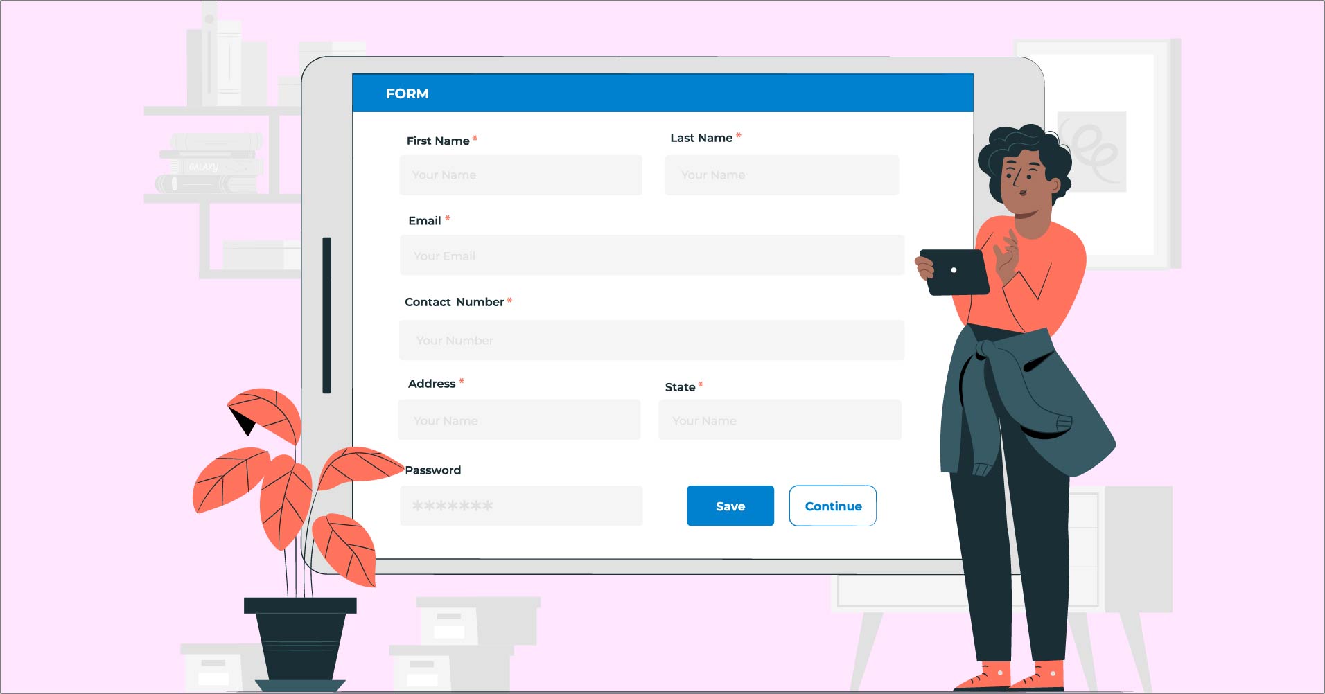
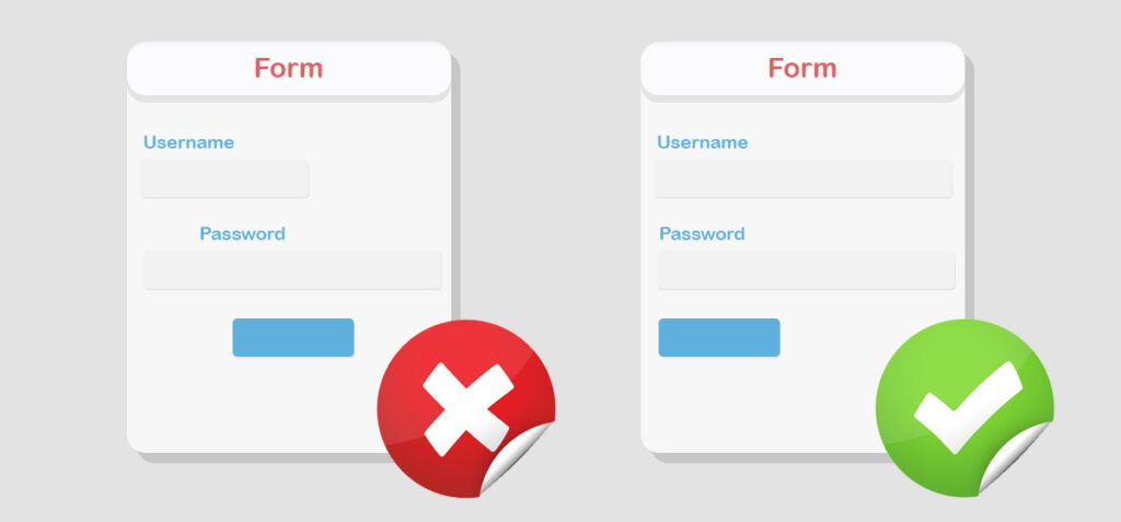
Keep your forms simple and straightforward
You want your forms to stand out from the others. Give attention to the design to ensure that users fill out the form with enthusiasm. Keep the form simple and the design of the page should follow it. Otherwise, it would be hard to lock the user’s attention on the form.
If you’re falling short on ideas, try to build a form after getting inspired
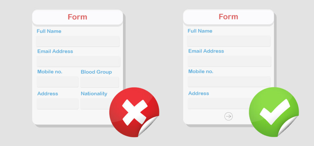
Avoid redundant fields
Being careful with the form creation is important because the amount of sales depends on it most of the time. It’s not an offense to add as many fields as you want; but remember, additional fields require extra time on the user’s end. A user losing patience can cause a loss on the form completion.
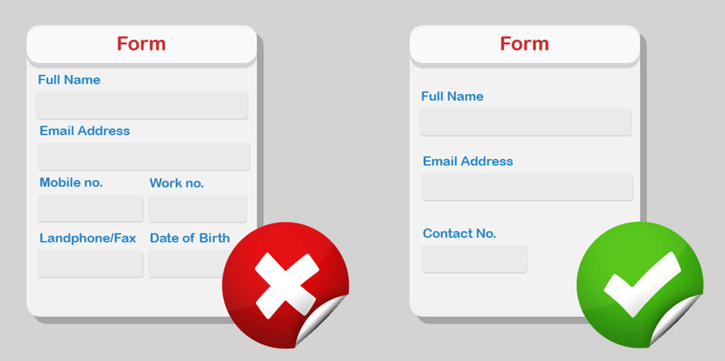
Hence, it’s important to incorporate only the necessary fields and discard those with little value. Ask most relevant questions, because users are likely to respond better to a form with fewer input fields.
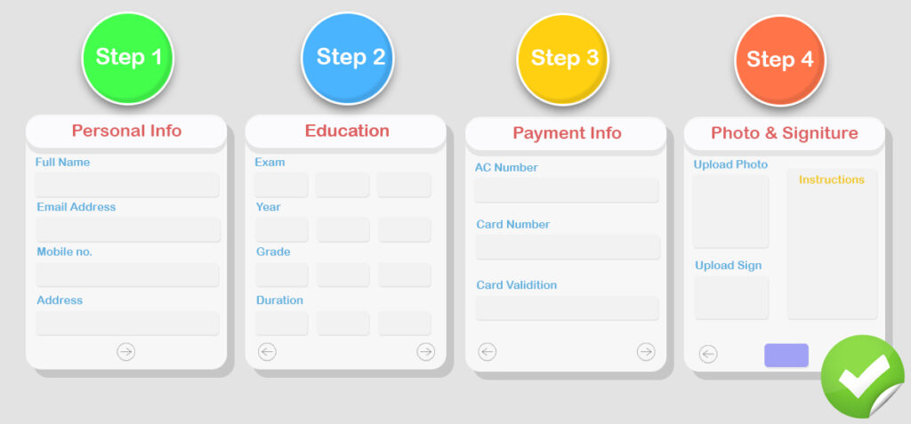
Use multi-step forms if your form is long
There’s an ongoing myth between single-step and multi-step forms. Some experts think single-step forms are better, while others have an opposite view. Both types of forms have their own advantages and disadvantages. Sometimes it’s a must-needed matter to use multi-step form and the same thing goes for single-step form.
Online users want to accomplish a lot of things within a shorter time period. Also, they’re less likely to spend much time on a single web page. To achieve your goal with forms, you need to guide them properly. Multi-step forms work best when the form is too long, requiring more time to complete, usually collecting multiple types of user data.
Conditional logic for more control
In many cases, some of the form fields may be unnecessary for particular users. It’s a good practice to hide the unnecessary elements so that users can go through only the essential fields. Conditional logic allows you to hide and show the elements in your way.
The best part is users only have to fill out some fields and the control is in your hand. If they are not eligible for some options, don’t show those features to them. For a
Inline validation to mitigate confusion
It’s not a good idea to give a warning when users are about to submit the form (whereas they have spent some time to complete it). Rather you should place inline validation. Knowing what’s happening in real-time offers them a smoother experience.
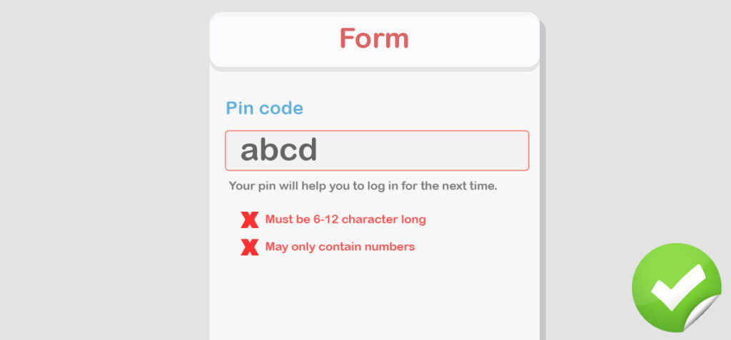
But, the best practice with inline validation is users shouldn’t be bothered instantly. At least, the validation should appear right after they have completed a field. You can give some hints though while creating a password like “Your password should be a mix of character and number” or username (some pre-generated idea based on users’ name or email).
Address, map, and phone number
While users know they can reach you through the contact form it’s also helpful to provide an alternate way of contacting. It will help them find the most convenient option to communicate. Sometimes they need to get an urgent response and your contact form can’t assure that.
Although your business is online it tends to boost better engagement if you add a local address with Google Maps (or a custom map). Remind people you exist in reality, and that you are reachable. Besides, adding
Top align labels
Labels can be placed anywhere and there’s no hard and fast rule for that. Forms with top-aligned labels tend to lead to higher conversion than forms with left-aligned labels. Moreover, top-aligned labels look good on mobile screens as well.
For large data requirements, you can use left align labels because they help users scan easily. Furthermore, they consume lower space which reduces unnecessary height for the form. For small or single-step forms, the top align labels are more considerable.
Keep the CTA bold and attractive
The call to action is the telling part where you want your users to ultimately click. Make it appear bold so you can draw the user’s attention to there. Primary and secondary, two separate buttons bring more effective outputs as their purpose is significantly different.
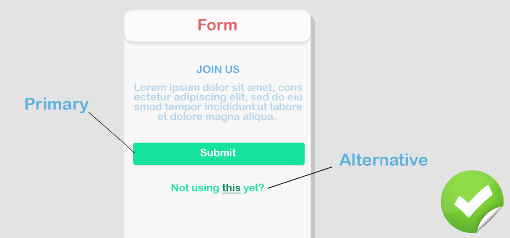
Also, the color of the CTA button is important to give priority. Human eyes get attracted to the bright color. Let’s decide the color based on your overall design scheme but consider anything dark.
reCaptcha to prevent spam bots
Making your forms secure from spam is another crucial point. Luckily, there are learn methods to do that and one of them is Google’s reCaptcha. Although it’s not the ultimate firewall, it still has a wonderful benefit in terms of saving the form from getting attacked by spamming bots.
Several studies have found that some users take captchas negatively. As long as it only requires a click on the checkbox, users don’t get much frustrated. Security comes first, so
Avoid all caps
While setting placeholder text and field labels, avoid all caps. Because all caps are hard to scan considering which is comfortable on the eye. Evidently, sentence case is the most readable format and all of us are used to it since we read almost all text in this format.
It’s just a text and it should feel that way. Don’t make it difficult for the users.
Social links under forms
Whatever you do online, you should earn a robust trust base from among your users. This way the business will sustain longer and loyalty can be achieved thoroughly. Alongside contacting you through the contact forms, some users may prefer to connect with you via social media channels.
Above all, social platforms like Facebook and Twitter can offer a feeling of comfort. Seeing your activity there, users can easily be persuaded to get in touch with you. It seems easier and more lively as well compared to the contact form.
Subscription option
Do you want more subscribers to your email list? You should use opt-ins on the prominent places of your website. And, the form can be a good place to ask users to put their email addresses for receiving regular updates.
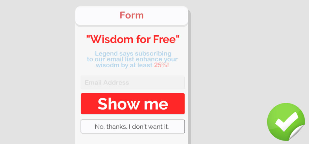
To do that add a check box below the form which seeks permission from the users whether they want to join the list. Building an email list can be a grand source of prospective traffic and trusted customers. Let’s give users a feeling of growing a connection.
FAQ and other resources
If you’re just starting off, you may not find it difficult to reply to all the queries made by your customers. You’ll start noticing after a while, a lot of people ask the same things or the questions vary slightly. Many popular websites include a FAQ section so users get their questions answered readily.
Alongside adding the FAQs, you can set a link for the additional resources. For instance, if you have documentation and guides on different topics, let the visitors know it exists before they’re going to submit a form.
Better if you know CSS
What you see on the internet is the result of CSS. To give an interesting look to a flat web page, nothing is more powerful than CSS. If you are an expert or have even some knowledge of CSS, you can modify the form with a visually appealing layout.
If you don’t know how to style with CSS, you can learn it online. There are thousands of free resources available to start right away. Well, it’s not obligatory to learn CSS, but if you can edit the codes you can design a better form that inspires millions.
Also, many popular forms builder plugins like Fluent forms allows users to include additional CSS which simply changes the existing design in your way.
Grouping for similar fields
It’s easier to grasp if all the semantic data fields are arranged under a single group. To illustrate further, you can keep name, phone number, email address in a section called Personal Details. Likewise, the Payment section needs to be filled out with the card number and card expiry date.
In case of a long form, there’s a great chance of users being overwhelmed. But, if you create groups with a logical base, the form completion rate may increase faster as it gives users an easy understanding of the required data.
Add some information users should know
Make your contact form welcoming. It’s not like you’re forcing your users to put in their data. If possible, set a polite message to invite them to get in touch with you. Also, let them know for what purposes they can contact you.
It’s not mandatory but a good practice to guide users with some basic information before sending a contact request. To elaborate, you can keep a support form only for the existing customers and a general contact form for all. Moreover, you can mention how long they may have to wait to get a response from you.
Include thank you message
A simple appreciation and acknowledgment make users trust your system. It requires time to fill out a form. After completing it, they might be happier to see a note saying something like “Thank you for contacting us. We’ll get to your query soon.”
Through this way, you can also assure them that the form was received by the authority. Alternatively, you can redirect users to a new page where you keep some offers for them. Or, if you take them to additional resources they might find it useful; which of course, could be a great signal for more conversion.
Put an asterisk mark for mandatory fields
Users should know which fields are mandatory and which are optional. To save time and effort, they may want to skip the optional fields. This is why the compulsory fields should be marked clearly. Many forms use asterisks to point out which fields are required.
Well, there’s another issue — some people (who are not too familiar with contact forms) may not understand what this asterisk mark (*) stands for. For them, and for all, you can specify optional fields which denote all the other fields are obligatory.
Make some fun if you can
You necessarily don’t have to be too serious with the form. It can feel more engaging if it’s presented in a conversational way by spicing up some details. Let the users feel the vibe of your brand. With some graphics,
Clear text for submission button
When users come to the end of your form, they should know what happens next. The button must describe the action precisely. A good idea is to improve what’s written on the CTA, otherwise adding a line of text for stating what they can expect. A two or three-word phrase like “Get early access” confirms an increased conversion. Make it descriptive, make it clear. Don’t keep your users in the dark.
Prebuilt templates are useful
Ready form templates are highly effective regarding effortless action. Also, they can help with some inspiration to create a great form. Fluent Forms has three prebuilt forms to use instantly. If you use WordPress plugins for creating forms, look for the plugins with templates. In case you have no idea which fields to include, the ready-to-use forms can ameliorate the process.
Helper text, tooltips, and placeholder
Don’t expect every user to be acquainted with the web forms. A number of people can get perplexed with what to write or what is the right version of a particular input. Helper text and placeholders – both can be highly beneficial to show the users the correct way.
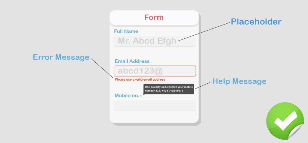
Your goal is to make the form unobtrusive for all the users. Adding placeholders makes the forms easier to understand and faster to fill. Tooltips are also some great rescuers to clarify complex items. Placeholders, however, are highly recommended. Between helper copy and tooltips – decide what to use based on your predicament.
Bonus: Using automatic calendars to pick a date, month and year
Users can fill out the date with their freedom. That’s okay. Yet, if you provide them an organized and easy option, it would be more effective. Adding a calendar means when users click on the date field, they will get a popped-out calendar. From there they can pick a date easily with year month and day with a single click. It requires no manual typing and is a user-friendly option, too.
Moving forward
In a nutshell, form design tips and tricks are for accelerating your form conversion. I hope you will use these tips to boost your forms with great designs and amazing functionality.
If your site is on WordPress then you’ll have plenty of options to make a contact form without any complication. Even free WordPress plugins can give you the result at your will.
Don’t let the plugin decide what to do and what not to. It’s you who are going to present the form to your audience. It’s the form that presents your brand.
This article is to offer you some useful design hacks with form design so that your users love it and that consequently, they can be converted.
Fluent Forms Pro
Try Fluent Forms today and see for yourself!
WPManageNinja has released a number of plugins to help WordPress lovers. NinjaTables has gleaned a lot of popularity with its free version as well as pro version.
Fluent Forms is getting ahead in the race and the users are giving inspiring feedback. You can use it to see what features it got inside. I hope this article helped you much, providing enough value in Styling WordPress Forms in a greater sense.
Apart from using plugins, you also can get more help and support using WordPress from WP Buffs, a WordPress website maintenance, and management support services provider. WP Buffs offers unlimited customizations and fixing jobs on your WordPress websites so that you won’t have to worry about your website maintenance ever again!
Do subscribe to our YouTube channel to get WordPress-related tips and tricks. Also, follow us on Twitter and Facebook.
-

Contact Form Mistakes to Avoid in 2026: UX, Spam, and Conversion Fixes
Fixes for Contact form mistakes covering UX, SMTP delivery, spam, -

Create Online Surveys in Conversational Style with Fluent Forms
You know why surveys are needed. To collect information, to… -

Design a Spooky Popup Form & Halloween Email Campaign in WordPress
No matter what your website is about, collecting emails, doing…
Comments
-
[…] 20 Tips for Making WordPress Forms Ready to Roll […]
-
[…] 20 Tips for Making WordPress Forms More Enthralling […]
Leave a Reply
You must be logged in to post a comment.