Single-Step Form vs. Multi-Step Form: Which One Is the Best and Why

Most people assume the answer is obvious. Multi-step forms are modern, so they must be better. Right? Not always.
A five-field contact form stretched across four steps will frustrate users. Similarly, a 15-field registration form shown on one page is monotonous.
Its not a competition on Single-Step Form vs. Multi-Step Form. Neither format wins universally. What wins is the right format for the right situation.
Key Takeaways
- A single-step form shows all fields on one page. A multi-step form breaks them into sections that users navigate through one at a time.
- Single-step wins for short forms, 5 fields or fewer. It’s fast, transparent, and frictionless when the form is simple.
- Multi-step wins for longer, more complex forms. 6+ fields, sensitive questions, or mobile-first audiences.
- Multi-step forms capture partial entry, which you can use to follow up with users who abandoned the form.
- A progress bar with labeled steps (“Your Details → Project Info”) consistently outperforms a percentage-only indicator.
- Conversational, accordion, and tab layouts are additional options, each suited to a specific type of content and user flow.
What’s a Single-step Form
A single-step form shows all fields on one page. No “Next” button or progress bar. No extra navigation. Users fill in everything they see and hit submit.
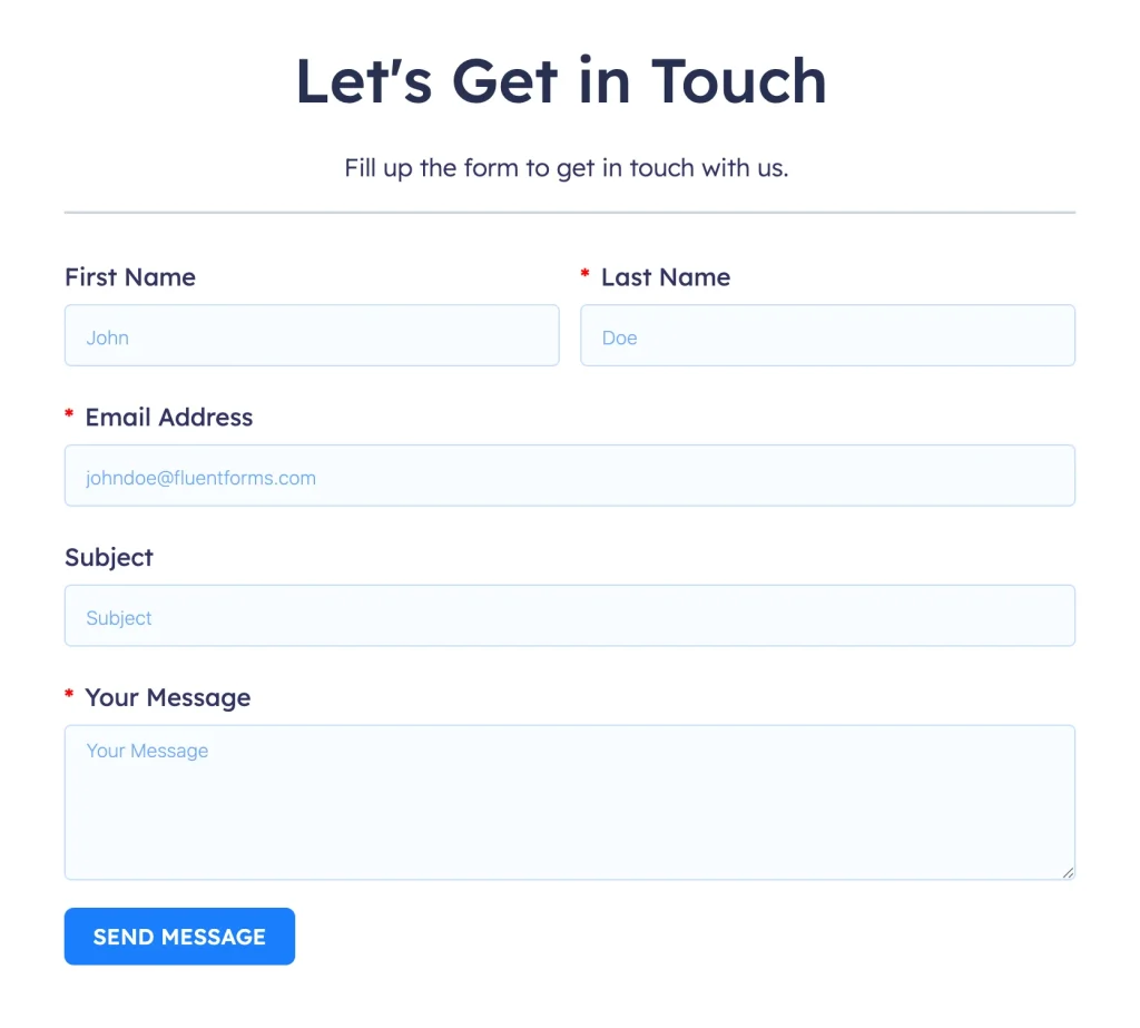
It’s the classic format, and for the right situations, it’s still the fastest and most effective option. A newsletter signup asking for a name and email is done in seconds. A basic contact form with three fields gives the user full transparency about what’s being asked before they type a single character.
Single-step forms work best when the ask is small. They’re frictionless by design. There’s no commitment to a multi-step journey, no wondering how many more screens remain. Users see what’s required, make a quick decision, and either fill it out or don’t.
Common examples: contact forms, newsletter subscriptions, login pages, quick poll forms, email-gated downloads.
What’s a Multi-step Form
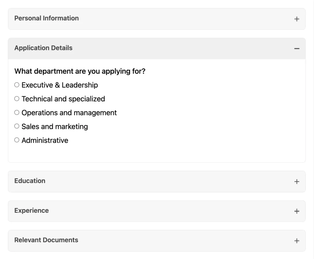
A multi-step form breaks a longer form into sections, presenting one group of questions at a time. Users complete a step, click Next, and move to the next section. A progress indicator shows them where they are and how far they have to go.

The questions don’t change. What changes is how users view them. Instead of facing all 12 fields at a time, they see three or four in each step. The form feels shorter than it is. The experience feels more like being guided through a process than being interrogated on a page.
Multi-step forms are particularly effective when the form involves multiple types of information, personal details, preferences, project specifics, scheduling, etc, that logically belong in separate categories. They also perform significantly better on mobile, as scrolling through many fields on a small screen can get difficult.
Common examples: booking forms, quote request forms, applications, onboarding surveys, product quizzes, insurance, and financial forms.
Single-Step Form vs. Multi-Step Form
Here’s a side-by-side breakdown across the criteria that matter most:
| Criteria | Single-step | Multi-step |
|---|---|---|
| Structure | All fields are visible on one page | Fields are split across 2 to 4 grouped steps |
| Ideal field count | 1 to 5 fields | 6+ fields |
| User experience | Feels fast, transparent, low commitment | Feels guided, manageable, progressive |
| Conversion behaviour | Best for short, simple forms | Outperforms for longer, complex forms |
| Mobile performance | Good for short forms | Significantly better, less scrolling per step |
| Progress visibility | Not needed, form is fully visible | Progress bar essential |
| Lead capture on drop-off | No. Abandonment = no data | Yes. Partial entries save mid-flow data |
| Setup complexity | None | Simple (Pro feature in Fluent Forms) |
| Sensitive fields | Visible before the user commits | Place in later steps for higher completion |
When Single-step Forms Win
Single-step forms aren’t outdated; they’re just situational. If your form has five fields or fewer, a single-step layout is usually the better choice. Users can see everything at once, understand what’s being asked, and complete it quickly without extra clicks or steps getting in the way.
They also work best when transparency matters or when users are already ready to act. Showing all fields upfront can build trust. For high-intent visitors, adding multiple steps only creates unnecessary friction instead of improving the experience.
Single-step is the right choice for:
- Newsletter and email opt-ins (1 or 2 fields)
- Simple contact forms: name, email, subject, message
- Login and basic registration forms
- Quick polls and single-question surveys
- Email-gated content downloads
- Any form where the total field count is 5 or fewer
Single-step Form Best Practices
To make the most of a single-step format:
If you find yourself adding a sixth or seventh field, that’s your cue to switch to multi-step instead.
When Multi-step Forms Win
For longer or more complex forms, multi-step layouts tend to perform significantly better. Breaking questions into smaller sections makes the process feel less overwhelming. Progress indicators keep users engaged and motivated to continue. Instead of facing a long list of questions, users move through the form in manageable steps, which improves completion rates.
Multi-step forms are also especially useful when handling sensitive questions like budget, health details, or company revenue. Placing these later in the flow reduces drop-offs, since users are more likely to continue after already investing effort. They also allow partial data capture. Even if someone abandons midway, you still retain the information they’ve entered up to that point.
Multi-step is the right choice for:
- Quote request and estimation forms
- Job and service applications
- Booking and scheduling forms
- Detailed lead generation with qualifying questions
- Onboarding and registration flows
- Any form with 6 or more fields
- Forms that include sensitive questions (budget, health, company revenue)
FAQ: Do you lose partial data with single-step forms?
Usually, yes. Before users click the submit button, the form doesn’t process their data, meaning it doesn’t enter your server.
However, Fluent Forms offers a dedicated Save & Resume button (as an input field). You can place it anywhere in your form, and when users click it, their partially entered data gets saved.
They’re given a URL to continue completing the form later without losing the data they already entered. However, a save button isn’t typical of a short form. It’s more suitable for longer/complex forms like applications or detailed registrations.
💡 Learn how to easily create a multi-step form in WordPress.
When Multi-step Forms Backfire
Multi-step forms aren’t always better, and applying them in the wrong situation can hurt your conversions.
On short forms, the extra clicks create friction that was never there. A three-field contact form split into three steps forces the user to click Next twice before submitting. The structure adds no value and wastes time.
Too many steps cause fatigue. Most effective multi-step forms have between two and four steps. Beyond four steps, user fatigue becomes a significant factor unless the form involves genuinely complex inputs. If your form has 8 steps, the first thing users think when they see the progress bar is “this is going to take a while.” That is not the psychological effect you want.
A progress bar that reveals too many steps is worse than no progress bar. “Step 1 of 9” is not a motivator. Users who didn’t know the form was that long will often abandon immediately after seeing it.
Multi-step without backward navigation is a UX flaw. Users should be able to return to a previous step to edit an answer. If clicking back wipes their data, many will give up rather than start over. Always save field data on every step transition.
Arbitrary groupings break trust. Multi-step works when each step feels like a logical unit, “my personal details,” “my project details,” “scheduling.” When fields are grouped for no apparent reason, users get confused and might doubt your professionalism.
Multi-step is a structural solution for forms that are too long to show at once. Applied to a form that was already short, it adds complexity without adding value.
Multi-step Form Best Practices
Which One Should You Use
Work through these questions to find the right format for your form:
Single-step wins when: short form, high intent, desktop-first, no qualification needed, speed matters most
Multi-step wins when: 6+ fields, sensitive questions, mobile audience, lead qualification needed, complex, multi-part information
Related Layouts: Conversational Forms, Accordions & Tabs
Single-step and multi-step are not the only two options. Conversational forms, and two related layout types, accordions and tabs, give you additional formats for specific situations.
| Format | How it works | Best for | Mobile experience | Get with Fluent Forms’ |
|---|---|---|---|---|
| Single-step | All fields on one page | Short forms, 1–5 fields, high-intent users | Good for short forms | Free version |
| Multi-step | Fields split across 2–4 grouped steps | Long forms, qualifying leads, mobile users | Excellent | Pro version |
| Conversational | One question at a time, chat-like flow | Quizzes, onboarding, high-engagement surveys | Excellent | Free version |
| Accordion | Sections stack vertically; click to expand one at a time | Optional extra sections; long forms on mobile; ordered flows | Very good, natural vertical scroll | Pro version |
| Tabs | Sections sit side by side; click to switch content | Independent sections users may revisit; desktop-first forms | Moderate, tabs collapse vertically on small screens | Pro version |
Conversational forms
Conversational forms are a variant of multi-step forms that present one question at a time in a chat-like flow. They feel more like a conversation than a form.
Completion rates are generally high for the right use cases, but they are slower than both single-step and standard multi-step. They can frustrate users who want to scan the full form before filling it out.
They work best for product recommendations, quizzes, and onboarding, where the conversational tone adds value.

💡 Learn how to create a conversational form in WordPress.
Accordion forms
Accordions work best when your form has a natural top-to-bottom order. They’re particularly good on mobile, where vertical scrolling feels natural. Use accordions for sequential sections so users can navigate them one after another. Keep them collapsed by default so the form feels short.
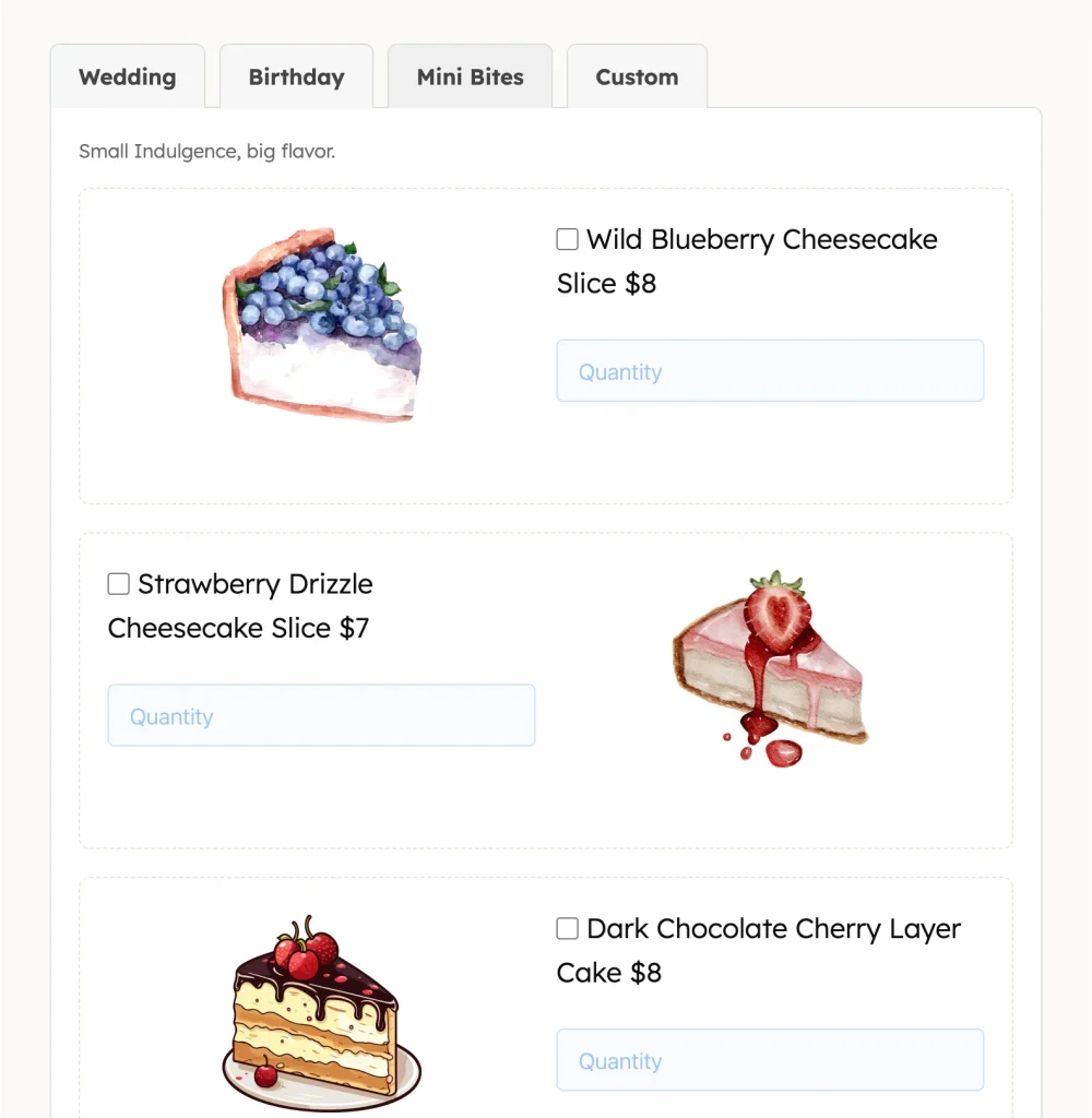
Tabs are suited to forms where sections are independent of each other. The user might fill out the “Personal info” tab, jump to “Preferences,” and come back to “Contact” in any order.
They require enough horizontal screen space to display all tab labels, which makes them a better fit for desktop-first experiences.
Tabs also work great where users may need to compare between sections, for example, product/package categories for order forms.
Optimize Your Forms with the Right Layout
What does a user notice in the first three seconds of seeing your form?
The length.
If it’s a long single-page form, they’re already calculating the effort. They haven’t read a single label yet, but the visual weight of all those fields has already answered their question, “This is going to take a while.” A lot of users leave right there.
Show a multi-step form instead, and the experience is completely different. Multi-step forms lower the perceived effort. Users see a few fields, think it’s manageable, and start filling it out.
And once they’ve started, they tend to finish, because they’ve already invested their time and energy in it.
For short forms, go with a single-step form. Single-step works because it’s fast and transparent. It saves time and enables users to make quick decisions regarding whether they want to submit their information. You receive quality leads that you can nurture over time.

Sarika creates helpful content for Fluent Forms & FluentPlayer. Endlessly curious, she loves connecting over diverse interests & unique perspectives. Off the clock, she’s exploring art or relaxing with a binge-worthy show.
-
How to Manage Client Feedback in WordPress Without Losing Track
Learn how to manage client feedback in WordPress with simple -

Customer Satisfaction Survey: Types, Questions, and Steps to Create
Customer satisfaction survey is important to gather feedback of your -

21 Recent Innovative Marketing Examples Every Business Can Learn From
21 recent innovative marketing examples from Spotify, CeraVe, and more,
Comments
-
[…] an ongoing myth between single-step and multi-step forms. Some experts think single-step forms are better while others have an opposite view. Both types of […]
-
[…] Image Source: WP Manage Ninja […]
-
[…] you’ll need to present the form in a way that doesn’t irritate users. To understand the difference between multi-step and one-step form, read the guide just linked. […]
-
[…] Behind this first step is the rest of the form. Although more information is required, it has been proven that users who start filling out a form are more inclined to move through it than users who never […]
-
[…] منبع:https://wpmanageninja.com/ […]
-
[…] Image Source: WP Manage Ninja […]
Leave a Reply
You must be logged in to post a comment.