
How to Use Forms for Enhancing UX in WordPress

Are you satisfied with your website’s contact forms?
Do you think they’re easy to complete and contribute to the site’s overall user experience (UX)?
If at least one answer to this question is “No,” then keep reading.
UX and website design are two essential elements that complete each other. However, UX is often overlooked by designers and website owners because it’s a complex area that involves a wide range of web design characteristics and features that one needs to get right to maximize the benefits for visitors. That’s why it’s important to do your research carefully, so you make sure you are going with one of the top web design companies that will meet your needs.
Overlooking UX is a critical mistake. Think about it: why would Google prioritize fast-loading websites with an intuitive structure and a user-friendly interface? Clearly, it strives to provide its users with the best browsing experience, so it ranks optimized websites higher than those that don’t deliver a great user experience.
Contact and other types of web contact forms are often a reason why a website fails to provide such an experience. For example, they could disrupt a browsing session or make it difficult to contact a business. That’s why so many people don’t like filling out forms and leave a website if asked to fill out a long-form.
In this article, let’s talk about how you can design UX-friendly forms on your WordPress website and get more customer data to grow your business.
How Do Online Forms Impact UX?
If you’re a frequent Internet user, you know how boring and annoying it is to fill out online forms. Unfortunately, they’re everywhere: whether you want to subscribe to a newsletter, buy a ticket to a concert, or book a hotel room, you’ll need to provide your details such as name and email address via a web form.
With time, it becomes more and more annoying to fill out all the forms – especially if they’re complex – so they became one of the most common reasons why visitors leave a website and never return. Let’s now quickly talk about the main reasons why one’s attitude to filling out a form on your website may become a problem for UX:
- A form is complicated. For example, it may contain a number of fields that require a user to do a lot of typing
- Filling out a form is time-consuming. This happens when a form has a lot of mandatory fields, and completing them may take much more time than it should
- A form asks for sensitive or irrelevant information. Some forms demand personal data such as a cell phone number or home address, which could be perceived as unrelated or inappropriate to the purpose of the form.
All of these reasons contribute to a high drop off rate and undermine the quality of UX on your website, so you should remove them. One way to achieve this is to follow the best practices of web form design.
The Best Practices on Creating Web Forms
Adopt a Minimalist Design

This is a solution to the problem of complexity and great time requirements. A difficult design of a contact form is much more likely to scare people away, so a minimalist design is a right way to go.
Not only it creates the perception that completing the form takes a few moments, but also allows a quick submission, which is perfect for your website’s UX. For example, here’s an example of a subscription form that meets both of these requirements, courtesy of Content Management Institute.
It doesn’t overwhelm the user with a lot of fields and requires only an email address to be provided (the country is chosen in a dropdown list). So, filling out such a form should take about 20 seconds, which is good news for UX.
A clean and minimalist design like this one is a good way to make data submission as easy as possible.
Don’t Ask for Details You Don’t Really Need

As we already know, one of the most common reasons why people choose to abandon an online contact form is the requirement to submit sensitive or inappropriate information.
For example, let’s suppose that you want to subscribe to a newsletter on a blog, but the subscription form demands you to input your phone number.
This data is clearly unrelated to the request to subscribe to a newsletter. To send you updates, they need your email address, not the phone number, so this requirement can – and should – be removed.
Remember, the shorter the form is, the lower the drop-off rate will be. That’s why the forms on your WordPress website should never ask visitors for irrelevant or sensitive (unless required by the form’s goal) details. The below example from a blog called Spoon & Tamago is what a perfect newsletter subscription form should look like.
So, the less information you ask, the higher is the chance that a visitor will complete the form, and this applies not only to newsletter subscriptions. Are you selling an eBook? Then don’t ask people for their physical address or cell phone number. You need their name, email address, and credit card number. Nothing else.
Stick to a Single-Column Layout

Forms may have multiple columns for data, but as the evidence shows, the more columns are there, the less likely they are to be completed. While many blogs out there use a two-column layout, studies have shown that they may be a bit confusing to the visitors.
For example, this Baymard Institute study found that multi-column form layouts are prone to misinterpretation. Specifically, the source suggests that such form often lead users to:
- Fill out unrelated or incorrect fields because they perceive them to be mandatory
- Omit fields because they either misinterpret their meaning or even don’t notice them at all.
Here are all the ways in which a website visitor can misinterpret how to fill out a multi-column form, according to Baymard.
The bottom line here is that if your forms have a single column, the chance that someone will be confused about how to fill it out would be very low. Besides, such a layout reduces eye movement because a visitor doesn’t have to scroll down or jump to other sections. They’ll only have one way to look: down.
Add Supporting Text to Make Completing Forms Easier
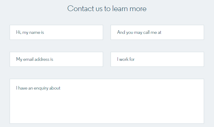
“If your forms include multiple fields, adding supporting text would be a good idea because it lets them know what information or data they need to provide,” recommends Jenna Brown, a UX designer. “This makes the process of filling out the form much easier and faster and is highly recommended in case the request is complex and requires a lot of details from the visitor.”
To be as effective as possible, the supporting text should be simple and concise (check out the above image for example). Just let the user know what they need to do to submit their request with a word, or a short phrase or sentence.
Make a CTA that Stands Out
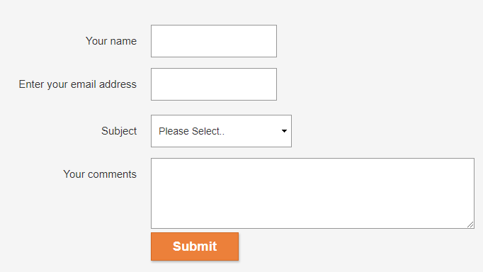
One of the main rules of digital marketing and web design is to make the call-to-action button (CTA) stand out on a web page to attract the attention of the viewer and encourage them to click on it. You can do so by giving it a color that is different from the colors of other elements on that page.
This form on a British health retailer Holland & Barrett’s website perfectly illustrates that. The CTA button, Submit, has a contrasting color which helps it to stand out, so the visitors won’t have any problems with submitting the information in the form.
The choice of the color depends on your preferences (for example, you can use the color of your brand) but the key rule here is to make it prominent.
Summary
Forms are important elements of all websites that play a critical role in helping to collect information from visitors. That’s why you should do your best to make working with the forms on your website an easy and simple experience.
While there’s no universal formula for designing a high-converting web form, the implementation of the best practices above will improve user experience with them by removing the three aforementioned problems: complexity, significant time requirements, and requests for irrelevant or sensitive information.
This should be a great bonus for improving the overall UX of your WordPress website and helping it get higher in Google results!
Author byline:
Diana Nadim is a writer and editor who has a Master’s degree in Marketing. She combines her passion for writing with her interest in research and creates thought-provoking content in various fields. Besides working as a contributor writer for TrustMyPaper and BestEssayEducation, Diana also does some editing work at WoWGrade. What inspires her the most in her writing is traveling and meeting new people. Follow her on Twitter.
-

Contact Form 7 vs Fluent Forms: Which one should you go for?
Learn the comparison between Fluent Forms vs Contact Form 7. -

How to Create an Event Registration Form on WordPress in Minutes
Discover how you can easily Make An Event Registration Form. -

Best Payment Gateway for WordPress: 7 Top Options Compared (2026)
Compare the 7 best payment gateways for WordPress in 2026.
Comments
-
[…] Check out our other articles to learn about creating nonprofit donation forms in WordPress or read how to use forms for enhancing UX in WordPress. Do more than simply accept […]
Leave a Reply
You must be logged in to post a comment.