[ninja_table_banner]
Responsive Breakpoints
The Ninja Table Plugin comes up with a powerful feature, where it helps users to show data in a table format using six distinct breakpoints. The device widths are all set at their exact values suitable to your target. This feature helps to ensure your tables created on your site are responsive.
Here’s a quick guide on how to set up Responsive Breakdown in Ninja Tables. So, let’s go through how this works:
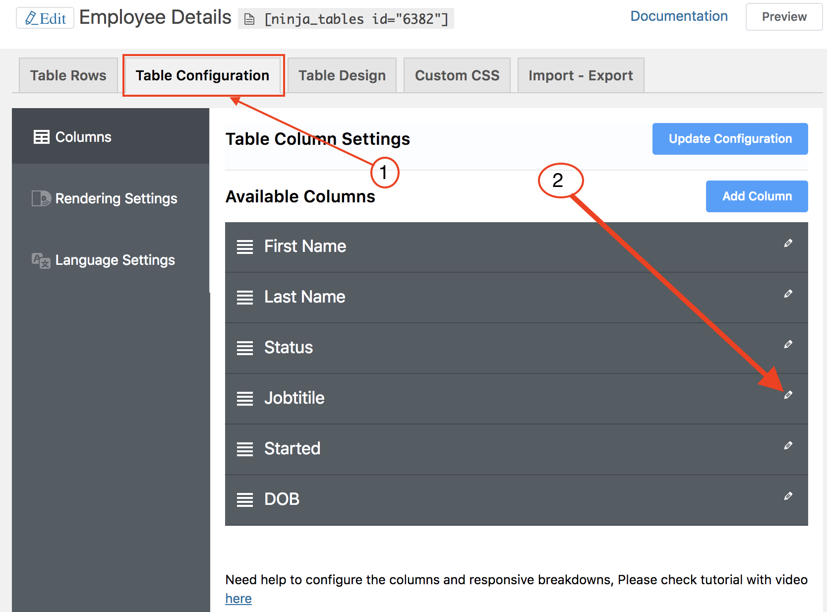
- Click the “Table Configuration” tab to set up your table’s responsive breakpoints.
- Next, go to the “Edit”(pencil) icon to modify your desired column to configure the responsive breakpoints.

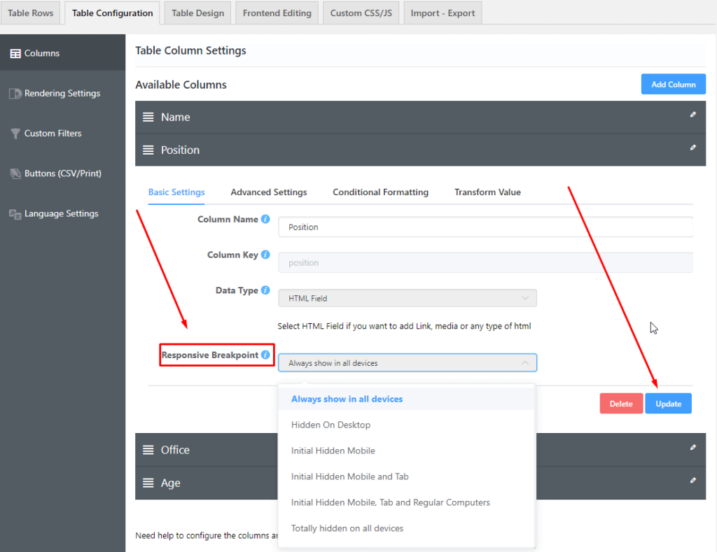
Besides the responsive breakpoint, you will notice a drop-down which consists of 6 options such as:

Always show in all devices: This lets the column gets displayed on every device.
Hidden On Desktop: The column will be displayed on mobiles & tablets except for desktop devices.
Totally hidden on all devices: This option allows you to keep the columns hidden on all devices.
Initial hidden mobile: This allows you to view the columns on all devices other than mobile devices. The column hides beneath the plus(+) icon in the mobile view. So when a user clicks this icon, the hidden column data will be shown.
Initial hidden Mobile and tab: Lets you view the columns on all devices other than mobile & tab devices. The column will be hidden under a plus(+) icon on mobile and tab devices. And the data from the column is shown when this icon is clicked.
Initial hidden Mobile, Tab, and all Regular Computer: After selecting this option, the plus(+) icon will hide the column data on all kinds of devices. Similar to the previous options, users have to click the plus(+) icon to display the data.
You get to select any one of the options suitable for your requirements. Make sure you are choosing the correct configuration from the Responsive Breakpoint segment when you prefer to show particular data on restricted devices.
[ninja_table_banner]

