Ninja Tables comes up with eight distinct Data Types combined with customized formatting. That makes it more user-friendly.
Read this simple guide to set-up various data types to create different interactions for users.
If you already created a table, click on the Add Table Column to add a new column. To configure data type you need to fill up the Data Type input field when making columns.
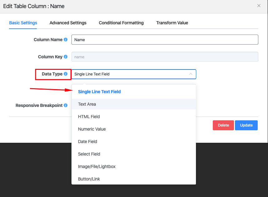
Ninja Tables has eight default data types as follows:
- Single-Line Text Field
- Text Area
- HTML Field
- Numeric Field
- Date Field
- Select Field
- Image/File/Lightbox
- Button/Link
1. Single-Line Text Field
To use the single-line text field you have to select this data type from the drop-down list. This data type will display text in a single-line format. Click on the Add Data button on the top right corner of the table. Like the example below:
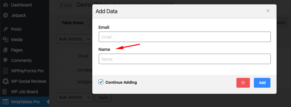
Fill in this field with your required data & click the Add button. Now a new “Name” column has been added to the table.
2. Text Area:
This data type allows you to add multiple lines in a field. There’s no limit in adding the number of lines in a Text Area. Then a pop-up form will appear with the text input field.
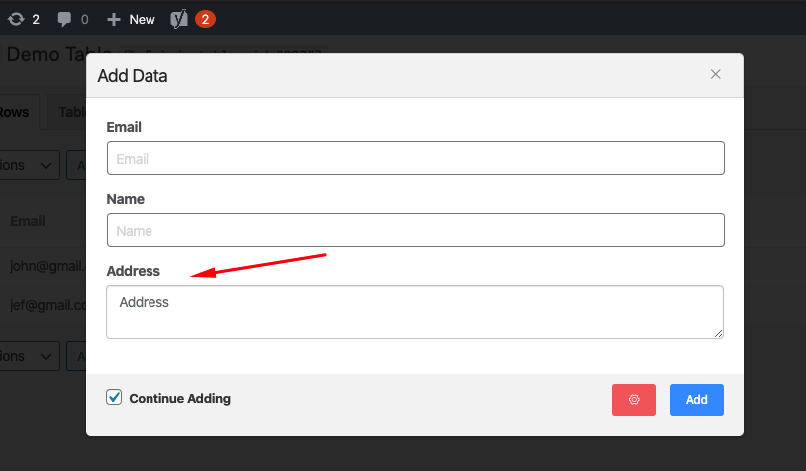
3. HTML Field:
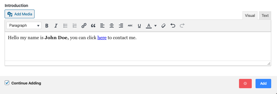
Choose this data type if you want to customize the input fields. HTML field enables you to make the text bold/italic, edit the text color and add media files, create lists & add anchor links.
4. Numeric Value:
If you want just the number in the input field, then choose Numeric Value as the data type. It can restrict your input only in the number field. Using the numeric value, the data can be sorted in ascending or descending order.
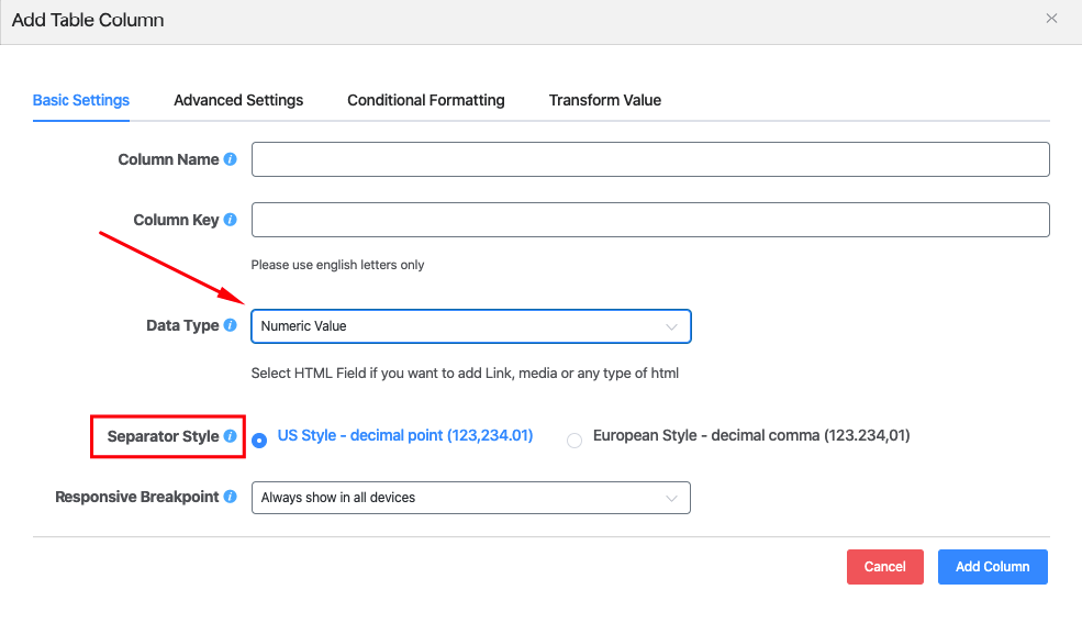
The separator style lets you select the type of digit separator, either US-style or European Style. Given below is the example of this input field:

5. Date Field:
This data type is used to add a date in the input field. The date field mainly includes 8 formats. A custom date can also be added if the default options do not meet your needs. Like the example below:
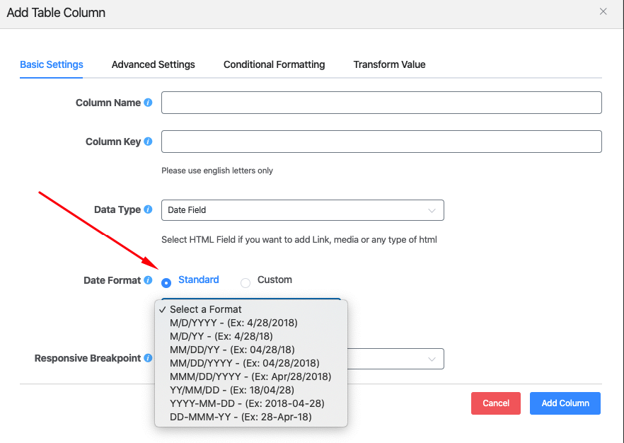
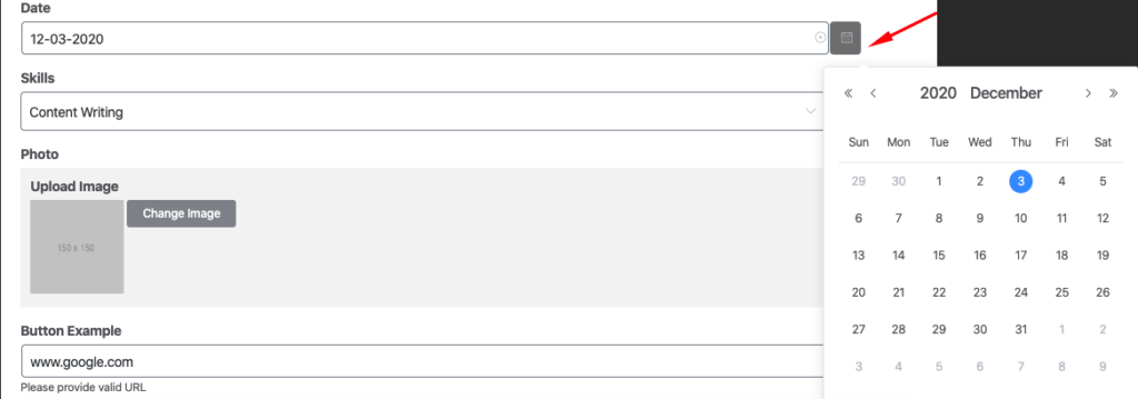
To set the custom date, click on the Custom radio button & place your desired date format in the field. Below is the example of the output:
6. Select Field:
This data type is used to add multiple options in a dropdown format when certain data is entered. The select field is helpful if the same field has to be added more than once.
After choosing this field, Select Items field will automatically appear. Type your preferred elements accordingly in the given column.
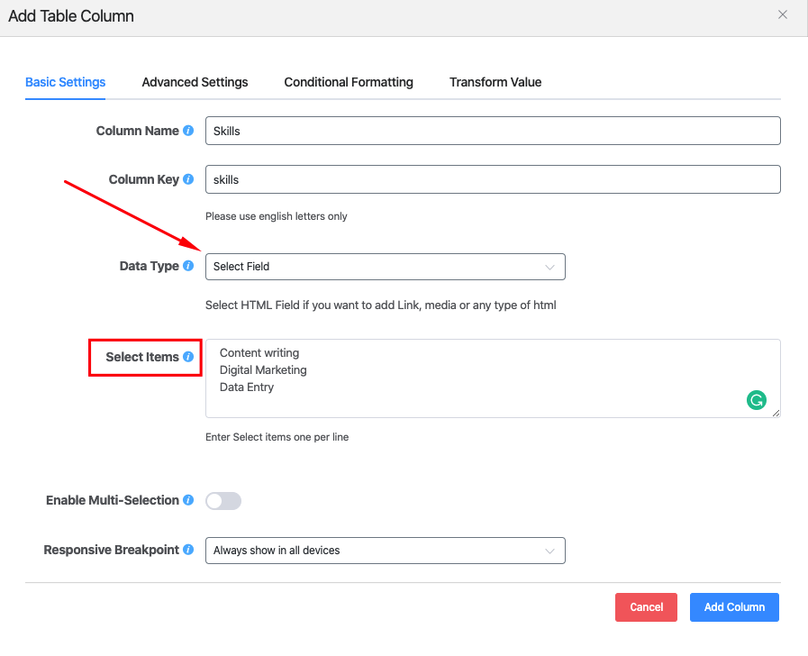
Now, to add data to this field in the column, simply click on that field’s blank space. In the Select Items, you will find a drop-down list that was given earlier. Select one of the elements to fill in this field.

There’s an additional feature called Enable Multi-Selection. This allows you to choose multiple elements to be added in a single column.
7. Image/Lightbox:
This data type allows you to add images in a field. An Image Linkable option automatically appears after the Image/Lightbox field is selected. This option includes Image Only, Image Lightbox, Iframe Lightbox & Link to URL.
Please Note: The Image/Lightbox field is not available in tables using external data such as Google Sheets.
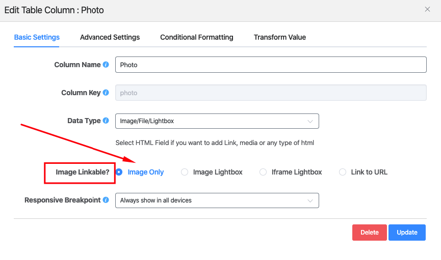
Given below is the functions of each of these Image Linkable options:
- Image Only: In this option, only image files can be added to the column’s field. Both JPG & PNG file formats are supported.
- Image Lightbox: When an image is uploaded using this option. The image is displayed in a pop-up form when it is clicked.
- Iframe Lightbox: Here the image can be added along with the iframe URL.
- Link to URL: This option lets link the uploaded image to the target URL.
If you choose Image Lightbox, the output of this field would look like this after clicking the image:

To select the image as an Iframe Lightbox, upload an image with an Iframe URL like the example below:

Lastly, to add a link to URL in an image click the Link to URL radio button. And upload the image along with the target link.

8. Button/Link:
This allows you to add a button in a column, links can also be added if required. The button can be styled where background, text and border color can be edited.
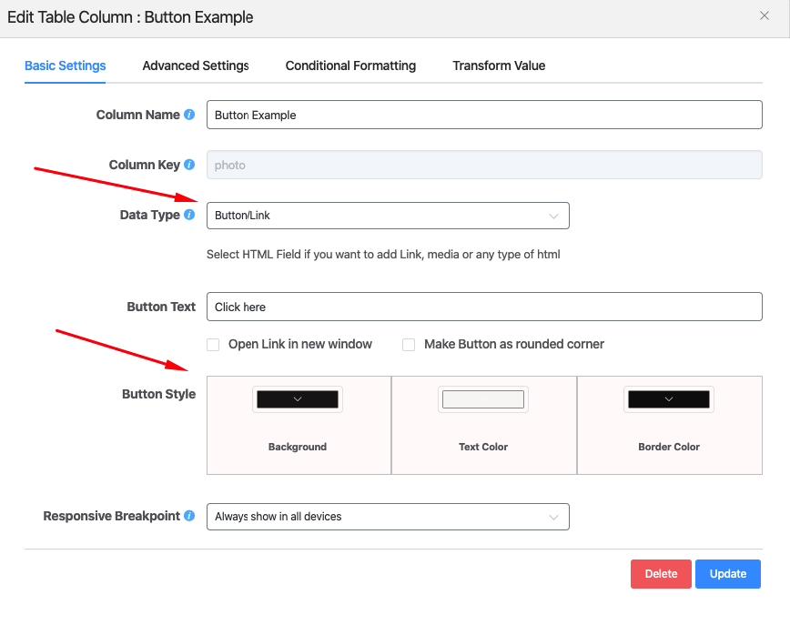
The button’s link can be set to open in a new window. By checking the Open Link in new window option, the same goes in terms of Make Button as Rounded corner.
Now let’s have a look at the final output of this Ninja table. To get a better idea, the example is given below:


