
Contact Form Mistakes to Avoid in 2026: UX, Spam, and Conversion Fixes

Most contact form problems aren’t form problems. They’re email delivery and UX problems that look like form problems. The form submits fine, but the entries never arrive, the confirmation never sends, or spam protection silently blocks real visitors.
This guide covers 15 contact form mistakes across design, delivery, spam, and accessibility, each with a specific fix.
TL;DR
- Most missed form submissions are a delivery failure, not a form failure.
- 27% of users abandon forms because they’re too long.
- A “required” field doesn’t stop someone typing “123” or “N/A” into your phone field.
- A multi-step form with no progress indicator gives users no idea how much is left.
- Conditional logic shows only the fields each user needs, nothing more.
- Forms break silently after launch with no error in the admin panel.
15 Contact Form Mistakes Killing Your Conversions in 2026
1. Asking for too much, too soon
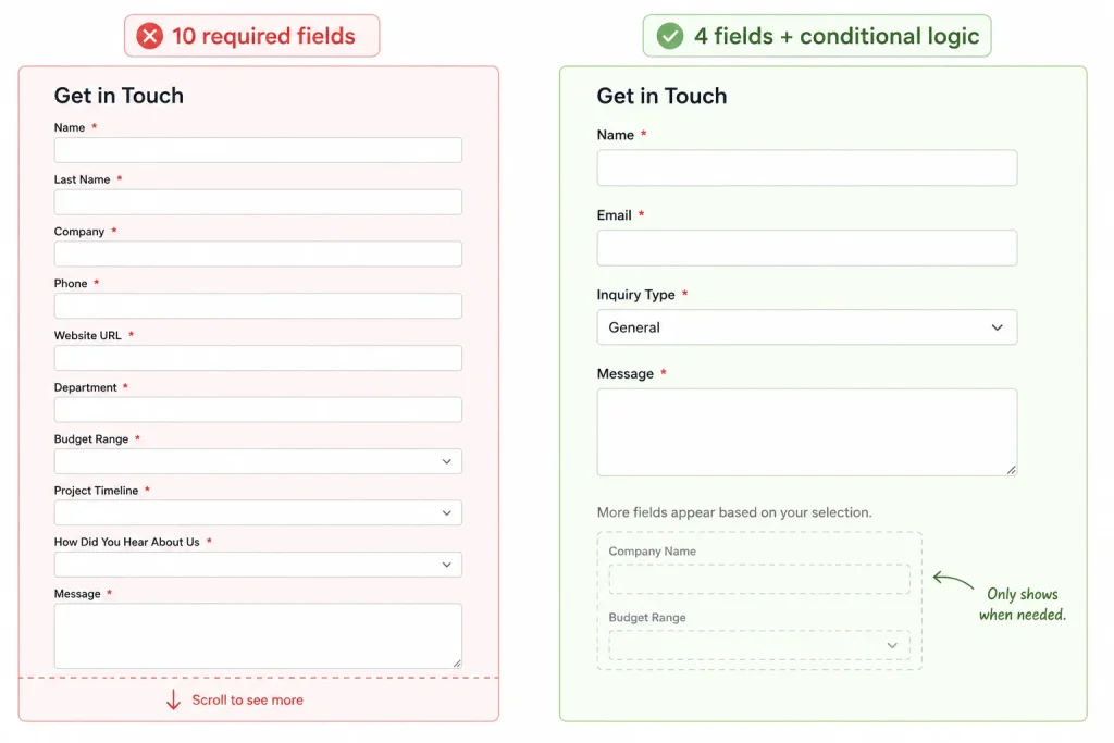
Every field you add is a decision you’re asking the visitor to make. Most people don’t abandon forms because the questions are hard. They abandon, because there are too many of them.
The fix isn’t cutting questions. It’s using conditional logic to show fields based on what the user selected. A visitor selecting “Partnership inquiry” sees different fields than one selecting “General question.” The form stays short for everyone.
How many fields should a contact form have?
Three to five fields covers almost every contact form: name, email, subject or inquiry type, and a message. Phone number and company name should be optional unless your workflow requires them. Every required field beyond five reduces your completion rate.
2. No confirmation after submission
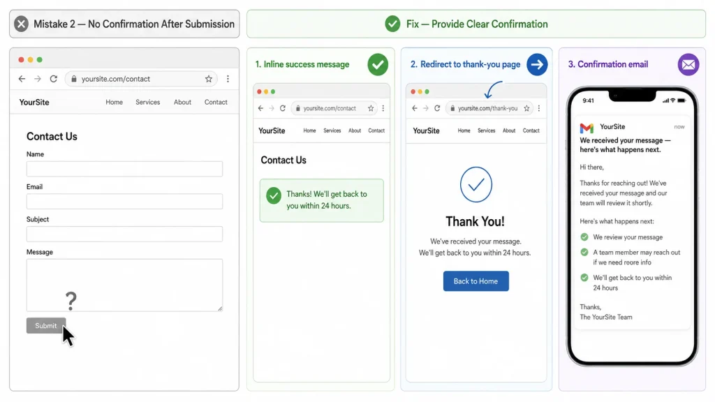
Silence after someone hits submit reads as failure. Most users assume the form didn’t work and either submit again or leave.
You have three options: an inline success message, a redirect to a thank-you page, or a confirmation email to the user. Use at least one. All three together give visitors the clearest signal their message arrived.
3. Your form emails aren’t arriving
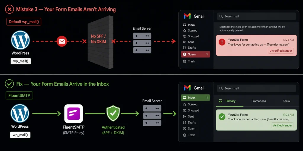
Your form looks like it’s working. The entry hits the database, but the notification email never arrives and you have no idea.
WordPress sends mail through wp_mail(), which calls PHP mail by default. Most shared hosting environments don’t configure proper SPF and DKIM authentication for outgoing mail. Gmail and Outlook treat unauthenticated mail as suspicious.
The emails land in spam or get dropped silently. No error, no bounce, no alert.
Why is my WordPress contact form not sending email?
WordPress’s default mail setup skips authentication entirely. It uses your server’s PHP mail function, which most hosting providers haven’t configured for deliverability. FluentSMTP has crossed 600,000 active installs on WordPress.org and fixes this for free.
It routes form notifications through an authenticated connection: Gmail, SendGrid, Amazon SES, Outlook, and others. After setup, send a test submission and confirm delivery.
Connect FluentSMTP using the setup guide to configure your sending connection.
4. You’re collecting garbage data
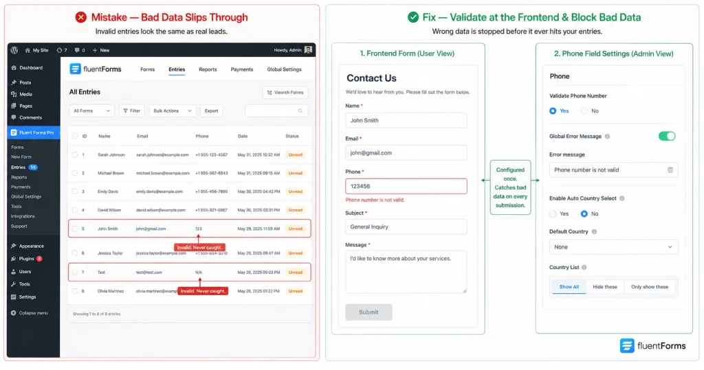
Spam protection stops bots. It doesn’t stop a real person typing “123,” “N/A,” or a 6-digit phone number into your form. The entry looks legitimate in the log. You follow up on a lead that was never real.
Phone fields need format validation, not only a required flag. Fluent Forms Pro includes a dedicated phone field with a “Validate Phone Number” toggle, a custom error message, and auto country detection. An invalid number never reaches your inbox.
5. Spam flooding your inbox
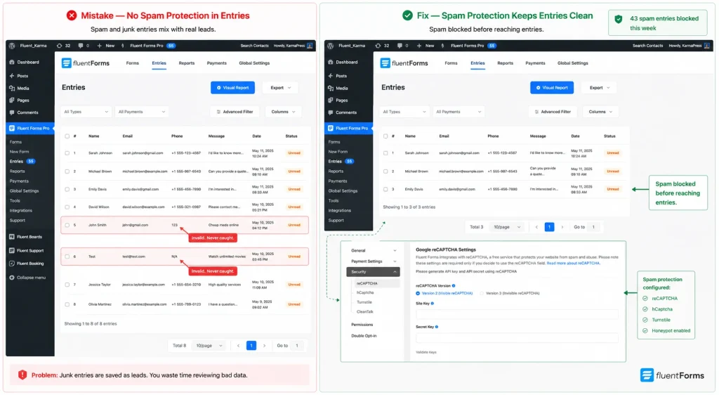
Bots scan every unprotected WordPress form. A contact form with no spam protection collects fake entries, promotional links, and occasionally malicious content alongside real submissions. Real inquiries get buried under fake ones.
Fluent Forms includes honeypot protection, hCaptcha, reCAPTCHA v2 and v3, Cloudflare Turnstile and Akismet integration. For most contact forms, honeypot plus reCAPTCHA v3 (invisible, no user friction) is the right combination. High bot volume? Add Akismet as a second filter layer.
Learn how to protect your online forms from spamming
6. CAPTCHA that punishes real users
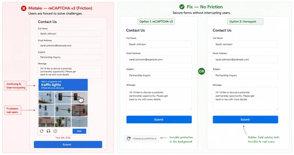
Old-style reCAPTCHA v2 asks users to identify fire hydrants, traffic lights, and bicycles across a grid of blurry images. That friction is a conversion problem, not a UX quirk.
reCAPTCHA v3 runs invisibly and scores each submission by behavior. Honeypot fields add a hidden input that bots fill in and humans don’t. No challenge, no friction. Either option blocks bots without slowing down real visitors. Fluent Forms supports both.
7. The form breaks on mobile
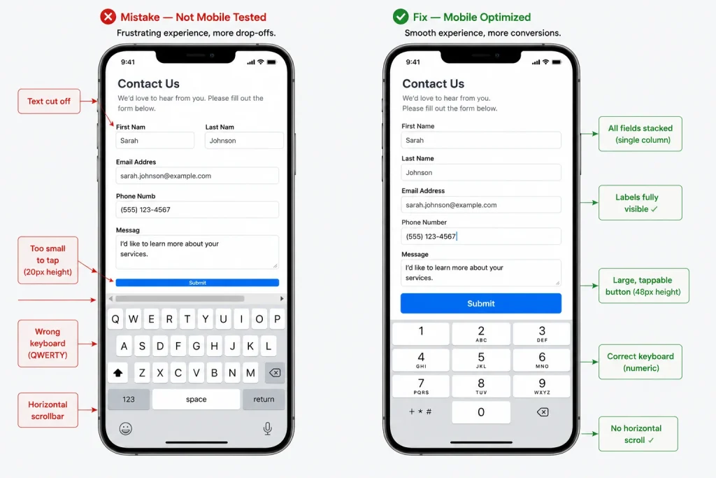
A form that works on desktop often breaks on a phone in ways the admin panel won’t reveal. Over 60% of global web traffic is mobile, according to Statista. The problem isn’t screen size. It’s how the form behaves.
Tap targets should be at least 44×44 pixels so buttons don’t require precision tapping. Phone number fields should trigger the numeric keyboard with inputmode=”numeric”. Forms should stack in a single column. Multi-column layouts create horizontal scrolling on a 375px screen.
Fluent Forms mobile preview lets you test all of this before the form goes live.
8. Long forms with no progress indicator
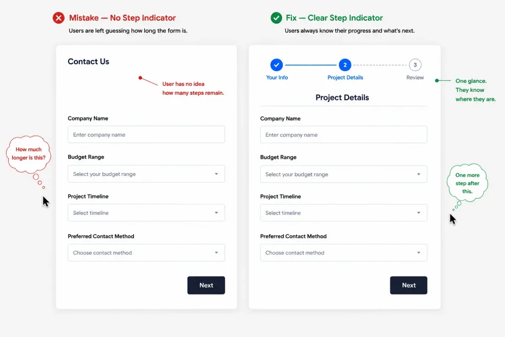
A multi-step form with no progress bar gives users no idea how far they’ve come or how much is left. Most users won’t guess. They’ll leave.
A visible step indicator, “Step 2 of 4,” sets the expectation upfront so users commit to finishing. It also makes the form feel shorter because progress is measurable.
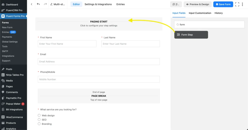
Fluent Forms includes a step progress bar for multi-step forms that shows the current step, total steps, and completion percentage.
9. Error messages that don’t help
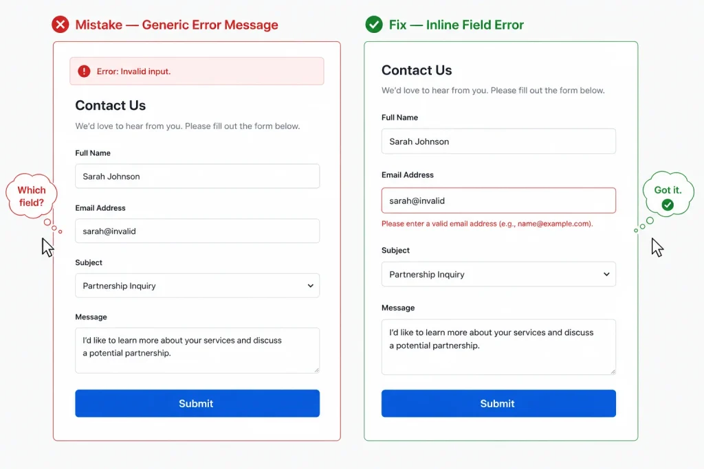
“Invalid input” is not an error message. “Please enter a valid email address” is. The difference between those two messages is the difference between a user fixing their mistake and a user abandoning the form.
Inline, field-level validation should tell users exactly what went wrong and what to enter instead. The message should appear next to the field where the error occurred, not at the top of the form after submit.
Fluent Forms lets you customize validation messages at the field level. Replace the defaults with plain language instructions.
10. No labels, or labels that disappear
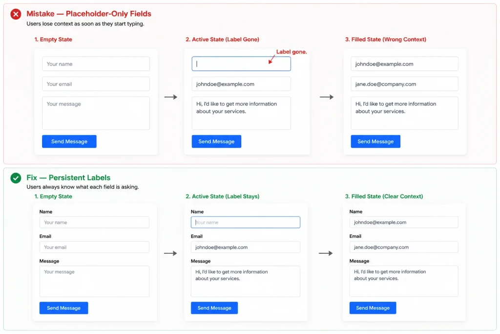
Placeholder text is not a label. It disappears the moment a user clicks into the field, which means anyone who gets distracted mid-form has to clear their input and re-click to remember what the field is asking.
WCAG 2.2 Success Criterion 1.3.5 requires that form inputs have programmatic labels. No visible label means higher abandonment, for screen reader users and everyone else.
11. The form doesn’t match the page
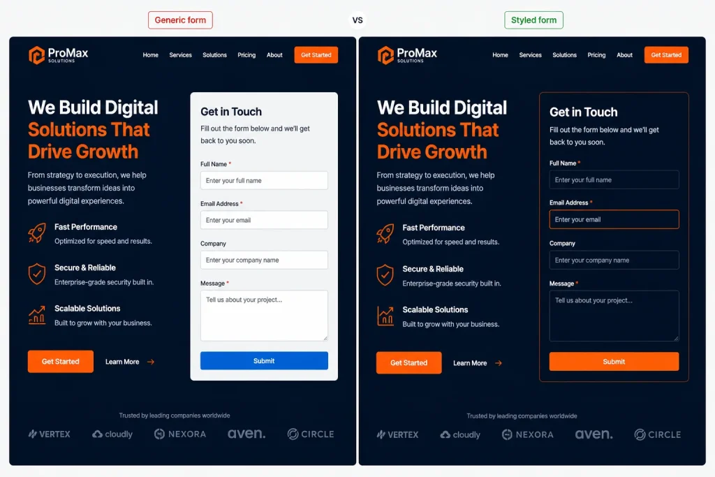
A generic grey form dropped onto a branded landing page signals to visitors that they’ve reached a bolt-on. The mismatch erodes trust before a visitor types a single character.
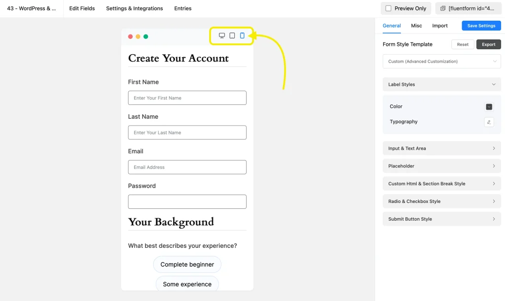
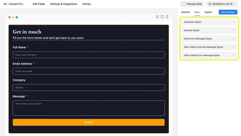
Your form should match the surrounding page: same font family, same button color, same border radius on inputs. Fluent Forms includes a form styler with controls for field padding, label typography, button styles, and focus states.
A form that visually belongs on the page gets completed more often than one that looks borrowed.
12. One form for every situation
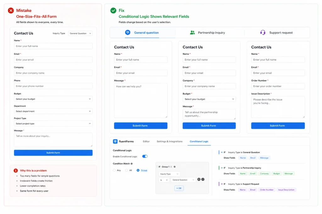
Using one form for every inquiry type means every visitor answers questions that don’t apply to them.
Conditional logic is the first solution: add a dropdown for inquiry type and show relevant fields based on the selection. Separate forms per campaign context convert better than a universal catch-all. Fluent Forms conditional logic handles both without code.
13. No thank-you page, only a message
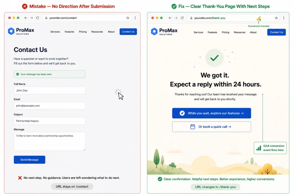
An inline success message tells the visitor their submission was received. A dedicated thank-you page does more.
A form thank-you page is where you direct users to a relevant resource, a product page, or a calendar booking link. It sets the expected response time and keeps the conversation moving forward.
It’s also where you fire a GA4 conversion event. Without a dedicated URL to track, form submissions don’t register as conversions in your analytics.
14. You’re not tracking submissions
Without tracking, you don’t know where people dropped off or which fields caused the friction. Every change you make to the form is a guess.
Fluent Forms logs every entry. Pair that with a GA4 form submission event on the thank-you page and you have two data layers: Fluent Forms entries vs. GA4 events. When the numbers don’t match, that gap is your drop-off rate.
15. Form rot: never auditing after launch
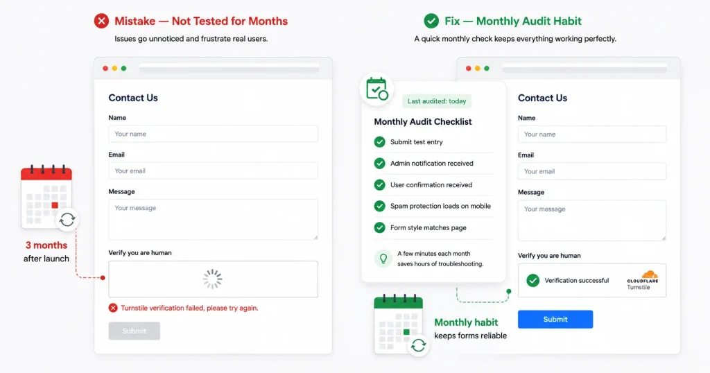
A form that worked on launch day will sometimes fail silently three months later. Plugin updates change how conditional logic rules resolve. CAPTCHA keys expire or misconfigure. Notification email addresses change when team members leave.
In March 2026, a site owner reported that their Cloudflare Turnstile appeared valid in settings. The dashboard confirmed the key as active. But the widget wasn’t loading on the frontend. Every real visitor got a “Turnstile verification failed” error.
Submissions never completed, so the log stayed empty and the admin showed nothing wrong. The form was blocking every visitor. The fix was a misconfiguration between the Appearance Mode setting in Fluent Forms and the Turnstile dashboard.
Five minutes of frontend testing would have caught it the day it broke. Build a monthly audit into your calendar: submit a test entry, confirm the notification arrives, check spam protection loads, verify the confirmation email lands in the inbox.
Quick Fix Checklist: 15-Minute Form Audit
Run this checklist against every form on your site once a month.
- Submit a test entry from the front end. Confirm it completes without errors.
- Check that the admin notification email arrives in the correct inbox, not spam.
- Check that the user confirmation email arrives and renders correctly.
- Load the form on a phone. Confirm single-column layout, correct keyboard types, tappable buttons.
- Count the required fields. If there are more than five, review each one.
- Check that every field has a visible label, not placeholder text only.
- Trigger a validation error intentionally. Confirm the message is specific and field-level.
- Check that spam protection (CAPTCHA or honeypot) loads and completes on the frontend.
- Confirm the thank-you page or success message fires after submission.
- Check that the form style still matches the surrounding page after any recent theme updates.
Most of These Fixes Take Under an Hour
Go check your contact form right now. Open it on your phone, fill it out, and submit it. Watch where the confirmation goes.
Most people haven’t done this since the day they set the form up. A lot will find something broken.
The mistakes in this guide don’t announce themselves. Your entry log looks normal. Your settings panel shows no errors. The only way to know is to test from the outside, the way a real visitor would.
Start with a test submission this week. Then put a reminder in your calendar to do it again next month.
Fluent Forms and FluentSMTP are there when you need them.

This is Sumit. He’s a physics major who’s trying to understand both the physical as well as the WordPress worlds. Whenever he’s not busy, plays fifa or spends time with his family.
-

13 Best Wireframing Tools in 2026: Free, AI & Paid Options
Compare 13 of the best wireframing tools for websites and -

Contact Form 7 vs Fluent Forms: Which one should you go for?
Learn the comparison between Fluent Forms vs Contact Form 7. -

How to Create an Event Registration Form on WordPress in Minutes
Discover how you can easily Make An Event Registration Form.
Leave a Reply
You must be logged in to post a comment.