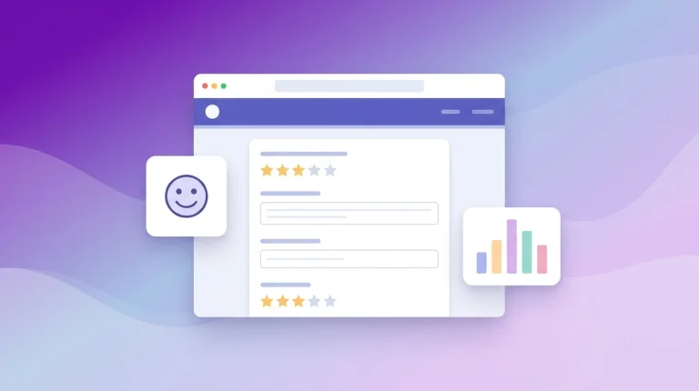
How to Create a High-Converting Affiliate Landing Page

Whether you’re promoting Amazon products, your own products, or other affiliate products, landing pages are one of the most important parts of your affiliate campaign — they’re the landing pad for converting visitors into customers.
But if you don’t have one with a clear call-to-action (CTA), compelling copy, and easy-to-read formatting, then you’re losing out on potential sales.
Having an unoptimized landing page — or no page at all — is one of the many mistakes affiliate marketers make.
After reading this article, you’ll know exactly how to create a high-converting affiliate landing page that leaves your visitors wanting more.
8 Tips for creating a high converting affiliate landing page:
- Keep your design simple
- Make your call-to-action pop
- Write high-converting marketing copy
- Write an engaging headline
- Let readers know what’s in it for them
- Include an amazon comparison table
- Include social proof
- Keep your page mobile-friendly
What Is an affiliate landing page?
An affiliate landing page is ultimately a page where you’re trying to persuade an audience to buy or subscribe to your affiliate’s product or service. They help your visitors decide as to whether they’ll take the next step and buy into whatever you’re selling.
While most people use the same structure for most or all of their landing pages, affiliate marketers should specifically tailor the landing page content to each product or service they’re promoting.
For example, if you want to sell a fitness program, you might tailor the landing page to focus on what the product can do for health or muscle gain. If you’re selling an email marketing software like FluentCRM, then you’ll want to focus on the value it provides, which could be things like better lead management, automated email sequencing, and email campaigns.
How to create a high-converting affiliate landing page
Now that you know what an affiliate landing page is, let’s discuss how to create one that converts.
1. Keep Your Design Simple
Regardless of what you’re selling, landing pages need to be simple. You want to ensure that your page doesn’t have too much going on — whether it’s just text or a combination of images and text.
Having an affiliate landing page with too many elements will distract the visitor and make it much more difficult for you to get them to take action. Instead, your landing page should focus on one specific aspect and offer the visitor a clear call to action.
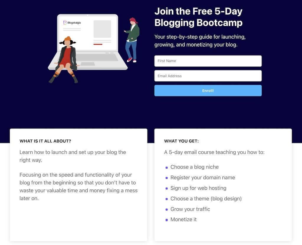
Below is an example of a great landing page with no navigation menu or sidebar with links, only a signup form. Once you enroll in the Bootcamp, you’ll get access to several valuable guides that contain affiliate links to a few products.
If you want to promote your affiliate’s newsletter, then use the landing page as an opportunity to let visitors know the type of content they’ll receive. If you’re promoting a product or service, then focus on how it can alleviate the problem that the visitor might be having.
2. Make your call-to-action pop
Along with keeping your affiliate landing page design simple, you also have to make sure it has a clear CTA that’s eye-catching and draws people in, so you can get as many clicks as possible.
One way to do this is by using a contrasting color or changing the format of your CTA, so it stands out from the rest of the content on the page.
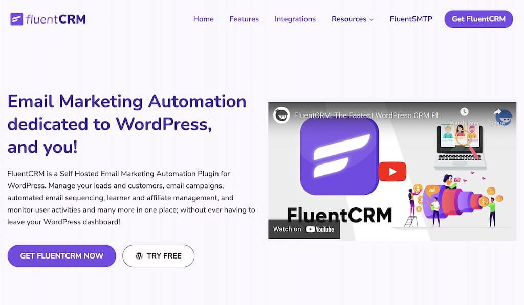
Below is an excellent example from FluentCRM. As you can see, the purple button stands out against the lighter background.
The more content you have on your landing page, the more often you should be using a CTA to increase conversions. A good place for one is right at the top of your page after the benefits statement. You should also use it at least once within your copy and finally again at the bottom.
This way, readers will have easy access to the affiliate links regardless of where they are on the page — conversions can happen at different points for different visitors.
Lastly, you want to use short commands, such as “join now,” “learn more,” “get started,” or “try for free.”
3. Write high-converting marketing copy
Your affiliate landing page should have a marketing message that’s written to appeal and relate to the visitor — whether it’s appealing to their sense of urgency by offering a limited-time discount or explaining how the product will solve some kind of problem for them.
You should also aim for brevity rather than verbosity. Keep things simple, short, and to the point.
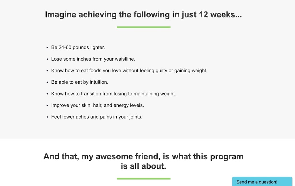
If you have a lengthy page, consider writing bullet points since they’re an excellent way to summarize the content and encourage visitors to engage with it.
Below is an example of a landing page that uses bullet points to tell visitors exactly what they’ll get from the product.
Writing an enticing copy is no easy task, but it’s one of the most crucial elements of a high-converting affiliate landing page.
Luckily, if you’re not good at writing marketing copy, you can use an AI copywriting tool to assist you.
For example, with some of these tools, all you have to do is add the name and description of your product, and they will automatically generate a compelling copy for you.
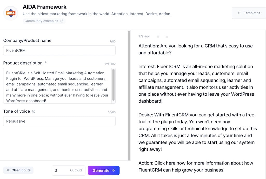
They can also generate other things such as product descriptions and engaging headlines — which brings us to the next tip for creating a high-converting affiliate landing page.
4. Write an engaging headline
While it might be tempting to want a landing page that focuses on having an eye-catching design, you also want to focus on your page’s headline.
This headline should highlight the benefit of whatever product or service you’re promoting and be clear and concise, just like the headline of an article would be.
Remember, a headline’s primary function is to grab your reader’s attention and motivate them to explore more.
Below is an example of Fluent Form’s headline. Just from reading it, you know what the product is all about.
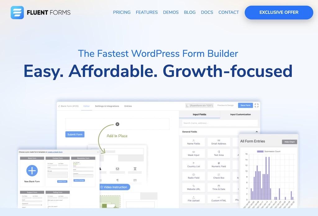
High-converting affiliate landing pages also have an image placed near the headline. This helps better communicate the offer to your visitors.
This is great not only for affiliate marketers but also for those selling their products or services.
5. Let readers know what’s in it for them
Once you’ve written your landing page headline, it’s time to write the text below it. This is often referred to as the “benefits statement.”
One common mistake affiliate marketers make is writing the features of the product they’re promoting. However, this statement should tell the reader how the product or service can change their life.
Going back to the FluentCRM example, you can see how the benefits statement mentions how the user can manage their leads, email campaigns, and automated email sequencing right from the WordPress dashboard.
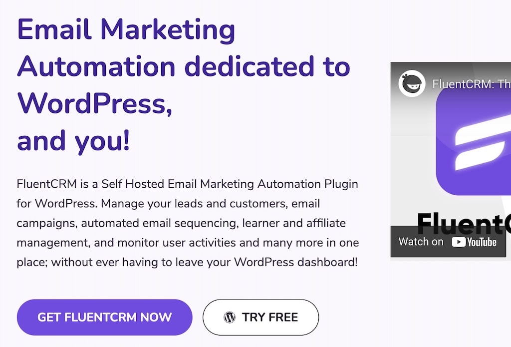
This tells the reader that this product will save them time and make their marketing process more efficient.
6. Include an amazon comparison table
There’s no denying that Amazon Associates is one of the biggest affiliate networks. If you’re part of this program, creating Amazon comparison tables for your affiliate landing pages can help increase conversions.
Nowadays, people do a lot of research before purchasing a product. Having an Amazon comparison table will ensure that visitors don’t leave your site to look for alternatives to the product being promoted since you’ll be displaying all of them right there.
One of the most powerful Amazon affiliates plugins for WordPress is AzonPress.
What’s cool about this plugin is that it allows you to quickly create Amazon comparison tables without the need for any coding knowledge.
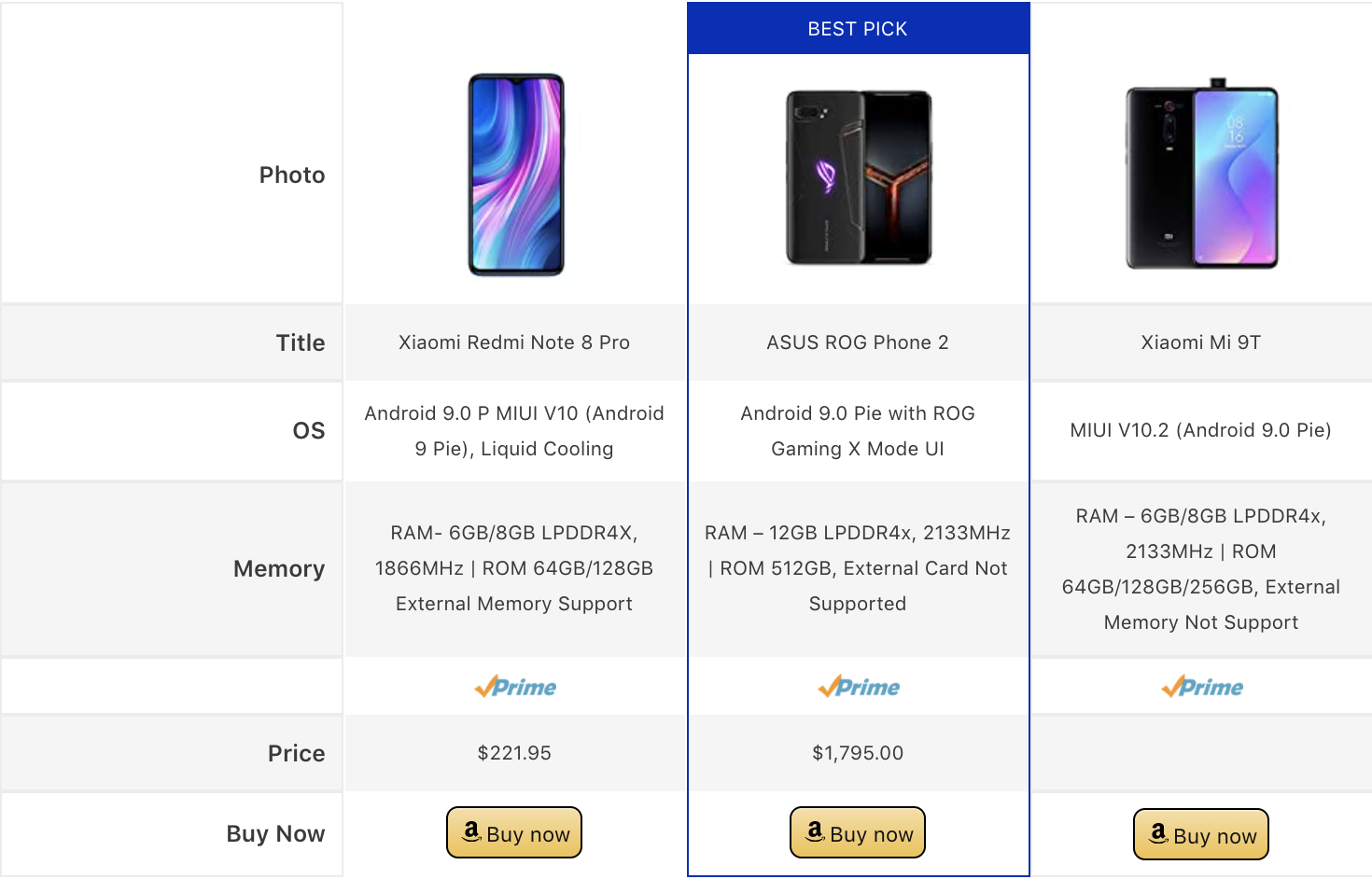
Once you install the plugin, you just have to connect your Amazon advertising API and begin searching for products.
The plugin will allow you to find Amazon products and automatically pull images, pricing, and prime status using the API — all from within your WordPress dashboard.
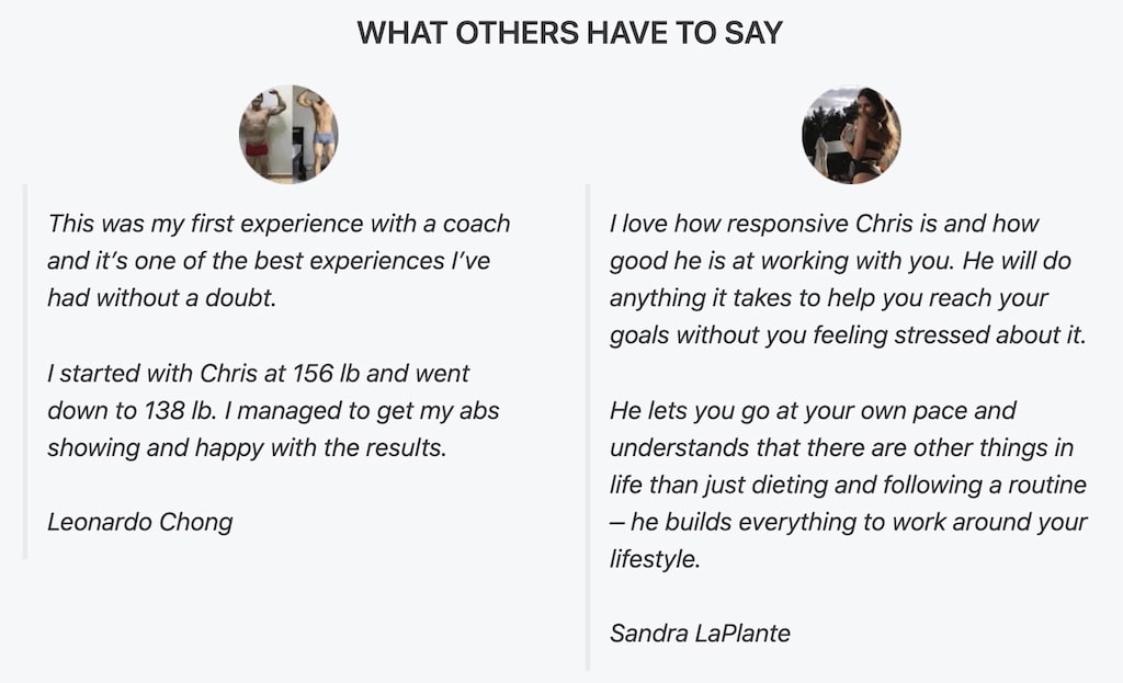
7. Include social proof
Social proof involves using testimonials and other means of demonstrating that the product has been approved by others who have used it before.
This will serve to give your affiliate landing page an added sense of credibility while also showcasing why other people would benefit from purchasing the product or service.
To use this effectively in your landing page, however, you’ll need to be sure to include their names and photos so that they come across as more personal and believable — this isn’t limited to people, you could also use the name of companies and their logos.
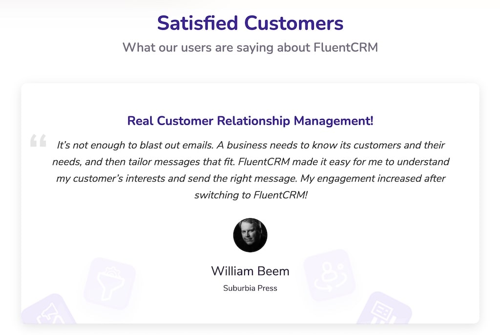
In the testimonial itself, you’ll want to include information about how much value this person got from the product or service, not just that they used it.
Below is an example of testimonials about 7Sigma Physique’s fitness coaching service.
If you’re also promoting some of your own products, such as online courses, testimonials are a great way to get customers to do your marketing for you.
8. Keep your page mobile-friendly
Today, more than 50% of web traffic comes from mobile. This means that you can’t afford to have an affiliate landing page that doesn’t look good on mobile devices. If your page isn’t optimized for mobile users, they will abandon your site, and your conversions will take a hit — fast.
So make sure that you’re using a mobile-responsive WordPress theme, keeping clickable elements separate enough, and using decent-sized fonts.
9. Use tables for affiliate products
Affiliate marketers can get the right audience to engage and convert easily if the product they’re reviewing or promoting is displayed in a smart tabular manner. Affiliate product tables can showcase product price, discount, and any other information necessary.
Some of the high-converting product tables are comparison tables, pros and cons tables, discount an deal highlight table, product roundup tables, and product review tables. And you can create any of these with Ninja Tables.
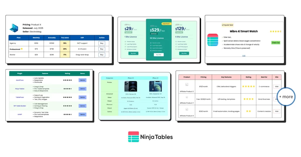
Check out some table templates as an affiliate marketer, customize whatever you need, and earn more commissions!
Start Earning More!
It’s common for affiliate marketers to overlook the importance of a landing page. That’s why it pays off to put just as much effort into your design and content creation process as you do with other aspects of marketing.
It can be tempting to cut corners because that won’t help you convert more visitors into customers. By including some — or all — of these tips, your revenue can increase tremendously.
Which one are you going to start using today?
Author: Christian Coulson
Christian is an industrial engineer who’s used his knowledge and experience to grow 7Sigma Physiques—his fitness coaching business and blog with thousands of monthly readers. He now teaches other entrepreneurs how to scale their business at Blogstalgia.
-
BFCM 2026 Preparation: The Complete Black Friday Cyber Monday Playbook
Your complete BFCM 2026 preparation guide Black Friday Cyber Monday -
How to Manage Client Feedback in WordPress Without Losing Track
Learn how to manage client feedback in WordPress with simple -
Customer Satisfaction Survey: Types, Questions, and Steps to Create
Customer satisfaction survey is important to gather feedback of your
Leave a Reply
You must be logged in to post a comment.