
Charts vs Tables in WordPress: When to Use Each (with Examples)

If your website handles lots of dynamic data, it’s best to keep everything organized in tables and charts. But you’ll face the same question once or twice: should this data be displayed as a table or as a chart?
The answer depends more on clarity, readability, and intent than on aesthetics. People interact with visualized data differently depending on whether they are looking for exact values or trying to understand patterns.
Choosing the wrong format of data display can make useful info feel confusing or overwhelming. You need to be clear about either using tables or charts.
This article will discuss the differences, use cases, and facts of both charts and tables.
Key Takeaways
- Tables = exact details. Use tables when readers need precise values, side-by-side comparisons, and the ability to scan, sort, filter, or search.
- Charts = quick insight. Use charts when your goal is to highlight trends, proportions, changes over time, or performance patterns at a glance.
- Match format to intent, not aesthetics. If your reader wants to verify numbers, go table. If they want to understand what’s happening, go chart.
- Pricing + comparisons usually belong in tables. Plan features, limits, and tool comparisons need line-by-line clarity—charts often hide the nuance.
- Reports work best with both. Use a chart to show the story (growth/decline) and a table underneath for the breakdown (revenue, cost, margin, etc.).
- Best workflow: build once, reuse everywhere. Create structured datasets in Ninja Tables, then convert the same data into visuals with Ninja Charts, no duplicate work.
Charts Vs Tables: The Core Difference
Tables and charts solve different problems but both have the same goal – help people understand the data.
Tables present precise values in a structured grid with header, columns, and rows. They are for comparing details, scanning multiple attributes, or verifying specific numbers.
On the other hand, charts transform raw data into visual patterns. They help understand trends, proportions, or performance shifts quickly without reading every individual number.
If you want accuracy and side-by-side comparison, a table is usually the right choice. And if you want insight and pattern, a chart becomes more effective.
The difference between chart and table in short:
- Tables show exact values
- Charts show patterns and relationships
Understanding this distinction is the foundation of effective data visualization in WordPress.
When to Use a Table in WordPress
Tables are best when specificity matters. They allow readers to examine data row by row and make detailed comparisons.
For example, affiliate websites that compare software tools rely heavily on comparison tables. Visitors want to see prices, feature lists, integrations, ratings, and limitations clearly aligned. Using a chart in this case would oversimplify that data and hide nuance.
But a well-structured table with search, sort, and filtering options, helps users make confident decisions.
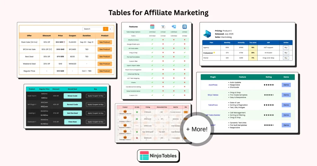
|| 11 high-converting tables for affiliates
Pricing pages follow the same principle. SaaS companies and agencies use pricing tables because customers need to compare plan features line by line. Storage limits, user caps, support levels, and included tools must be visible simultaneously.
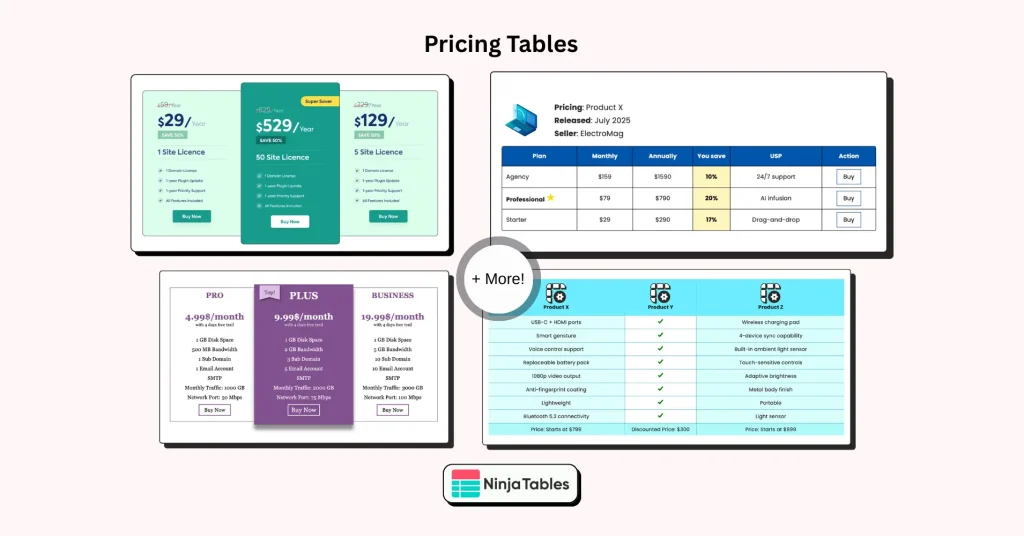
Tables are also better for large datasets, such as directories, resource lists, product tables, or feature comparisons. With WordPress table plugins likeNinja Tables, you can add search, filters, and responsive layouts to your tables.
Use a table when:
- You’re showing pricing plans with multiple features or price tiers
- You’re publishing a product comparison
- Readers need to scan and compare side by side
- Users may need to sort, filter, or search the data
- Exact values matter for decision-making
- You’re presenting specifications, limits, or technical details
When to Use a Chart in WordPress
Charts are perfect when your goal is understanding rather than inspection. They reduce cognitive load by transforming numbers into shapes, lines, and portions.
If you are publishing traffic growth, revenue reports, or performance comparisons, charts allow readers to grasp the big picture instantly with a visual summary.
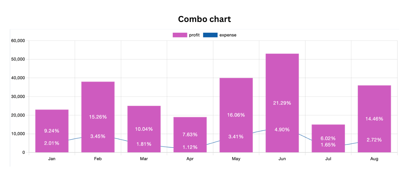
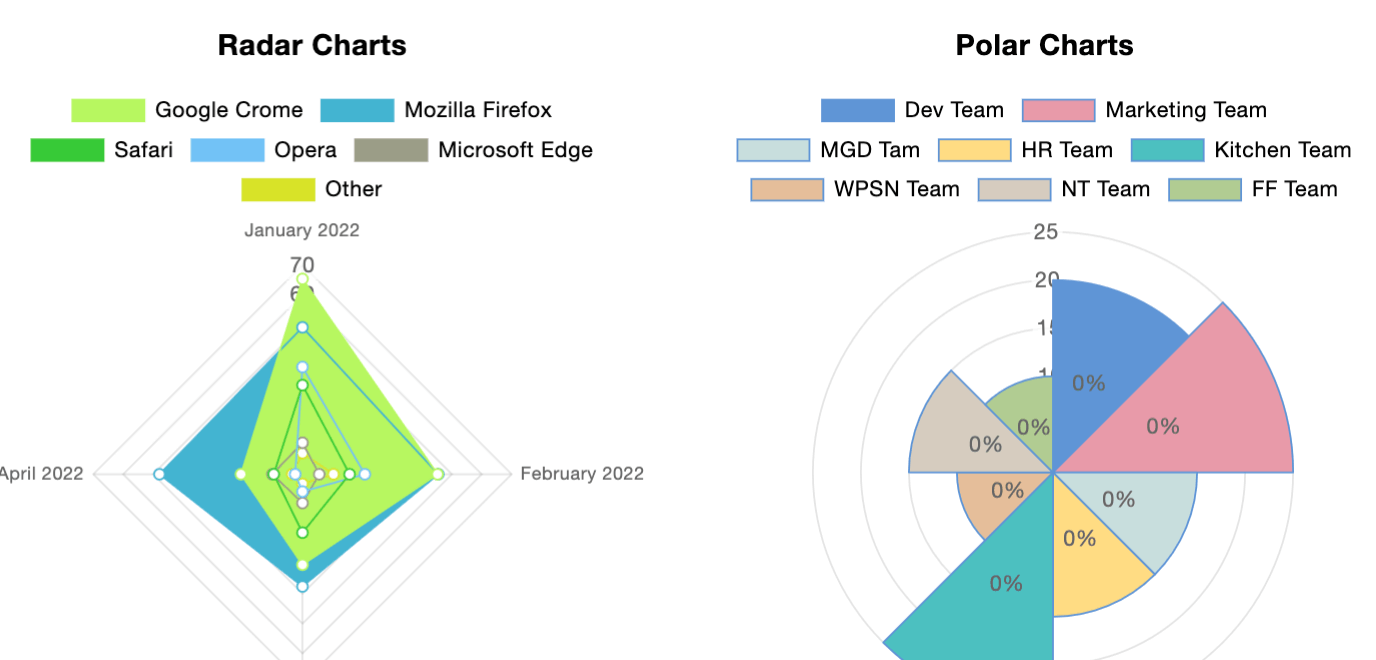
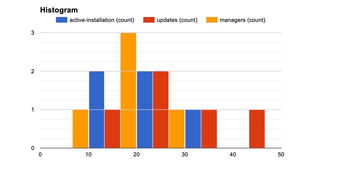
A line chart is ideal for showing change over time like monthly sales growth or website traffic trends. Pie charts are effective for visualizing proportions, such as budget allocation or traffic sources.
| Chart 1 | Chart 2 | Chart 3 |
|---|---|---|
 |  | 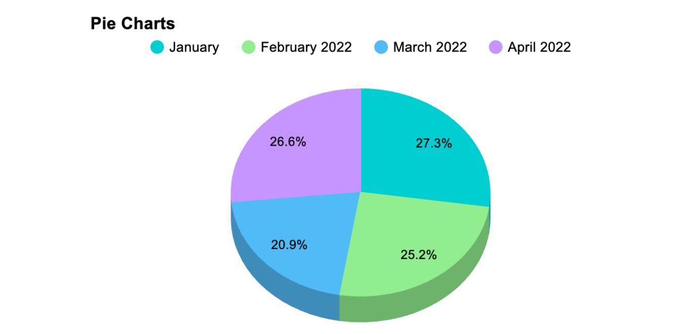 |
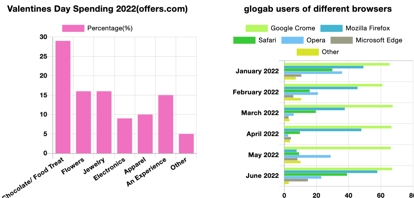 | 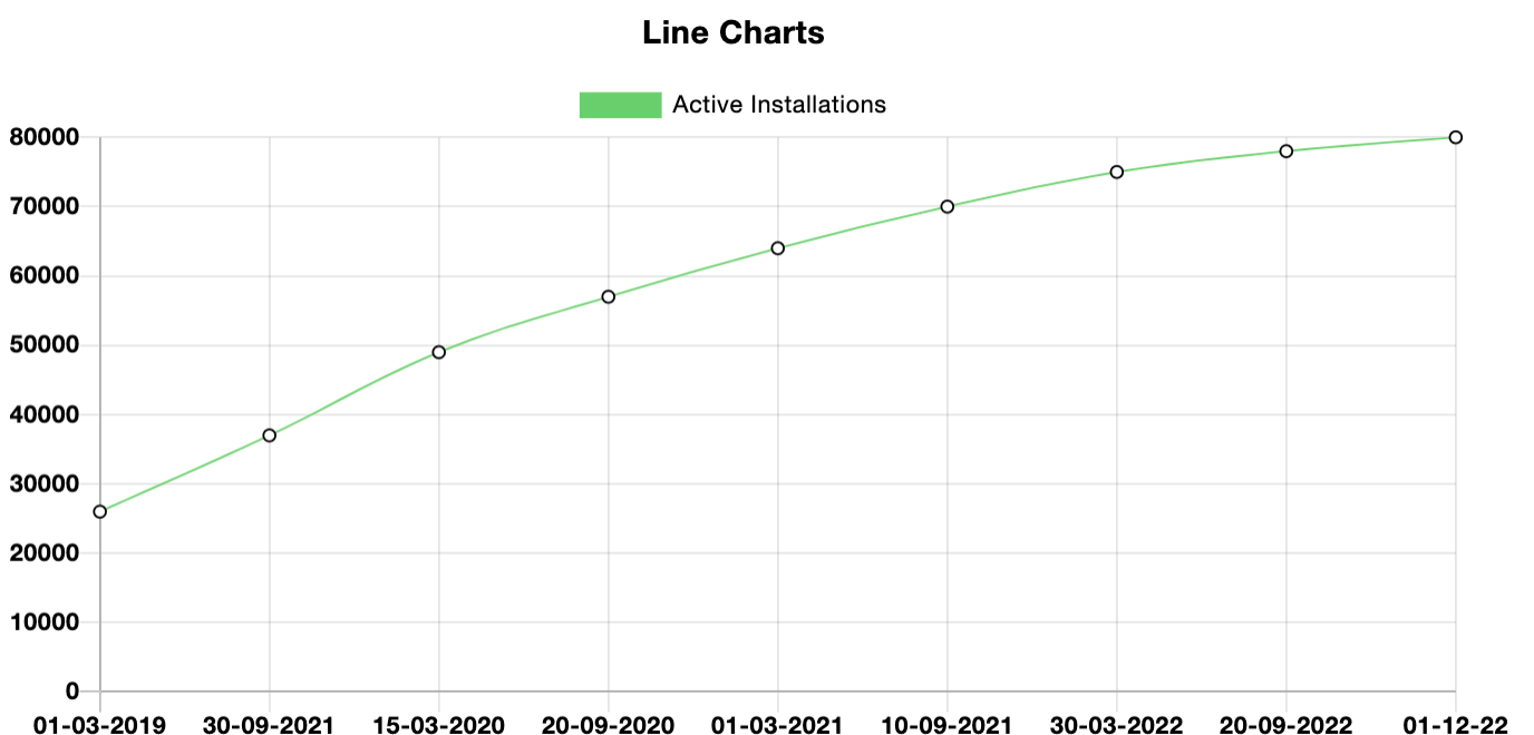 |  |
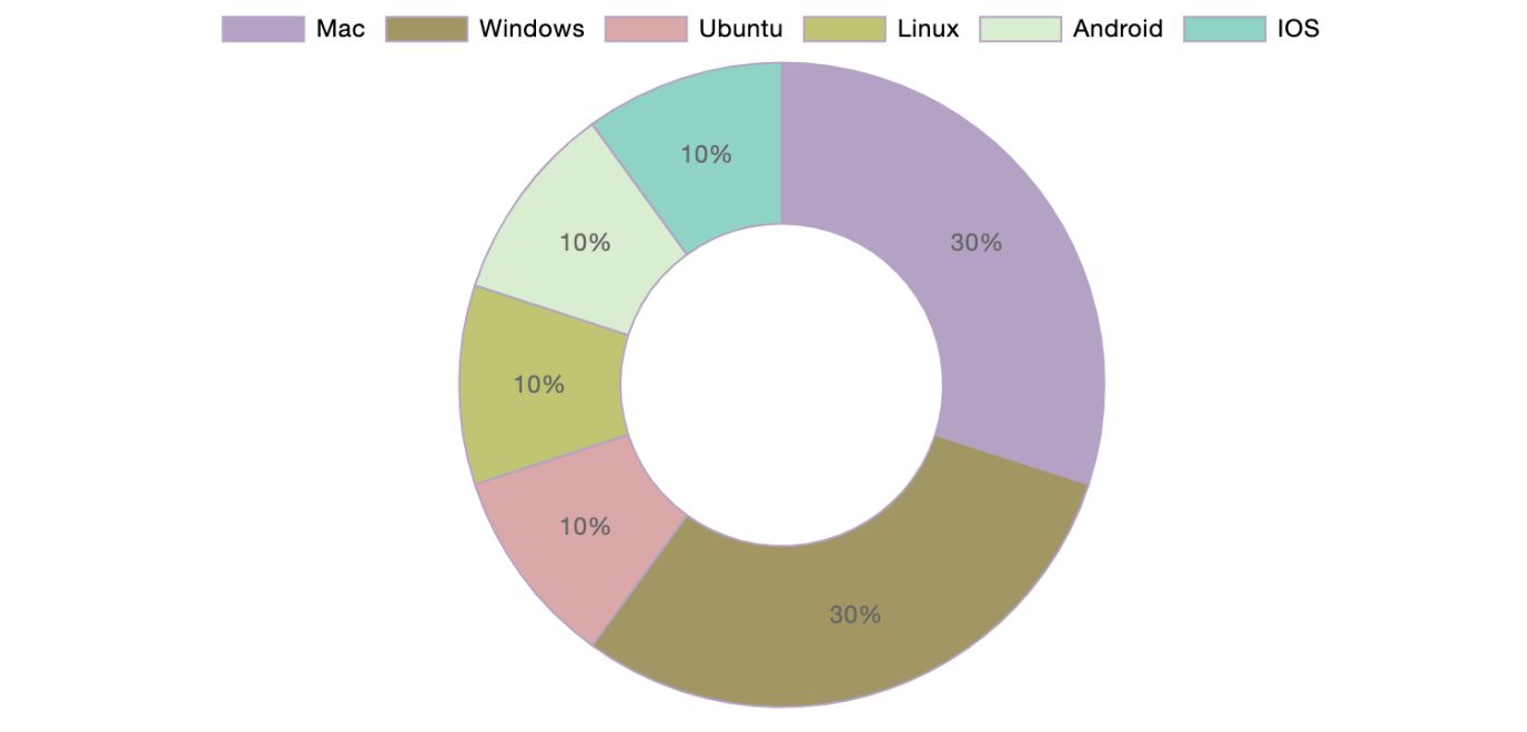 |  |  |
 |  |  |
These formats make interactive charts valuable for educators, agencies, and business sites that publish ongoing reports.
Use a chart when you’re:
- Showing growth over time
- Presenting survey results
- Explaining proportions
- Highlighting performance improvements
- Visualizing data story instead of raw numbers
WordPress Charts and Tables: Real Examples
Here are some everyday examples of different websites using charts and tables.
SaaS or Agency Pricing Page
A pricing page always relies on a pricing table. Potential buyers need to compare plan features, limits, support levels, and add-ons. The table makes differences instantly visible and prevents confusion.
PRO | Top! PLUS | BUSINESS |
4.99$/month with 4 days free trail | 9.99$/month with 4 days free trail | 19.99$/month with 4 days free trail |
1 GB Disk Space | 1 GB Disk Space | 1 GB Disk Space |
500 MB Bandwidth | 2 GB Bandwidth | 5 GB Bandwidth |
1 Sub Domain | 3 Sub Domain | 10 Sub Domain |
1 Email Account | 5 Email Account | 10 Email Account |
SMTP | SMTP | SMTP |
Monthly Traffic: 1000 GB | Monthly Traffic: 2000 GB | Monthly Traffic: 3000 GB |
Network Port: 50 Mbps | Network Port: 75 Mbps | Network Port: 100 Mbps |
If the company wants to highlight growth over time, such as “monthly revenue trend chart” a small line chart can support that claim on the page.
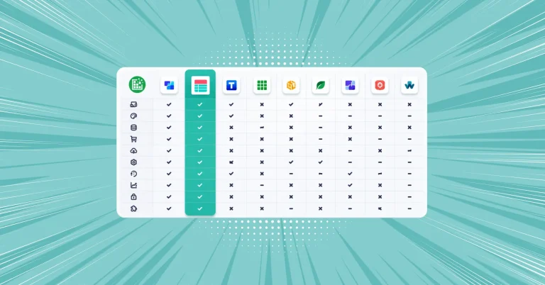
Comparing Tools or Products
A side by side comparison of products or tools in a table can include features, pricing, and integrations. People expect to scan differences quickly without reading long paragraphs.
| Features |  | |||
|---|---|---|---|---|
| Table Design Options | Unlimited | Limited | Unlimited | Limited |
| Colors | Unlimited | Limited | Unlimited | Limited |
| WooCommerce | ||||
| FluentCart table | ||||
| Google Sheets sync | ||||
| WP Posts table | ||||
| Drag & Drop | ||||
| Pre-built templates | ||||
| Custom filter | ||||
| Export-Import Table | ||||
| One-click Migrate from TablePress | ||||
| Fluent Forms integration | ||||
| Advanced Styling | ||||
| ACF Field Mapping | ||||
| Charts | ||||
| Conditional formatting | ||||
| Value transformation | ||||
| Custom CSS | ||||
| Trash/restore |
If you need to show units of product sold, a simple bar chart can summarize which tool was sold the most.
|| Check out 7 types of comparison charts you can use to compare different sets of variables
Business Report or Monthly Update
Many businesses publish monthly traffic, revenue, or performance updates. A line chart works best because it shows growth or decline.
Below that, a detailed table can list revenue, cost, profit margin, etc with custom filters and table design.
| Product | Category | Units Sold | Revenue | Cost | Profit Margin | Stock Remaining | Back Order |
|---|---|---|---|---|---|---|---|
| SmartWatch X | Electronics | 420 | $25200 | $14800 | 41.3% | 180 | No |
| Panda mask | Sleep-wear | 180 | $200 | $1400 | 20.3% | 280 | No |
| Yoga Mat Pro | Fitness | 380 | $11400 | $6200 | 45.6% | 220 | No |
| Coffee Beans | Grocery | 520 | $8320 | $4500 | 45.9% | 300 | No |
| Happy Hair | Beauty, Hair care | 320 | $3420 | $4005 | 4.5% | 150 | No |
| Wireless Earbuds | Electronics | 600 | $30000 | $18000 | 40.0% | 150 | Yes |
| Avocados | Grocery | 200 | $3000 | $1800 | 50.0% | 270 | Yes |
| Happy Skin | Beauty, Serum | 340 | $13600 | $7000 | 48.5% | 260 | Yes |
|| Check Sales data visualization with tables and charts
Using Tables and Charts Together in WordPress
Most business websites don’t need to choose between tables or charts. They need both.
The important part is making them work smoothly together.
If you’re already managing a data table in WordPress, you shouldn’t have to rebuild the same information just to create a chart. Ideally, your chart plugin should be able to use the data from your existing tables. That way, you enter your data once and decide how to display it depending on the context.
For example, you can create comparison tables, pricing tables, or structured datasets using Ninja Tables. Then, using Ninja Charts, you can turn that same data into line charts, bar charts, or pie charts without starting from scratch.
This Ninja Tables and Ninja Charts integration keeps your workflow simple. Once both are active, you can decide whether to present your data as a table, a chart, or both.
Step 1: Build the Data Table
Use Ninja Tables to:
- Create data table
- Enable search and filters
- Build custom layouts
Step 2: Turn Table Entries into Chart
Use Ninja Charts to:
- Select table data columns
- Convert them into line, bar, pie, or area charts
- Display interactive charts directly inside posts
Instead of thinking charts vs tables for WordPress, think flexibility.
||Bonus tip: You can also use Fluent Forms data to create a chart in Ninja Charts.
Charts vs Tables for WordPress: The Bottom Line
Choosing between charts and tables in WordPress comes down to purpose.
Use tables when readers need exact numbers, structured comparisons, and side-by-side clarity. Use charts when you want to highlight trends, proportions, or performance patterns at a glance.
In many cases, the strongest content uses both. A table provides detail and accuracy. A chart delivers quick insight and visual impact.
For bloggers, agencies, educators, and business sites publishing data regularly, the goal isn’t to pick one format forever. It’s to present information in the way that best serves the reader. With the right tools, you can manage your data efficiently and display it as a comparison table, pricing table, or interactive chart whenever it makes sense.
Make charts and tables work effectively in WordPress using Ninja Tables and Ninja Charts.
-
10 Best TablePress Alternatives in 2026 (For Every Use Case)
TablePress works for simple tables. When you need a more -

Designing Big Data Tables: UI/UX Principles and Best Practices
Designing big data tables requires more than clean layouts. Insights -

Ninja Tables for Modern eCommerce: FluentCart Product Table (and More!)
Exciting news for Ninja Tables lovers. Your favourite table plugin
Leave a Reply
You must be logged in to post a comment.