
WPPayForm comes up with 12 general input fields that can be used when it comes to creating payment forms on your site. You will find all the input fields under the General Fields section located in the right sidebar on the plugin dashboard.
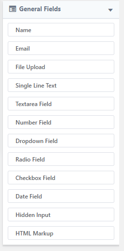
Let’s have a look at the detailed approach of each input field.
Customer Email
Customer Email input field is used to add an email input field in your payment form. This input field comprises 5 options to configure. They are given below:
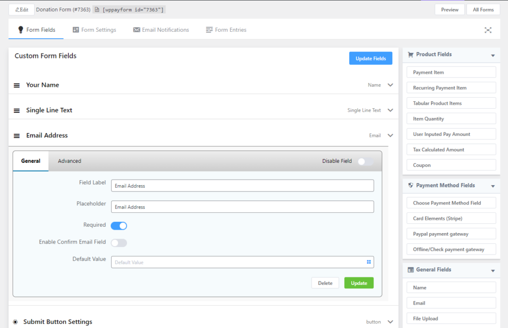
- Field Label: This option is used to give a label (sub-title) of this input field.
- Placeholder: This is used to provide the placeholder name. This option will provide a hint that is the expected value, which gets displayed before the user enters a value, for example, you can use here “Type your email address” as a placeholder.
- Required: This option allows you to enable and disable the field make as mandatory. The required option specifies that the input field must be filled out before submitting the form.
- Default Value: Using this option you can display a default value that will display by default when the form will open.
- Field ID: This is an ID of this input field and it will be used when it comes to adding any custom CSS for this specific field.
Customer Name
Customer Name is another input field that is used in the payment form to take the client’s name while completing the payment form. This input field includes 5 options to configure. They are given below:
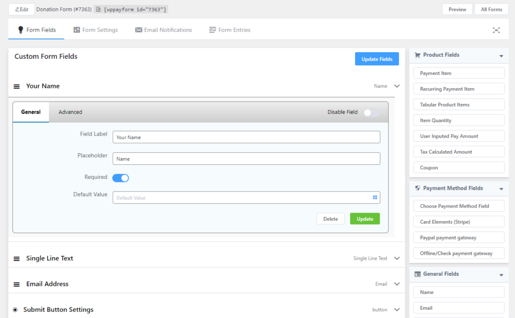
- Field Label: This option is used to give a label (sub-title) of this input field.
- Placeholder: This is used to provide the placeholder name. This option will provide a hint that is the expected value, which gets displayed before the user enters a value, for example, you can use here “Type your name” as a placeholder.
- Required: This option allows you to enable and disable the field make as mandatory. The required option specifies that the input field must be filled out before submitting the form.
- Default Value: Using this option you can display a default value that will display by default when the form will open.
- Field ID: This is an ID of this input field and it will be used when it comes to adding any custom CSS for this specific field.
File Upload
File Upload input can be used if you want your user to upload single or multiple files while submitting the form. It has 6 options:
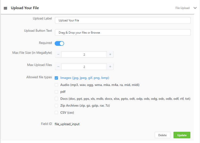
- Upload Label: This option is used to give a label (sub-title) of this input field.
- Upload Button Text: This text will be shown on the button.
- Required: This option allows you to enable and disable the field make as mandatory. The required option specifies that the input field must be filled out before submitting the form.
- Max File Size: The maximum size of a file that is allowed to upload. This option is important if you are really concerned about your hosting storage. Suppose you want your user to submit a pdf form of 2-3 page, so you can limit there upload max file size to 2 megabytes by putting 2.
- Max Upload Files: How many files can be uploaded. If you want a single file: put 1, or for multiple files put your desired number.
- Allowed file types: It’s an important option to keep an unwanted attacker away. You can select the type of files the user can upload here. There are several file types of check-boxes. You can select one or multiple options here.
- Field ID: This is an ID of this input field and it will be used when it comes to adding any custom CSS for this specific field.
Single-Line Text
Single-Line Text is the next input field that is used in the payment form to specify anything required while completing the payment form. For instance, if you sell football, you can use this input field to specify the size of the football using this input field. This input field includes 5 options to configure. They are given below:
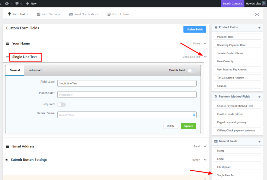
- Field Label: This option is used to give a label (sub-title) of this input field.
- Placeholder: This is used to provide the placeholder name. This option will provide a hint that is the expected value, which gets displayed before the user enters a value, for example, you can use here “Size of the football” as a placeholder.
- Required: This option allows you to enable and disable the field make as mandatory. The required option specifies that the input field must be filled out before submitting the form.
- Default Value: Using this option you can display a default value that will display by default when the form will open.
- Field ID: This is an ID of this input field and it will be used when it comes to adding any custom CSS for this specific field.
Textarea Field
Textarea Field is one of the important input fields that is used in the payment form to specify a minimum or a maximum number of characters that may be entered into while completing the payment form. For instance, if you want to have the address of your clients, you can use this input field. This input field includes 4 options to configure. They are given below:
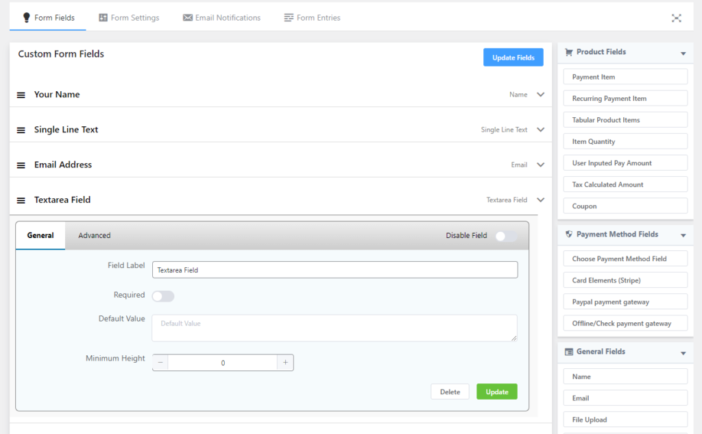
- Field Label: This option is used to give a label (sub-title) of this input field.
- Required: This option allows you to enable and disable the field make as mandatory. The required option specifies that the input field must be filled out before submitting the form.
- Default Value: Using this option you can display a default value that will display by default when the form will open.
- Field ID: This is an ID of this input field and it will be used when it comes to adding any custom CSS for this specific field.
Number Field
Number Field is another important input field that is used in the payment form to specify any numeric value while completing the payment form. For instance, if you want to have a cell or telephone number of your clients, you can use this input field. This input field includes 6 options to configure. They are given below:
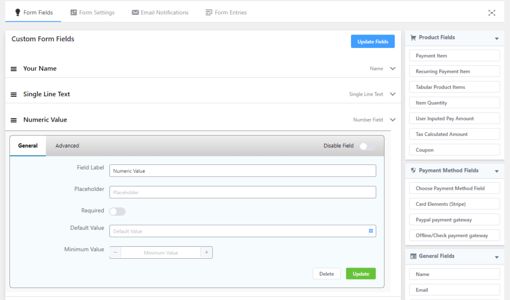
- Field Label: This option is used to give a label (sub-title) of this input field.
- Placeholder: This is used to provide the placeholder name. This option will provide a hint that is the expected value, which gets displayed before the user enters a value, for example, you can use here “Size of the football” as a placeholder.
- Required: This option allows you to enable and disable the field make as mandatory. The required option specifies that the input field must be filled out before submitting the form.
- Default Value: Using this option you can display a default value that will display by default when the form will open.
- Minimum Value: This option lets you provide a minimum value of the input field. You can a manimal number using the option.
- Field ID: This is an ID of this input field and it will be used when it comes to adding any custom CSS for this specific field.
Dropdown Field
Dropdown Field is another input field that is used in the payment form to add multiple values with its label in a form of the
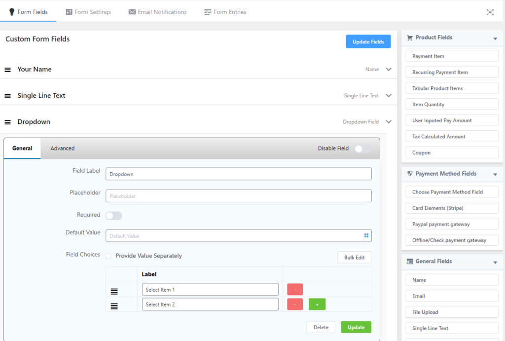
- Field Label: This option is used to give a label (sub-title) of this input field.
- Placeholder: This is used to provide the placeholder name. This option will provide a hint that is the expected value, which gets displayed before the user enters a value, for example, you can use here “Choose one size from the rest” as a placeholder.
- Required: This option allows you to enable and disable the field make as mandatory. The required option specifies that the input field must be filled out before submitting the form.
- Default Value: Using this option you can display a default value that will display by default when the form will open.
- Field Choices: This option lets you provide an opportunity to have multiple options in the form of the dropdown menu. There is a checkbox that will allow you to provide value and label separately.
- Field ID: This is an ID of this input field and it will be used when it comes to adding any custom CSS for this specific field.
Radio Field
Radio Field is another input field that is used in the payment form to select one from the multiple values with its label in a form of radio button while completing the payment form. Users just can select a single option from multiple options. For instance, if you want to provide clients with multiple options, you can use this input field. This input field includes 6 options to configure. They are given below:
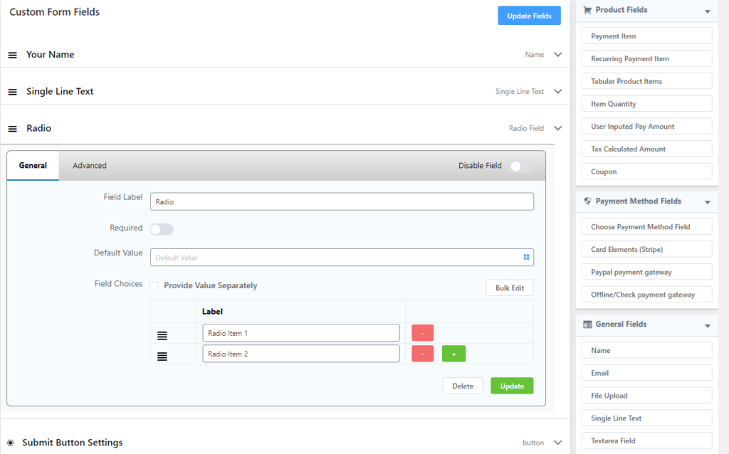
- Field Label: This option is used to give a label (sub-title) of this input field.
- Placeholder: This is used to provide the placeholder name. This option will provide a hint that is the expected value, which gets displayed before the user enters a value, for example, you can use here “Select the actual size” as a placeholder.
- Required: This option allows you to enable and disable the field make as mandatory. The required option specifies that the input field must be filled out before submitting the form.
- Default Value: Using this option you can display a default value that will display by default when the form will open.
- Field Choices: This option lets you provide an opportunity to have multiple options in the input field. There is a checkbox that will allow you to provide value and label separately.
- Field ID: This is an ID of this input field and it will be used when it comes to adding any custom CSS for this specific field.
Checkbox Field
Checkbox Field is an input field that is used in the payment form to add multiple values with multiple selections in a form of checkbox button while completing the payment form. For instance, if you want to provide clients with multiple options with multiple selections, you can use this input field. This input field includes 5 options to configure. They are given below:
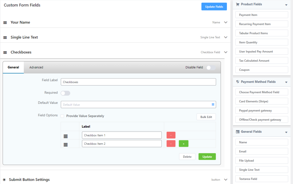
- Field Label: This option is used to give a label (sub-title) of this input field.
- Required: This option allows you to enable and disable the field make as mandatory. The required option specifies that the input field must be filled out before submitting the form.
- Default Value: Using this option you can display a default value that will display by default when the form will open.
- Field Choices: This option lets you provide an opportunity to have multiple options with multiple selections in the input field. There is a checkbox that will allow you to provide value and label separately.
- Field ID: This is an ID of this input field and it will be used when it comes to adding any custom CSS for this specific field.
Date Field
Date Field is an input field that is used in the payment form to add a specific date format into your payment form with its label while completing the payment form. For instance, if you want to provide clients with an option so that they can put
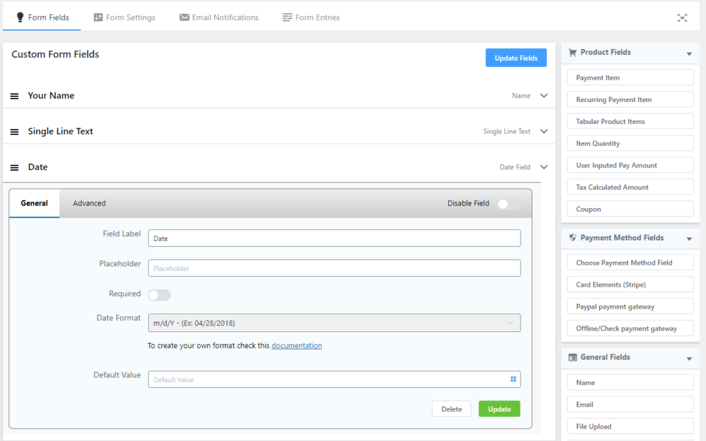
- Field Label: This option is used to give a label (sub-title) of this input field.
- Placeholder: This is used to provide the placeholder name. This option will provide a hint that is the expected value, which gets displayed before the user enters a value, for example, you can use here “Type your age” as a placeholder.
- Required: This option allows you to enable and disable the field make as mandatory. The required option specifies that the input field must be filled out before submitting the form.
- Date Formate: This option will allow you to add the specific data format into the payment form. There are 8 different predefined date formats available in this option.
- Default Value: Using this option you can display a default value that will display by default when the form will open.
- Field ID: This is an ID of this input field and it will be used when it comes to adding any custom CSS for this specific field.
Hidden Input
This is another input field. This Hidden F
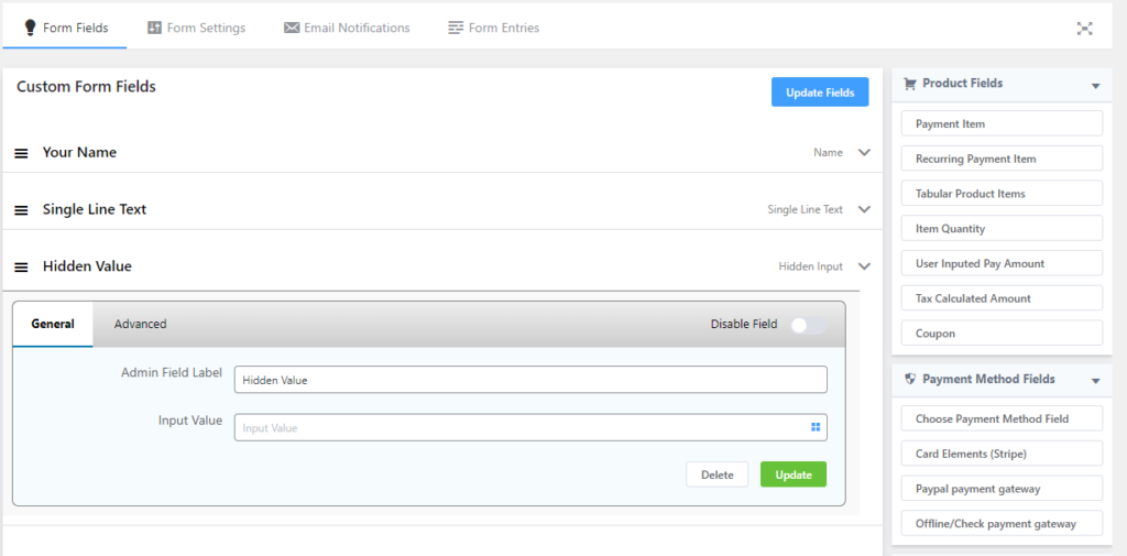
- Admin Field Label: This option is used to show a different label for your admin users when they view the form submissions you can configure that using this option. This will not affect the form rather only for administrative purposes.
- Input Value: This option defines the specific value that a developer wants to pass.
- Field ID: This is an ID of this input field and it will be used when it comes to adding any custom CSS for this specific field.
HTML Markup
HTML Markup is one of the powerful tools that enables you to add anything regarded HTML. For instance, you want to add a URL in the payment field, you can do it easily using this option. Here in this input field, you also can show the total payment value using {payment_total} short-code. Here is a practical example of the usage of this input field.
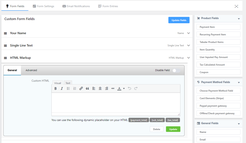
Here HTML Markup comprises 2 options.
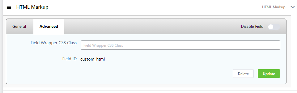
- Custom HTML: This option allows you to add the HTML elements to make changes you want.
- Field ID: This is an ID of this input field and it will be used when it comes to adding any custom CSS for this specific field.
T&C/ Consent
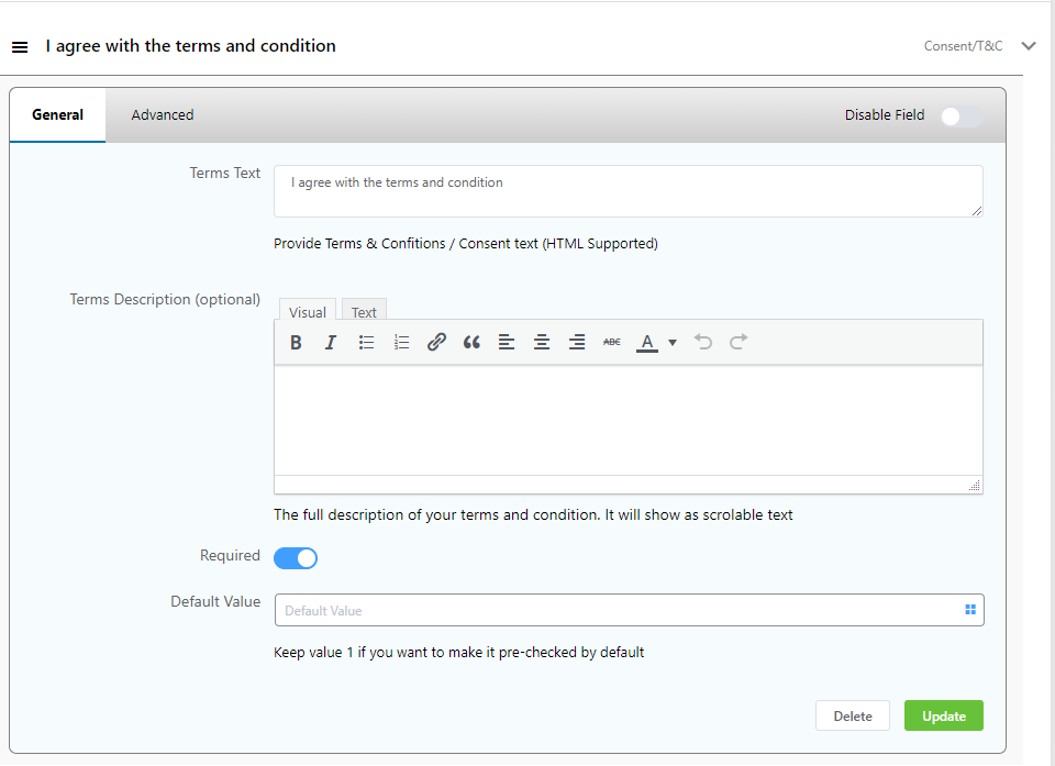
This option enables you to add Terms & Conditions to your form. You can add your Terms Text, Terms Description. Choose whether the field should be required or not. You can also add a default value & then click Update.
These are the total input fields of the WPPayForm plugin you can have while using the plugin. All the fields here let you create your payment gateway more easy and smooth.