
How To Apply Responsive Breakpoints In WordPress Tables
You obviously want your data table to be responsive to all devices. Whether you want the columns to show up on all or hide on a specific device, responsive breakpoints are a must for table plugin users. Using this feature, they can decide on the visibility of columns.
Here we have a short article on how to use breakpoints in a quality WordPress table plugin. For a responsive data table example, we have picked Ninja Tables because it’s one of the most user-friendly plugins. No coding needed to use this feature.
Navigate among these topics, whichever you want to know about.
- Breakpoints for responsive design in Ninja Tables
- How to configure the breakpoints
- Demo
- Stackable table configuration
Ninja Tables breakpoints for devices
A “Breakpoint” for a data table is where it changes or adapts to different devices. For instance, you can decide not to show a column of your table and hide it completely, preventing it from appearing on any screen.
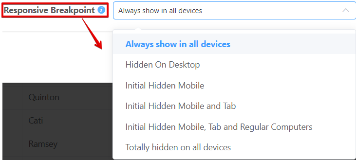
Ninja Tables comes with six best responsive breakpoints for desktop, mobile, and tablets.
- Always show in all devices
- Hidden On Desktop
- Initial Hidden Mobile
- Initial Hidden Mobile and Tab
- Initial Hidden Mobile, Tab, and Regular Computers
- Totally hidden on all devices
Always show in all devices
It’s the default option that’s pretty much regular for any table. If this is selected from the dropdown list for a specific column, the column will show up on all devices.
Hidden On Desktop
You can set the column to be visible on all devices, except for a desktop.
Initial Hidden Mobile
Ninja Tables is a mobile responsive data table. As a result, it shows on mobiles just like other devices. But you can hide columns for tables on mobile devices with this option.
A “+” icon in the mobile view can disable the column from hiding. When the “+” sign is clicked, the hidden column will be visible.
Initial Hidden Mobile and Tab
If selected, it can prevent the column from showing up on mobile and tablets. And similar to the previous option, it can be disabled with the “+” icon.
Initial Hidden Mobile, Tab, and Regular Computers
This one lets the column hide initially on all devices and also lets it appear after the “+” icon is clicked.
Totally hidden on all devices
Finally, if you want to hide the column completely and not let it show up on any device, select this one.
Configuring responsive breakpoints
Ninja Tables is useful for beginners and experts all the same. It’s not hard to find your way around this dynamic table plugin. However, Ninja Tables documentation might help you a lot.
In the previous section, we have mentioned and explained the breakpoints. Since it’s user-friendly, it comes with a lot of flexibility. For instance, there are two ways you can apply responsive breakpoints in Ninja Tables.
Hovering over the column
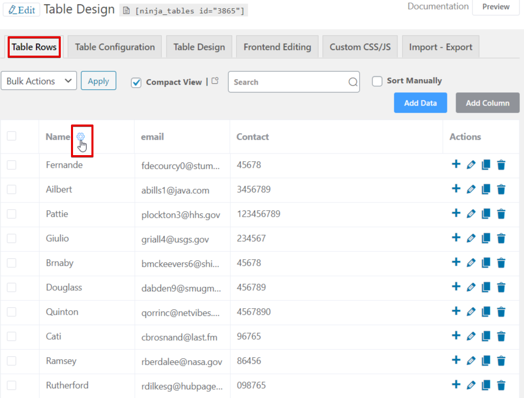
Open any table from the “Table Rows” panel and hover over the column you want to configure the breakpoints for.
Click the settings icon that gets highlighted while hovering. You will see a popup window- “Edit Table Column”.
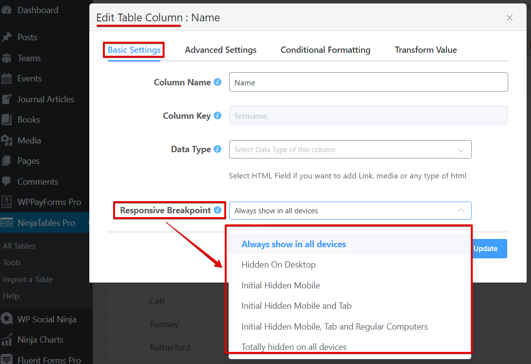
The window will have four different sections. All six of the recommended breakpoints are the last one on the “Basic Settings” section.
From Table Configuration panel
Right after the “Table Rows” panel, there’s another panel to configure the data table. Here you can customize areas like column width, text alignment, conditional formatting, and value transformation.
Just like before, breakpoints for an adaptive table design are in “Basic Settings”.
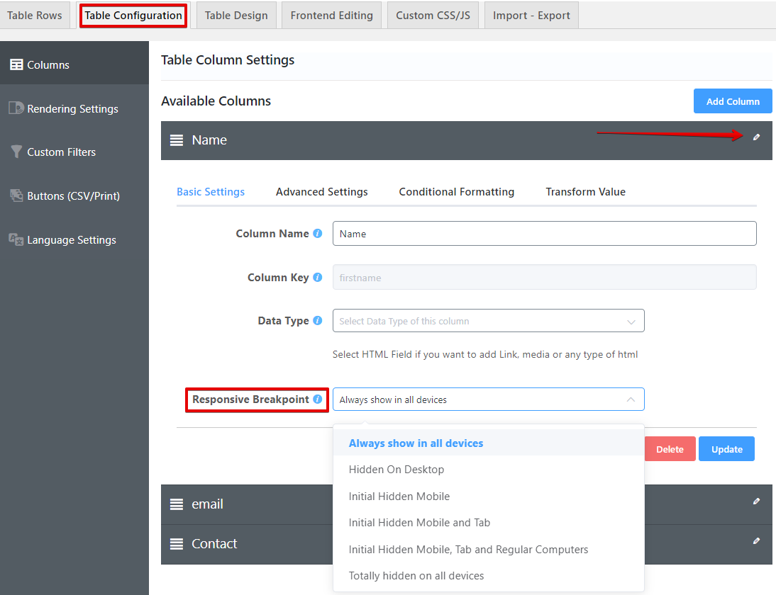
Move to the pencil edit icon for the target column to open “Basic Settings” and select breakpoints from there.
Demo
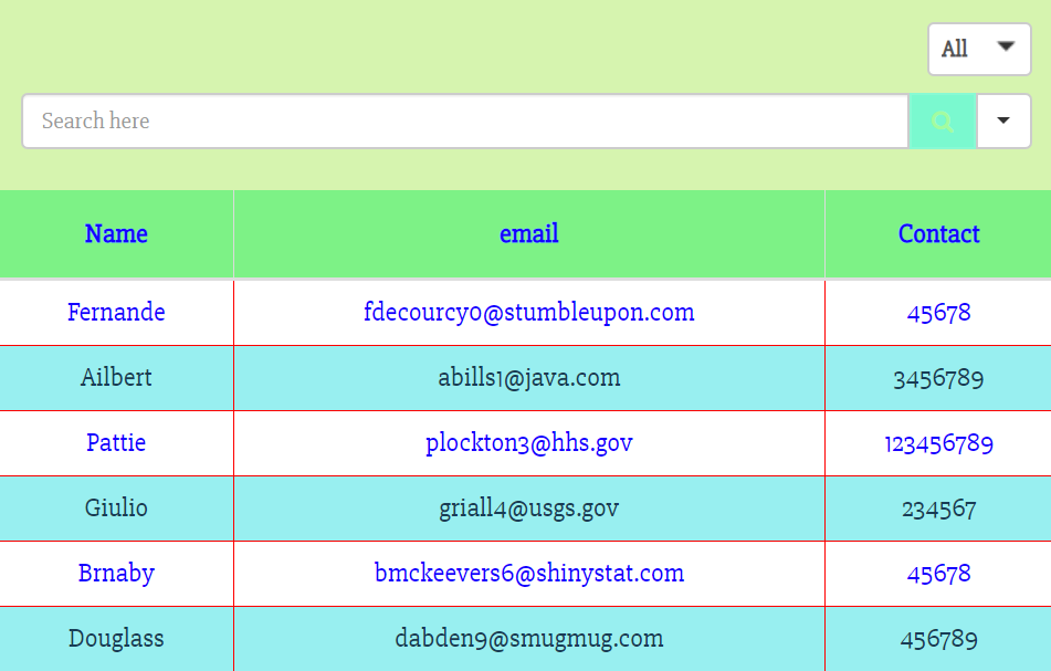
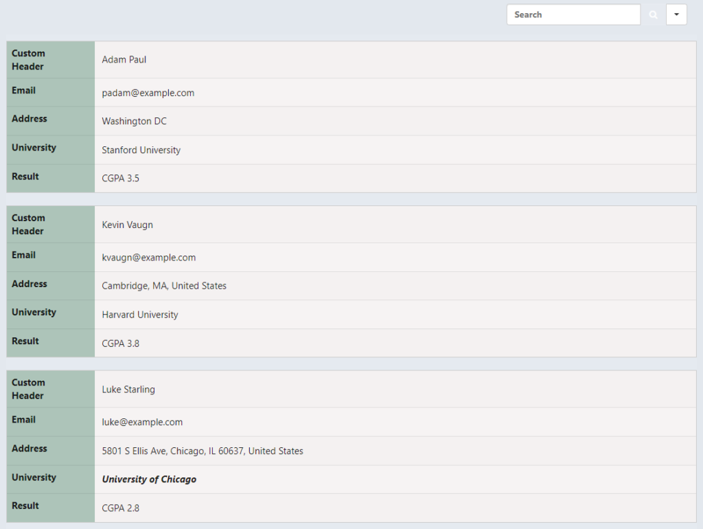
To show you how this feature works, we have edited one table and picked the “Hidden On Desktop” responsive breakpoint.
So, here’s how the table looks in general.
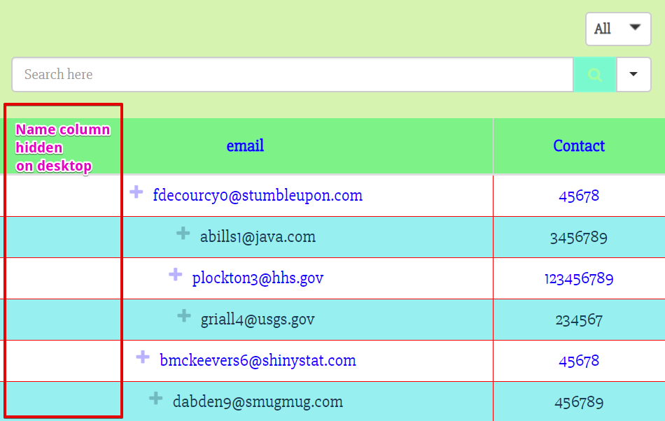
The “Name” column will be hidden from desktop users after we select “Hidden On Desktop”.
After selecting and updating, the table looks like this-
If you want to edit the column width, go to “Advanced Settings” from Table Configuration.
Stackable table configuration
Since we’re talking about responsiveness, this feature in Ninja Tables has to be mentioned.
Go to the “Table Design” tab and open the “Styling” menu.
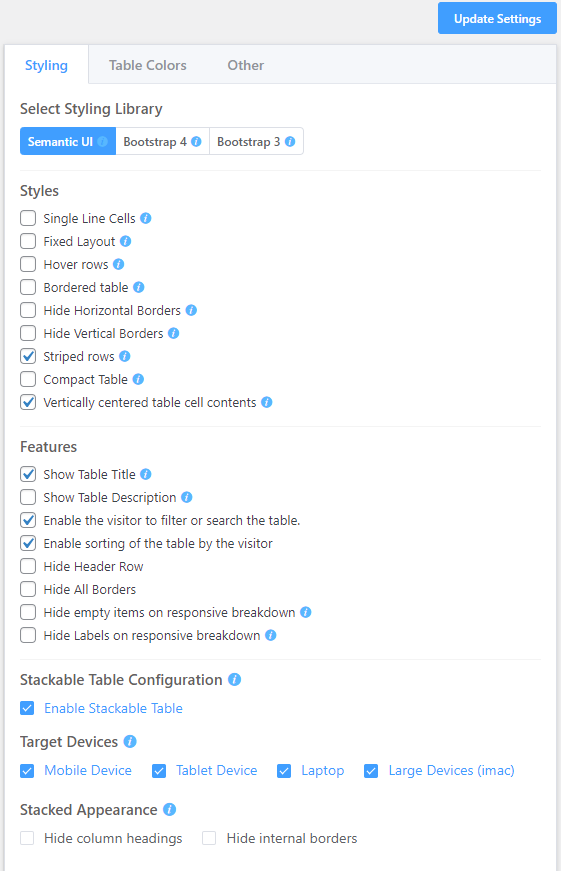
Here you can adjust the appearance of your online table. Select the target device to enable the stackable table feature and also choose the stacked appearance. Tables will display all the data broken down into separate sub-amount.
From the image below, you can see how a table looks after enabling the feature.
Final notes
Data tables with responsive breakpoints are more convenient for users because they can control the column’s visibility. In that case, Ninja Tables acts as a savior!
Using this table plugin, you can hide columns on a desktop, mobile, or tablet view and even hide them for all devices. Similarly, you can choose to go with the default “Always show in all devices” option.
Ninja Tables has a lot of tricks up its sleeves. Give us a holler if you want to check out some more.
On another note, learn how to make tables in mobile responsive.
-

Best WordPress Shopping Cart Plugins to Get Your Store Up and Running
Looking for the best WordPress shopping cart plugin? Compare FluentCart, -

Best WordPress CRM and Email Marketing Plugin: What to Look for in 2026
Looking for the best WordPress CRM and email marketing plugin? -
WP Social Ninja vs Rich Showcase: Which Google Reviews Widget to Choose?
Compare WP Social Ninja and Rich Showcase to find the
Leave a Reply
You must be logged in to post a comment.