
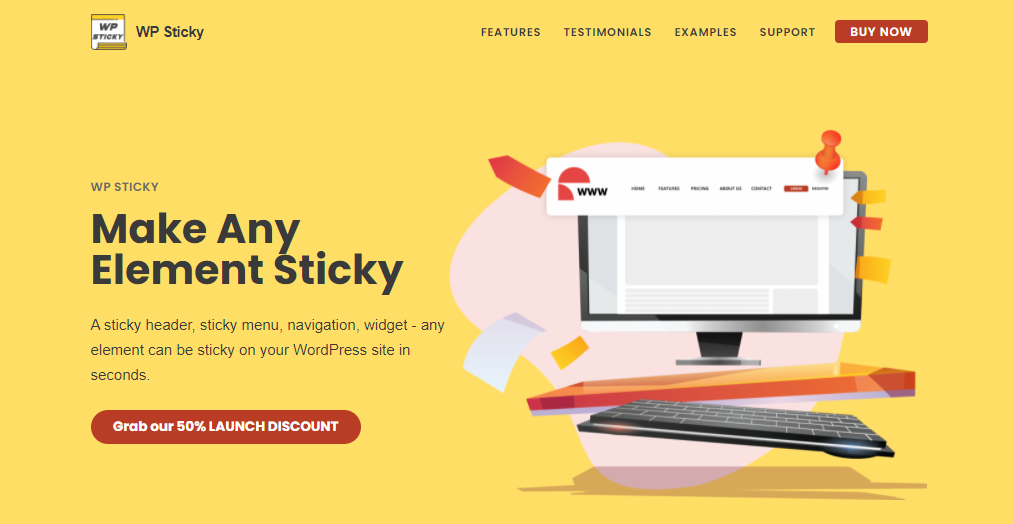
How to Make a Sticky Header in WordPress
In the last decade or so, there’s been an ever-growing emphasis put on website navigation. This has coincided with the widespread usage of smartphones that have limited navigation options compared to the traditional desktop interface. The difference in website design is more than evident if you look at a comparison between a site from 2011. and one that was made now.
One of the main methods that were used in reconfiguring the site layouts was sticky elements. Appropriately named, these elements stick to the page on its borders when you’re moving around it, i.e., they keep their original position (think of freeze panes in Excel, and you’ll have a good idea how it works).
Top, bottom, left, and right
Sticky elements are usually reserved for menus, headers, and/or status bars; these bring great flexibility to the visitor because he can instantly switch from one page to the next without having to backtrack at all. Also, all of these are positioned on the top and bottom page borders to begin with, which works nicely with the whole premise. It would be extremely difficult to build a page around a sticky element that’s positioned in the center of a page.
Rarely can they also be found on the left and right borders, with the same functions, just a different layout. In these cases, they’ll be hidden until you hover over them with your cursor or touch them on the screen.
Space savers
The interesting thing about sticky elements is that they save you space on the page and on the site as a whole – they can actually be used to replace whole pages. This is because they leave the main body of the site intact and make the borders multifunctional tools that take on a lot of the page’s functions on themselves. Just think about your average site layout for a moment.
The top is reserved for the menus that entail pages sorted through designated categories and a search bar. These are both hidden behind a bar while scrolling and expand when needed. If this was not the case, only the menu tree would take up the whole upper section of your page and wouldn’t “follow” when scrolling down, so your visitor would be required to constantly move up and down just to navigate through the pages.
On the other hand, a sticky bottom element can replace an entire support page quite easily – just add the email and/or number along with a chat button, and you’re good to go. You’re providing your visitors with a constantly present way of contacting you. Once more, the practical application is fantastic – a customer is scrolling through your product pages, has a question, and can instantly find out what he/she needs by clicking the chat button.
Creating sticky elements
When we’re talking about WordPress, there are always numerous ways to go about anything you can think of, and the same is true here. You can create sticky elements manually within the default editor, or you can use a plugin that replaces the need for coding with a beginner-friendly interface. The contrast between the end results is minimal, but the way you get there makes all the difference. For our example, we’ll be using sticky headers since they are by far the most common element that’s made to stick.
Manually creating a sticky header
Creating a sticky header manually in WordPress requires using CSS code. Without getting too technical, CSS code is something we can add to practically any element on a page to alter its properties. When coding manually, this is our main method of customization. Using CSS first requires for the header to be present on a page, so be sure there is something to customize in the first place. WordPress simplifies this process because even the default editor gives the option to add it with a click.
Once you have a header to work with, you’ll need to access the console. Simply go to the appearance section found on the left-hand side of your dashboard, choose “customize”, and then click on “additional CSS”. With the console now open, you need to input the code that makes your header sticky:
#website-navigation {

background:#fff;

height:60px;

z-index:170;

margin:0 auto;

border-bottom:1px solid #dadada;

width:100%;

position:fixed;

top:0;

left:0;

right:0;

text-align: center;

}
The code above is just an example of how it should generally look, not a be-all-end-all definitive command. Keep in mind that the first line is always specific to each site – replace #website-navigation with the CSS class or ID of your navigation header before going back to the page editor.
After you’ve checked the functionality within the page/post preview window, just publish, and you’ve got yourself a sticky header. We have to point out that you’ll probably want to expand the CSS code to encompass more than just the “sticky” attribute for a header like this – adding things that will emphasize the header visually is recommended, such as color fonts, size, indentation, etc. Because it’s a permanent fixture on a page, it can easily be overlooked, so you should try and make it stand out.
Creating a sticky header with a plugin
There’s a huge overlap between those that need a website for their business or blog and those that simply don’t have the knowledge to build something that looks and feels professional. Luckily with WordPress, there are so many plugins that make life easier for everyone; there’s virtually no need to possess anything more than basic software knowledge to accomplish your goals. WP Sticky is a great example of a plugin that replaces all of the coding we’ve covered above with a user-friendly interface anybody can get a hold of quickly. At the same time, it offers the same amount of functionality that you would have while creating a sticky header manually. Let’s break it down.
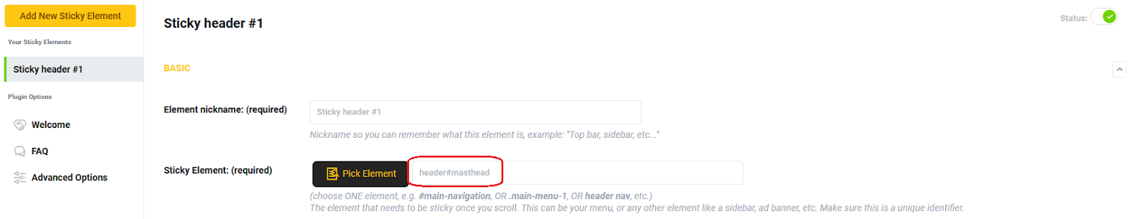
Creating an element
Just like you need to have a header to start with when you’re using CSS, you need to create an element to which you then add the sticky attribute.
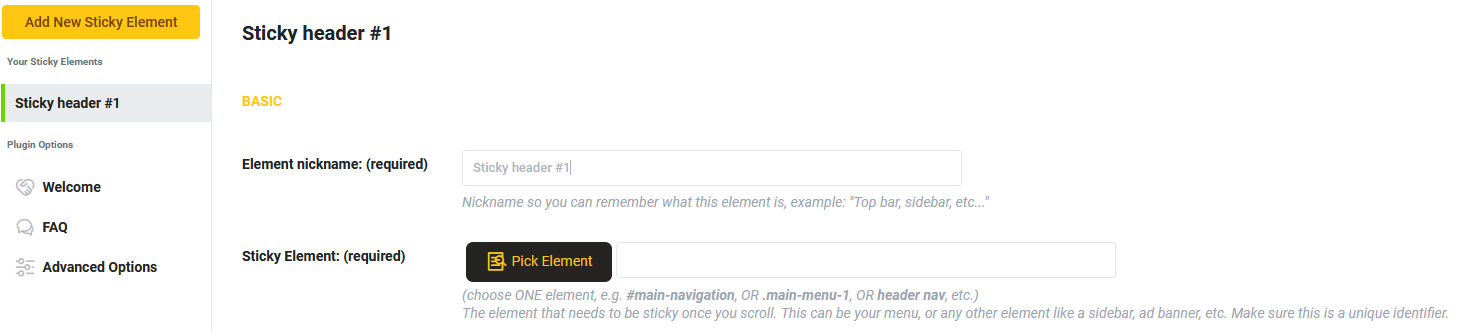
There are two distinct ways to single out the element – you can input the designation in the required field, or you can pick the element through a preview window by clicking on it (this works wonders if you’re having trouble figuring out the designations). When choosing your element in the preview window, you’ll see the changing designations on top of your screen.

We’ve found that after working with the plugin for some time, you’ll get so comfortable with it you’ll hardly ever use the visual picker. The designations will become familiar, which leads to simply and manually inputting them, saving you time. Until you are familiar with that extent, the visual picker will be your best friend. Ultimately, either method will get you to the same place – a sticky header on the frontend.
Make it look good
Not all sticky elements are created equal, and yours shouldn’t be a run-of-the-mill example either. The visual settings section will provide you with a plethora of customization options you can work with to make your sticky header unique in every way.
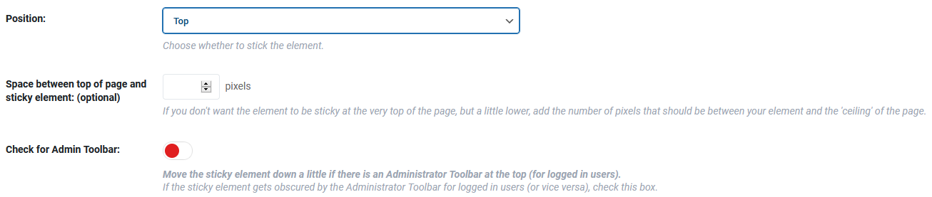
The first thing you need to account for is the positioning of your element. Since we’re making a header, this will be an easy decision – we’re sticking it to the top of the page. Positioning is key to a good header, so if you don’t want it to hug the very top of the page, you can move it down a couple of pixels for a better fit. Additionally, if your site uses an admin toolbar for registered users, you can make the plugin automatically check for it and adjust the header accordingly.
We’ve touched a bit on the necessity of a site to be fully responsive since there are so many ways potential visitors have to browse the web. To make your site fully adaptive, you can choose on which screens the header will be sticky.
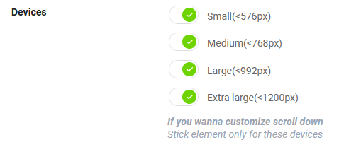
Usually, smaller screens benefit the most out of sticky headers, whereas bigger ones used on traditional desktops that have more navigation options do just fine without them. The sizes are divided into four groups that cover all the major screen sizes.
The Z-index is an optional setting that could confuse many at first glance. Because of this and the fact it’s an optional feature, many will probably wave it off and ignore it. If everything works, you’ll probably never even look back; however, if there are troubles with the display, the Z-index could potentially be a quick-fix solution. Essentially, think of a page as a collection of stacks where the stacks on top have higher numbers than the ones on the bottom. Therefore, if something is obscuring your sticky header, try to elevate the Z-index (99999 is suggested as a value that works)

With your sticky header “top of the stacks”, it’s time to get even more creative with adding effects while scrolling down. When both options are disabled, the header will just keep its position on top like a cutout piece of the original page. You can add more flare with effects like fade-in or slide down. Consider the overall visual design of your site before you opt for these types of effects; however – oftentimes, less is more.
Visual effects aren’t limited only to those that are connected to movement. You can also customize the header itself (in addition to the moves you made while creating the header). Opacity is useful if you don’t want the header to obscure any other content on the page. Setting it to around 50% will make both the header and the content underneath relatively visible.

An even more useful feature than opacity is adjusting the scroll range. In case you have very long pages like blogs usually have, there’s a certain point in navigating down where having a sticky header just doesn’t make sense anymore. These are the times when it’s a good idea to make the header unstick after your visitor has scrolled down far enough.
Finally, there’s an option to change the background color of the header when it’s sticky, making it stand out even more, but getting it reversed to its original values when the header isn’t sticky anymore.
The very last part of visual editing brings us back full circle to manually editing the sticky header through CSS.

Even though you really don’t need to have any previous coding knowledge to successfully use WP Sticky, it can elevate your work if you do use it. The feature is optional, so it’s entirely up to you if you want to use it and to what extent.
Advanced options
The advanced options section is pretty much all about exclusion, i.e., in what instances a sticky header will cease to be sticky and revert back to “original programming”.
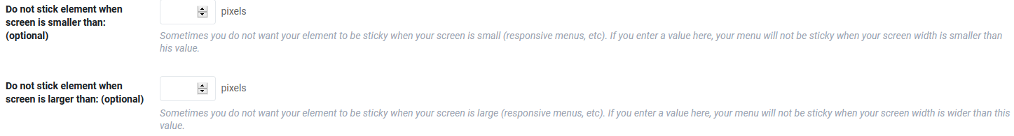
Manually setting up the screen size where the header isn’t sticky is a step up on the four default sizes you’re presented within the visual settings section. Here, you’ll get to be as specific as you want, so if there’s ever a wild screen in the future that doesn’t fit into any of the predetermined sizes, you can make rules that will work for it.
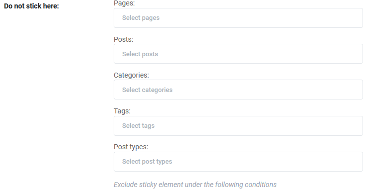
Making a header not sticky isn’t all about screen size, but also the content on your site, more specifically categorization. You can make your header not stick on designated pages, posts and post types, specific categories, or content with certain tags. All these conditions can be mixed and matched to make the perfect compendium when the sticky header is used and when it’s not.
Similar to the way you’ve chosen the sticky element (in our case, header) back at the very beginning, you can also choose a push-up element lower on the page on which you want your header to be pushed up upon. This will essentially make your header move to the very border of this element with no padding or any kind of space between them.

To end it all, when you’re fed up and don’t want your sticky element anymore, there’s always the final option to delete it entirely. Be warned that this is a permanent action, and all the customization you’ve done to the element (in this case, header) will be lost.

Summary
It’s hard to say which way of doing things is better. You most definitely have more options at your disposal using CSS, but that’s a solution for very few people overall. On the other hand, a plugin like WP Sticky combines ease of use with still robust functionality that makes it a perfect choice for beginners or those still unsure about coding from scratch. Probably the best way to go about making a sticky, working header is to start with the latter and work yourself up to the former.
Author: Matej Milohnoja
Used to write about games and gaming in general, but has since switched to testing and writing about web development software. Still plays a lot of games, just for the fun of it.
-
Kanban vs Scrum vs Agile vs Waterfall: What’s the Difference?
Get a clear, no-jargon breakdown of Kanban vs Scrum vs -
13 Best Wireframing Tools in 2026: Free, AI & Paid Options
Compare 13 of the best wireframing tools for websites and -
Email Deliverability Hacks: Complete WordPress Guide With Free Tools
Improve WordPress email deliverability with FluentSMTP, SPF, DKIM, DMARC, list
Leave a Reply
You must be logged in to post a comment.