
Online data tables in WordPress websites are basically used to display info summary in an organized manner. Also, no matter how well-ordered your table is, it needs to fit any device with different screen sizes. Table plugins with custom table styling features seem to be ahead in the race because users can customize tables for desktop, tablet, or mobile screens. And proceed with further stylings like hovering rows, borders, alignment, etc.
Users of Ninja Tables have full control over the visual table styling and customization of any data table. There are some extra styling options too. You can do it all without CSS knowledge!
We will be covering how you can customize the style of your data table easily.
Custom table styling in Ninja Tables (Without CSS)
If your posts have a massive amount of texts or multiple long paragraphs, readers might lose interest and leave. So, it’s better to resort to a table plugin and present important data in organized rows and columns.
However, to ensure a good experience, you should make the table fit in desktop, tablet, and mobile screen sizes for responsive design. Not everyone uses a desktop, and mobile devices are more convenient these days.
Plus the table might need further styling so that it’s convenient for everyone. This is why Ninja Tables comes with various options for custom table styling, such as-
Table style customization
Even if the data table is huge and has hundreds of rows and columns, you can set the table’s appearance to fit all devices.
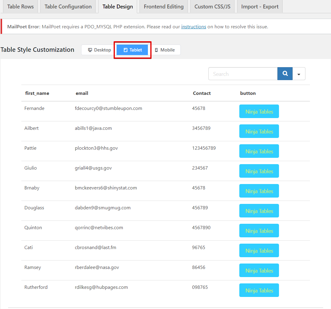
The “Table Design” panel shows a bar with the device segmentation on top. You can see “Table Style Customization” has three device options- Desktop, tablet, and mobile. Here we have an example table made with Ninja Tables.

The default view is set as “Desktop”. If you have a table with more columns, there will be a scroll bar for you to move.
Then if you select the “Tablet” view, the size compresses and gives a real-time preview of how the table will appear on the tablet screen.
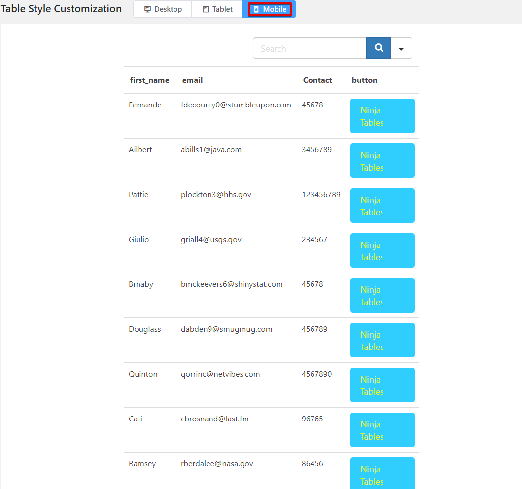
Finally, there’s a “Mobile” view that shrinks more and shows how the table will look on mobile.
Styling library
On the “Table Design” panel, the right side has “Select Styling Library” with three sub-categories.
- Semantic UI
- Bootstrap 4
- Bootstrap 3

1. Semantic UI
The first one in the Styling Library section has nine styles and eight features.
Styles
- Cell content will be single-line and not wrap with “Single Line Cells”.
- “Fixed Layout” for not resizing table cells based on content.
- “Hover rows” for row hover animation.
- “Bordered table” adds cell and table borders.
- Table body’s rows can be hidden with “Hide Horizontal Borders”.
- “Hide Vertical Borders” of table rows.
- “Striped rows” can add alternating zebra stripes on rows.
- “Compact Table” option cuts cell padding in half.
- All cell contents will align vertically with “Vertically centered table cell contents”.
Features
- “Show Table Title” in the frontend
- “Show Table Description” to the frontend users
- Enable visitors to filter or search the table
- Enable sorting of the table by visitors
- Hide Header Row
- Hide All Borders
- Hide empty items on responsive breakdown
- Hide Labels on responsive breakdown
Stackable Table Configuration
After selecting this checkbox, two more options will come with some select-boxes.
- “Target Devices” is for the device width. It has four boxes- mobile devices, tablet devices, laptops, and Large devices.
- Customize the “Stacked Appearance” by choosing between hiding column headings and internal borders.
You can learn more about this feature in our article on Stackable Tables in WordPress.
2. Bootstrap 4
The second table style bootstrap has seven styles and eight features.
Styles
- Striped rows
- Bordered table
- Hide Horizontal Borders
- Hide Vertical Borders
- Hover rows
- Small table with half cell padding
- Vertically centered table cell contents
Features
- Show Table Title
- Show Table Description
- Enable visitors to filter or search the table
- Enable sorting of the table by visitors
- Hide Header Row
- Hide All Borders
- Hide empty items on responsive breakdown
- Hide Labels on responsive breakdown
Stackable Table Configuration
It’s the same for all styling libraries.
3. Bootstrap 3
Again, everything is the same as Bootstrap 4. But the half cell padding option is called “Compact table”.
Final notes
So far, we’ve shown you how to use the custom table styling feature in Ninja Tables and make your data table more viewer-friendly. Now you know how to adapt your table to any device screen and style the data cells, borders, rows, and columns, etc.
Try it yourself, and if you want, take a peek at the documentation too. For more information, make sure to hit us up anytime.
Hi,
I’m happy user of the Ninja tables PRO. I would like to:
1) Position the sorting arrows aligned at the end of the column header text
2) Make the sorting arrows always visible (not only on hovering)
Please advise how to.
Thanks
Udi
Hello! You can do all of those using custom CSS since it’s still not possible by default.
Thanks for trusting Ninja Tables.