

Vanity Metrics vs Actionable Metrics: What to Track in 2026

The report looks excellent. Traffic is up eleven percent. The newsletter hit a 42% open rate. The company crossed 30,000 followers. Everyone nods, the slide advances, and nobody in the room can say what any of it means for next quarter.
Meanwhile the pipeline is thin and nobody knows why.
The numbers that fill a good-looking report without affecting the business have a name. They are vanity metrics, and most marketing reports are built largely out of them.
The problem got sharper recently.
Research from Pew Research Center found that when Google showed an AI summary, users clicked a traditional search result on just 8% of visits, compared with 15% where no summary appeared. Numbers that felt solid for a decade now move for reasons that have nothing to do with your business.
This guide covers how to tell the two apart, and how to convert every weak number in your report into one that drives a decision.
Key Takeaways
- A metric is only useful if it changes a decision. If you cannot explain what you would do differently when the number moves, it is probably a vanity metric.
- Context turns weak metrics into useful ones. Page views become more valuable when you add the traffic source, landing page, conversion rate, and resulting revenue.
- Use the three-question test: Can you identify the cause? Does the metric change a decision? Can you connect it to revenue or retention within two steps?
- Raw traffic is not enough anymore. Break traffic down by source, intent, conversion, and revenue before using it to judge marketing performance.
- Followers, impressions, opens, views, and total users should rarely be headline metrics. Pair them with clicks, activation, retention, conversions, or revenue.
- Your first-party data often holds the most actionable numbers. Forms, email campaigns, checkout data, communities, and video analytics can show what people actually did after arriving.
- A strong report does more than show movement. It explains what changed, why it changed, and what the team should do next.
What Vanity Metrics Actually Are
A vanity metric is a number that makes you feel informed without making you better informed. It rises, it looks good on a slide, and it does not tell you what to do next.
Where the term came from
Eric Ries popularized the distinction in The Lean Startup. His framing was simple: some metrics help you learn, and some metrics help you look good. Total registered users only ever climbs, so it always flatters you. Retention by signup cohort can fall, so it can teach you something.
The harder part of his argument is that teams often prefer the flattering number, and usually not on purpose.
Why they spread so easily
Vanity metrics survive because everything about them is easy.
They are easy to collect: Every platform hands you followers, impressions, and page views by default, with no setup required.
They are easy to grow: Cumulative counts rise on their own. A total that only goes up produces a chart that always looks like progress.
They are easy to present: Nobody in a review argues with a number that went up. Actionable metrics invite hard questions, which makes them riskier to put on a slide.
That last point is the real reason vanity metrics persist in mature teams. It is not ignorance. It is that the safe number is safer.
The tell: you cannot name the action it triggers
Here is the fastest way to catch one.
Look at the number and ask what you would do differently if it doubled tomorrow.
If page views doubled, what changes?
Probably nothing, because you would not know which pages, which sources, or whether any of those visitors wanted anything from you.
If qualified leads from organic search doubled, the answer is immediate. You find out which pages produced them and publish more of that.
The second number carries an instruction. The first does not.
What Makes a Metric Actionable
An actionable metric survives three conditions, and missing any one of them makes the number decoration.
A repeatable cause
You can point to what produced it and do that thing again. “Conversions from the pricing page rose after the form moved above the fold” is repeatable. “Traffic was up in March” is weather.
This is why segmented numbers beat totals, since a total blends every cause together until none of them is visible.
A decision waiting on it
Before you look at the number, you should be able to name the decision waiting on it:
- Which channel gets next quarter’s budget
- Whether the onboarding sequence stays or gets rebuilt
- Whether the pricing page is worth another round of work
If no decision is waiting, you are checking the number out of habit.
A short path to revenue or retention
Not every useful metric is a revenue metric, but every useful metric should reach revenue or retention within about two steps.
Form completions to qualified leads to closed deals is two steps, and that chain holds.
Impressions to brand awareness to eventual purchase is not a chain, it is a hope.
Vanity Metrics vs Actionable Metrics at a Glance
Every vanity metric is missing a specific piece of context, and naming that piece makes the fix obvious.
| Vanity Metric | What’s Missing | Actionable Metric | Decision It Drives |
|---|---|---|---|
| Page views | Who arrived and whether they wanted anything | Conversion rate by landing page and source | Which pages to expand or retire |
| Social followers | Whether followers actually take action | Site clicks and leads generated from those clicks | Whether the channel deserves more investment |
| Email open rate | Whether the email moved anyone to act | Click rate and revenue per send | Whether to keep or rebuild the campaign format |
| Impressions & reach | Whether visibility changed demand | Branded search volume over time | Whether awareness activity is working |
| Downloads or signups | Whether people actually used the product | First-seven-day activation rate | Whether onboarding needs attention |
| Total registered users | How many users are still active | Monthly active users and cohort retention | Where people leave the lifecycle |
| Video views | Whether viewers stayed | Completion rate and drop-off point | Which videos or sections need editing |
| Gross sales | What remained after discounts and refunds | Net revenue and refund amount | Whether the promotion actually paid |
Email open rate deserves a specific note. Since Apple introduced Mail Privacy Protection in 2021, images in many emails are pre-loaded automatically whether or not a human ever read the message. A share of your opens are machines, so the number did not just become less useful, it became partly fictional.
Which is why the pairing matters more than either number alone.
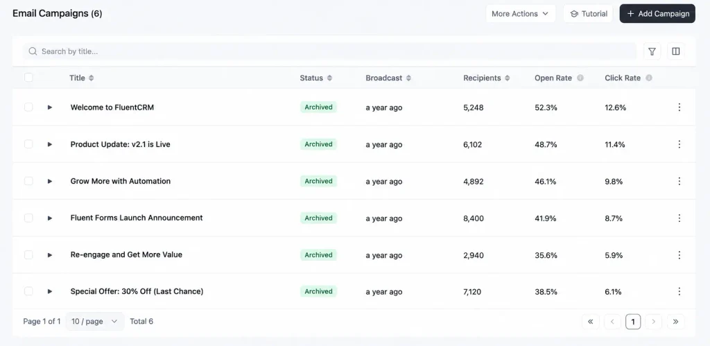
Take this list as an example. The top campaign opens at 52.3% and clicks at 12.6%. The first number fills a slide, the second tells you the email worked.
The Three-Question Test for Any Number
Lists of bad metrics go stale. A test does not.
Take any number currently on your dashboard and ask:
Can you name what caused it?
Look for a cause you can deliberately repeat, not a guess or correlation.
Does it change a decision?
A useful metric should have a specific decision and owner waiting on it.
Can it reach revenue or retention?
The path should usually take two steps or fewer.
Here is the test run on two made-up numbers, the kind that turn up in most reports.
40,000 page views last month
Organic pricing-page conversion rate: 3.4%, up from 2.1% after moving the form
Why Raw Traffic Can Be a Vanity Metric
Traffic itself is not the problem. Reporting it as one lump number is, and the fix is not to stop measuring traffic but to stop reporting it raw.
Traffic can fall while demand grows
Google now answers a lot of questions on the results page, so people read about your topic and never click through. The Pew figures from earlier show the scale of it: 8% clicked a normal search result when an AI summary appeared, against 15% when none did.
Pew calls this an association rather than proof of cause, and the study covers US adults in March 2025, but nobody running a content site disputes the direction.
So your traffic can drop while interest in you rises, or jump on a viral post that brings nobody who will ever buy. The number moves for reasons that have nothing to do with your business.
The new vanity metrics nobody calls out yet
A new set of numbers is starting to appear in reports: how often your brand gets mentioned in AI answers, your share of voice in chatbot replies, total AI impressions.
Run the three questions on them and they fail all three. You cannot name what caused a mention, you cannot name a decision it changes, and there is no path to revenue. These are the newest vanity metrics, and almost nobody is calling them that yet.
Turning Raw Traffic Into Actionable Traffic
One number is useless. Cut it four ways and it becomes useful.
Say you had 40,000 visitors last month. On its own that tells you nothing, so break it into four cuts:
| Traffic Cut | Vanity View | Actionable View | Decision |
|---|---|---|---|
| Source | 40,000 sessions | Sessions + conversion rate by channel | Which channels deserve more budget and effort |
| Intent | Organic traffic increased | Branded vs non-branded search volume | Whether content is building demand or simply capturing it |
| Conversion | 8,000 landing-page views | Conversion rate + people who started but didn’t finish | Whether the page needs improvement or simply more traffic |
| Revenue | Sales increased | Net revenue + refund rate | Whether the promotion should run again |
Source
- Vanity metric: 40,000 sessions
- Missing context: where they came from, and whether those channels behave differently
- Actionable metric: sessions and conversion rate by channel, side by side
- Decision: where next quarter’s effort goes
A channel sending 500 visits that convert at 4% beats one sending 5,000 that convert at 0.1%. A traffic total tells you the opposite, confidently.
Intent
- Vanity metric: organic traffic is up
- Missing context: whether the new visitors were looking for you or wandered in
- Actionable metric: branded versus non-branded search volume, tracked monthly
- Decision: whether your content is building demand or just catching it
Branded search is the most underrated number here. If more people are typing your name into Google, your work is landing even when clicks are down, and Search Console shows this for free.
Conversion
- Vanity metric: the landing page got 8,000 views
- Missing context: how many of those views turned into anything
- Actionable metric: conversion rate for that page, plus the count who started and did not finish
- Decision: whether the page needs rewriting or simply more traffic
This is the cheapest one to fix, because most tools already record both halves. Reporting only the people who finished, when the number who quit is sitting right next to it, is a choice.
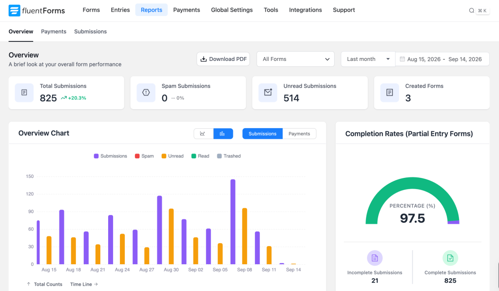
Say a form collected 825 submissions at a 97.5% completion rate. That looks like nothing left to fix, but the number worth acting on is the 21 people who started and quit, since they are the only ones you could still win back.
Revenue
- Vanity metric: the campaign drove a spike in sales
- Missing context: what survived refunds, discounts, and returns
- Actionable metric: net revenue and refund rate, compared against the prior period
- Decision: whether to run that promotion again
Gross sales is the traffic of ecommerce, going up reliably while explaining nothing, and a heavy discount campaign can post record sales yet still lose money once the refunds land.
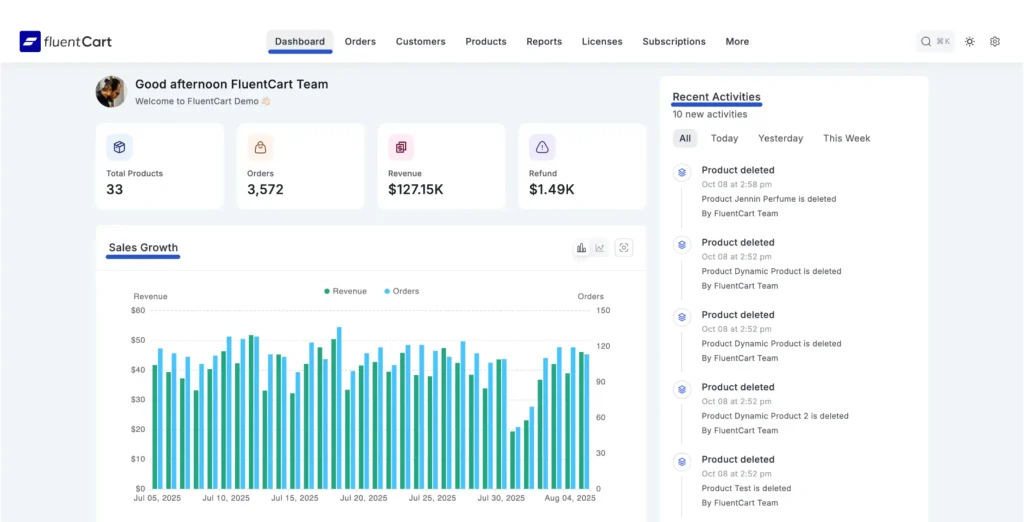
Take this dashboard as an example. Revenue reads $127.15K against $1.49K in refunds, and only the pair together tells you what the period earned.
Page views increased.
Separate the traffic by source and landing page.
Compare conversion rates between those segments.
Expand the pages and channels producing qualified conversions.
Where the Same Pattern Shows Up Elsewhere
The four-part shape holds across every channel once you look for it.
Video: A view count records that a player loaded and says nothing about whether anyone stayed. Video analytics for course content shows how far that distinction goes when your content library is the product.
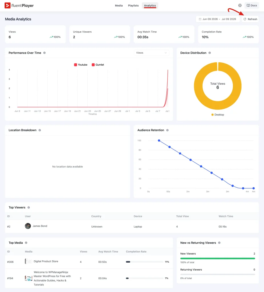
Suppose a video report reads like this one. A view records only that the player loaded, while average watch time narrows it, completion rate narrows it further, and the retention curve names the exact second people left, which stops being a statistic and becomes an editing instruction.
Messaging: Delivery counts and open rates only measure that a message arrived, while revenue per message measures whether sending it was worth the cost.
Community and membership: Total members only rises, while active members this month and retention by joining cohort show you where people quietly leave.
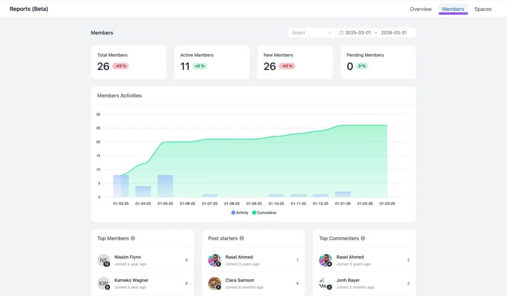
Picture a community showing 26 total members and 11 active. The total only ever climbs, since it counts everyone who joined, while the active figure is the one telling you how many are still around.
Where Your Most Useful Numbers Already Live
You don’t need a new tool to find most of the numbers this guide has been asking for. Your own site has been recording them the whole time-
- Forms know who submitted, which page they were on, and where they came from.
- Email knows who clicked, what they clicked, and who went on to buy.
- Checkout knows what sold, at what value, and who came back for a second order.
- Memberships and courses know who is still active and who drifted away after week two.
An analytics platform estimates these numbers and decides how much of them to show you, while your own database simply holds the record, so nothing is lost to a blocked script or a consent banner.
The irony of the current measurement crisis is that the data most businesses already have has been the most reliable all along, while everyone refreshed a third-party dashboard.
Building a Report That Survives a Leadership Review
Knowing which metrics matter is the easy half, and the harder half is presenting them to people who have grown comfortable with the old numbers.
Before a Metric Goes Into Your Report
A clearly defined goal should have one primary number.
Replace broad totals with source, page, campaign, or audience context.
Explain what changes because this number changed.
Use multiple periods instead of presenting an isolated snapshot.
The metric moving in the wrong direction may be the most useful one in the report.
Expect resistance the first time a traffic total drops off the front page. The useful framing is not that the metric is worthless, but that it is now driven by things outside your control, so here is the one that is not.
Frequently Asked Questions
What is the difference between vanity metrics and actionable metrics?
A vanity metric describes something that happened without telling you what to do about it. An actionable metric ties to a cause you can repeat, changes a specific decision, and connects to revenue or retention within a couple of steps.
Is website traffic a vanity metric?
Raw traffic reported as a single total usually is, and increasingly so now that AI summaries answer questions directly. Split by source, with a conversion rate attached, the same data becomes one of the most useful numbers you have.
Are social media followers always a vanity metric?
Almost always as a total. Follower count says nothing about whether anyone acts. Clicks from social, and leads from those clicks, are the version worth reporting.
Can a vanity metric ever be useful?
Yes. Any metric can be either, depending on use. Page views are vanity as a headline and useful as context beneath a conversion number. The failure is promoting a number to a position it cannot hold.
What are some examples of actionable metrics?
Conversion rate by source, cost per qualified lead, activation rate in the first week, retention by signup cohort, net revenue per campaign, video completion rate, and customer lifetime value by acquisition channel.
Is email open rate still worth tracking?
As a rough deliverability signal, yes. As a performance measure, no. Mail privacy features pre-load images automatically, so a meaningful share of opens were never read by a person. Click rate and revenue per send are the honest numbers.
The One Thing to Do Next
Open your most recent marketing report. Take every number on it and ask the three questions: can I name the cause, can I name the decision, can I reach revenue in two steps.
Then for each number that fails, write down what context is missing. That single column is usually the whole fix.
Most reports lose more than half their contents this way. That is not a failure, it is the point. What remains is short, occasionally unflattering, and tells you what to do on Monday.

Hi there! I’m Mahjabin, a content writer at WPManageNinja. I write about project management and love helping teams find smarter solutions to everyday work challenges.
-

10 Best jQuery Table Plugins for Best Data Visualization in 2026
Discover the 10 best jQuery table plugins for 2026. Compare -

Black Friday Marketing Strategies for 2026: Core and Advance Move
Black Friday is the most celebrated shopping season worldwide. Discover -

How Much Can You Earn With Amazon Affiliate Marketing? Rates & Niches
How much can you earn with Amazon affiliate marketing? Dive



Leave a Reply
You must be logged in to post a comment.