
Top 10 Checkout Page Design Tips to Improve Sales Flow
By optimizing your checkout page, you can increase your sales and provide your users with a better experience. That’s why you need to work on this page and make it more user-friendly. Well, in this post, I’m going to give you some checkout page design tips so that you can follow them and make your checkout smoother and easier.
What’s a checkout page?
I know you know what’s a checkout page. Still, I’d like to state a simple definition to keep us both on the same page.
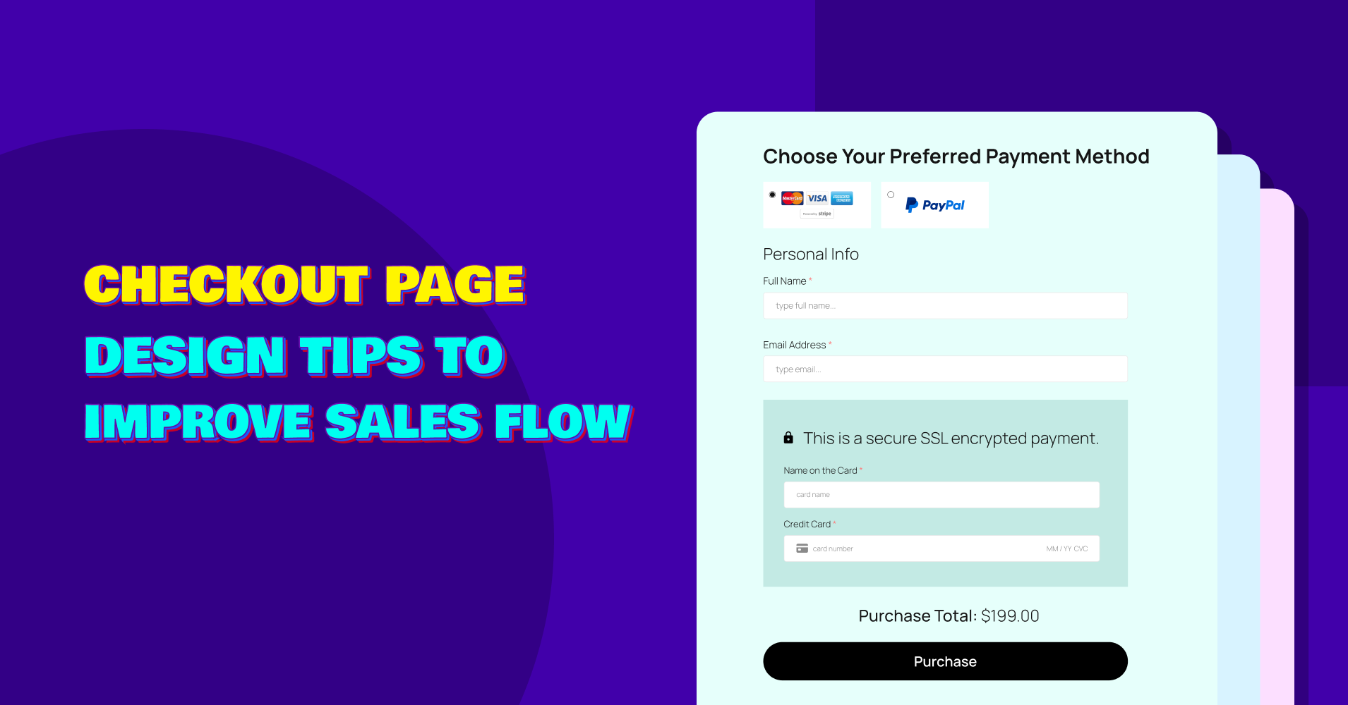
Analysis of an ideal checkout by Samsung
Simply put, the checkout page is the final step of a customer journey where they’re about to pay for your products/services.
It sounds simple, but remember, the checkout page is the pivotal moment in an online shopping experience where visitors turn into customers.
They’re now about to pay. So, you have a chance to make the moment memorable, to turn your customers into advocates. If they could make the purchase with a good experience, they would come back or tell others.
Why should you care about your checkout page design?
The checkout page is the most significant part of online shopping. Therefore, the design of your checkout page notably impacts your sales.
A seamless, user-friendly checkout process can encourage customers to complete their purchases to avoid cart abandonment.
A well-structured checkout page ensures a smooth transaction, thereby maximizing conversions and reducing bounce rates.
On top of that, a well-optimized checkout experience can contribute to enhancing brand reputation.
I’m saying all the positive sides here. But think about what will happen if you present a poorly designed checkout page.
Customers will receive a bad experience and they won’t love to come back. As a result, you may get more support tickets and bad reviews.
Explaining all the basics, let’s move into the main points.
Top 10 Checkout Page Design Tips to Improve Sales Flow
1. Keep it simple
Simplicity comes in many facets while we’re talking about the checkout page. It’s the number of form fields. It’s the layout itself.
People already spent some time checking your products. Now, don’t make them spend more minutes filling in the form. The philosophy is to keep as few form fields as possible. That’s all.
Allbirds’ clean and simple checkout
Let’s talk about the layout. Of course, you shouldn’t keep the layout very busy. Keep it clean, keep it minimal. The goal is to guide the customer through a clear, straightforward process without unnecessary steps.
There should be no step that might cause frustration or confusion. Also, try to implement auto-fill options while filling out the form to simplify the input process.
2. Show progress indicators
Imagine you’re filling out a form and you don’t know how long it is! Not only it will create frustration but you may leave in the middle without even knowing how close you were.
If you keep your checkout form multi-page, show a clear indicator. Users must know how far they’re away from the final step.
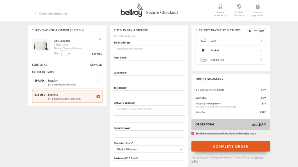
Bellroy managed the three-step checkout in a single page
Which one is better? Multi-step or one-page? That’s a long discussion. I’ll tell you briefly that one-page forms are better if your form doesn’t have too many fields. If it has a large number of fields, then implement a multi-stage form.
A progress bar or step counters are great solutions for multi-page forms. Also, while keeping a long form, try to avoid keeping “required” fields as few as possible.
The progress indicators simply tell users where they are in process and it encourages them to proceed to completion.
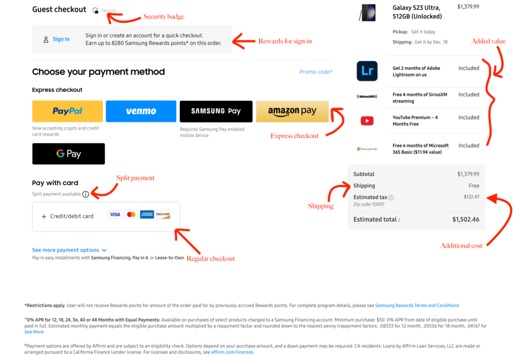
3. Display shipping information
Shipping information is very crucial for online orders. You should keep the necessary fields so that users can give their details.
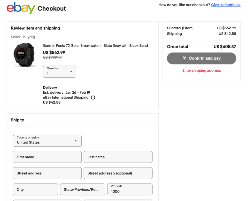
Clear shipping information provided by eBay
Another important part is you have to be clear about shipping fees and additional costs. If you charge anything extra, you should state that clearly to avoid any confusion.
Unexpected charges may lead to cart abandonment and infuriate frustration. Lastly, provide an estimated delivery time so users don’t have to wait in the dark.
If you have any specific return policy, you should also mention it somewhere on your checkout page. The goal here is to give customers peace of mind, not the other way around.
4. Clear call-to-action buttons
The CTA button is the ultimate guide for customers to proceed to the final step of the buyer journey. As an eCommerce store owner, you can play with your CTA button to make it eye-catching.
Moreover, the CTA button should be prominent, using vibrant colors that contrast with the rest of the page to capture attention.
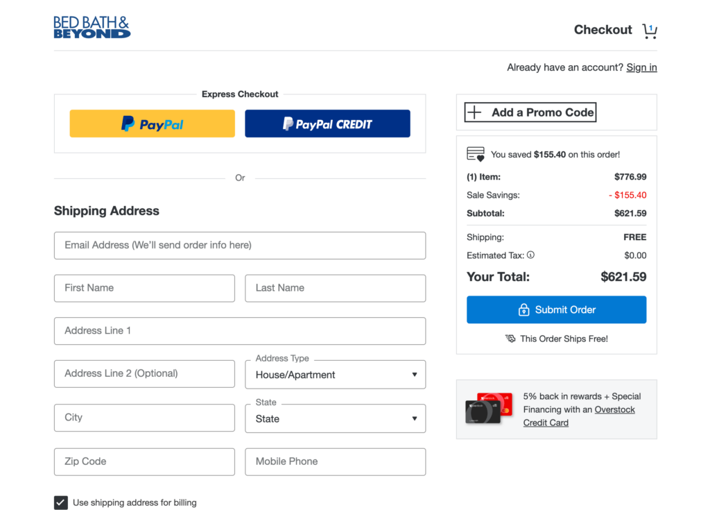
Bed Bath & Beyond has a brilliant checkout
The next part is the CTA text which should be clear and action-oriented. Add “Proceed to Checkout” or “Complete Purchase” that ensures there’s no ambiguity about what happens next.
You can even add text like “Get 50% Off” or “Avail the Discount,” etc. That’s why I said you can play with your CTA button. With multiple color combinations and text variations, you have the opportunity to take it to the perfect position.
5. Trust badges and security icons
The thing is people can’t take products into their own hands and check them online. It’s important to give them enough reason to trust your store.
Trust badges may come from various places. It may be an ISO standard or software review rating such as G2 or Capterra. As I said, it depends on your industry. Whatever is the most familiar in your niche, use badges from there.
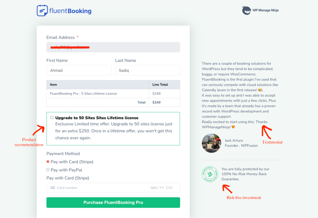
WPManageNinja checkout is simple and has trust badges
That’s one point. Another point is actual security icons that ensure people can share sensitive information like their card details within your website.
SSL is the first option and then comes many security features like Stripe/PayPal icons. You may even make icons to tell users their transactions are safe with you.
6. Multiple payment methods
Some customers might prefer PayPal, while others might want to pay with their credit or debit cards. This is why keeping diversity in payment methods is crucially important. It accommodates different customer preferences.
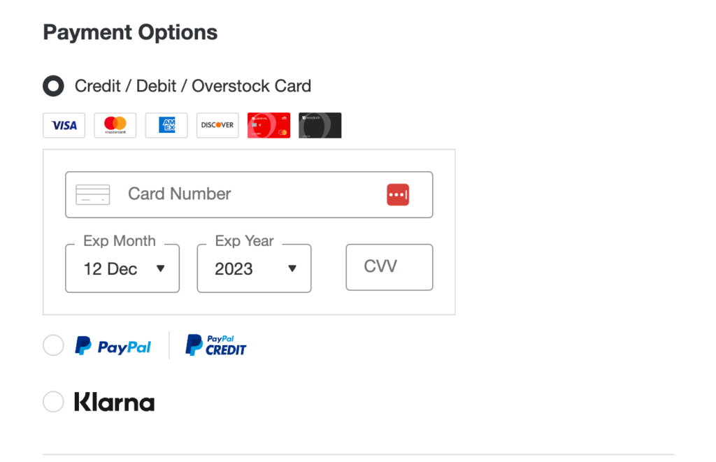
Keep multiple payment options for your customers
Some customers might prefer PayPal, while others might want to use their credit or debit cards directly.
Offering a range of options can significantly reduce cart abandonment rates, catering to the specific needs and trust levels of different buyers.
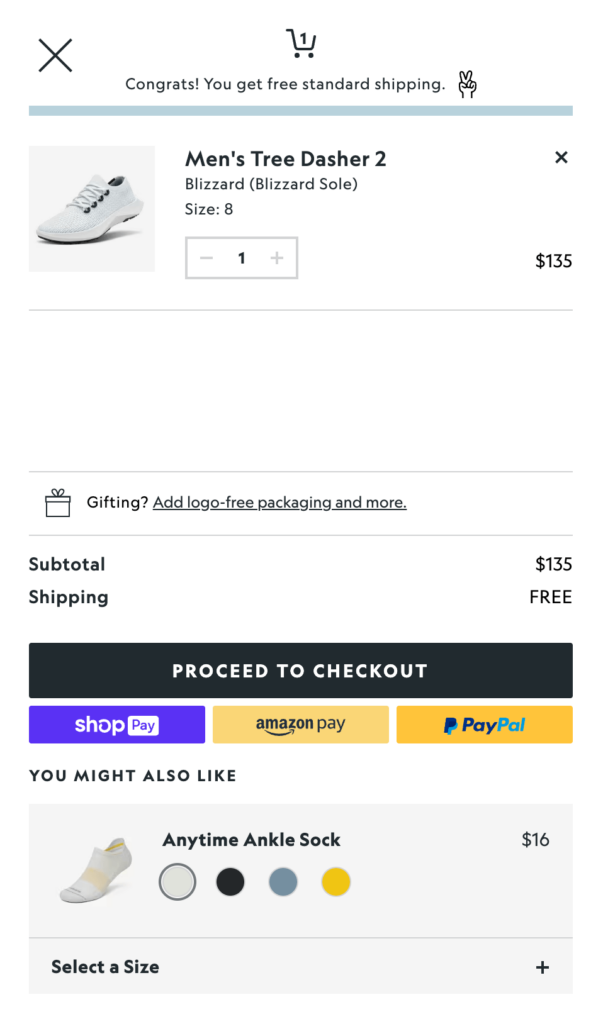
7. Offer guest checkout
As a store owner, your goal is to make the checkout process as easy as possible. While it’s recommended to collect information from users for future relations, there’s no harm in keeping a guest checkout option.
Offering guest checkout boosts sales
Sometimes customers are not ready to give you all their details. In that case, you need to reduce the barrier by keeping an easy option to checkout.
You may show a text mentioning what benefits users will get if they sign up. Otherwise, a seamless buying experience can bring more success.
8. Instant feedback for errors
Put indicators for required fields, then provide immediate feedback so that users can know instantly what they should have done.
After completing the full form and knowing about the errors after clicking the submit button is frustrating. So, be careful about it.
Highlight the areas where errors happen and let them know how to correct the mistakes. Descriptive error messages can help users to understand the fault and mitigate it properly.
A successful purchase requires effort, and you have the responsibility to make it smooth and user-friendly. Put asterisks, use tooltips, and highlight areas with errors.
9. Mobile optimization
Here’s a fact. 53% of total customers buy through mobile devices, and the number isn’t decreasing.
Is there a way to ignore mobile optimization? The answer is no.
It’s not any more optional. Not only it’s recommended to keep your online store mobile-friendly, but you must optimize your checkout page too.
Make sure that your checkout page is responsive and easy to navigate on smaller screens. Keep everything tap-friendly. Images should be larger after tapping.
Also, implement larger buttons and simplified forms to accommodate mobile users. The more convenient the checkout is, the more sales you can expect.
10. Test and iterate
While thinking about the checkout page design optimization, experimentation is key. Continual testing and refinement can lead to a smooth checkout page.
Start with A/B testing. It’s the simplest formula and proven method to find out what your customers love best.
By conducting A/B tests, you can analyze user behavior and receive feedback simultaneously to identify pain points. You can later find out which areas need improvement.
One of the best practices in eCommerce is to evaluate your design and adjust it from time to time based on the user’s demand.
Other things to consider
All the options I’ve mentioned above are the most significant ones. But these are not the final items. There’s always room for improvement. And you have to continuously seek for it.
These tips are your starting point. You can figure out more opportunities along the way. Be prepared for that.
Before finishing, I’d also like to mention a few other things that might be helpful while optimizing the checkout page design. For instance, you can keep an option to increase and decrease the number of items.
You can automatically add country codes for phone numbers based on the country your users selected. Coupons are another part that boosts sales. You should keep a field for that, as well.
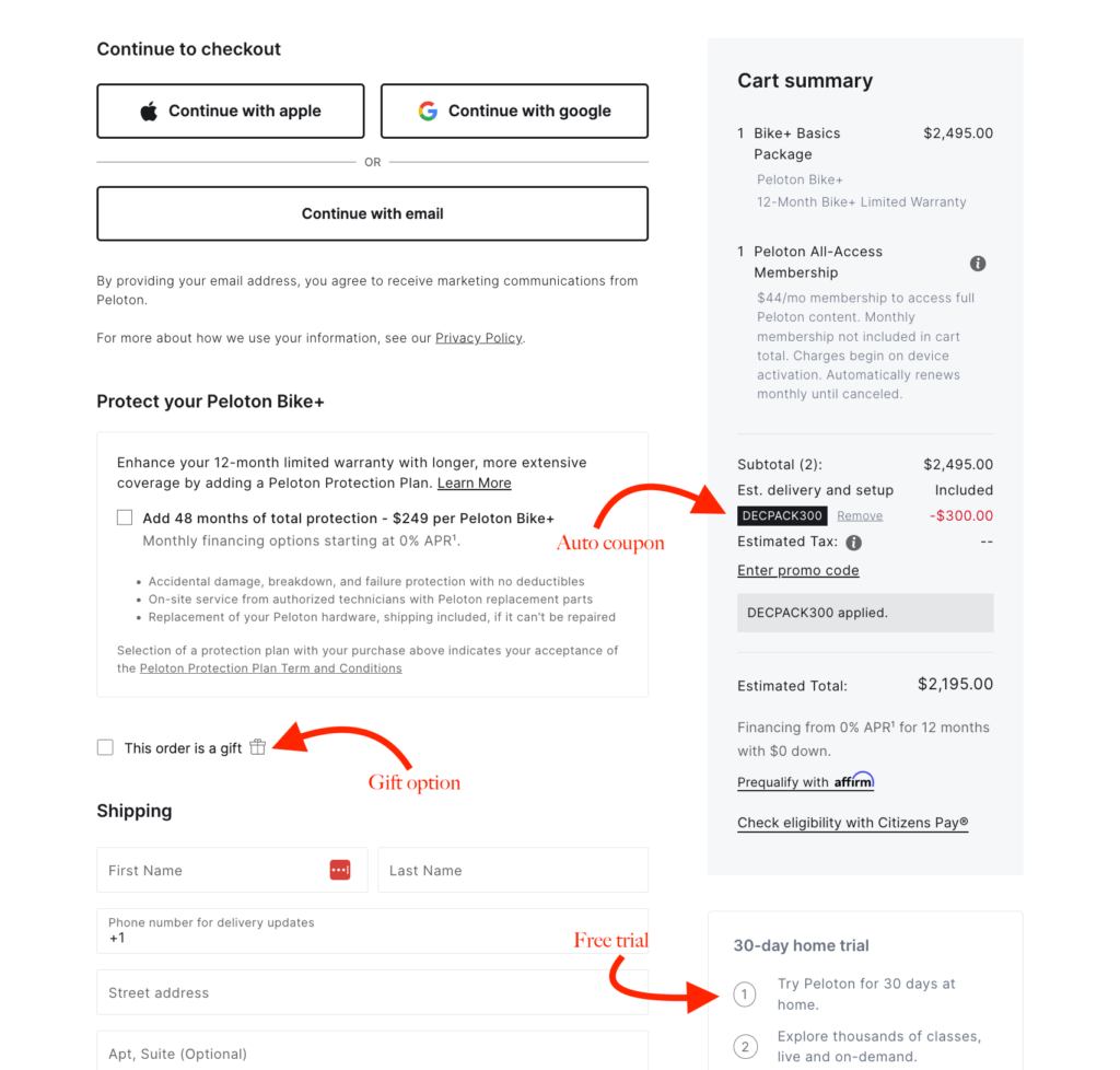
Peloton offers auto-coupon in their checkout
Interest-free installments also allow users when the price is out of their range. It will increase your sales since customers would love to pay $50 for four months instead of paying $200 at once.
Furthermore, you can even ask for feedback during the checkout. Nothing to push here, just keep an option so if users wish to say something about the checkout process they can.
Conclusion
Your checkout page design is the most crucial component of your online store. By implementing these tips, you can elevate your user’s journey and make their buying process smoother.
An intuitive, efficient, and secure checkout system can be the game-changer in turning visitors into satisfied customers.
Remember that, a user-friendly experience can significantly improve your overall conversion, resulting in a high number of sales.
-
Types of Online Communities to Help Scale Your eCommerce Store
Discover the 7 types of online communities that boost customer -
Advanced Product Variations, Built In and Free with FluentCart
Most WordPress eCommerce plugins charge extra for advanced product variations -
Add Product Variations to Your eCommerce Store Free With FluentCart
Add product variations to your eCommerce store for free with
Leave a Reply
You must be logged in to post a comment.