
Do you want to add various online charts to your site? No worries, though! Ninja Charts is a powerful chart generator in WordPress that allows you to generate and use a variety of charts.
You can create awesome charts in different formats by simply following a few basic steps.
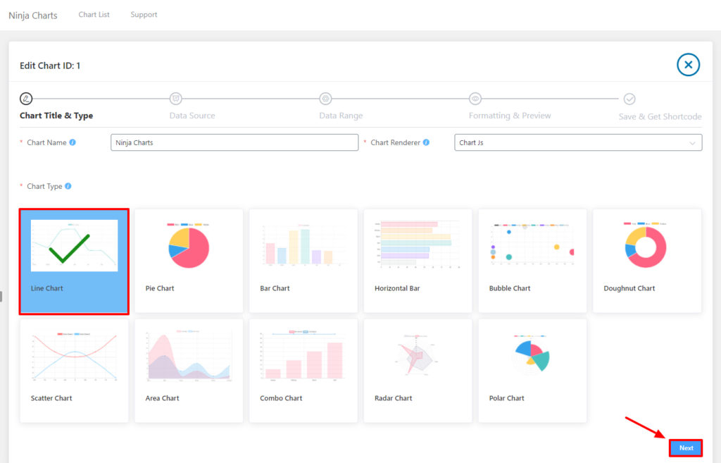
To create a Manual Chart firstly, you have to click on the Add New button. Then enter your Chart Name and choose your Chart Renderer. Two types of chart renderers are available: Google Charts & Chart Js.
After that, choose your preferred chart type from the dashboard. In this example, the Line Chart will be used. Other types of charts include; Pie Chart, Bar Chart, Horizontal Bar, Bubble Chart, Doughnut Chart, Scatter Chart, Area Chart, Combo Chart, Radar Chart & Polar Chart. Click Next to go to step 2.
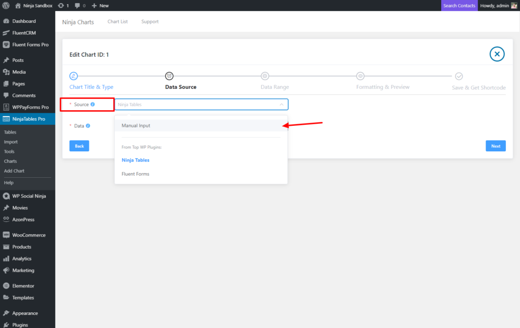
In the next step, from the Data Source select Ninja Tables. You will have an option for manual chart creation. Select this option from here.
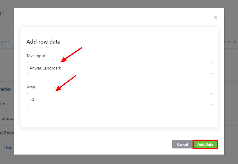
After clicking next, the Data Range option will appear. Here, to enter new column names you have to click on Add Columns. When you’re done adding columns, click on Save. Now it’s time to add the data in the columns. Click the Add data to do that.
Then don’t forget to click the Next button. This is how you can easily create Manual Charts using Ninja Charts.