Ninja Charts has incredible features that lets you build unlimited online charts and graphs on your website. This plugin gives you flexibility when it comes to customizing your data chart. When creating the chart, in the formatting and preview step, you’ll find a number of advanced options to customizing your online chart.
Just follow this simple guide to learn how to customize your chart.
Given below are some features that can be used for customization:
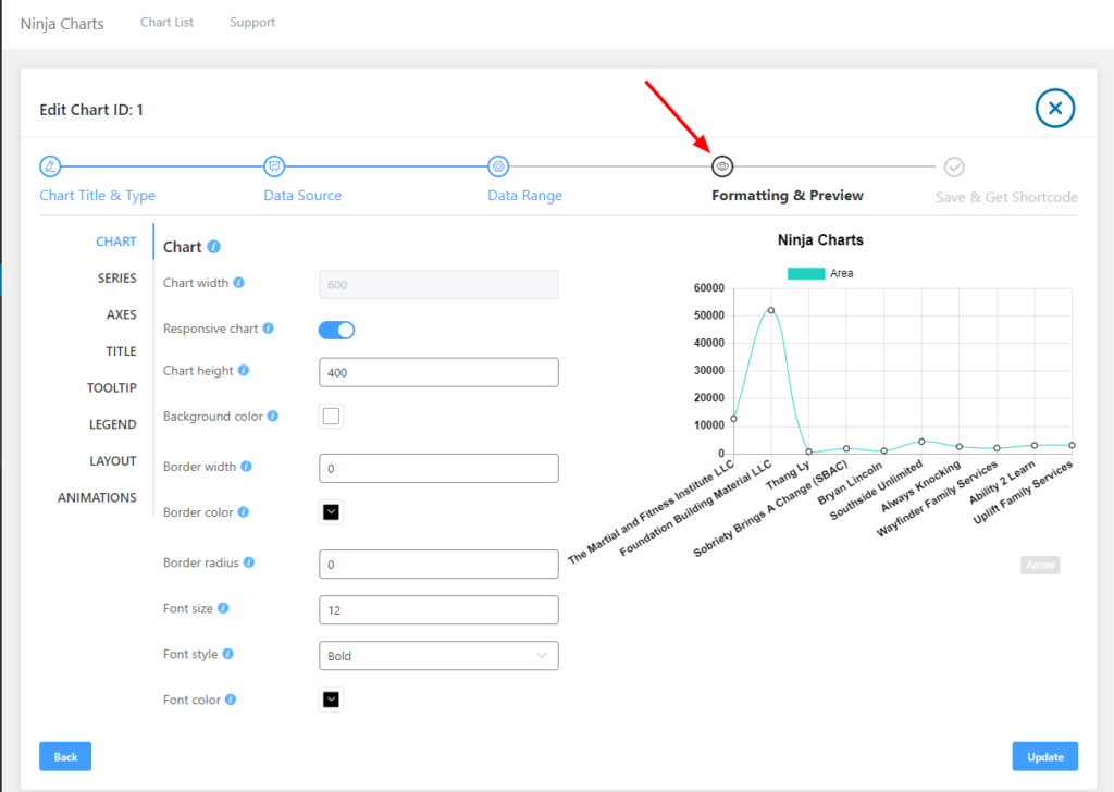
- Chart width: With this option you can adjust the width of the chart.
- Responsive chart: If you tick this, chart width will always adjust to 100% width of the container.
- Chart Height: You can adjust the height of your chart with this option.
- Background Color: With this option, If you tick this, chart width will always adjust to 100% width of the container.
- Border Width: Using this option, change the pixel width of the outer chart border.
- Border Color: You can set the color of the outer chart border using this.
- Border Radius: With this option, you can set the corner radius of the outer chart border.
- Font Size: This is the default font size in pixels, of all text in the chart.
- Font Color: With this option, you can change the default font color for all text in the chart. And make sure to click on Update button.
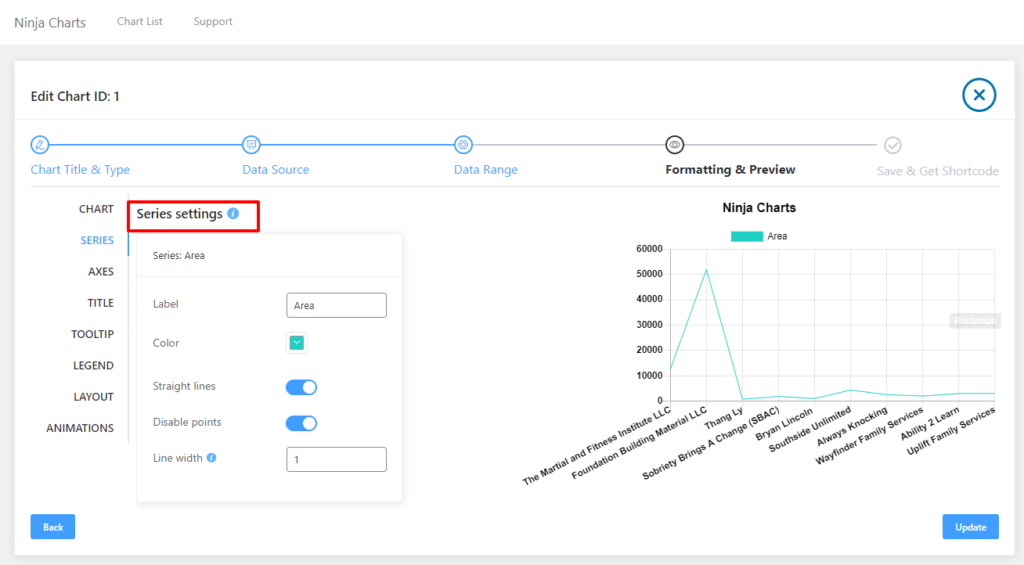
Moreover, you’ll get more options like Series, Axes, Title, Tooltip & Legend for making your online chart more personalized. Let’s have a look at the Series option now.
In the Series option, if you want to redefine the series labels and colors you can do it here.
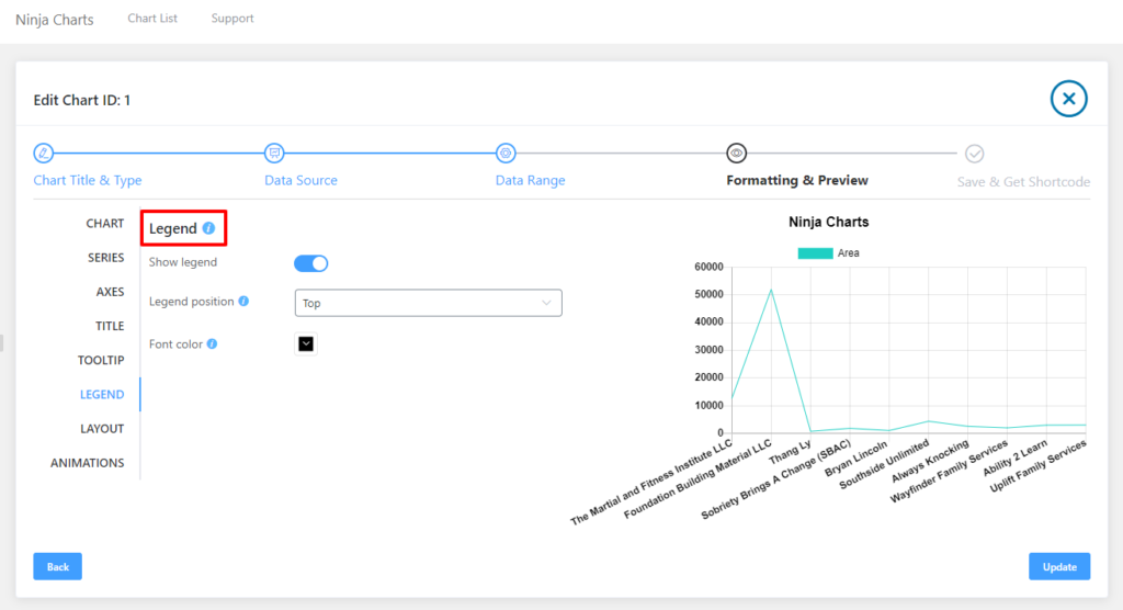
You can enable or disable the Legend option. Set the position of the legend. Possible values are top, left, bottom and right. With Legend Alignment, set the Alignments of the legend. Alignments values are start, center and end. Other options include Font Color & Font Size.
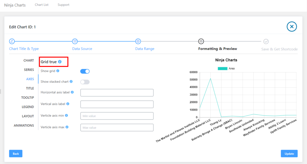
In the Axes option, you can control the curve of the lines on the chart/graph. Show Grid to control the grid view show and hide by switching it on. The Show Stacked Chart option controls the stacked chart view by switching it. Name the horizontal axis using the Horizontal Axis Label. You can also label the Vertical axis label, set the Vertical axis min(minimum value of axis) & Vertical axis max(maximum value of axis).
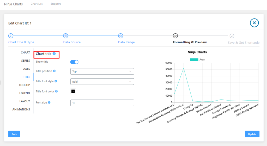
Here are the following options available in the Chart Title feature:
- Show title: Turn this option on to display your chart title.
- Title position: This is the position of the title. Possible values are top, left, bottom and right.
- Title font style: This is the default font style for text in the title.
- Title font color: Use this option for setting the default font color for text in the title.
- Font Size: This is option is used to adjust chart title font size.
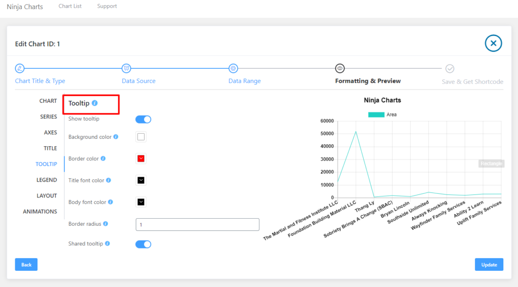
Now, let’s have a look at the options available for the ToolTip feature:
- Show tooltip: Turn this option on to display your tooltip.
- Background color: This is the background color for the tooltip.
- Border color: Use this option to set the border color for the tooltip.
- Title font color: This is the title font color for the tooltip.
- Body font color: This option is for setting the body font color for the tooltip.
- Border radius: With this option, you can set the radius of the rounded border corners.
- Shared tooltip: When the tooltip area is shared throughout the entire plot, the area will be captured.
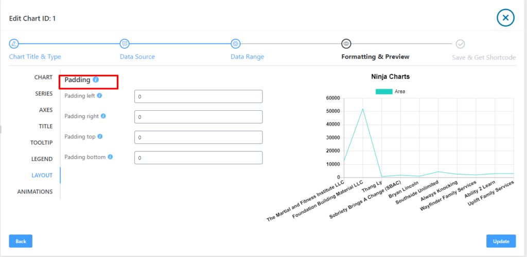
Here are the following options available in the Layout feature; Padding Left, Padding Right, Padding top & Padding bottom.