How to Use Contact Forms to Grow More Leads in WordPress

In the past few blogs, I wrote about several things related to contact forms, but one crucial thing was left behind; which is probably one of the most widespread uses of contact forms. We all know what an important role email marketing plays in every online business. This is why this article will focus on how to grow an email list using a contact form. Here I am using a WordPress plugin in order to create a contact form. This would help you grow more leads through your website.
Do you know to what extent you can use a contact form on your website to grow your email list?
If you are not aware of it yet, just make sure that you are concentrating on the post. You know, users get more interactive and engaged when they get to reach out using a contact form on your site. This is how the thing starts off.
Why Use a Contact Form for Growing Leads
First of all, you have to know that in the modern world, email is the key source of online marketing. In the era of social media, it might sound an ancient technic; but still, it dominates almost all parameters of digital marketing and the most cost-effective way to reach your audience.
If you are a webmaster or a marketer who is struggling with lead generation or audience retention, then you should learn about this issue right away. To encourage your expected users into the sign-up process, you need to combine different tools and methods. Providing multiple options to sign up always helps you rapidly to get more subscribers. This will ultimately put them into the funnel of the conversion.
Using a contact form can be one of such tools that can be implemented for having a better result in developing an email list. In many cases, we see maximum websites focus on adding email sign up forms to their websites. Which is not just common and conventional, but effective as well!
On the other hand, many webmasters collect their users’ emails in various ways such as surveys, quizzes, ebook downloads, and more.
Now, let’s see how to integrate easily your email list to your WordPress forms.
1. Integrating Email List to WordPress Contact Forms
If your website is set up with WordPress CMS, the first thing you need is to install and activate a form plugin that will make the whole process easier and convenient. I am using here Fluent Forms for serving my purpose. For having a detailed instructions, see our step-by-step guide on how to install and activate a WordPress plugin.
?Related link: Have a look at how to create a basic form using WordPress.
This is a free-of-cost and easy-to-use plugin, and you won’t need to hire a developer to set your contact forms with this plugin.
After activating the plugin, you will find everything you need on the board. Next, to make integration, head over to Fluent Forms ➡️ Settings page, then you would find several email marketing service options.
Basically, WP Fluent Form comes with direct integration with multiple best email marketing services like MailChimp, GetResponse, ActiveCampaign, CampaignMonitor, and iContact, etc. However, you will have to upgrade to the Fluent Forms Pro Add-on to avail of these integrations.
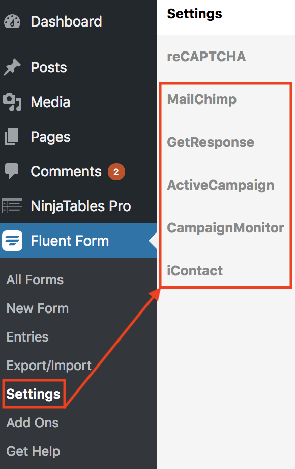
From the above top email marketing service providers, you can choose any one of them as your choice and enter the required credentials. This is how you can integrate your form with an email marketing platform. This integration will ultimately grow your email list as soon as someone fills up your contact form.
By implementing this method you can boost your email list that makes your business more impactful. It seems that you have now connected WP Fluent Form to your email marketing service so that you can add email options to your forms and add them anywhere on your website.
Combining Email Sign up Checkbox to Contact Form
There is another way that can improve your email list which is more efficient to work with. For more detail on how to create a basic contact form in WordPress.
After creating a form, the next thing is to add an email sign-up option into the same form. To make this happen, just use Fluent Forms and click on the checkbox field from the input fields options.
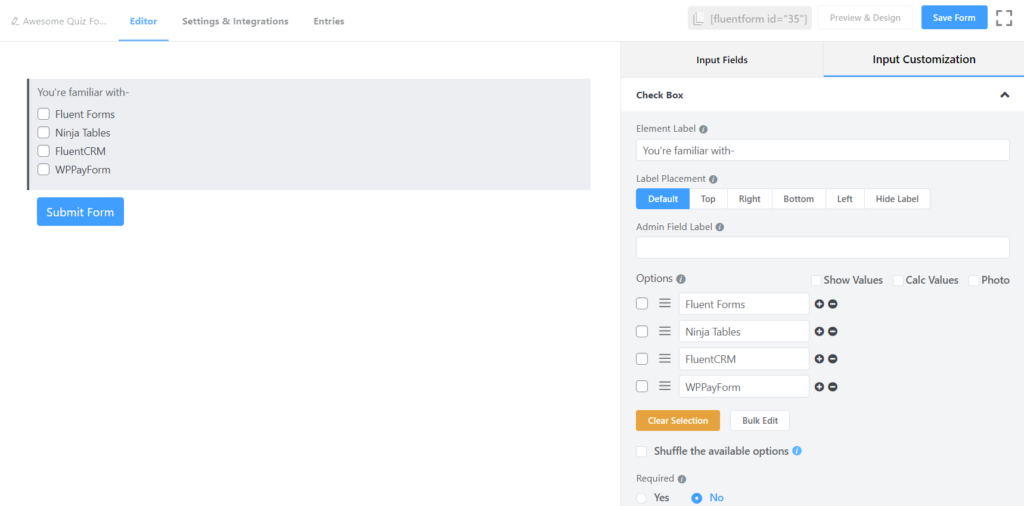
You will find three checkboxes after clicking the input field. Configure the input field by clicking on the edit icon (pencil) you get when hovering over the field. Keep one checkbox instead of three by removing two. You need to change the field label with a suitable name. When configuring you can check the box that would ensure that the box will be checked by default.
Now, it seems that your form is ready now, you just need to direct the form on what to do when someone fills up the form.
It’s pretty simple to do this, you just need to integrate the form with the MailChimp account or the email management system you are using. To have a solid understanding please look at the pro-tips given below.
There is one thing you MUST keep in mind. If your form is integrated with your MailChimp account, you have to manually configure it carefully. Otherwise, your users will be added to your list and get the notifications regardless of if they checked or didn’t check the subscription consent field.
?Pro-Tips: Give a go at how to integrate your form with MailChimp using Fluent Forms.
This is one of the best ways to increase your email list by integrating your form with an email automation provider.
2. Limit the Number of Fields
Sometimes a long-form can be boring stuff for the users and in this case, you should limit the form you are using. I am not talking about just the required fields but in general.
Suppose you are going to a new website for the first time simply for a query and they hand out to you a registration form with 15 input fields.
It might hamper your interest to fill-up the form, right?
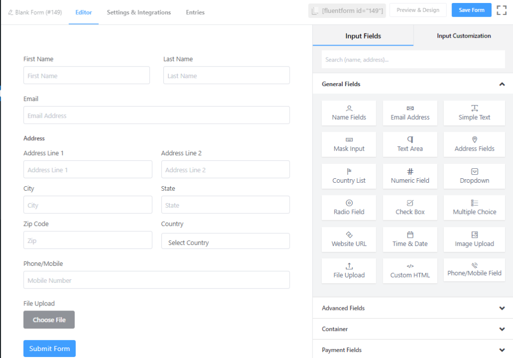
Studies show that the fewer fields you require, the more likely it is for users to fill out the form. Do you actually need 15 different pieces of information to get? If the answer is no, just go for the basics.
It’s always fine if you can limit the required fields to under five if not three.
3. Design Optimization
Make sure that the design layout of the form isn’t driving away users. Fortunately, modern WordPress Form builder plugins come with almost all the options one might need to customize a form’s UI. The plugin I am using- Fluent Forms lets me customize the field labels’ alignment, placeholders, confirmation types, the positioning of the help messages, error messages, asterisks, etc.
Keep one thing always in mind- any obstacle to submitting a contact form will ultimately hurt your form conversion rate, and eventually email list as well.
4. Required Fields Indication
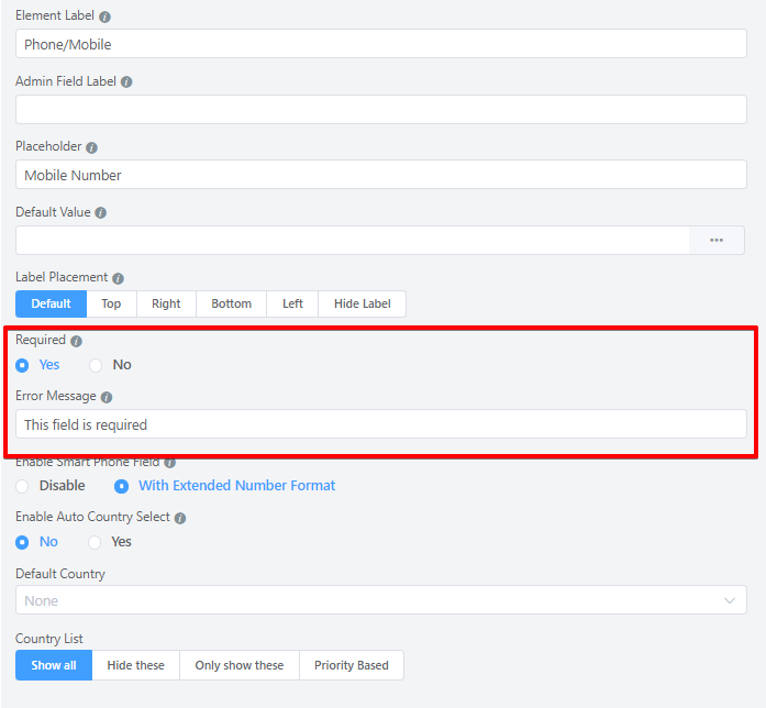
Always try to put the fields which are necessary and most relevant. You also can make things easier for your users by indicating the required fields.
You might not need all the fields you mentioned but put the asterisk(*) sign in your form that will define the required fields on your form. You also can label a field by typing any specific field optional.
This is psychologically proven that people aren’t likely to give their personal information. So show clarity towards your visitors so that they will successfully submit a query on the first try.
5. Mobile Friendly Design
Statistics show that nowadays the percentage of mobile users is increasing day by day. So if the form you created isn’t mobile-friendly that will miss a huge number of audiences to involve in the conversation.
Hence, make sure that your forms are always mobile-first in type. Design the form in such a way that a visitor will fill-up the form and submit it instead of leaving the form from their handheld devices.
6. Building Trust Issue
In the case of filling out a form, you are essentially asking the visitors to enter their personal information and submit it to you. The thing is you are an unknown person asking for information from another unknown one, this is quite bold!
So, make sure that your contact page is as trustworthy as it can be by following the basic online etiquette. First of all, you should only ask for information that you need for making a good impression and you can always have more information you need if you successfully establish a sound relationship with your subscribers.

Another important thing is to let your visitors know exactly what information you require and why you need it. It shouldn’t be something secret one rather it should be open. This doesn’t only increase your conversion rate, but at the same time create a sense of faith on your brand value.
It is also advised to put a link of your Terms & Conditions, Privacy Policy or GDPR consent field just above the Submit button. This way, you make sure that users are in accordance with your policies. That ultimately helps to build trust among the users and grow your email list.
7. Make a Commitment
Always try to make your visitors know that you will get back to them shortly and surely with the promise you make. How long actually will you take for you to contact them in returns? 24 hours? or 48 business hours? It’s even better if you can deploy an autoresponder email right after someone fills out a form.
Fluent Forms offers me this feature with their Email Confirmation feature. What is even better? I can send personalized emails to my new subscribers. The conditional email confirmation feature that comes with WP Fluent Form also enables me to send Thank you emails to my regular subscribers, and error emails to the ones where the subscribers fail to fulfill the certain criterion. But this Conditional Confirmation Feature is a Premium one. You will have to purchase and activate Fluent Forms Pro Add-on to perform this action.
When asking for any information, make sure that what is the preferred method of contact, phone or email? That might help you to get back to them soon.
8. Make Your Form GDPR Compliant

Nowadays, GDPR is a burning issue that will impact all the sectors of the modern world. And it is a necessary issue to consider the least. Make sure that your forms are GDPR compliant so that it will look more professional which ultimately make visitors feel more authentic.
Making your website GDPR friendly using a form that boosts up your business by collecting more leads into your list. Because you attract and collect information using various types of forms on your site and this will impact your visitors.
When visitors come to your site and see that your form isn’t complying with the GDPR rule, they might feel uncomfortable providing their information feeling unsafe.
?Related link: An Understanding of making your website GDPR compliant.
9. Don’t Just Say “Submit”

An online form is not an assignment or school homework that is to be submitted to the teacher. This is a piece of personal information and is way different from that of school homework.
At the end of the contact form, you can do lots of things to get the visitors to make the final action. In some cases “Submit” is ok but there are other ways that show that “Submit” is not super inviting.
In fact, several A/B testing scenarios tell that “Submit” was one of the lowest actionable words to get the people to pull the trigger.
So make the finest button text at the end of the contact form that would entice the visitors to make that final click.
10. Sell It With Enticing Title
A page title that shows like “Contact Form” or “Contact Us” is boring. People are getting bored to see those common titles on the contact form page. Give a title that encourages your visitors to fill-up the form and take an action.
If you offer some interesting things your visitor will be interested in fill-up the form. You can offer weekly recipes or different promotional offer something pretty relevant to your expertise. You also can start with the title like “Please tell us a little bit about your event” or “Make us know about yourself”.
11. Make a Loop
Always monitor your form activities and test the form events on a regular basis. This is how you can find what works for you and whatnot. You can go crazy on your contact page by following these above-mentioned suggestions and this could be an excellent starting point for you.
A loop of testing should be going on and on in terms of different designs, field requirements, Layouts, action words until you notice the form submissions increase 5 to 10 percent. It simply can be said if your conversion rate is 8-10%+, that is a good indicator that implies your site is moderately optimized.
I hope this article helped you learn how to use the contact form on your site to grow more leads. If you like the article have something to share, then let me know your opinion by putting a comment below.
Comments
-
[…] Read more here: How to Use Contact Forms to Grow More Leads in WordPress […]
-
Thanks, Jona! To have more resources on WordPress keep in touch with us.
-
Hello! I would wish to provide a enormous thumbs up for the great info you could have here about this post. We are coming back to your blog for further soon.
-
Thanks, Kristin, for your appreciation. Happy to know that you found the article helpful.
-
-
I’m really impressed together with your writing skills and also
with the structure in your weblog. Is that this a paid subject matter or did
you customize it your self? Either way stay up the excellent quality writing,
it is uncommon to see a nice blog like this one these days.. -
Thanks for finally talking about >How to Grow Email List Using
Contact Foms On Your Site <Loved it!-
Happy to hear that you loved the post.
-
-
Hi, just wanted to tell you, I liked this blog post.
It was inspiring. Keep on posting! -
Excellent way of explaining, and pleasant piece of
writing to take data on the topic of my presentation subject matter. -
projektownie wnętrz Gdynia
[…]check beneath, are some totally unrelated internet websites to ours, on the other hand, they’re most trustworthy sources that we use[…]
-
بديل تروكولر
[…]we like to honor many other world wide web web-sites around the net, even though they arent linked to us, by linking to them. Underneath are some webpages worth checking out[…]
-
free download for windows 10
[…]below you will obtain the link to some internet sites that we consider it is best to visit[…]
-
app for pc download
[…]Wonderful story, reckoned we could combine a couple of unrelated data, nonetheless definitely really worth taking a search, whoa did one master about Mid East has got more problerms also […]
-
free download for pc windows
[…]Here is a superb Weblog You may Locate Intriguing that we Encourage You[…]
-
app for laptop
[…]please visit the internet sites we stick to, such as this one, because it represents our picks from the web[…]
-
free download for windows 10
[…]below you will uncover the link to some web-sites that we feel you’ll want to visit[…]
-
apps for pc
[…]usually posts some really intriguing stuff like this. If you are new to this site[…]
-
apps apk free download for windows 8
[…]the time to read or visit the content material or internet sites we have linked to below the[…]
-
chief keef hiding download
[…]one of our visitors not long ago suggested the following website[…]
-
Weebi
[…]one of our visitors not long ago recommended the following website[…]
-
Buy Guns Online
[…]usually posts some incredibly interesting stuff like this. If you are new to this site[…]
-
IT Support Bristol
[…]we came across a cool internet site that you could love. Take a look should you want[…]
-
Google
Below youll locate the link to some internet sites that we believe you’ll want to visit.
-
Macbook pro akku reparatur pfäffikon
[…]Here are several of the internet sites we advise for our visitors[…]
-
Pinball Machines for Sale
[…]very handful of internet websites that happen to become in depth beneath, from our point of view are undoubtedly effectively really worth checking out[…]
-
Tanzania safari
[…]very handful of web-sites that transpire to become detailed below, from our point of view are undoubtedly nicely really worth checking out[…]
-
[…] Contact forms are the most convenient channels for potential leads to get in touch with your business. In this digital era, information is money. Contact forms make it easier for you to get valuable information about your visitors, convert your traffic into leads, and hopefully increase your total revenue. It may sound simple enough, but there are a bunch of practices that affect the success rate of your form’s conversion. Here are some top dos and don’ts of contact forms in 2022 you need to look out for in order to boost your conversion rate. […]





Leave a Reply
You must be logged in to post a comment.