Ninja Charts is a WordPress chart plugin that makes the process of creating online charts as simple as possible. Presently, the plugin includes 9 different chart types that you can customize with your own data to create a visual representation. The charts offered include:
- Line charts
- Pie charts
- Bar charts
- Bubble charts
- Doughnut charts
- Radar charts
- Polar charts
- Scatter charts
- Area charts
- Combo charts
Simply follow this demonstration to learn how to create different type of charts.
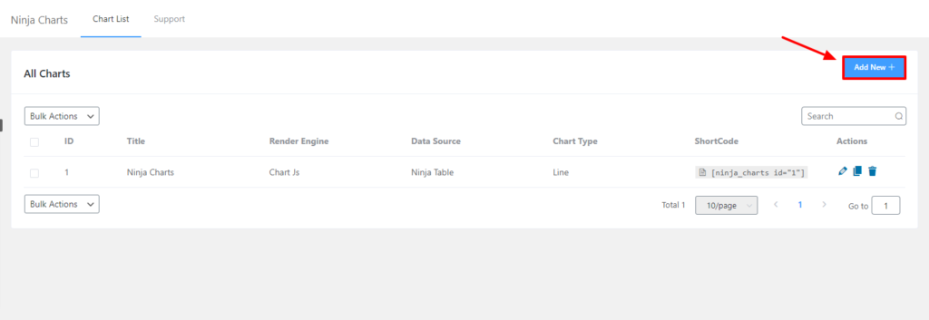
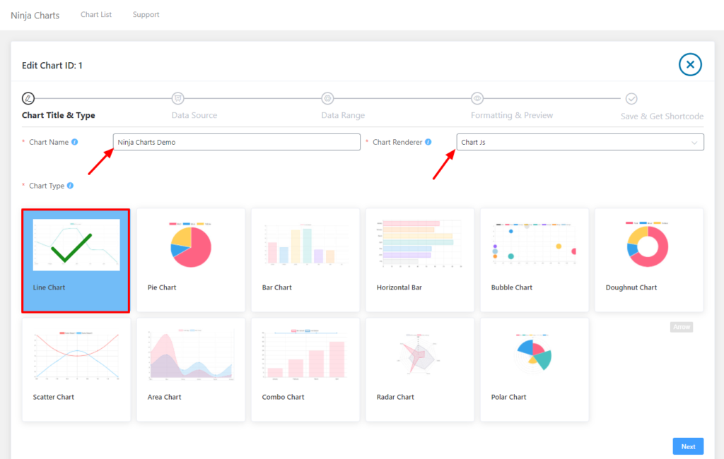
At first, go to your Ninja Charts dashboard & click on the Add New button to add a chart. Here, you can enter your Chart Name & choose the rendering engine using the Chart Renderer option. You can choose either Google Charts or Chart Js.
In this example, Chart Js has been selected. Now you will notice various kinds of charts to choose from. Simply select your preferred chart type from here. A Line Chart has been selected for demonstration purposes. Then click on Next.
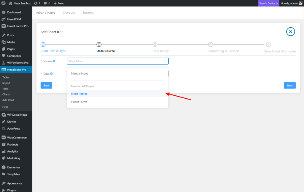
After clicking next, you have to select the source of data from the Source option. There are three options; Manual Input, Ninja Tables & Fluent Forms. Here, Ninja Tables has been chosen as the data source as an example.
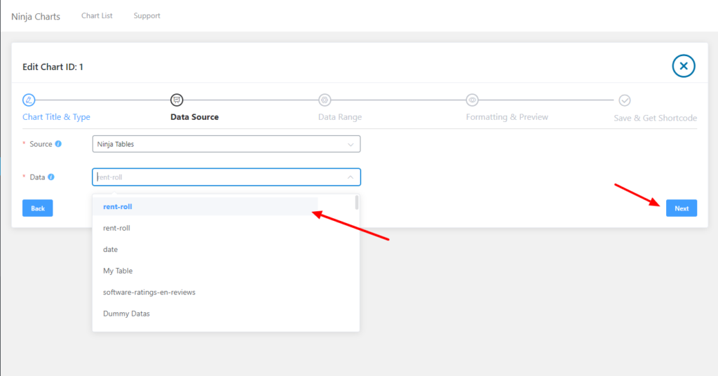
Next, another option will appear where you can select the Data from the list. Look at the example below to know more. And click on the Next button.
This is how you can create & select different charts using Ninja Charts.