
Video Analytics for WordPress Courses: What Creators Should Track

Your LMS tells you who passed the quiz. It does not tell you who rewatched the same two minutes four times or quit 30 seconds into lesson three. That behavior data lives in your video player. Most course sites never collect it. That gap is where course optimization goes to die.
TL;DR
- The median MOOC completion rate is 12.6%.
- Your LMS tracks outcomes. Your video player tracks behavior. Most WordPress course sites only have one of those layers.
- Audience retention curves show you exactly where learners disengage.
- Rewatch spikes mark confusion. Fix those segments first.
- FluentPlayer (Pro) tracks completion rate, audience retention, top users, device distribution, and new vs. returning viewers at the individual video level.
- FluentCommunity (Pro) adds community engagement data as a third layer alongside your LMS and video player.
Your LMS Is Tracking the Wrong Layer
LMS Data Layer
- Quiz Scores
- Enrollment Numbers
- Assignment Submissions
- Completion Certificates
Where most course
optimization fails
Video Behavior Layer
- Watch Time Per Video
- Drop-off Timestamps
- Rewatch Segments
- Device Type
- Retention Curve Shape
Your LMS records outcomes. Enrollment numbers, quiz scores, completion certificates, all logged. What it cannot record is why a student stopped engaging before any of those signals fired.
A student who rewatches the same segment three times did not understand something. A student who drops off at the six-minute mark of every lesson is hitting a structural problem, not a motivation problem. Those two situations need completely different fixes.
QUOTE: Outcome data cannot tell them apart. Video behavior data can.
The 5 Video Metrics That Actually Predict Course Performance
Completion rate and why the number alone misleads
What it is: Completion rate is the percentage of viewers who watch your video from start to finish.
It is the most-reported video metric and the most misread. A 60% rate on a 4-minute lesson means something different than the same rate on a 25-minute lecture.
Wistia’s 2026 State of Video Report found that educational videos under five minutes see viewers watch about halfway through on average. For longer formats, completion rates drop but total watch time goes up. Length changes what the number means.
Benchmark your completion rate against video length, not against other creators. A 45% rate on a 20-minute lesson is not a failure. On a 3-minute intro video, it is a problem.
FluentPlayer tracks completion rate at the individual video level. You see which specific lessons are losing learners, not just which courses.
Content decision example: A creator runs the Top Videos report and finds lesson 4 of a 6-lesson module has a 28% completion rate while every other lesson sits above 65%. The video is 22 minutes long. The decision is not to rewrite the content. It is to split lesson 4 into two shorter videos and add chapter markers. Completion rate on the split version becomes the test.
Audience retention and drop-off mapping
What it is: Audience retention is a second-by-second graph showing what percentage of viewers are still watching at each point in your video.
The shape of that curve tells you more than the completion number alone. A sharp drop in the first 30 seconds means your intro is not earning attention. A sudden cliff at a specific timestamp means something happened there.
Research published in Distance Education (November 2025) found that longer videos and slower instructor speech correlate with higher in-video dropout rates. Retention curves make those patterns visible, lesson by lesson.
FluentPlayer’s audience retention data pinpoints those timestamps. You bring the fix. The data tells you where to look.
Rewatch rate as a confusion signal
A segment that gets rewatched repeatedly is not necessarily your best content. In a learning context, it is often your hardest content.
Learners rewatch when something did not land the first time. Rewatch spikes mark the moments where your explanation was unclear, your audio dropped, or the concept moved too fast.
Those are the exact segments worth re-recording or restructuring with a worked example. FluentPlayer’s retention data surfaces these patterns. Video Chapters (Free plan) give you a way to act: split the confusing segment into a named, navigable section.
Device distribution and its effect on completion
Where your learners watch changes what your content needs to do. A dense slide-based lesson built for a 27-inch monitor plays completely differently on a phone screen.
If your device distribution shows 60% mobile, that is not a traffic insight. It is a production note. Your text needs to be larger, your slides less cluttered, and your first 60 seconds faster. Mobile learners do not tolerate slow intros.
If the same lesson has high mobile traffic and low completion, the device split is your first diagnostic question, not an afterthought. FluentPlayer logs device distribution at the individual video level, so you can cross-reference it against each lesson’s retention curve directly.
New vs. returning viewer ratio
On a course site, a high returning viewer ratio means learners are coming back. That signal reads differently than on a marketing video.
It can mean two things. They are reviewing material before an assessment, which is good. Or they are rewatching because the content did not stick, which is not.
Cross-reference the returning viewer ratio against your rewatch segments. The same people returning to the same timestamps repeatedly signals a curriculum design problem. Returning viewers spread across different segments signals deliberate study.
FluentPlayer’s New vs. Returning Viewers data (Pro) gives you that split per video.
Content decision example: A creator notices that lesson 3 has a 60% returning viewer rate, the highest in the course. Cross-referencing with the retention curve shows returning viewers cluster at a 4-minute segment explaining a technical concept.
The decision – pull that segment out, record a cleaner standalone explainer, and link it from the lesson notes. The returning viewer rate on that timestamp drops. Learners stopped needing to rewatch because the explanation finally landed.
What Good Video Analytics Look Like on a WordPress Course Site
Most WordPress video players give you a view count. That number does almost nothing for course optimization.
You need the full behavior picture at the video level, not just the course level. A course with a 40% overall completion rate might have five lessons at 80% and one at 12%. The rollup hides that completely.
Per-video performance vs. course-level rollup
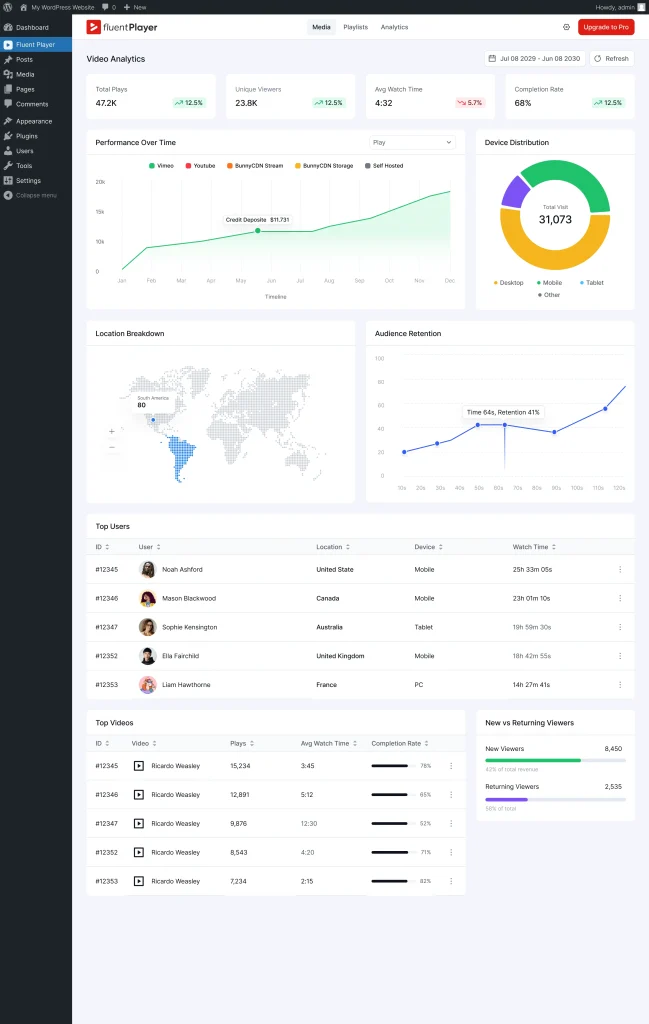
FluentPlayer’s Pro analytics suite tracks the following at the individual video level: Views, Average Watch Time, Unique Viewers, Completion Rate, Top Videos, Top Users, Watch Time Trend, New vs. Returning Viewers, Location Breakdown, Audience Retention, Device Distribution, and Performance Over Time. The full breakdown is on the FluentPlayer features page.
The Top Videos report shows which lessons hold attention and which ones lose it. Run it across your course library and you get a ranked list of content problems sorted by severity.
Connecting watch data to learner identity
The Top Users report shows which specific learners are watching the most, and which videos they are watching. This is where video analytics for WordPress courses gets genuinely useful.
Your most engaged learners are your most likely completers, referrers, and repeat buyers. Knowing who they are before they self-identify through a purchase or review gives you the chance to reach them while they are still inside the course.
Playlists and sequential drop-off
Video Playlists in FluentPlayer (Pro) let you group lessons into structured sequences with two layout options: standard and grid. For course sites, the analytics value is in what happens between videos. If learners consistently complete lesson 3 but do not start lesson 4, the drop is not inside a video. It is in the transition.
That gap does not show up in individual video completion rates. It shows up when you look at the Watch Time Trend and Top Videos data across a playlist sequence. Lesson 3 has strong numbers. Lesson 4 has low unique viewers. The content is not the problem.
The transition, the lesson title, the perceived difficulty, or the gap between sessions is. That is a different fix than re-recording.
Adding a Third Data Layer With FluentCommunity
Video behavior and LMS outcomes are two data layers. There is a third: what learners do between lessons.
Most course sites have no visibility into that gap. A learner who watched 80% of every video but never posted a question, never replied to a peer, and quietly stopped showing up is invisible until they do not renew. By then it is too late.
FluentCommunity is a WordPress community plugin that integrates with FluentPlayer (Pro). It sits alongside your course content so discussion, questions, and peer interaction happen in the same environment as the videos, not in a separate Facebook group or Slack channel you have no data on.
The practical use is specific: when your Top Users report shows you who your most engaged video watchers are, FluentCommunity is where you put them to work.
A discussion prompt after a high-rewatch lesson converts confusion into peer explanation. A cohort channel for your top learners builds the kind of accountability that completion statistics cannot manufacture.
👉 Start your course website with gated community using FluentCommunity.
How to Act on Your Video Analytics Data
Fixing drop-off with chapters and timed content
Once your retention curve shows you where learners leave, try navigation first. A learner who knows where they are in a long video is less likely to abandon it.
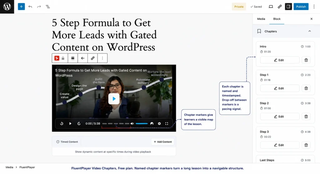
Video Chapters in FluentPlayer are on the Free plan. Say your retention curve shows a consistent drop at the 8-minute mark of a 20-minute lesson. Add a chapter break at minute 7 labeled “Quick recap” and another at minute 9 labeled “Applying the concept.”
That break gives the learner a visible progress point. Drop-off at a named chapter boundary is normal. Drop-off in the middle of an unmarked block means the content lost them with no exit ramp.
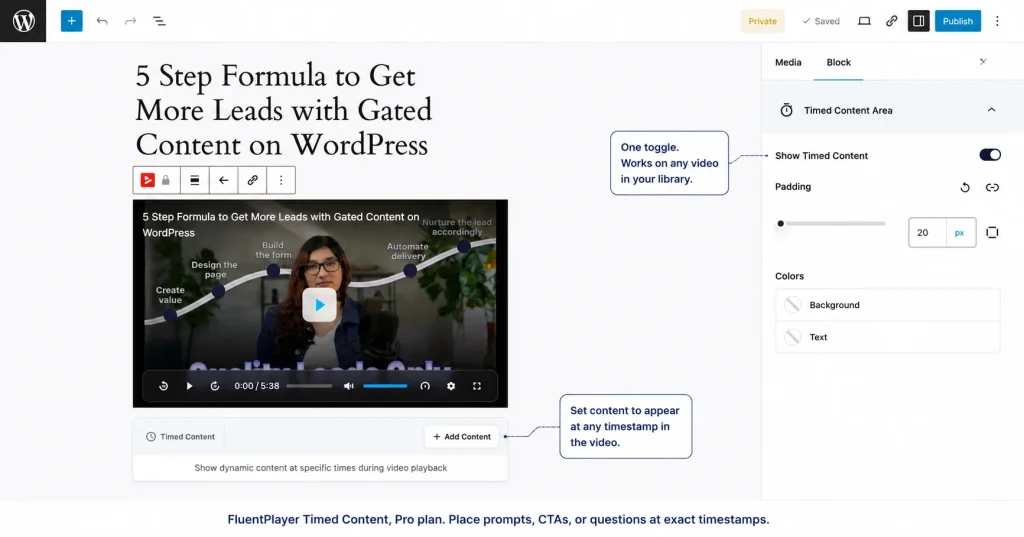
Timed Content (Pro) goes further. If your rewatch data shows learners replaying a specific concept three or four times, place a short comprehension prompt at that timestamp. Something like: “What would you do differently here?”
That single question converts passive rewatching into active processing. It is a re-engagement point built into the video itself, not a follow-up email sent three days later.
CTA placement using retention data
Most course creators place CTAs at the end of a video. Most viewers never get there. Your retention curve shows you where engagement is actually highest.
That is where a CTA belongs: just before the first significant drop-off point, not after it.
If your retention curve shows strong engagement through the first 6 minutes of a 10-minute lesson and a sharp drop at minute 7, place your CTA at minute 5:30.
A prompt to download the accompanying worksheet, enroll in the next module, or join the course community lands when attention is at its peak, not when the viewer has already mentally left.
FluentPlayer’s Timed Content lets you place that CTA at the exact timestamp the data identifies.
Using top-user data to identify your best learners
Run the Top Users report after your first cohort completes a course. The learners at the top watched the most, returned the most, and engaged most deliberately.
These are the people worth reaching out to directly. Skip the automated sequence, send a personal message asking for a five-minute call.They already showed you they value the material. That is the rarest and most useful signal a course creator gets.
Your Weekly Video Analytics Checklist
Run this after every cohort week. It takes 15 minutes. Each item maps to a specific decision.
Every week:
- Check completion rate by video – Any lesson under 40% that is longer than 10 minutes gets flagged for a chapter review. Any lesson under 40% that is under 5 minutes gets flagged for an intro rewrite.
- Scan the retention curve on your lowest-performing lesson – Identify the timestamp of the sharpest drop. Is it consistent across viewers or isolated to a few? Consistent means a content problem. Isolated means a device or connection issue.
- Look at the rewatch spikes- Any segment with a visible upward spike in the retention curve goes on a re-recording shortlist. Add a chapter break there first as a temporary fix while you plan the rewrite.
- Check device distribution on mobile-heavy lessons – If a lesson is above 50% mobile and below 50% completion, flag it for a pacing and visual audit before the next cohort.
After each cohort completes:
- Run the Top Users report – Export the top 10. These are your testimonial and case study candidates. Reach out within 48 hours of course completion while the experience is current.
- Run the Top Videos report – Your top three are the strongest lessons in the course. Study what they have in common: length, pacing, chapter structure, topic type. Rebuild your weakest three lessons to match those patterns.
- Check New vs. Returning Viewers on your highest-rewatch lessons – If returning viewers are clustering at the same timestamps cohort after cohort, the content has a structural problem that chapter breaks alone will not fix. That lesson needs a rewrite.
Start With the Behavior Layer
If you are running a course on WordPress without video behavior data, you are optimizing blind. Katy Jordan’s analysis of 221 MOOCs puts the median completion rate at 12.6%.
The course creators closing that gap know where learners leave, why they return, and which lessons are worth rebuilding.
FluentPlayer gives you that data inside WordPress, at the video level, without a third-party platform. The VIP waitlist is open now.
Join the waitlist at fluentplayer.com and get access before the public launch.

This is Sumit. He’s a physics major who’s trying to understand both the physical as well as the WordPress worlds. Whenever he’s not busy, plays fifa or spends time with his family.
-

How to Build an Affiliate Program for Retailers: WordPress Guide
Build an affiliate program for retailers step by step. Margin-safe -

Complete Guide on How to Build A Church Website with WordPress
Learn how to build a church website with WordPress, from -
Kanban vs Scrum vs Agile vs Waterfall: What’s the Difference?
Get a clear, no-jargon breakdown of Kanban vs Scrum vs
Leave a Reply
You must be logged in to post a comment.