Top 15 Dos and Don’ts of Contact Forms in 2022

Contact forms are the most convenient channels for potential leads to get in touch with your business. In this digital era, information is money. Contact forms make it easier for you to get valuable information about your visitors, convert your traffic into leads, and hopefully increase your total revenue. It may sound simple enough, but there are a bunch of practices that affect the success rate of your form’s conversion. Here are some top dos and don’ts of contact forms in 2022 you need to look out for in order to boost your conversion rate.
Most Important dos and don’ts of contact forms
Let’s dig deep to find out the most important factors of contact forms to be successful. These practices can give you the desired results you are seeking for.
Do: Make it simple and personal
First of all, keep in mind that visitors usually use a contact form to contact you, implying that people want to connect with you. Be explicit about your proposition. It’s only fair as they’re looking for some personal interaction and going to give you their personal information. Also, you need to get their confidence before filling the form. For instance, make them feel at home and convince them it’s okay to reach you out.
Do: Keep it relevant
Before thinking about anything else, like what color to use or the kind of fonts to use, make sure you know the form’s purpose. You may start with brainstorming and defining the different form fields, including their type, name, placement, etc. Make it convenient for the visitors and leave out all the fields you cannot justify.
Don’t: Add unnecessary fields

Long forms make users feel overwhelmed, and they often lose interest.. Pay close attention to the length of your form. Sure, the form should contain all the fields necessary to gather contact information and identify the users’ needs. However, don’t fall into the dilemma of which fields to include and which to exclude. If your contact is fairly new, keep it concise and straightforward.
Do: Try different layouts
Keep an eye on the performance of your contact form. Don’t hesitate to change the layout of your form to improvise. Adding labels and placeholders to the fields, including the form on the right side of the page, may give an extra boost to your form. Try to keep track after changing the layout. Pay attention to your analytics for further marketing moves.

Do: Offer alternative contact details
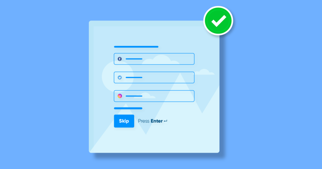
Contact forms might not attract everyone. Some people like forms, some people don’t. Make sure you have other options available on your contact page to avoid losing touch with your potential leads. These alternatives can be as simple as an email address, phone number, or social media inbox.

Don’t: Ignore the button
Most of the form builders have the button text set to Submit by default. Don’t be that guy; get creative with your Submit button. Change the text “Submit” to something exciting like “Let’s Get Started” or “Subscribe for the Newsletter.” Also, give it a nice color and shape to make it click-worthy! Be imaginative; get your hands dirty!
Do: Make it responsive
Responsive forms are the ones that adapt to the size of the screen. As people are using different devices to visit your sites, the responsiveness of contact forms is a must. Otherwise, input fields won’t scale down or correctly appear to the users. Make sure your contact forms are responsive for any screen size, which gives you more flexibility to hook up more clients in general.

Do: Utilize thank you page
After submitting the form, the user should be redirected to a thank you page instead of a simple “Thanks for submitting” note. Instead, redirect them to a page that will better prepare them for the conversion process. You can simply include your social media accounts, an offer, a link to your most popular blogs, and more. Encourage them to stay on your site by offering more content to consume.
Don’t: Use Captcha
Using CAPTCHA to prevent bots is old school. People don’t like to use CAPTCHA every time they encounter any forms. Use reCAPTCHA or hCaptcha instead to simplify the process, and there are two versions reCAPTCHA to try out. Moreover, Fluent Forms offers different options to increase the security of your forms like hidden fields, Akismet, honeypot, etc. along with these.
Do: Enable visuals

Give life to your contact form by using media – images, small animation, or a video could give your form a vibrant look. Whatever you choose, just make sure it goes with the context. Also, you don’t need to overcrowd your form by using unnecessary attachments. If you’re interested in making interactive and eye-candy forms, you can try Conversational Forms.
Don’t: Hide your contact form
Very few visitors usually scroll to the bottom of a page to find a tiny contact form. Don’t be shy to be more visible. You can put your contact form on the contact page or the about page, put it inside or beneath blog posts, or simply add it in the sidebar. The main thing is your form should get more exposure if you want more leads. Try out different positioning of your form and choose the best one for you.

Do: Win followers at no cost
Give your users something to get abroad. This can be a discount offer, newsletter, or free pdf guidebook. Make it easier to join your email list and partake of your updates, as email marketing is still a powerful method if used strategically.
Don’t: Forget to test your form
Finally, don’t forget to test your form before launching it. If the form doesn’t work properly, all your hard work goes in vain. Nobody wants that. Don’t let the users think your site is a disreputable one. So, before publishing, run your form once or twice to make sure everything’s in order.
Some additional Dos and Don’ts of Contact Forms to follow in 2022
- Don’t: Use mandatory mobile number field
A mobile number is considered much more personal than an email address. It’s easy to filter spam email, but when the wrong people get your number it’s a nightmare. Try to avoid the mandatory mobile number field unless it’s an absolute necessity.
- DO: Take a look at your analytics
Do check your Google Analytics regularly to improve your conversion rate. A high bounce rate can tell a lot about the user experience on your webpage. You can identify what’s keeping your users away from the contact form and take steps accordingly. For example, you can reduce the form fields and measure their impact on your conversion rate.
- Do: Leverage social proof
Try to display a handful of partner companies to inspire others to connect with you for more sales, make the most of your social platforms. If your product or service is aimed at individuals, encourage users to join your large community by showing off the big numbers next to your contact form.
- Don’t: Forget data validation
Save your users some time and get them abroad without any confusion. Instead of showing error messages after a user has filled out the information, provide hints on the proper data format on the go. For example, you can require a specific format for information such as phone number, date, email, or location.
Wrapping up
There are a bunch of methods to improve your contact form’s overall look and performance. However, each company is unique, and results may differ. It means that no matter what tactic you come up with, first you should test it out and analyze the data before taking the next step. Leverage these dos and don’ts of contact forms for best practices in 2022.
If you want to learn more about contact form design, take a look at the top 10 dos and don’ts of designing a web form. If you think we’re missing out something, comment here. Furthermore, our social media channels Twitter, Instagram, Facebook, YouTube, are rich in tutorials, news, and updates on Fluent Forms.
Fluent Forms Pro
Try Fluent Forms today and see for yourself!


Leave a Reply
You must be logged in to post a comment.