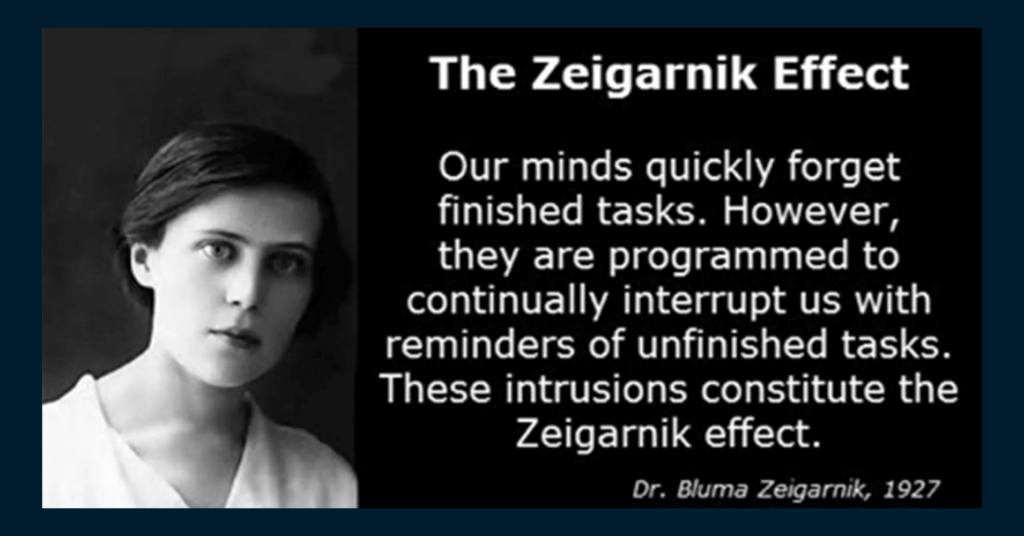
As we are the human being, we have a psychological fact that causes us to feel unflexible leaving things half-done or incomplete. This state of mind is called the Zeigarnik Effect, a phrase stamped by Bluma Zeigarnik, a 20th-century Russian psychologist.

After completing her experiments, she came to a decision that says unfinished tasks are remembered approximately two times and completed ones as well.
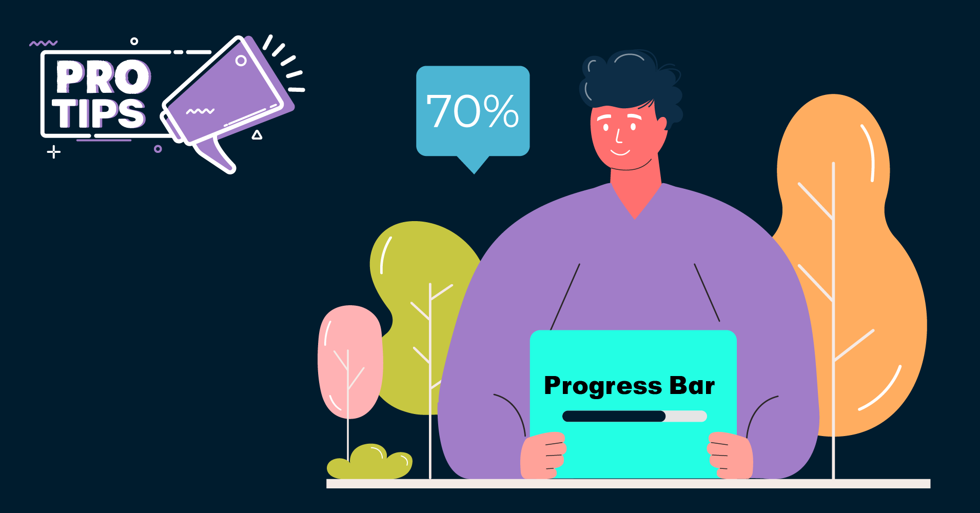
You can use the Zeigarnik Effect to influence your visitors to take action by presenting them that they have yet to complete the process. In this case, you can use a progress bar to point out the whole procedure. This will make them aware of their incompleteness so that they can take the necessary steps to complete the whole task.
For example, Linkedin and other application procedures use a progress bar to show their users a progress rate to complete the whole process. This makes the users more interactive which ultimately lessen the bounce rate of your site and increases your site performances.
If you are planning of implementing progress bars in your online forms, you can try out WP Fluent Form’s “Form Step” feature and increase your form conversion rate!
Hopefully, this pro-tip was helpful. Find more Pro-tips here.

Comments
-
I am sweating. I am trying to style a progress bar but I cant find a way to do this in fluent forms
How do you apply custom css to a progress bar? I do not like the blue progress bar. Iwant something self styled. Does anyone here know how to do that?


Leave a Reply
You must be logged in to post a comment.