Styling Beautiful CSS Forms with WP Fluent Forms’ Global Styler

Every online business owner wants to turn its leads into customers. However, what they experience in reality is people visiting the site regularly, but not converting to end-users. To get the conversation going, many online business people resort to contact forms. Despite being a powerful tool, many use contact forms with no avail. If you add a contact form to your site without considering its styling and positioning, it might do more bad than good. So how can you make beautiful CSS forms for your potential customers?
Well, any standard form needs a clean visual structure, a real hierarchy of form elements, and high functionality so that it looks perfect while working smoothly. There are a bunch of form builder plugins that will help you design beautiful forms. In this article, we will focus on a specific form builder plugin named WP Fluent Forms’ Global Styler, in creating beautiful CSS forms. But before we get into that, let’s elaborate on why styling a contact form is essential.
Why is styling online forms necessary?

A contact form is a crucial part of your website. When designing a website, you may overlook the contact form as it is a tiny part of the business. But you can’t ignore the impact it leaves. This part helps you to increase the conversion rate for your online business site. So, while creating the contact form, you need to give full attention to it and take the steps necessary to build a stable form for your website.
Otherwise, the form might provide a bad user experience, confuse the audience, thus decreasing the conversion rate. Let’s see some essential tips for creating a good form on your website.
Some general tips for creating beautiful CSS forms
Well, there are no hard and fast rules for styling contact forms. You can personalize your form as you want. But, you need to keep your eye on some basic things must, such as question patterns according to form, fields, design sense, etc. Please, have a look at the following details.
Include necessary fields
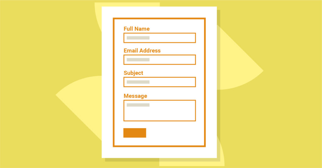
While filling an online form, you may often face irrelevant or inappropriate questions. For example, if a contact form asks for your passport number when it’s not at all related to the service they provide, you are very likely to leave that page, aren’t you?
On the other hand, if your form doesn’t include enough relevant questions, the purpose of data collection might remain unclear to your audience. You also have to ensure you ask all the essential questions to get all the necessary data. A detailed but engaging contact form will encourage the audience to complete it.
In such situations, you must organize your form in a way that doesn’t bore people. You can add a small clarification about each field, which will gain people’s trust, and they will stay on your website.
Make the form user-friendly

Users are getting into your form either from their desktops or any handheld devices. So, your form should be so that the users can fill your form without any difficulties. Your form needs to be furnished in a way that users can feel the comfort of filling it out.
There are so many reasons for users not to find your form friendly, such as using CAPTCHA, which can be very annoying. When you find it to be irritating yourself, why would you ruin your website with it? Another factor that’ll drive people away from completing your form is applying tricky or technical words in the questions. People will not put aside much time to fill up your form, so if they have to spend extra time and effort to understand it, they will surely leave it undone. Avoid making that mistake at all costs.
Another common mistake in designing a contact form is using too many dark colors and fancy fonts. You may think you’re decorating your form to make it more lucrative when, in reality, users find these things disturbing when filling up online forms.
Allow autofill
Google is offering the autofill feature to make your life easier. It minimizes the risk of errors occurring in important fields. So, while creating a responsive form CSS, either you can use make your simple so that Google can understand the form fields easily, or you can use any extension for the autofill purpose. When are offering this type of flexibility to users, it will save their time, and they can quickly fill up the queries.
Use an attractive call-to-action button

When you are styling form elements, a call-to-action button is the most necessary part of it. It is the central portion where your users will click to take some action. If you use confusing words on your CTA button, people won’t understand the purpose of your form. So if you haven’t paid attention to this part before, you need to go back and improve your buttons.
For instance, in case of a contact form, instead of using straightforward words like “ok” or “submit,” use “contact us.” Use “get in touch” to your CTA button for an inquiry form. In that way, users will easily understand what they will get after submitting your form.
Apply progress bar

You should try adding a progress bar in your contact form when creating a form with a long list of questions. Though it doesn’t have any direct impact on increasing the conversion rate for your form, it will add to the user experience. Your users will be able to see the process of filling out the form. In that way, the chances of leaving your form will decrease.
Well, nowadays, there are so many form builder plugins in WordPress that will help you to style beautiful CSS forms for your website. Today we will see how you can create responsive form CSS using WP Fluent Forms. So, let’s dive into the topic.
Style beautiful CSS forms using WP Fluent Forms’ global styler
WP Fluent Forms is designed in a way that can create different good looking forms for your website. Still, if you want to make a form that matches your website style, you can use the global styler feature of WP Fluent Forms.
The global styler permits you to easily style any design for the form without a single coding system. This article will help you to make beautiful CSS forms using Fluent Forms elements and layouts with Global Styler in a few clicks.
After creating a form, click on preview and design from the corner of the top right side of the editor. A preview window will open, and now you can style your form elements as you want.
The design part comes with two holders, named as the General Tab and the Misc Tab. The General tab is for styling the template of each form. You can choose from any of the models, such as Default, Modern, Classic, Bootstrap Style, and Custom (Advanced Customization).
Select from the templates
You can choose any from the pre-defined templates. When you select a model from the pre-defined list, you can still customize the global styles of your form. For example, I have chosen the Bootstrap style as my template. To customize your form, go to the Misc Tab, located near the General Tab. The tab will be like the image given below.
Here, you will see stylers named, Container Styles, Asterisk Styles, Inline Error Message Styles, After Submit Success Message Styles, and After Submit Error Message Styles.
Container styles
When you click on the Container styles, a dropdown menu will open with many customizable fields. Here, you will see fields named as, Background Color, Color, Form Margin, Form Padding, Border Type, Border Color, Border Width, and Border-Radius. You can define your Form Color, Form Width, Border Width, and Color the way you want with these fields. For better understanding, have a look at the screenshot below.
Asterisk styles
Asterisk styles will help you in selecting the color of asterisks in your form.
Inline error message styles
Select the color of the error messages with the Inline Error Message Styles. Also, set the Font Size, Font Weights, Text-Decoration, Line Height, and Letter Spacing. Check out the screenshot below.
After submitting success message styles
In this setting, you can personalize your form after submitting texts. For testing purposes, fill out the form, and click on submit to view the after submitting text. Now, click on the “After submit success message styles.” Here you can select the color for the text, background of the text, Typography, and Box-Shadow. In the Typography field, you can resize your Fonts, select Font-Weight, Transform, Font Style, Text-Decoration, Line Height, and Letter Spacing.
The box-shadow field will allow you to customize the shadow behind the “after submitting the text box” area if you want. Take a look at the screenshot below.
After submit error message styles
You can also customize the After Submit Error Message Styles. This styling option is similar to the After Submit Success Message Styles. Set the color of the font, Background Color. The Typography includes Font Size, Font Weights, Text-Decoration, Line Height, and Letter Spacing. After the Typography box, you can move on to the Box Shadows to style the after success message.
Custom (Advanced Customization)
From the General tab, if you choose the Custom (Advanced Customization) template, you can design your input fields as you need. The new window will look like the screenshot below.
Label Styles
When you click on Label Styles, a new dropdown menu will open with color and Typography. You can change the Font Color, Font Size, Font Weight, Font Style, Text-Decoration, etc.
Input & Textarea
Change the background color and the font color of your form with the Input and Textarea. Additionally, you will be able to set the Font Size, Font Type, Letter Spacing, Font-Weight, etc. with the Typography. With Box-Shadow, you can even customize the shadow behind your box areas shown in the picture below.
If you want to decorate the border, click on the “Use Custom Border Style.” This will help you to personalize the border Color, Border Width, Border Radius of your form fields.
You can also design a specific field when it is focused.
Placeholder Styles
Pick the color of the placeholder of the input fields to give it a signature look. Place the typography together with the Font Size, Font Weights, Text Decoration, Line Height, and Letter Spacing. Have a look at the screenshot below.
Section break style
If you want to add Section Break field to your form then, go to the Edit Fields options from the top bar. Click the option, and you will get the section break on advanced fields of the form input fields.
Now go to the Preview and Design option again. Here, you will see a new item added on the list of form elements, named as Section Break Style. This field comes with two parts named Label Styling, and Description Styling.
On the Label Styling section, you can edit the Label of the field with Font Size, Font Color, Text Decoration, Letter spacing, etc. It also supports the Padding and Margin sections for the positioning of the text label.
On the other hand, the Description Styling portion helps you customize the description area texts of the Section Break field with the same edit options of Label Styling. Here is the preview of the setup.
Grid table style
Now, if you also add a grid table from the input fields of your form, you will see another new section opened in the element on the custom CSS of WP Fluent Forms. It is named as the Grid Table Style. The styler comes with two tabs, Table Head and Table Body.
Table head will help you to design the table header background color. You will also see a Typography option there.
The Table Body is about customizing the body of the table, such as font color, font size, font, type, background color, etc.
Radio and checkbox style
Enable the smart UI to find the edit options of Radio and Checkbox Style. Here, you will find two options for customizing the radio and checkbox field. Specify the border color or background color of the checkboxes.
Submit Button Style
WP Fluent Forms also lets you style the submit button of your form. Click on Submit Button Style, and a new dropdown menu will come with two options. One is normal, and another one is hover.
In the normal section, you can set the background and font color of the button to set the position of the button. There is also Typography for setting the font size, font type letter spacing, etc. Furthermore, you can set the box shadows specifically for this button. If you enable the Use Custom Border Style, you can choose the border type, border color, border width, border radius, etc. for the submit button.
Now, let’s find out about the Hover section. When you float over the submit button you will notice some changes on the button. The hover section is about letting you customize the option as per your liking. It comes with the same styles as the other fields such as background color, font color, typography, box shadows.
So, these are some instructions on how you can style beautiful CSS forms with WP Fluent Forms’ Global Styler. There are more, you can personalize your contact form using this styler.
Wrapping up
Fluent Forms Pro
Try Fluent Forms today and see for yourself!
In this article, I have tried to give a detailed idea about styling beautiful CSS forms with WP Fluent Forms. This form builder plugin is coming up with new updates every two to three months. There are some video tutorials on using the Global Styler of WP Fluent Forms. Also, this contact form builder plugin is very user-friendly and cost-effective.
I hope you find this article was helpful and enjoy the add-ons and elements of WP Fluent Forms’ Global Styler.
Comments
-
How can I change the color of the progress bar?
-

Hello Fabian,
Thank you for your comment. To edit the progress bar, you have to select the “Custom(Advanced Customization) template. Then, click on Range Slider Style as it works as a progress bar in FF. Here, you will get all the settings for this field.
-


Leave a Reply
You must be logged in to post a comment.