
What Is a Design System? A Practical Guide for Growing Product Teams
Small design decisions pile up fast as products grow. Buttons look different, spacing shifts, and the same sections get rebuilt again and again. A design system fixes that by giving teams shared rules, reusable components, and clear structure, so they can build faster without losing consistency.
- A design system is a shared foundation of components, rules, tokens, patterns, and documentation.
- The biggest benefit is not only visual consistency. There are fewer repeated decisions.
- Growing product teams use design systems to move faster without rebuilding the same patterns.
- For WordPress product teams, a design system helps keep product websites, landing pages, and campaigns aligned.
- A useful design system should stay flexible, documented, and easy for the whole team to use.
- At WPManageNinja, our design system helped reduce repeated design work by around 50%.
What Is a Design System?
A design system is a structured collection of reusable components, visual rules, design patterns, tokens, and documentation that helps teams build products with more consistency and less guesswork.
- It is not just a Figma file.
- It is not only a UI kit.
- It is not a folder full of buttons, cards, and icons.
A design system is the logic behind how a product looks, behaves, and scales.
It defines how colors should be used, how spacing should work, what typography rules to follow, how components should behave, and how teams should combine those pieces to create consistent pages and interfaces.
For growing teams, this matters because design work eventually stops being about isolated pages. It becomes about repeatable decisions. When the same spacing, colors, typography, and layout patterns already exist inside a system, teams can build faster without starting from zero every time.
Why Design Systems Matter for Growing Product Teams
A design system matters because it saves teams from doing the same work again and again.
That sounds simple, but repeated work is one of the biggest hidden slowdowns in product and marketing teams. When every page starts from scratch, designers spend too much time solving things that should already have a clear answer.
- Should this button be 48px or 52px high?
- Should this section use 80px or 96px spacing?
- Should this feature card use an icon above the title or beside it?
- Should this CTA follow the same layout as the previous product page?
When these decisions are not documented, every new project creates new confusion.
A design system removes that friction. It gives designers, developers, marketers, and product teams a shared visual language. Everyone can work from the same foundation instead of translating half-finished ideas back and forth.
That means fewer inconsistencies, fewer unnecessary revisions, and faster production.
More importantly, it gives the team confidence. When the common design decisions are already solved, people can spend more time thinking about the actual experience, the message, and the user journey.
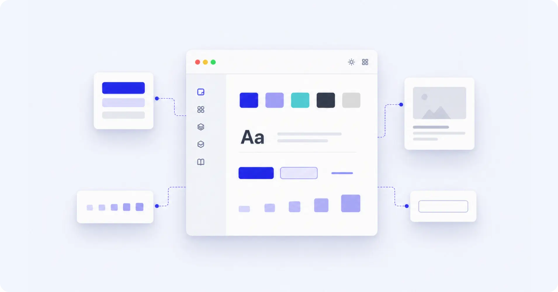
What Makes Up a Design System?
A strong design system usually has a few core parts. Each part plays a different role, but together they create one shared structure for the whole team.
Foundations
Foundations are the base design decisions of the system.
These include colors, typography, spacing, grids, shadows, borders, radius, layout rules, and other visual standards that shape the product experience.
For example, if your product websites use different spacing values across different pages, the layouts may feel slightly inconsistent even when the content is strong. A foundation layer solves that by giving everyone the same base rules.
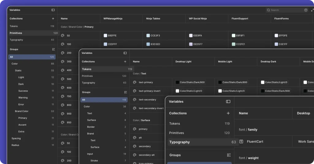
Design Tokens
Design tokens are reusable named values for design decisions.
Instead of randomly choosing a color, spacing value, font size, or border radius every time, teams use predefined tokens. These tokens help keep the system consistent across design and development.
For example, instead of using different shades of blue manually, a team can define brand color tokens. Instead of guessing section spacing, the team can use spacing tokens.
This reduces guesswork and makes future updates easier.
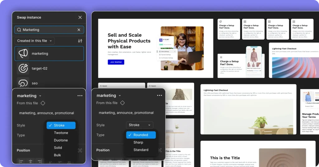
Components
Components are reusable UI pieces.
These can include buttons, cards, forms, navigation bars, pricing tables, testimonial blocks, feature grids, alert boxes, and CTA sections.
Components help teams avoid rebuilding the same UI again and again. Once a component exists, designers can reuse it, adapt it, and scale it across different pages.
Patterns
Patterns are larger combinations of components that solve common layout problems.
For example, a hero section, feature section, comparison block, integration section, pricing area, or product benefit section can become a reusable pattern.
Patterns are especially useful for marketing websites because teams often need to create similar sections across multiple product pages.
Documentation
Documentation explains how and when to use each part of the system.
Without documentation, a design system can quickly become confusing. People may know that components exist, but they may not know which one to use, when to use it, or how to adapt it.
Good documentation keeps the system usable for everyone, not just the person who created it.
Governance
Governance is the process of keeping the design system clean, useful, and up to date.
Without ownership, a design system slowly becomes a junk drawer. New components get added randomly. Old patterns become outdated. Different people start making their own versions.
A good system needs a clear way to add, update, review, and remove elements.
The Problem We Faced at WPManageNinja
At WPManageNinja, the need for a design system became clear as we worked across multiple product websites.
At first, nothing felt seriously broken. The websites worked. The pages looked good. Each product had its own identity.
But small inconsistencies started stacking up.
Spacing felt different from one site to another. Similar sections were being recreated for different products. Hero areas, feature blocks, CTA sections, icon areas, and content layouts needed fresh design decisions every time.
The real problem was not only inconsistency.
It was repetition.
Every repeated decision added a little extra weight to the workflow. A landing page took longer than it should. A simple product section needed more back-and-forth than expected. Designers had to solve problems that had already been solved before.
That is when we realized we did not just need better designs. We needed better structure.
How We Built Our Design System
We did not start by creating random components.
That would have only created a bigger library without solving the real problem. Instead, we started by looking at the repeated patterns across our product websites.
We asked simple questions.
- What sections do we keep rebuilding?
- What design decisions do we keep repeating?
- Which layouts appear across multiple product sites?
- Which parts should stay consistent?
- Which parts should stay flexible for each brand?
That helped us build the system from the ground up.
We Started With Repeated Problems
The first step was identifying the sections and design choices that came up again and again.
- Typography
- Brand Color Applications
- Spacing Patterns
- Button Hierarchy
- Reusable cards and Layout Structures
- Icon Library and Usage
- Hero sections.
- Feature blocks.
- CTA sections.
- Content sections.
These were not one-time design tasks. They were recurring needs across multiple product websites.
So instead of designing each section separately, we started thinking in systems. We focused on building reusable structures that could support different product brands without losing consistency.
For example, instead of designing a new CTA section for every product site, we created flexible CTA patterns. The core layout could stay the same, while the colors, gradients, icons, and content could change based on the product brand.
That made the system practical from the beginning.
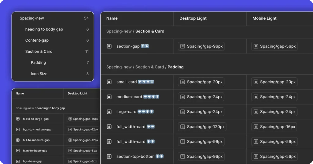
We Built the System in Layers
Inside Figma, we built the system in layers.
We started with primitives, tokens, and typography.
Primitives handled the smallest visual building blocks. Tokens made those values reusable. Typography gave the whole system a consistent voice and rhythm.
This layering helped the team think more clearly.
Instead of designing page by page, we could design from the bottom up. Spacing tokens removed guesswork. Typography rules made layouts more consistent. Reusable values reduced random decisions.
The same values started showing up across the system, which meant fewer mismatched layouts and fewer manual corrections.
Atomic Design Method Gave Us a Scalable Framework
The Atomic Design Method helped us organize the system in a way that could scale.
It gave the team a simple structure for thinking about design in layers, from smaller building blocks to larger page sections.
We did not use the Atomic Design Method as a fancy theory. We used it as a working model.
Smaller elements could combine into components. Components could combine into sections. Sections could support full pages. This made it easier to understand how each part of the system connected to the next.
That structure became useful as more components were added. It kept the system from becoming messy too quickly.
Multi-Brand Switching Changed How We Worked
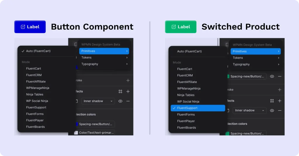
One of the most valuable parts of the system was multi-brand switching.
WPManageNinja has multiple product websites, and each product needs its own visual identity. But rebuilding everything manually for every brand is slow and fragile.
With multi-brand switching, we could update colors, gradients, and key visual elements through the system itself.
This separated brand identity from UI behavior.
That was a big shift.
The structure could stay stable while the visual layer changed. A component could keep the same layout and behavior, but adapt to different brand styles.
For a product family, this is a major advantage. It helps different products feel connected without making every site look identical.
Documentation Made Collaboration Easier
A design system only works if people can actually use it.
That is why documentation became an important part of the process.
Documentation helped designers understand what already existed, when to use each component, and how to continue someone else’s work without confusion.
This made collaboration easier.
When one designer needed to pick up another designer’s work, the system reduced the guesswork. The rules were already there. The structure was already defined. The handoff became smoother.
That is one of the underrated benefits of a design system. It does not only make the final design more consistent. It makes teamwork easier.
What Changed After Building the System
The biggest win was not just better visual consistency.
The biggest win was fewer repeated decisions.
Once the team had a shared system, everyday design work became easier. Designers did not need to rebuild the same sections from scratch. They did not need to rethink every spacing value, typography choice, or component structure.
Common marketing sections became faster to create because the foundation was already in place.
Based on our internal workflow, design time for repeated page sections dropped by around 50%. This happened because designers no longer had to rebuild the same layouts, icons, spacing, and brand styles from scratch every time.
The system also made the team more confident.
When common decisions are predictable, designers can focus more on the actual idea behind the page. They can spend more time on the message, the user experiences, and the story the page needs to tell.
That is the real value.
A good design system does not reduce creativity. It removes repetitive thinking.
What a Design System Looks Like for WordPress Product Teams
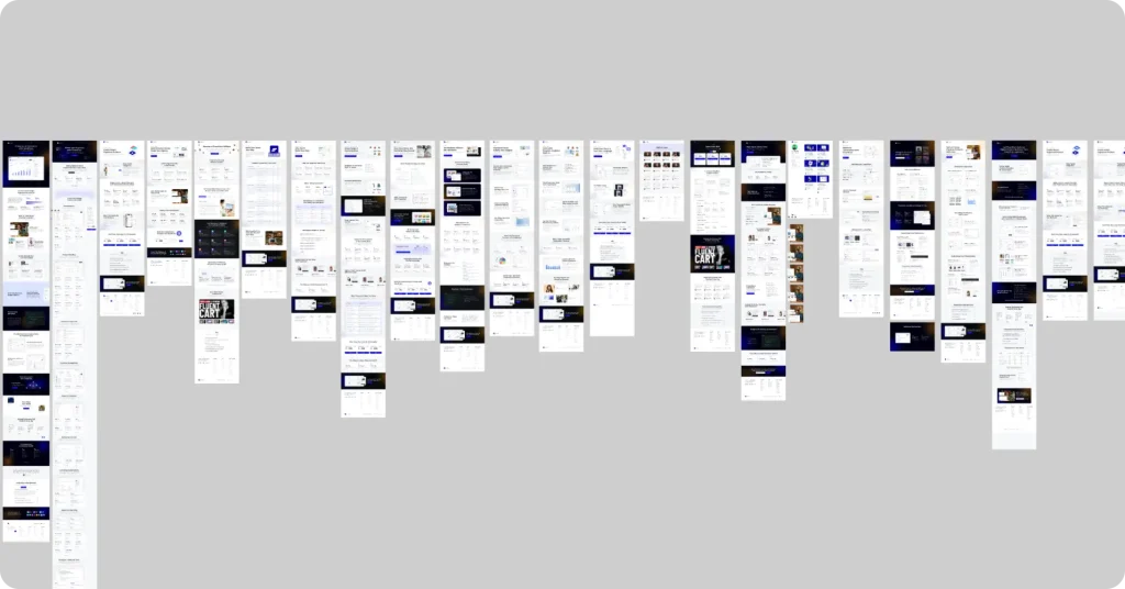
For WordPress product teams, a design system is especially useful because the work is spread across many surfaces.
You are not designing only one app or one website.
You may need to manage:
- Product marketing websites
- Feature pages
- Launch pages
- Documentation pages
- Pricing pages
- Comparison pages
- Blog visuals
- Campaign landing pages
- Product ecosystem assets
All of these need to feel connected.
Without a design system, each new page can become a fresh design project. That slows the team down and makes consistency harder to maintain.
A WordPress design system gives teams a shared structure. It helps product websites stay visually aligned, makes campaign pages easier to launch, and gives designers a reliable foundation for creating new pages faster.
This matters even more when a company manages multiple WordPress products under one ecosystem.
Challenges of Building a Design System
Design systems are useful, but they are not magic.
They take time to build, and they need maintenance. If nobody owns the system, it gets stale fast. If the system is too rigid, it can slow people down instead of helping them move.
Adoption is the real test.
A design system only works if the team actually uses it. If designers keep inventing one-off solutions, or developers keep bypassing the shared rules, the whole point disappears.
The system has to earn trust by making work easier, not heavier.
That is why flexibility matters. A good design system should give people enough structure to stay consistent, but enough freedom to solve real problems.
The Team Behind It
This system was not built by one person.
I was involved from the early stage, helping shape how the system should work and how it could scale across multiple product websites. Md Kawsar Chowdhury guided the overall direction, while Asish Chandra Mohon and Najmul Saju played a key role in making the system practical, usable, and ready for real team workflows.
It was a proper team effort. And honestly, that is what made it work.
A design system only becomes useful when the people behind it understand both the structure and the daily problems it needs to solve. That shared understanding helped us build something the team could actually use, not just admire from a distance.
Best Practices for Maintaining a Design System
Building a design system is only the beginning. Maintaining it is what keeps it useful.
Here are a few practices that help.
Keep the Documentation Simple
Documentation should help people move faster, not make them feel like they are reading a manual from another planet.
Keep it simple, direct, and practical.
Explain what each component is for, when to use it, and when not to use it.
Treat the System Like a Product
A design system is never fully finished.
It should evolve as the team grows, products change, and new use cases appear.
Review it regularly. Improve what needs improvement. Remove what no longer serves the team.
Make It Easy to Use
If the system is hard to use, people will avoid it.
The easier it is to find components, understand rules, and apply patterns, the more likely the team is to adopt it.
Adoption is the real test of a design system.
Keep It Flexible
A design system should not make every page look identical.
It should give teams enough structure to stay consistent, but enough flexibility to solve real design problems.
Too much freedom creates chaos. Too much rigidity slows people down.
The balance is the key.
Assign Ownership
Someone needs to own the system.
That does not mean one person controls everything. It means there should be a clear process for updates, reviews, improvements, and cleanup.
Without ownership, even a good design system can become messy over time.
What We Learned
The biggest lesson was simple: a design system is not only about visuals.
It is about how teams make decisions.
At WPManageNinja, the system helped us reduce repeated work, improve consistency, support multi-brand design, and make collaboration easier across product websites.
We also learned that separating brand identity from UI behavior makes scaling easier. The visual layer can change without breaking the core structure. That gives product teams flexibility without creating chaos.
Most importantly, we learned that a design system should remove repetitive thinking, not creativity.
That is what makes it valuable.
Final Thoughts
A design system is not just a design asset. It is a workflow advantage. And its the future design trend that we can anticipate in 2026.
For growing product teams, it can be the difference between constant reinvention and steady momentum.
If your team keeps rebuilding the same sections, rethinking the same layouts, or fixing the same inconsistencies, the problem may not be a lack of talent. It may be a lack of structure.
Start with the repeated problems. Build the system in layers. Document the rules. Keep it flexible. Improve it as your team grows.
A good design system will not do the creative work for you.
It will simply clear the repetitive work out of the way, so your team can focus on the ideas that matter.
Frequently Asked Questions
What is a design system in simple words?
A design system is a shared set of rules, components, patterns, and documentation that helps a team build products consistently. It gives everyone the same building blocks, so the work stays aligned and easier to scale.
Do small teams need a design system?
Yes, if they are already repeating the same design decisions across pages or products. Small teams may not need a huge system, but even a lightweight design system can save time and reduce inconsistency.
Is Atomic Design part of a design system?
Atomic Design is not the design system itself. It is a framework that helps organize a design system into layers, from small building blocks to larger components, patterns, and pages.
What are design tokens?
Design tokens are reusable named values for design decisions like colors, spacing, typography, radius, and shadows. They help teams keep visual rules consistent across design and development.
How do you build a design system from scratch?
Start with structure, not random components. Define your colors, typography, spacing, tokens, and core rules first. Then create reusable components, document how they should be used, and improve the system as the team uses it.
What is the biggest benefit of a design system?
The biggest benefit is reducing repeated decisions. A design system helps teams avoid rebuilding the same patterns again and again, which saves time and keeps the product experience more consistent.

Award-Winning UI/UX Designer with 9+ years of progressive experience, specializing in strategic, high-conversion web and mobile experiences. Recognized as the Rising Designer at WPManageNinja.
-
13 Best Wireframing Tools in 2026: Free, AI & Paid Options
Compare 13 of the best wireframing tools for websites and -
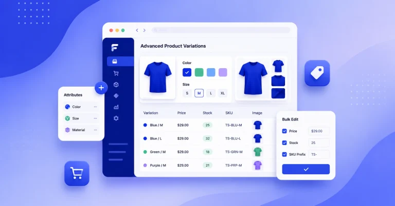
Advanced Product Variations, Built In and Free with FluentCart
Most WordPress eCommerce plugins charge extra for advanced product variations -
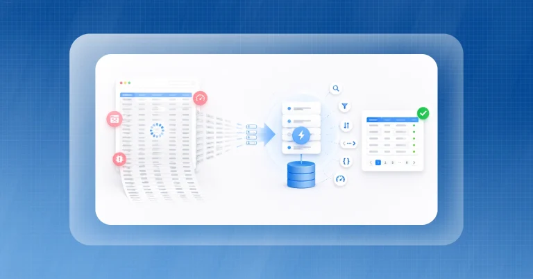
Server-Side Processing For WordPress Tables: Why Big Data Tables Need It
Most WordPress tables break under real data volume. Here’s what
Leave a Reply
You must be logged in to post a comment.