
User Experience Basics: Fundamentals and Tips for Better Websites
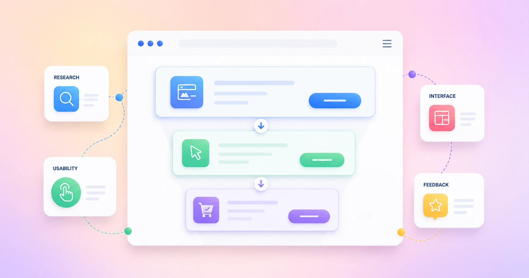
User experience is not one single design trick. It is the way a person feels while using your website, app, product page, form, dashboard, or checkout. This guide breaks down the user experience basics that make digital journeys clearer, easier, and more useful.
Key Takeaways
- UX is about the full journey, not only the screen people see.
- A clean interface matters, but usability, accessibility, structure, and content matter just as much.
- Good UX starts with user needs, not internal assumptions.
- The right UX design process helps teams research, design, test, and improve with confidence.
- Better UX supports business goals by reducing friction and helping people take action.
What Is User Experience?
User experience is how easy, clear, useful, and satisfying it feels for someone to use a website, app, product, or service. It includes the interface, navigation, content, speed, accessibility, feedback, and the full journey from first visit to final action.
A good product is not only beautiful. It is also usable, clear, reliable, and helpful. When someone opens a pricing page, fills out a contact form, books a meeting, joins a community, or buys from a store, every step shapes the entire user experience.
The result of UX is simple. People either feel confident enough to continue, or they leave because something feels confusing, slow, or unnecessary. That is the fundamental reason UX matters for every digital product.
Why Are User Experience Basics Important?
The user experience basics matter because every website is asking visitors to do something. Read a blog. Submit a form. Start a free trial. Join a list. Book a call. Buy a product. Open a support ticket. If the path is confusing, users struggle and the business loses momentum.
Good user experience removes guesswork. It helps users understand where they are, what they can do, and what will happen next. This is why UX is important for blogs, SaaS websites, WordPress products, online stores, learning platforms, membership communities, and service pages.
Better UX also supports trust. When the design is consistent, the navigation is clear, and the content answers real questions, people feel safer using the site. That trust can improve engagement, conversion, retention, and long-term brand value.
The UX BASICS Loop: A Simple Way to Understand User Experience Basics
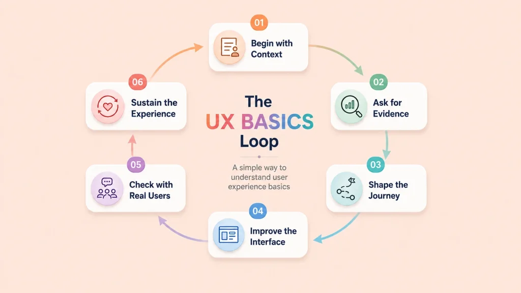
User experience is not built from one big design decision. It is built from many small moments that either help users move forward or make them stop, think, and leave.
That is why the basics of user experience should not be treated like a one-time checklist. A better way to understand it is through the UX BASICS Loop: Begin with context, Ask for evidence, Shape the journey, Improve the interface, Check with real users, and Sustain the experience.
This framework keeps UX practical. It helps product teams move from “we think users need this” to “we know what users need, we tested it, and we are improving it.”
B: Begin With Context
Every good UX decision starts with context. Who is using the product? What are they trying to do? Where are they using it? What device are they on? What problem are they trying to solve?
A visitor reading a blog, a customer submitting a support ticket, a store owner checking sales reports, and a student joining a course community all have different goals. The same interface cannot serve everyone well unless the context is clear.
This is where user experience basics begin. Before changing colors, layouts, forms, or buttons, understand the situation. A design only becomes useful when it is aligned with user needs.
A: Ask for Evidence
Assumptions are expensive. Teams often redesign pages because something “feels outdated,” but real user behavior may show a different problem.
Ask for evidence before making design decisions. Check analytics. Read support tickets. Run quick surveys. Talk to actual customers. Watch where users struggle. Review search queries, form drop-offs, and repeated complaints.
Good UX starts when you stop guessing. User research helps you find the real pain points behind a confusing journey. Nielsen Norman Group defines user experience as covering all aspects of the end-user’s interaction with a company, its services, and its products, which means research should look beyond one screen or page.
S: Shape the Journey
Once you understand the context and evidence, shape the user journey. This means deciding how people should move from one step to another without unnecessary friction.
For a website, this may include navigation, content structure, page hierarchy, and internal links. In a form, it may mean fewer fields and clearer labels. For a dashboard, it may mean showing the most important data first. For a checkout flow, it may mean fewer distractions and better error messages.
This is also where information architecture matters. If users cannot find what they need, the experience breaks before the design gets a chance to impress them.
I: Improve the Interface
The interface is where users finally touch the product. Buttons, forms, cards, menus, filters, modals, messages, and layouts all shape the experience.
But interface improvement is not only about making things look pretty. It is about making actions easier. Can users understand the button label? Are they reading the text? Can they recover from an error? Is it responsive enough to complete the task on mobile? Can people with disabilities use the same flow?
Usability is one of the clearest parts of UX. NN/g explains usability as how easy user interfaces are to use, including learnability, efficiency, memorability, errors, and satisfaction.
C: Check With Real Users
A design is not proven because the team likes it. It is proven when real users can complete the task with less confusion.
That is why user testing matters. Ask a real user to complete one important task. Watch what they do. Do they hesitate? Are they clicking the wrong thing? Do they miss the CTA? Or, do they understand the error message? Do they know what happens next?
This step helps teams validate design decisions before scaling them. It also keeps UX honest. A beautiful design that fails in testing still needs work.
S: Sustain the Experience
UX does not end after launch. Users change. Products grow. Pages get updated. New features appear. Support questions reveal new gaps. Analytics expose new friction points.
That is why user experience is a loop, not a line. Keep collecting feedback, testing important flows, improving accessibility, and refining content. A design system can also help teams sustain UX by keeping buttons, forms, patterns, and design elements consistent across the product.
The best digital products are not “finished.” They stay useful because teams keep improving them based on real user needs, business goals, and changing behavior.
UX vs UI: What Is the Difference?
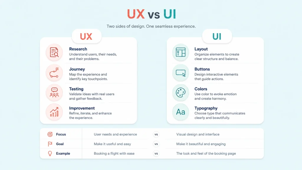
UX is the full experience a person has with a product. UI is the visual interface they use to interact with it. UI is part of UX, but UX also includes research, structure, usability, accessibility, testing, and user goals.
UX and UI are related, but they are not the same thing. UI means the visual layer people interact with. It includes buttons, forms, colors, cards, spacing, typography, and other parts of the user interface.
UX is wider. It looks at the full experience before, during, and after the user interaction. A page may have polished ui, but still create bad UX if the form is too long, the message is unclear, or the next step is hidden.
User interface design and ui design help make the screen clear and attractive. UX makes sure the interface helps the end user complete a task without confusion.
| Area | UX | UI |
| Focus | Flow, clarity, usability, user needs | Visual layout, buttons, typography |
| Goal | Make the experience useful and easy | Make the interface clean and attractive |
| Example | A form that feels simple to finish | A button that looks clickable |
What Are the Core Elements of User Experience?
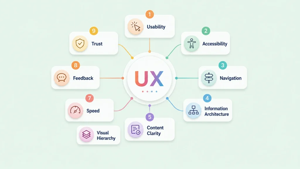
The elements of user experience are the many layers that shape how a product feels. Usability is one of the biggest parts. If people cannot use your product easily, the design is not doing its job.
Accessibility matters too. A website should work for people with disabilities, people using keyboards, people with low vision, and people browsing on different devices. A product is not truly inclusive if only some users can complete the journey comfortably.
Other important parts include information architecture, content clarity, visual design, speed, feedback messages, trust signals, user control, and clean design elements. The UX honeycomb explains this nicely by showing that experiences should be useful, usable, desirable, findable, accessible, credible, and valuable.
| UX Element | What It Means | Simple Example |
|---|
| Usability | Users can complete tasks easily | A form that is short and clear |
| Accessibility | More people can use the product | Keyboard navigation and readable contrast |
| Navigation | Users can find what they need | Simple menus and breadcrumbs |
| Information architecture | Content is organized logically | Categories and pages follow user intent |
| Content clarity | Words guide users clearly | Helpful button labels and error messages |
| Feedback | Users know what happened | Confirmation after form submission |
| Trust | Users feel safe taking action | Reviews, policies, secure payment signs |
What Is the UX Design Process?
The UX design process is a repeatable way to understand user needs, define the problem, design possible solutions, test them with real users, and improve based on feedback.
The process helps teams move from assumptions to better decisions. It usually starts with understanding the problem. What are users trying to do? Where do they get stuck? What outcome does the business need?
Next comes user research. Teams may study analytics, interview customers, read support tickets, review feedback, or observe how a real user moves through a page. This helps uncover pain points that are easy to miss from inside the company.
After that, teams create user personas, map the user journey, sketch a wireframe, design the interface, run user testing, gather user feedback, and improve. The UX process is not a one-time activity. It is a cycle of learning, designing, testing, and refining.
What Are the 7 UX Design Principles?
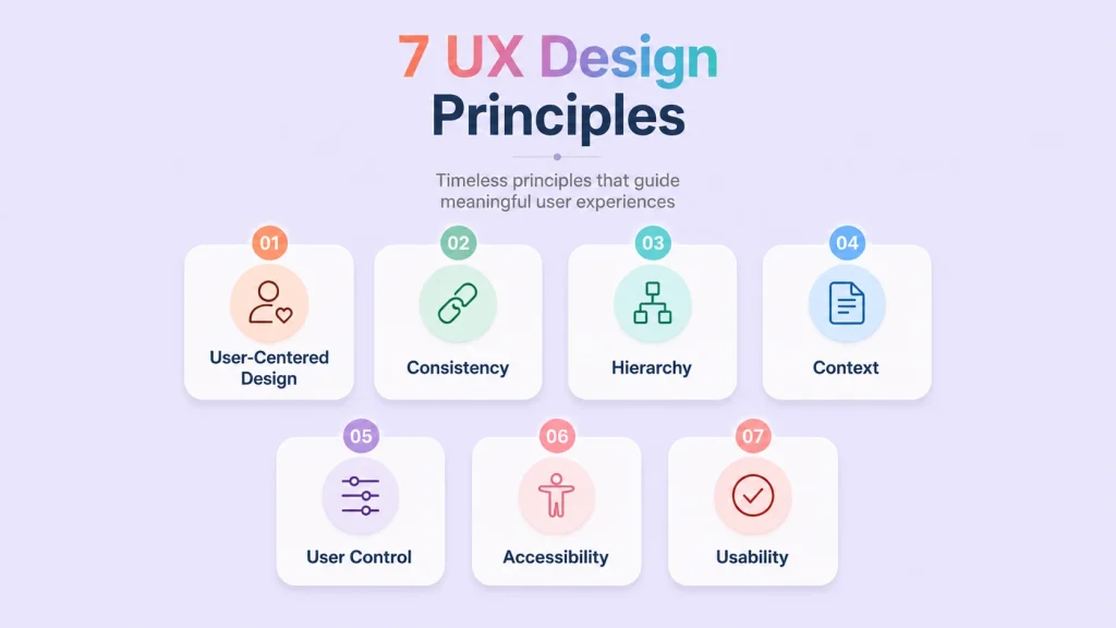
The 7 UX design principles are a helpful way to understand what makes a product easier to use. These key principles are not strict rules, but they can guide your design when you need to make better choices.
First, user-centered design keeps decisions aligned with user needs. Second, consistency helps people understand patterns faster. Third, clear hierarchy shows what matters most. Fourth, context helps the design match the situation. Fifth, user control lets people edit, undo, go back, or cancel actions. Sixth, accessibility makes the experience more inclusive. Seventh, usability makes the product practical.
These UX design principles work together. If a form looks beautiful but users cannot correct an error, the experience breaks. If a dashboard has useful data but no clear hierarchy, people may miss what matters.
| Principle | What It Means | Website Example |
|---|
| User-centered design | Design around real user needs | Ask users what blocks them before redesigning |
| Consistency | Keep patterns predictable | Use the same button style across pages |
| Hierarchy | Show what matters first | Put the main CTA above secondary links |
| Context | Match the user’s situation | Make mobile actions easier with larger buttons |
| User control | Let users undo or edit actions | Allow form edits before final submission |
| Accessibility | Remove barriers for more users | Add labels, alt text, and keyboard support |
| Usability | Make tasks easy to complete | Reduce form fields and explain errors clearly |
How Does User Research Improve UX?
User research improves UX because it replaces assumptions with evidence. Product teams often think they know what users want, but real behavior can tell a different story.
For example, users may ignore a button because the label is vague. They may abandon a signup flow because a field feels unnecessary. They may contact support because the help text is missing. Research helps teams understand what users do, not just what teams hope they will do.
UX designers rely on interviews, surveys, heatmaps, analytics, session recordings, support conversations, user stories, and usability testing to validate design decisions. This makes design decisions stronger because they are based on observed behavior, not personal preference.
How Do Usability and Accessibility Shape Better UX?
Usability means people can complete a task without unnecessary effort. A usable page has readable text, clear labels, helpful buttons, simple forms, and a layout that does not make people think too hard.
Accessibility expands that idea. It asks whether more people can use the product comfortably. Can someone navigate with a keyboard? Is the color contrast readable? Are form errors clear? Is the content understandable for someone using assistive technology?
This is where effective UX becomes more than design polish. A good user can move through a product with confidence, but the design should also support different abilities, devices, environments, and levels of experience.
What Makes a Website or App Feel Intuitive?
A website or app starts to feel intuitive when people do not need instructions for every step. They can scan the page, understand the structure, and move forward naturally.
Familiar patterns help. Menus should be where people expect them. Buttons should look clickable. Forms should ask for information in a logical order. Confirmation messages should appear after important actions. This creates a smoother experience because the design is aligned with user behavior.
Great UX does not force people to decode the interface. It quietly guides them. Clear navigation, helpful microcopy, and predictable design choices help users feel in control from the first click.
What Are Common UX Issues to Avoid?
Bad UX usually happens when the product makes users work harder than necessary. The problem may look small from the team’s side, but it can feel huge to the person trying to complete a task.
Common UX issues include confusing menus, slow pages, weak contrast, unclear CTAs, long forms, hidden information, poor mobile layouts, and error messages that do not explain how to fix the problem.
| UX Issue | Why It Hurts | Better Approach |
| Confusing navigation | Users cannot find what they need | Use simple menus and clear labels |
| Too many choices | Users feel overwhelmed | Reduce decision load |
| Long forms | Users quit before finishing | Ask only for necessary details |
| Weak contrast | Text becomes hard to read | Improve readability |
| Unclear CTA | Users do not know what to do | Make the next step obvious |
| Poor mobile layout | Users struggle on phones | Design for smaller screens early |
How Do You Measure User Experience?
User experience is not only a feeling. You can measure it through user behavior, task success, drop-offs, errors, and feedback. If people can complete a task quickly, understand the interface, and move forward without confusion, the experience is probably working.
Some useful UX metrics include task success rate, time on task, error rate, form abandonment, conversion rate, bounce rate, support tickets, customer satisfaction, and qualitative feedback from usability testing.
For example, if users start a form but do not finish it, the issue may be unclear labels, too many fields, weak trust signals, or poor mobile usability. Measuring UX helps teams find the real friction instead of guessing.
How Does UX Support Business Goals?
UX supports business goals because every business outcome depends on people completing meaningful actions. A visitor may need to subscribe, book, pay, compare, contact, download, comment, learn, or use your product. If the journey is unclear, the action becomes harder.
For WPManageNinja, this applies across the full ecosystem. Better forms improve lead collection. The Better CRM dashboards help teams understand contacts faster. Better booking flows reduce scheduling confusion. The Better support portals make help easier to receive. Better community experiences keep members engaged. Better FluentCart checkout flow helps stores sell with less friction.
The result of UX design is not only a nicer screen. It is a smoother relationship between the product and the person using it. The end result of UX should be confidence, clarity, and action.
How Do Design Systems Improve User Experience?
A design system improves UX by keeping experiences consistent across products, pages, and teams. Instead of designing every button, form, card, or layout from scratch, teams use shared rules and reusable components.
This matters because users notice inconsistency. If one form behaves differently from another, or one dashboard uses different patterns than the next, the experience becomes harder to learn. Shared UX guidelines reduce those gaps.
A strong design system for product teams also helps with faster decisions, cleaner collaboration, and fewer repeated mistakes. You can learn more about this in WPManageNinja’s guide on building a design system that supports scalable product experiences.
How Is UX Connected to the Future of Web Design?
The future of web design is moving toward faster, smarter, more accessible, and more personalized experiences. Websites are no longer simple static pages. They collect leads, answer questions, recommend content, process payments, book appointments, connect with automation tools, and support customers.
That shift makes UX more important. Modern sites need to guide the overall user clearly from the first visit to the final action. A beautiful layout is useful only when the experience helps people reach their goal.
This is why modern web design trends are deeply connected with UX. If you want to explore where websites are heading next, read WPManageNinja’s article on the future of web design.
How Is UX Changing with AI and Automation?
AI and automation are changing how people interact with websites and digital products. Users may now get smart suggestions, automated answers, personalized recommendations, predictive search, or AI-assisted workflows.
But the basics of UX still matter. Users need control, clarity, accessibility, and trust. If an AI feature acts without explanation, hides important choices, or makes the interface unpredictable, the experience can quickly become frustrating.
Good AI UX should show what the system is doing, let users accept or reject suggestions, explain important actions, and keep people in control. The future of UX is not only smarter interfaces. It is more transparent and trustworthy experiences.
How Can Beginners Start Improving UX Today?
You do not need a massive redesign to improve UX. Start with the basics of UX and look at your site through a user’s eyes.
Test your most important pages on mobile. Ask someone outside your team to complete one task. Review your forms. Improve button labels. Make your content easier to scan. Add clear error messages. Remove steps that do not help the user.
The basics of user experience are often simple. Watch where people stop, listen to what they ask, and improve the areas that create friction. This user-centered approach keeps the product aligned with user needs and helps teams make better design choices over time.
A 15-Minute UX Audit Checklist for Any Website
You can find many UX problems without running a full redesign. Start with one important page and one important user action.
- Open your website on mobile and complete one important task.
- Check if the main CTA is visible without confusion.
- Review your navigation and remove unclear menu labels.
- Test one form and see if every field is necessary.
- Read your error messages and check if they explain the fix.
- Check text contrast, font size, and button spacing.
- Ask one real user to complete a task without guidance.
- Watch where they pause, scroll back, hesitate, or click the wrong thing.
- Remove one unnecessary step from the journey.
- Repeat the same test after making changes.
What Does a UX Designer Actually Do?
A UX designer studies how people use a product and finds ways to make the experience clearer, easier, and more useful. Their work may include user research, journey mapping, wireframes, prototypes, usability testing, and product improvement.
In smaller teams, marketers, founders, developers, and product managers often share UX responsibilities. That is why learning UX basics is useful even if you are not planning a UX career.
UX careers are growing because businesses now understand that design is not only about decoration. It is about helping people complete tasks with less confusion and more confidence.
Final Thoughts
User experience basics are not only for a UX designer. They help marketers, developers, product teams, founders, and business owners create digital products people can actually use.
Start with user needs, keep the interface clear, remove friction, and improve through testing. Good UX is not decoration. It is how a product earns trust.
Important Things to Remember
- User experience is the full journey people have with a product, not only the visual interface.
- UX and UI work together, but they are not the same thing.
- Good UX depends on usability, accessibility, content clarity, navigation, speed, and trust.
- User research helps teams understand real problems before making design changes.
- The 7 UX design principles can help teams create clearer and more useful experiences.
- A design system keeps product experiences consistent across teams and pages.
- UX supports business goals by making important actions easier for users.
- Improving UX starts with observing, testing, listening, and removing friction.
Frequently Asked Questions
What is user experience in simple words?
User experience is how a person feels when using a website, app, product, or service. It includes how easy, useful, clear, and satisfying the journey feels.
What is the difference between UX and UI?
UX is the full experience someone has with a product. UI is the visual interface they interact with, such as buttons, menus, forms, colors, and layouts.
Why is user experience important?
User experience is important because it affects how people understand, trust, and use a product. Better UX can improve engagement, conversions, retention, and customer satisfaction.
What are the 7 UX design principles?
The 7 principles are user-centered design, consistency, hierarchy, context, user control, accessibility, and usability.
What is the UX design process?
The process includes research, problem definition, journey mapping, wireframing, interface design, testing, feedback, and continuous improvement.
What are the core elements of user experience?
The core elements include usability, accessibility, navigation, information architecture, content clarity, visual hierarchy, speed, feedback, and trust.
How does usability affect UX?
Usability affects how easily someone can complete a task. If a product is hard to understand or use, the experience becomes frustrating.
Why is accessibility important in UX?
Accessibility helps more people use a product, including people with disabilities. It makes the experience more inclusive, practical, and reliable.
What are common examples of bad UX?
Bad UX includes confusing navigation, long forms, unclear buttons, poor mobile layouts, slow loading pages, hidden information, and unhelpful error messages.
How can beginners improve user experience?
Beginners can start by testing their site on mobile, simplifying navigation, improving forms, using clear CTAs, checking accessibility, and collecting feedback from real users.

WordPress, automation, eCommerce and growth marketing specialist, a Core Contributor and Media Corps member blending storytelling with technology to craft strategies in SEO, email marketing, and beyond.
-
Best Payment Gateway for WordPress: 7 Top Options Compared (2026)
Compare the 7 best payment gateways for WordPress in 2026. -
BFCM 2026 Preparation: The Complete Black Friday Cyber Monday Playbook
Your complete BFCM 2026 preparation guide Black Friday Cyber Monday -
How to Manage Client Feedback in WordPress Without Losing Track
Learn how to manage client feedback in WordPress with simple
Leave a Reply
You must be logged in to post a comment.