Lead Generation With CTA Button: A Complete Guide with Examples
Most marketers treat a CTA button like a design task. Pick a color. Write something short. Put it above the fold. Done.
That approach explains why most CTAs don’t work.
A call-to-action button is not a design element. It is the moment a visitor decides whether to move forward or leave. And that moment is shaped by three things working together: what the button says, where it lives on the page, and whether the offer behind it matches what the visitor actually needs right now.
Get any one of those wrong and it doesn’t matter how good the rest of the page is.
This guide covers all three. You’ll learn how to write a CTA copy that leads with what the visitor gets – not what the form does. How to place CTAs based on page type and visitor intent, not convention. How to test one variable at a time so you know what actually moved the needle. And how to read the three metrics that tell you whether a CTA is working or silently leaking conversions.
By the end, you’ll have a seven-point checklist and a testing plan you can use today – on any WordPress page, landing page, or email capture flow.
TL;DR
- A CTA button is not just a design element. It is the moment a visitor decides whether to move forward or leave.
- CTAs map to funnel stages. A ToFu CTA captures attention. A BoFu CTA asks for commitment. Mixing these up kills conversions.
- The best CTA copy follows a simple formula: benefit + action + low-friction reassurance.
- Placement matters as much as copy. Above the fold works, but mid-post and exit-intent CTAs often outperform it on blog pages.
- Test one variable at a time. Copy changes move the needle more than color changes.
- The three metrics that actually tell you if a CTA works: CTR, views-to-submission, and clicks-to-submission.
What a CTA is – and what it is not
A call-to-action button is the point where intent becomes action. It is the ‘Sign up free,’ the ‘Book a demo,’ the ‘Download the guide.’ It is the single step you are asking a visitor to take right now.
That is the simple version. Here is the nuance most marketers miss.
A CTA is not a button. The button is just the delivery mechanism. The CTA is the offer, the copy, the placement, and the context around it working together. A green button that says ‘Submit’ is not a CTA. A button that says ‘Send me the free audit’ is.
The difference between those two? One describes what the visitor gets. The other describes what the form does. That shift in perspective – from system action to visitor benefit – is where better CTAs start.
Quick definition: A lead generation CTA button is any prompt that moves a visitor one step closer to becoming a contact in your database – whether through a form, a download, a demo request, or an email signup.
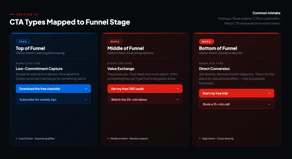
CTA types mapped to funnel stage
Not every CTA does the same job. The type of CTA you use should match where the visitor is in their decision-making process. Put a ‘Book a demo’ CTA on a cold traffic blog post and you will get almost no clicks. Put a ‘Download the free checklist’ CTA on your pricing page and you are accidentally pulling people backward.
Here is how to think about it by funnel stage:
| Funnel Stage | Visitor Intent | Right CTA Type | Examples |
| ToFu (Top) | Learning, browsing | Low-commitment capture | Download guide, Subscribe, Read more |
| MoFu (Middle) | Evaluating options | Value exchange | Free audit, Webinar signup, Case study |
| BoFu (Bottom) | Ready to decide | Direct conversion | Book demo, Start free trial, Get a quote |
Lead nurturing CTAs live in the MoFu zone. They are for contacts who already know you but have not committed. A product demo offer or a free trial with a defined end date works well here. These visitors need one more reason, not a cold pitch.
Social sharing CTAs live outside the funnel entirely. They expand reach. They are not conversion tools, so do not expect them to generate leads directly.
Form submission CTAs close the loop. Every lead generation flow ends with one. Make sure the button copy reflects what happens after the click – ‘Get my report,’ not ‘Submit.’
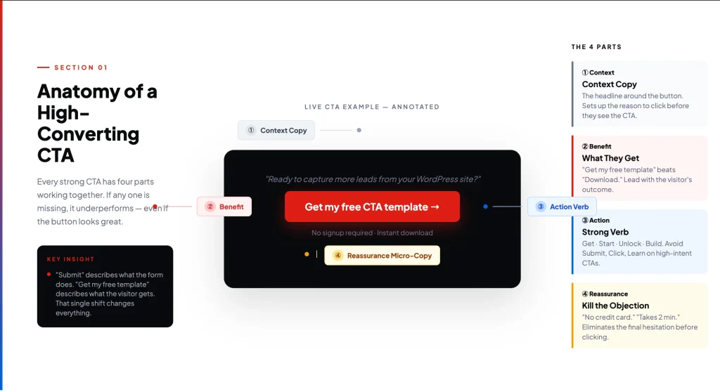
CTA copy formulas that work
Most CTA copy is weak because it describes an action rather than a benefit. ‘Submit,’ ‘Click here,’ ‘Learn more’ – these tell the visitor what to do, not why they should care.
The formula that consistently outperforms is simple:
Benefit + Action + Low-Friction ReassuranceExample: ‘Get my free lead capture template → No signup required’
Here’s the formula in action –
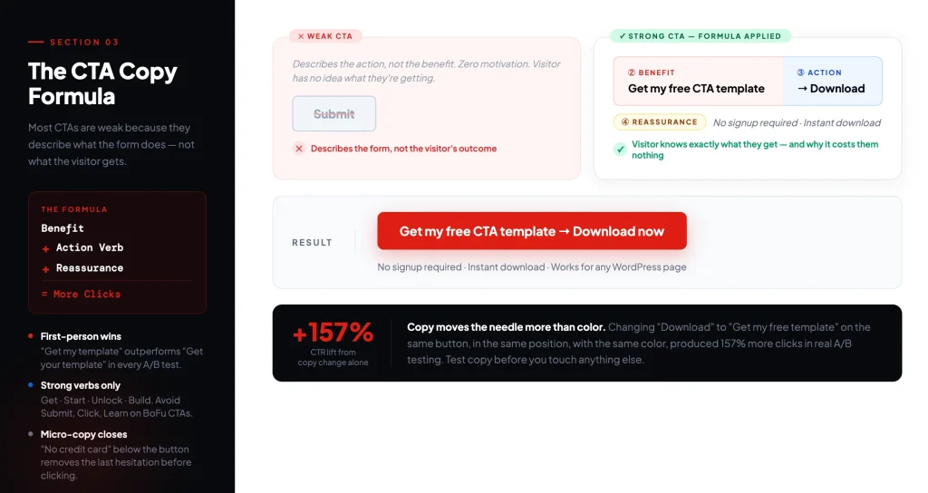
Let’s break down each element now:
Benefit
Lead with what the visitor gets, not what they do. ‘Start my free trial’ beats ‘Sign up.’ ‘Get the CRO checklist’ beats ‘Download.’ First-person phrasing (‘my,’ ‘me’) consistently outperforms second-person phrasing (‘your,’ ‘you’) in A/B tests, because it makes the reader mentally claim the outcome before clicking.
Action
Use a strong verb. Get. Start. Build. Unlock. Discover. Avoid passive or vague verbs like ‘Learn,’ ‘See,’ or ‘Explore’ for high-intent CTAs. Save those for ToFu where low pressure matters.
Low-friction reassurance
This is the micro-copy below or beside the button. It eliminates the last objection before the click. Common examples:
- No credit card required
- Takes less than 2 minutes
- Cancel any time
- Free forever plan available
You do not always need all three parts. A BoFu ‘Book a demo’ button with a reassurance line often outperforms a complex benefit headline. Context determines how much work the copy needs to do.
Where to place CTAs (by page type)
There is no universal ‘best position’ for a CTA. The right placement depends on the page type and the temperature of the visitor landing on it.
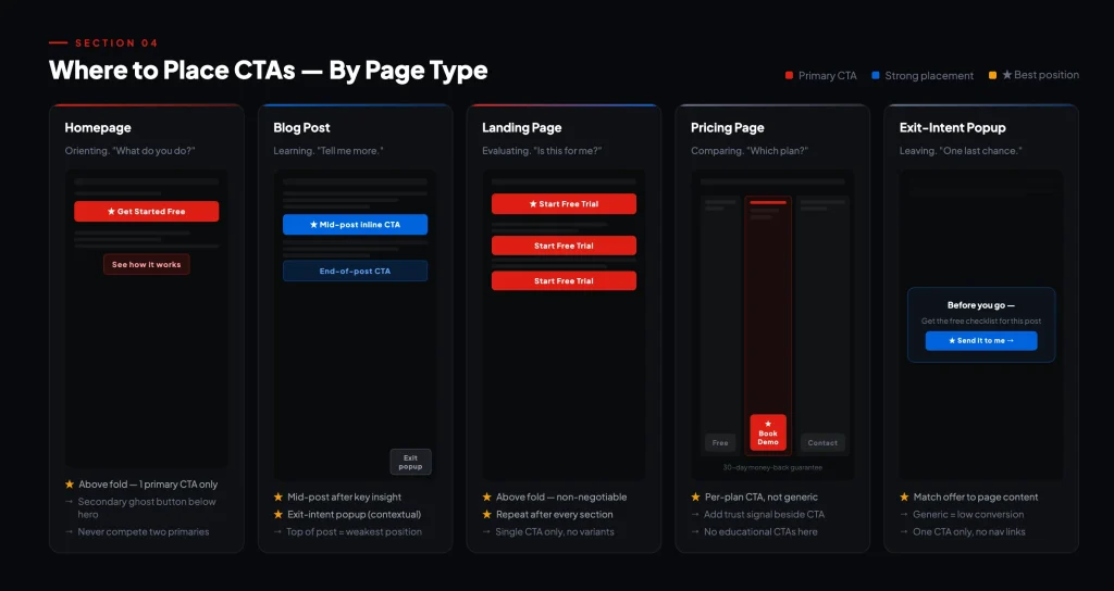
Here is what works, by page:
Homepage
Above the fold is the default and it works. Visitors arriving at your homepage are in orientation mode – they are figuring out what you do. The primary CTA here should be your clearest value statement in action form. Keep one primary CTA. Secondary CTAs (‘See how it works’) can live below the hero but should not compete visually.
Blog post
The top of a blog post is actually one of the weaker CTA positions for lead capture. Readers have not consumed the content yet and have no reason to trust you. Better positions on blog pages:
- Mid-post, after you have delivered a key insight (the reader is engaged)
- End of post, after you have earned their attention fully
- Inline within relevant paragraphs – contextual CTAs convert at 2–3x the rate of sidebar CTAs
- Exit-intent popup – captures visitors about to leave with a relevant offer
Landing page
Above the fold is non-negotiable here. But also repeat the CTA after every major section. Visitors who scroll are warming up – give them a conversion point as they go. Long landing pages with a single CTA at the bottom lose a significant portion of visitors who were ready before they got there.
Pricing page
Visitors on your pricing page have intent. They are comparing. Your primary CTA should be ‘Start free trial’ or ‘Book a demo’ – not ‘Learn more.’ This is the wrong page for educational CTAs. Support the CTA with trust signals: money-back guarantee, customer count, or a testimonial from someone like them.
Exit-intent popup
Used well, exit-intent popups are one of the highest-converting CTA placements for lead capture. The key is relevance. A generic ‘Subscribe to our newsletter’ exit popup converts poorly. An exit popup triggered on a specific blog post offering the related checklist in exchange for an email converts well. Match the offer to the content the visitor just consumed.
How to test CTAs
Most teams either skip CTA testing entirely or run tests that produce no actionable insight. The most common mistake is changing multiple variables at once and then not knowing what moved the needle.
The rule is simple: one variable per test.
What to test first
Copy outperforms color. If you have never tested your CTA copy, start there. A button that says ‘Get my free template’ versus ‘Download now’ is a meaningful test. Changing the button from blue to green on an untested CTA is almost meaningless – you are optimizing aesthetics before you have validated the message.
Order of priority for first-time testers:
- Button copy (especially first-person vs. second-person)
- Offer type (checklist vs. webinar vs. free trial)
- Placement (top of post vs. mid-post vs. exit-intent)
- Micro-copy / reassurance text
- Visual contrast and button size (after the above are validated)
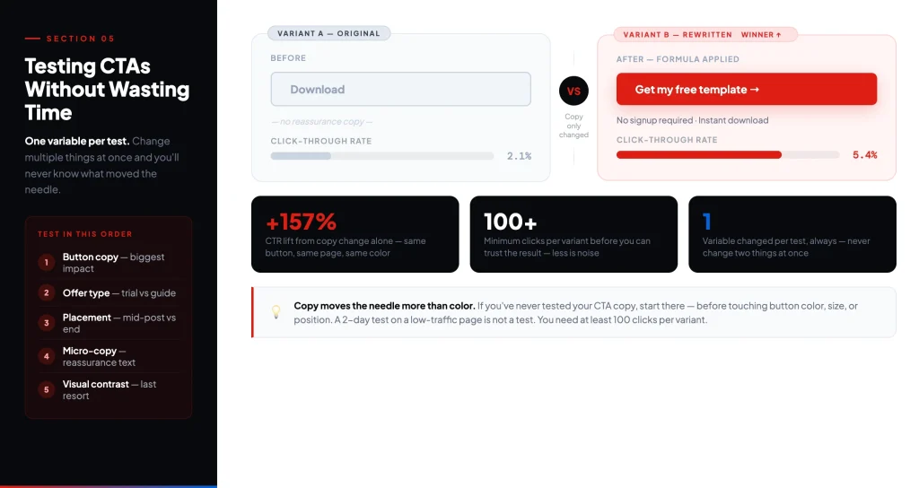
How to run a clean test
Run one CTA variant at a time on a page with sufficient traffic. You need at least 100 clicks per variant before drawing conclusions. Running a test for two days on a page with 20 visitors is not a test – it is noise.
Split test tools: Google Optimize (sunset – use alternatives like VWO or Optimizely), or simple A/B plugins for WordPress. If you are using Fluent Forms, you can duplicate a form, swap the CTA copy, and rotate which version appears to test conversion rates directly.
Measurement that actually matters
A CTA that gets clicks is not necessarily working. A CTA that drives form completions and qualified leads is. Here are the three metrics to track – and how to interpret them.
| Metric | What It Measures | What Low Numbers Mean | What to Do |
| Click-Through Rate (CTR) | % of visitors who click your CTA | Copy or placement is off. Visitors are not motivated to click. | Test your copy first. Then test placement. |
| Views-to-Submission | % of landing page visitors who complete the form | The landing page or form is creating friction after the click. | Shorten the form. Clarify the offer. Add social proof. |
| Clicks-to-Submission | % of CTA clickers who complete the form | There is a disconnect between the CTA promise and the landing page. | Align CTA copy directly with the headline and offer on the landing page. |
These three metrics tell a story when read together. High CTR but low views-to-submission means your CTA is compelling but your landing page is losing people. Low CTR but high views-to-submission means your CTA is weak but your landing page is strong – fix the CTA and you will unlock volume.
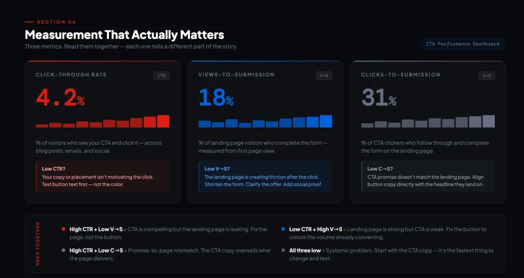
Track all three. They are not interchangeable.
CTA examples worth studying
The best CTAs share three traits: the offer is clear, the friction is low, and the copy speaks to a specific person’s situation. Here are examples that do all three.
HubSpot – removing the friction
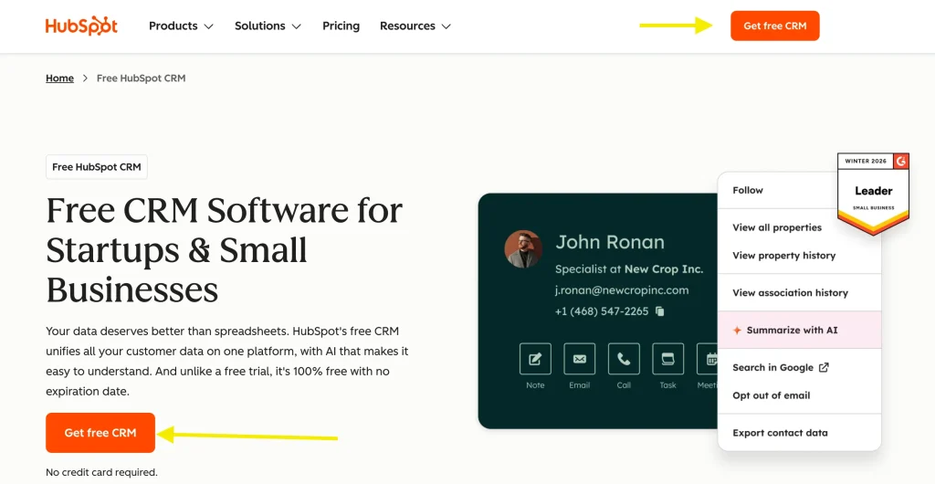
HubSpot’s CRM page has one primary CTA: “Get started free.”
Four words. No asterisks. No “14-day trial” qualification tucked in small print. The reassurance line below the button says “No credit card required.” – five words that remove the only remaining reason not to click.
What makes this CTA work is what’s missing. There’s no over-explanation of features, no urgency countdown, no secondary offer competing for attention. The product is the value. The button says so directly.
Most CTAs try to convince, but this one just removes the obstacles.
Notion – dual purpose CTA
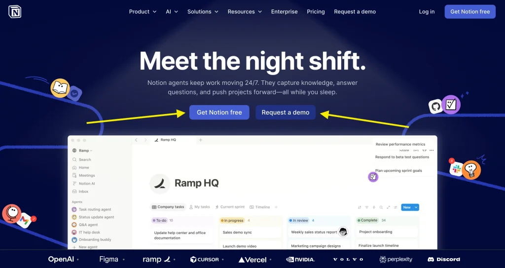
Notion’s homepage hero has two buttons: “Get Notion free” as the primary, and “Request a demo” sitting beside it as a ghost button.
This looks like a simple design choice. It isn’t. It’s segmentation built directly into the page layout. Individual users – the ones who just want to try it – read “Get Notion free” and click without thinking. Enterprise buyers – the ones who need to justify a team license – read “Request a demo” and go that route instead.
Neither CTA competes with the other because they’re not talking to the same person. The mistake most pages make is trying to write a single CTA that satisfies both audiences. Notion sidesteps that entirely. They let the visitor self-sort – and both paths convert because neither one feels like a compromise.
Fluent Forms – in-context lead capture
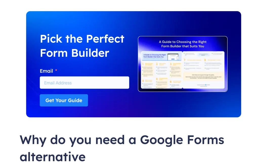
This one is about placement as much as copy.
A generic sidebar opt-in with “Subscribe to our newsletter” converts at around 0.5–1.5%. An inline form embedded mid-post, directly after a section the reader just found valuable, with button copy that mirrors the post topic – that same form converts at 2–3× the rate. The difference isn’t the form. It’s the context.
The Fluent Forms blog on Google Forms alternatives does this well. The post walks readers through Google Forms feature by feature. By the time they hit the “Why do you need an alternative” section, one question is already forming: which form builder should I actually use? That’s the exact moment the inline CTA appears – “Pick the Perfect Form Builder. Get Your Guide.”
It doesn’t interrupt. It answers. The button copy earns the click because the content just raised the question the offer resolves.
That’s the pattern: match your CTA offer to the question your content leaves the reader with. Place it at the moment that question peaks. The form and the page copy should feel like the same sentence.
Spotify – reassuring the user
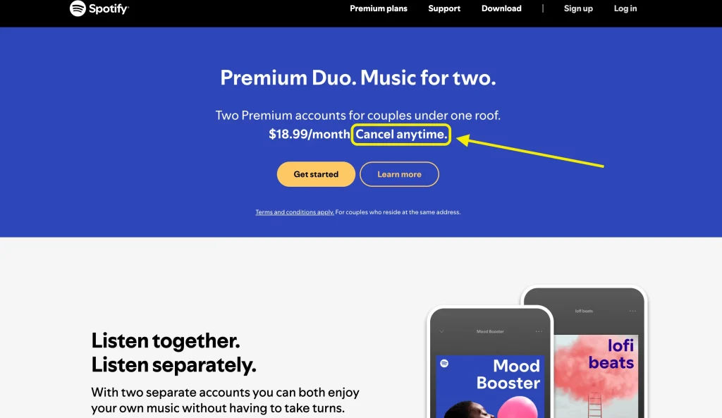
Most subscription CTAs hide the price and hope momentum carries you through to signup. Spotify does the opposite.
Their premium page shows the plan price upfront, then places “Cancel anytime” directly beside the CTA. They are not trying to get you past the price – they’re using the price as proof that the offer is fair. Here’s what it costs. Here’s what you get. And you can leave whenever you want.
That last part – “cancel anytime” – is doing most of the work. It reframes a subscription commitment as something closer to a try-before-you-decide. The CTA copy itself is simple: “Get started.” But the context around it – price visible, cancellation easy, no hidden catch – is what makes clicking feel safe.
For any subscription or recurring offer, this is the template: show the price, remove the trap, let the product do the convincing.
Your CTA launch checklist
Before publishing any CTA, run through this list:
- Does the button copy name a benefit, not just an action?
- Is there a micro-copy addressing the most likely objection?
- Does the CTA match the funnel stage of the page it is on?
- Is there only one primary CTA competing for attention?
- Does the landing page copy match what the CTA promised?
- Are you tracking CTR, views-to-submission, and clicks-to-submission?
- Have you defined what one variable you will test first?
Run through that list once before publishing, and once more before declaring a CTA ‘done.’ Most CTA problems are visible before you ever look at the data – they just require someone to look.
The bottom line
A lead generation CTA button is not a design decision. It is a conversion decision. The copy, the placement, the offer behind it, and the page it lands on all work together – or they do not.
Most CTAs underperform because they were written quickly and never tested. The bar is not high. Clear copy, matched intent, and one clean test cycle puts you ahead of the majority of sites competing for the same attention.
Start with one CTA. Write it to a specific person with a specific offer. Place it where they are already engaged. Measure the three metrics. Change one thing. Repeat.
That is the whole playbook.
-
How to Create eCommerce Order Bump: Copy, Tips & Best Practices
Learn how to create order bump with copy tips and -

12 Things to Consider When Starting an eCommerce Business
Are you starting an eCommerce business? Explore 12 key things -
How to Set Up Google Analytics for FluentCart (GA4 eCommerce Tracking)
Set up Google Analytics for FluentCart and track your full
Leave a Reply
You must be logged in to post a comment.