Necessary Aspects You Need to Consider While Choosing an Online Payment Form
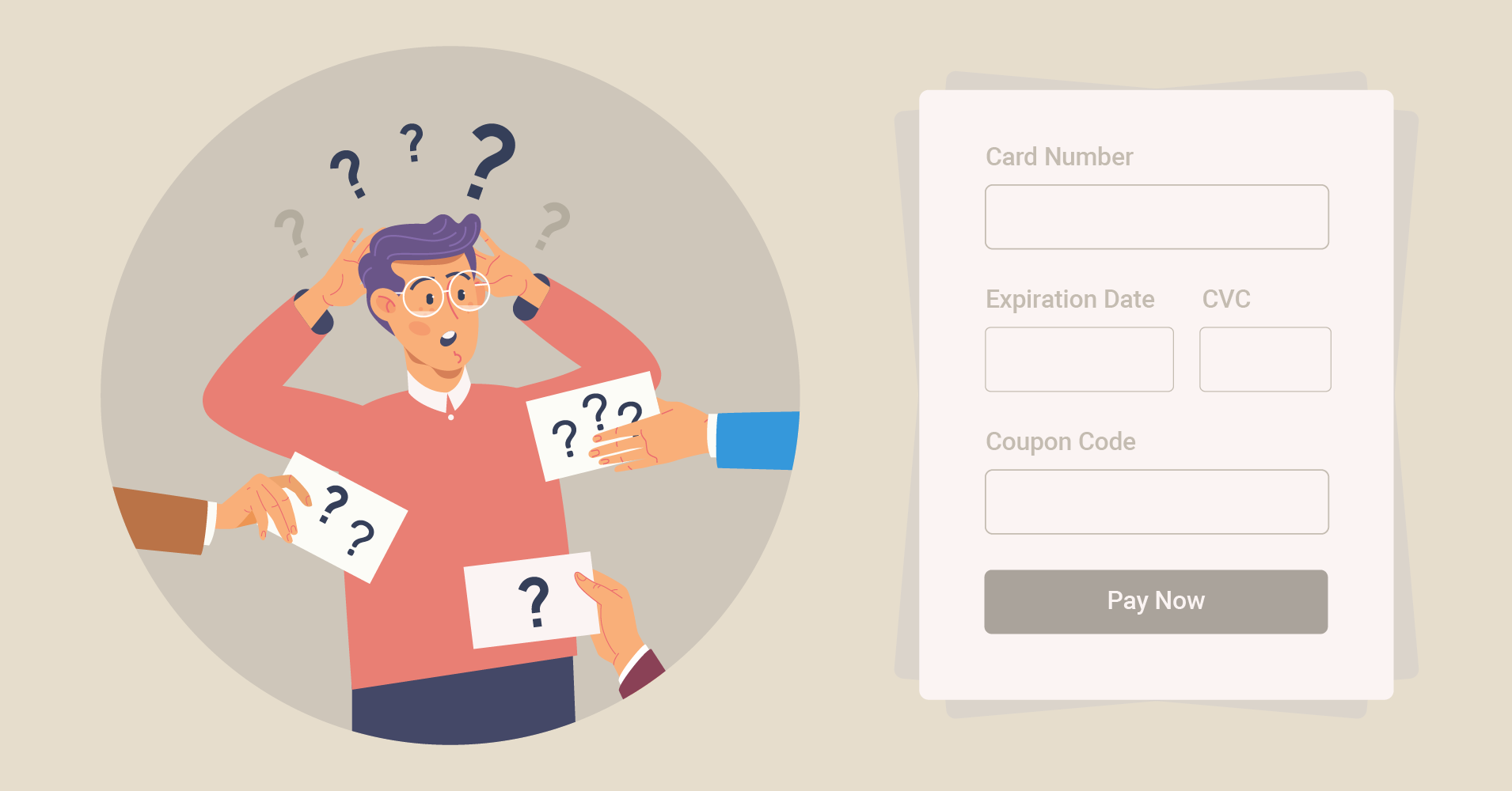
The millennials are becoming the new face of the business and this generation doesn’t even carry cash or checkbooks all the time. No matter if you are running a profit-making online business or non-profit organization, an online payment form is a game-changer.
Take a moment and think about the time when sending or receiving money was a never-ending process. Doing all the paperwork and then dealing with hard cash was quite lengthy, not to mention a difficult task. However, these complex tasks have now been replaced by e- payment forms.
Now what if we go backward and ask ourselves, why do we conduct business?
The purpose of doing business is not just to earn revenue but to provide the best service to your clients in the process. So both purposes of a business are closely connected to a stable payment integration method.
Frustrated customers with an inefficient checkout process could lead to a massive loss of revenue. Conversely, a smart payment integration form that is hassle-free and easy to set up is an essential part of your business.
Before we dive into the necessary aspects of an online payment form, let’s make a clear statement about the digital payment form.
What is an online payment form?
It is an arrangement of electronic payment processes that accepts cards instead of cash and uses mobile or internet to send or receive money from anywhere. Along with saving time, you also get some other exciting features. You can store user information, change the form outlook according to your brand, and take care of your fund.
Why do you need an online payment form?
If we consider customer satisfaction, a checkout component will allow a business to meet its clients. Why do we need an online payment form?

- When you have more than one payment processor, it is possible for you to reach more customers and consequently expand the business
- Secondly, a payment form works for online transactions. However, offline payment is an excellent feature of online payment forms
- Thirdly, a stunning feature of digital form is a detailed input field. Along with general fields, you get to make your own specified figures
- Scheduling options in a form following your time is a convenient feature. You can set the opening or closing time for your payment
- In order to place your form, you won’t have to make it from scratch. You can just copy the shortcode and paste it anywhere to get started
Standard payment gateway
Have you ever been in a situation where a favorite gadget has just launched, but your payment processor doesn’t match the payment method? If yes, you surely remember how disappointing it was for you!
Online shopping is the most popular and convenient way to buy things these days. You can buy your product or service from the comfort and safety of your couch. It is the most popular way to shop, but you won’t get any share of that business if you are still connecting with outdated tools.
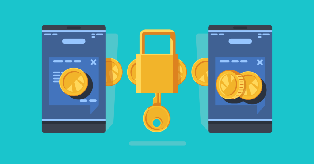
Though the payment integrations highlight their accessible components, yet they are not always flawless. An online payment form without standard integration is dysfunctional.
Some standard and worthy gateways such as Stripe, PayPal, Apple Pay, and Amazon Pay are accepted globally. Before deciding on the electronic payment form, you need to keep an eye on a few things and the names above are definitely to be your top priority.
Provide simple setup
The form is the bridge between a buyer and a user. It is considered the most crucial part of communication between two parties. The form is a messenger to convey the information to the required parties. The purpose of using a form is to achieve the goal of conducting monetary transactions.
Despite the significance, it is often seen that a customer is never interested in filling up a form. Studies have found that a complex form is always considered unattractive, and users don’t connect with it easily. Moreover, if the form is too long with unnecessary input fields, people tend to feel hesitant.
For instance, consider your own experiences. I bet you have also had an unpleasant experience at some point while trying to make an online purchase. A standard form is one of the essential things to be careful before you pick an online payment form.
Multiple payment methods
It is human nature to look for a convenient option. Even if the available option is appropriate, users still always search for a smoother experience.
Multiple payment methods are no exception to that norm. What drives the sellers to embed multiple payment integration into the business? When a buyer buys something from a shop, they expect to pay with whatever payment gateway they are using. In case the shop doesn’t provide the preferred option, the customer may lose interest and call it off.
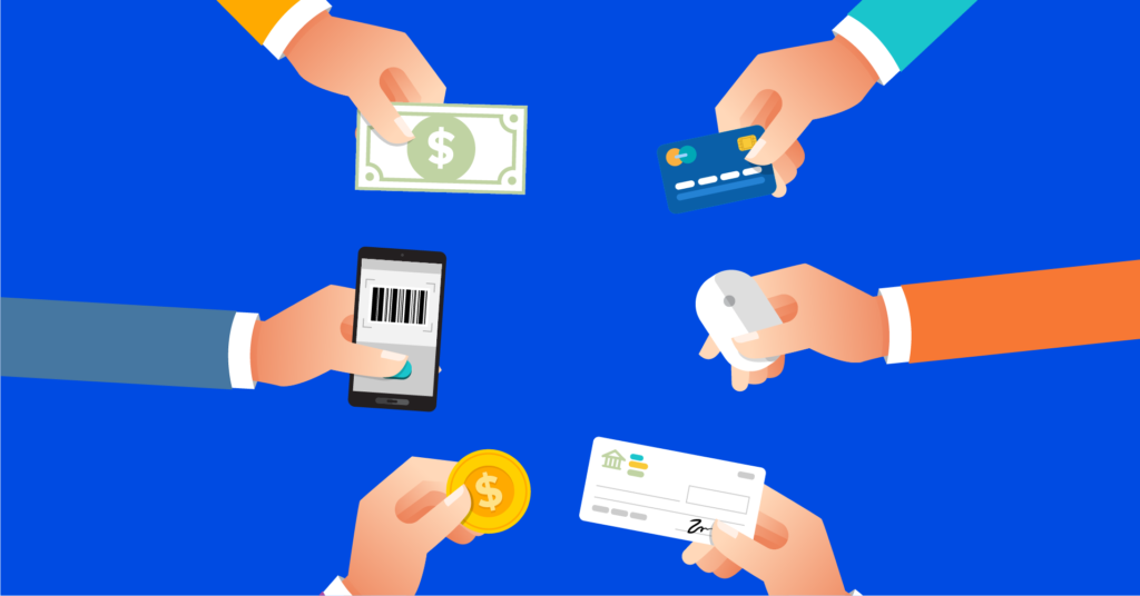
Whether receiving money for bills or as a donation, it is always best to keep multiple payment integration. Moreover, several options are always flexible enough to attract more customers.
An online payment form is the most important part of any startup or big venture. It is commonly seen that payment methods with numerous options are a prime concern when it comes to choosing an electronic payment method.
User-friendly
Another necessary feature that should be kept on mind is making it a user-friendly component. You don’t want to confuse your customers by providing a complex payment form. There is a myth that operating an online payment form needs high-tech knowledge.
However, some checkout pages are specially designed for non-tech users to understand clearly. With easy functionality and detailed video tutorials, payment tools have everything adequate to offer a customer.
Shortcode is an additional mentionable attribute. Without knowing anything about coding, users are able to build forms. You can just copy and paste the shortcode anywhere every time you want to resume work.
Moreover, it offers seamless qualities; for instance, AfterPay lets you fix the payment later for their customers. It is undoubtedly a unique quality and is in users’ interest.
Legit reasons for distractions
Consider the human brain as a computer. Just as a computer has a processor, the human brain has the same. But unlike the computer, the brain can’t control the distraction. Although distractions are a huge disadvantage, some distractions are inevitable.

But it is needless to say that, if your potential customers are going away due to interruption, this could cause a huge loss. Moreover, it is not in your control to decide the checkout page, but when you target a customer, you want to offer the best.
One thing to note while staying on the checkout page – the whole e-payment process shouldn’t waste your customers’ valuable time.
Design consistency
Not just in the case of the online payment form, but it is important to always keep the design and outline of your website updated.
When someone visits a brand online, they remember the associated logo or color. People tend to engage with a good design immediately. Before choosing an electronic checkout page, one should consider the design as well. To be more precise, the color of the product and the form should have a balance.
Furthermore, fraudulent online activities teach people to be extra cautious about the details. So, to keep up with the pace, having a consistent design is a prerequisite of an online payment form.
Think from a user’s point of view
As an owner, when you integrate a payment method on your website, you must look at both sides. Both the sellers and the buyer’s perspective is of utmost importance.
For example, when a user fills up a form, they look for a quick build-up. But some tools fail to notice that delays can annoy users and make them lose interest the next time.
A form with a straightforward set of questions gives a clear view of the user. On the contrary, lack of appropriate wording and clear instructions will lead the clients to confusion. Misunderstanding regarding the payment procedure tends to ensue far more significant problems.
A quick fix to tech-errors
Do you remember the time when you submitted a form after a long completion process?
And your server didn’t respond, and you had to do it from scratch and resubmit. I bet you vividly remember that experience, and it was quite distressing.
When you select your online payment form, remember, users expect a quick solution to an error. Some errors are quite confusing. For instance, when a user misses a required input field, the error might not show until he has clicked on “Next”.
But a checkout page doesn’t have to be designed this way. Saved information can reduce a lot of lengthy, redundant work. Regardless of the other unique features, this is one of the prime aspects to keep in mind in order to choose the right online payment form.
No hidden costs
A clear understanding of the fees is always necessary. Sometimes online services we use charge a hidden cost. This is a definite deal-breaker.
An online payment form should have a transparent offer for the users and no hidden charges. For example, the free version shouldn’t charge any fee, whereas, the fee of the premium versions should be transparent.
Ask for necessary information
Asking for too much information, whether in a conversation or an online payment form is not appropriate.
People tend to feel annoyed when there are tons of questions coming on their way. In some cases, users face the same questions twice.

The checkout page has some questions for the users, but it’s better if the questions are short and relevant. Too elaborate questions are relationship killers.
This one feature is for sure to be paid extra attention to while choosing an online payment form.
Reliable security system
Online fraud and scams are quite a familiar story these days. The most common reason people step back from online transactions is that they couldn’t rely on the security system.
In order to get more clients and excel in the business, a secured payment method is mandatory. However, tools are now super careful, and hackers are one step ahead too.
When someone is dealing with money and invests their trust, they expect a safe service in return.
Online payment forms also do the same thing. They provide encrypted text with the Secure Sockets Layer. Immediate email notifications are sent if there are any suspicious activities.
It is needless to say how sensitive the security system is when a user decides to deal with an online payment form.
Wrapping up
It goes without saying that an online payment form has lessened a lot of form-filling administrative works. Having a robust website with unique products and services just increases the necessity of electronic payment integration.
Whether it’s an e-commerce site or a physical shop, you need a payment solution. Although not everyone will know about the essential aspects of choosing a payment form, the ones who will delve into these details are on their way to making their customers happy.

For those looking for suitable options for their business transactions, they must choose the right tool. But the good news is we have ample exciting options to go with. The right online payment form will simply speed up your business activities.
If you are still unaware of what change could make an online payment form in your business, we strongly encourage you to embed one. More and more people are getting inclined towards online shopping, and now is the time to give them an easy online payment solution.




Leave a Reply
You must be logged in to post a comment.