Brand Resources and Guidelines
Welcome to WPManageNinja’s brand resource hub. This page provides guidelines, logos, and assets to ensure consistent and professional representation of the WPManageNinja brand.
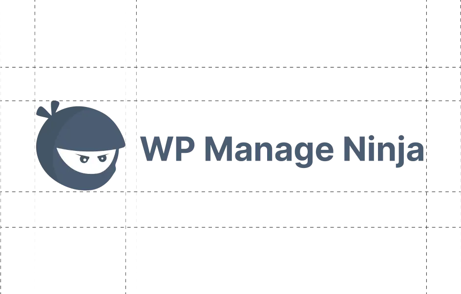
WPManageNinja Logo
The WPManageNinja logo represents our brand’s identity. It embodies who we are, what we believe in, and the trust we’ve earned. This guide ensures our logo always appears consistent, polished, and professional across every platform.

Primary Logo

Secondary Logo

Monotone Dark Logo

Monotone White Logo
WPManageNinja Icon
The WPManageNinja icon captures our brand at a glance. It’s perfect for tight spaces, app icons, or anywhere you need a simple yet powerful visual mark.

Primary Icon
Secondary Icon

Monotone Dark Icon

Monotone White Icon
WPManageNinja Logo Usage Guidelines
The WPManageNinja logo pairs our distinctive “Ninja Head” icon with the WPManageNinja wordmark.
The primary horizontal version is recommended for most applications.
To maintain clarity and impact, avoid using the logo at sizes that compromise legibility, and always use the official logo files provided.
Logo Scale Guidelines
For smaller applications, use the dedicated small-size logo variation. It’s optimized for widths between 238px and 56px to maintain clarity and visual balance.
When the logo needs to appear even smaller, under 56px in height, use only the WPManageNinja icon. Avoid using the stacked logo at these sizes to preserve readability and brand consistency.
Do
Use the full-color logos only on white, black, or light blue backgrounds.
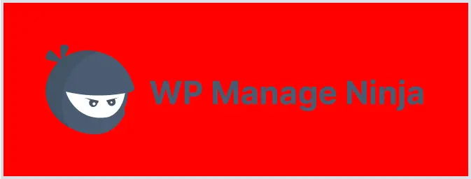


Don’ts
Don’t use the full-color logo on any background that fails accessibility. Always make sure it’s easy to see and has proper visual contrast.
Do
When placing the logo on a photograph, ensure the logo is positioned over a white, black, or blue area of the image to maintain visibility.


Don’ts
Focus on logo visibility first and do not alter any part of the logo’s color (logomark and wordmark).
Color Palette
Use these color proportions in any layout or collateral design. Text should always be set in dark grey (Text Color). Use the secondary color for buttons and focus areas.
The primary color is WPManageNinja’s main brand color; use it as a neutral tone or wherever brand representation is needed.
Here’s a quick overview to help you use our colors effectively:
#4B5D73
CMYK 35, 19, 0, 55
Primary
#0D5FFF
CMYK 95, 63, 0, 0
Secondary
#9FBFFF
CMYK 38, 25, 0, 0
Accent
#07090C
CMYK 42, 25, 0, 95
Text
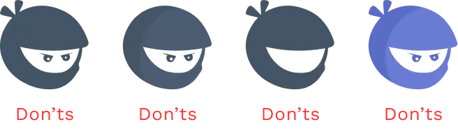
Icon’s Guidelines
When using our icon, it’s important to follow some essential rules. Always use the icons in their original, unaltered form to maintain the integrity and recognition of our brand.
Dos
Don’ts
Writing Guidelines
The do’s and don’ts of talking about WPManageNinja in your content or copy.
Dos
Don’ts
WPManageNinja Products’ Logos
Our product logos represent the heart of each WPManageNinja brand. They reflect our shared identity, credibility, and recognition across every platform.
Explore and download official logos to maintain visual consistency and professionalism in all your communications.

Fluent Forms Logos
Secondary
Secondary
Monotone Dark
Monotone Dark
Monotone White
Monotone White

FluentCRM Logos
Secondary
Secondary
Monotone Dark
Monotone Dark
Monotone White
Monotone White

Ninja Tables Logos
Secondary
Secondary
Monotone Dark
Monotone Dark
Monotone White
Monotone White

FluentCart Logos
Secondary
Secondary
Monotone Dark
Monotone Dark
Monotone White
Monotone White

FluentCommunity Logos
Secondary
Secondary
Monotone Dark
Monotone Dark
Monotone White
Monotone White

FluentBooking Logos
Secondary
Secondary
Monotone Dark
Monotone Dark
Monotone White
Monotone White

Fluent Support Logos
Secondary
Secondary
Monotone Dark
Monotone Dark
Monotone White
Monotone White

WP Social Ninja Logos
Secondary
Secondary
Monotone Dark
Monotone Dark
Monotone White
Monotone White

FluentAffiliate Logos
Secondary
Secondary
Monotone Dark
Monotone Dark
Monotone White
Monotone White

FluentSMTP Logos
Secondary
Secondary
Monotone Dark
Monotone Dark
Monotone White
Monotone White

FluentBoards Logos
Secondary
Secondary
Monotone Dark
Monotone Dark
Monotone White
Monotone White

Paymattic Logos
Secondary
Secondary
Monotone Dark
Monotone Dark
Monotone White
Monotone White

AzonPress Logos
Secondary
Secondary
Monotone Dark
Monotone Dark
Monotone White
Monotone White
WPManageNinja Products’ Icons
Our product icons deliver the essence of WPManageNinja brands at a glance. Designed for clarity and impact, they’re ideal for compact spaces, app icons, or anywhere a simple, recognizable mark is needed.
Use them correctly to ensure a cohesive and polished brand presence across platforms.
Fluent Forms Icons
Secondary
Secondary
Monotone Dark
Monotone Dark
Monotone White
Monotone White

FluentCRM Icons
Secondary
Secondary
Monotone Dark
Monotone Dark
Monotone White
Monotone White

Ninja Tables Icons
Secondary
Secondary
Monotone Dark
Monotone Dark
Monotone White
Monotone White

FluentCart Icons
Secondary
Secondary
Monotone Dark
Monotone Dark
Monotone White
Monotone White

FluentCommunity Icons
Secondary
Secondary
Monotone Dark
Monotone Dark
Monotone White
Monotone White

FluentBooking Icons
Secondary
Secondary
Monotone Dark
Monotone Dark
Monotone White
Monotone White

Fluent Support Icons
Secondary
Secondary
Monotone Dark
Monotone Dark
Monotone White
Monotone White

WP Social Ninja Icons
Secondary
Secondary
Monotone Dark
Monotone Dark
Monotone White
Monotone White

FluentAffiliate Icons
Secondary
Secondary
Monotone Dark
Monotone Dark
Monotone White
Monotone White

FluentSMTP Icons
Secondary
Secondary
Monotone Dark
Monotone Dark
Monotone White
Monotone White

FluentBoards Icons
Secondary
Secondary
Monotone Dark
Monotone Dark
Monotone White
Monotone White

Paymattic Icons
Secondary
Secondary
Monotone Dark
Monotone Dark
Monotone White
Monotone White

AzonPress Icons
Secondary
Secondary
Monotone Dark
Monotone Dark
Monotone White
Monotone White